La Belle Iloise Shellfish Veloute Packaging
Topics
Details
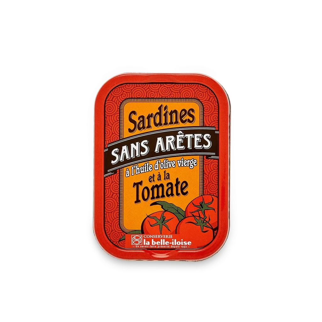
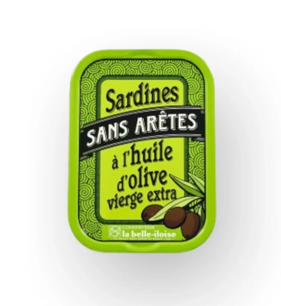
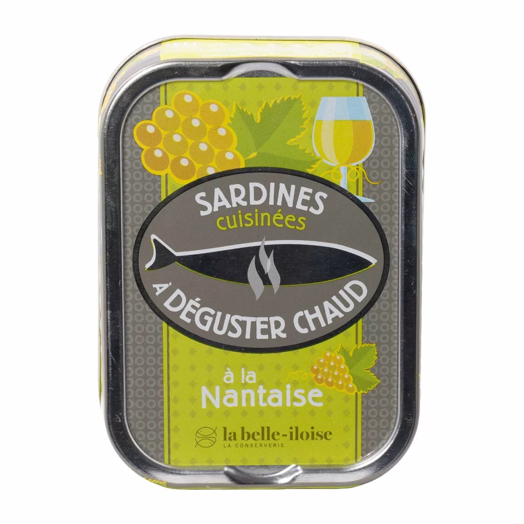
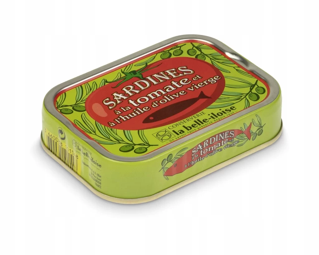
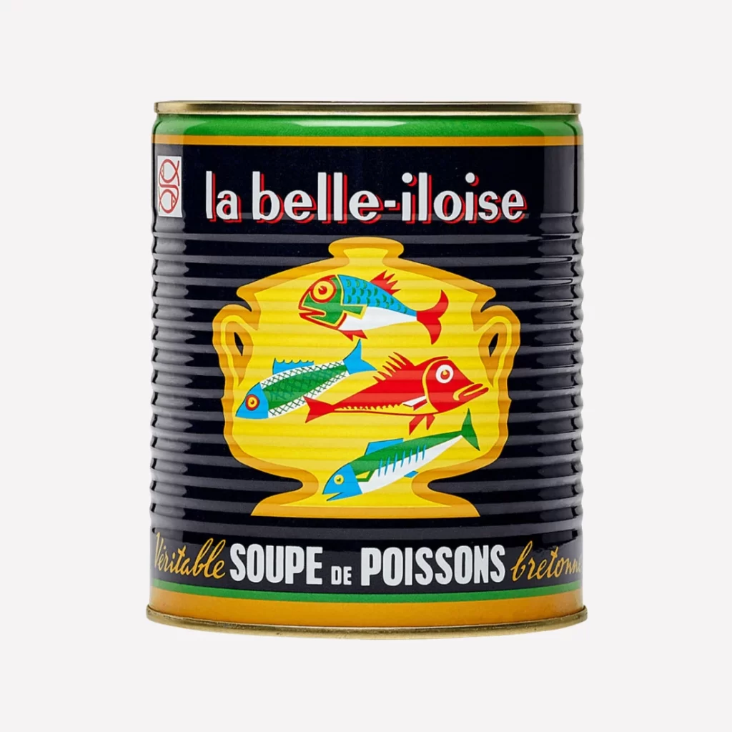
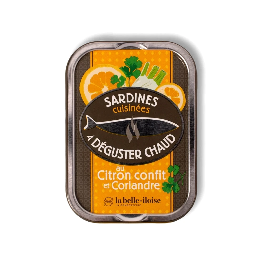
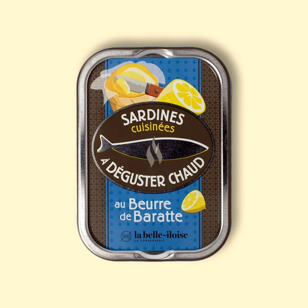
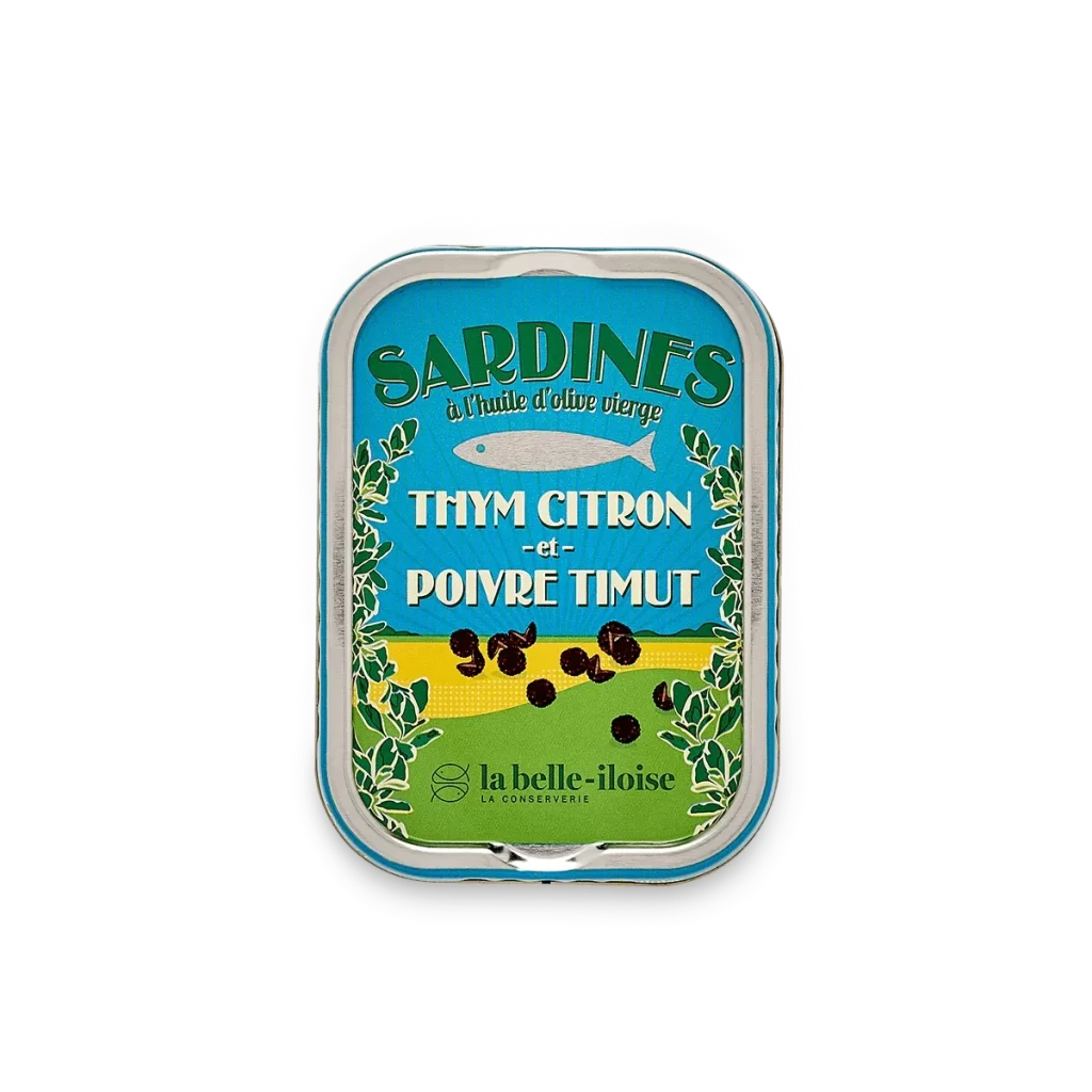
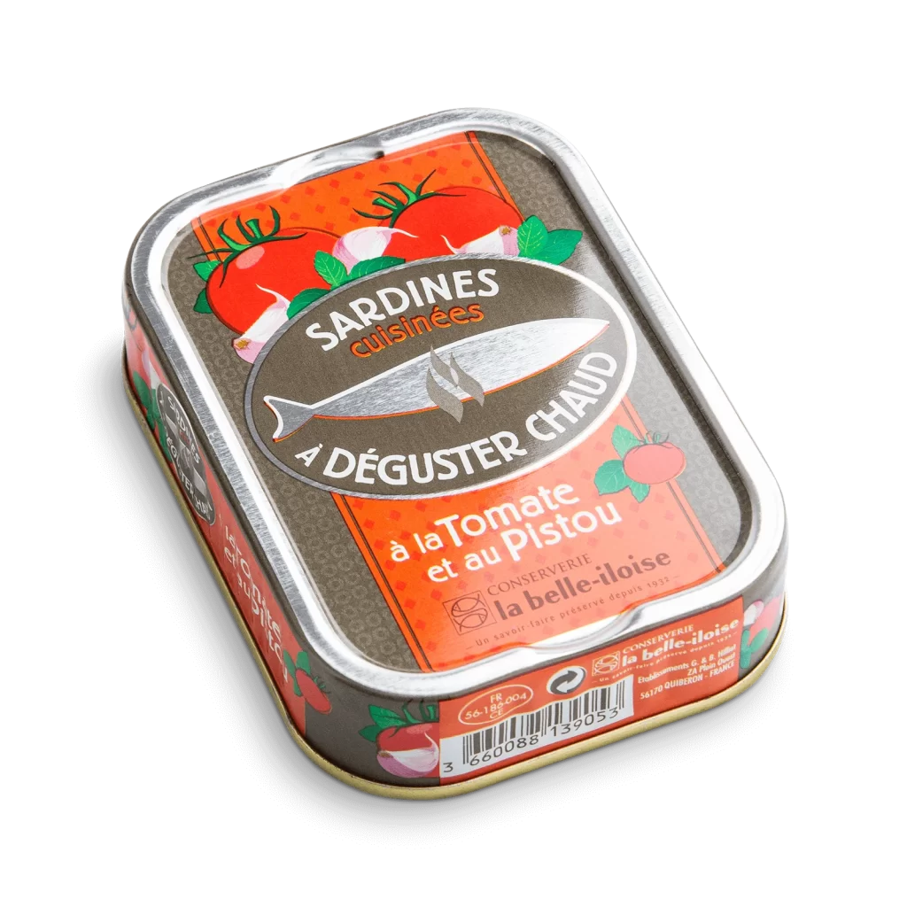
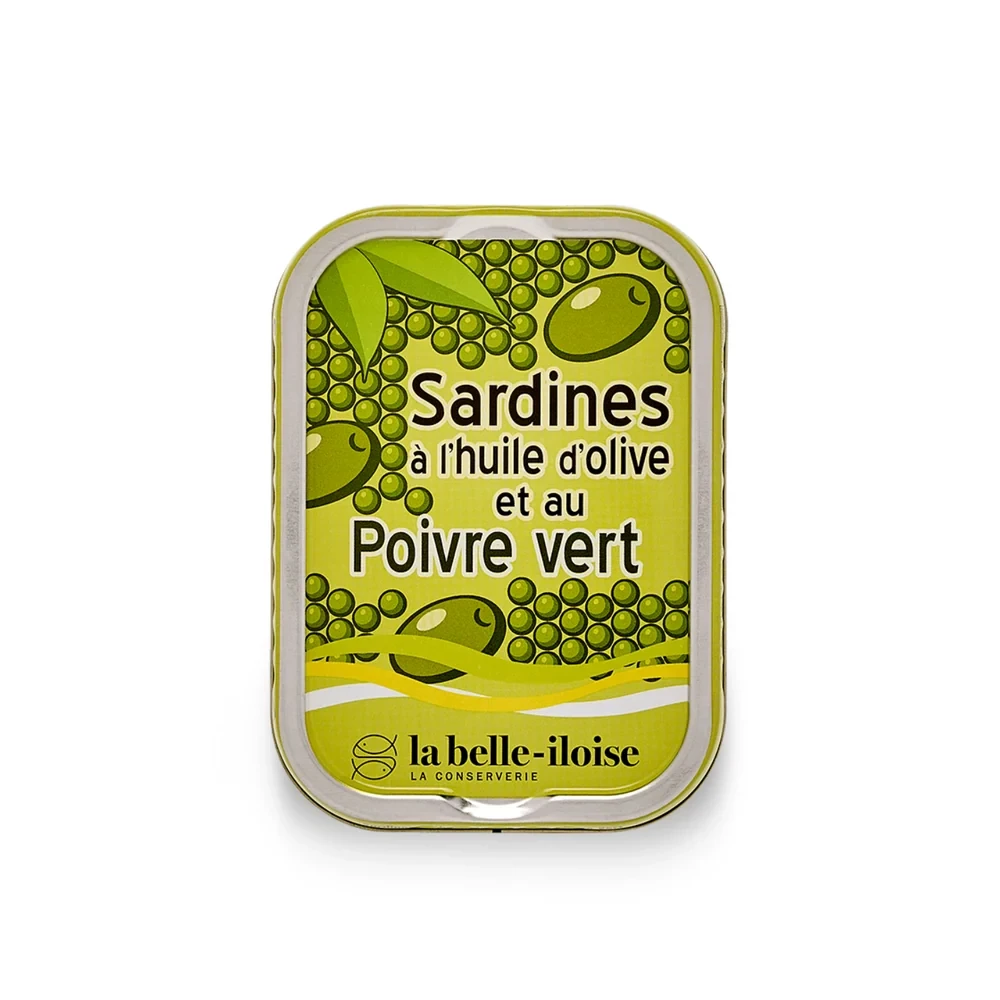
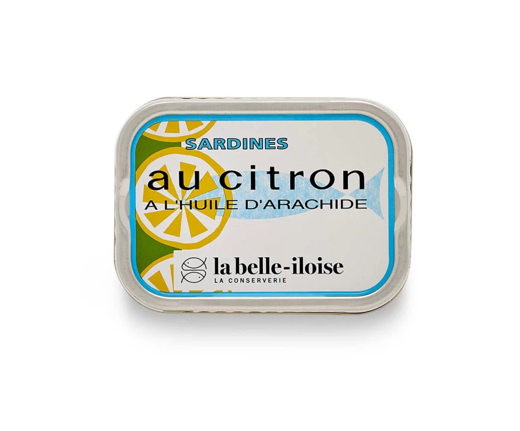
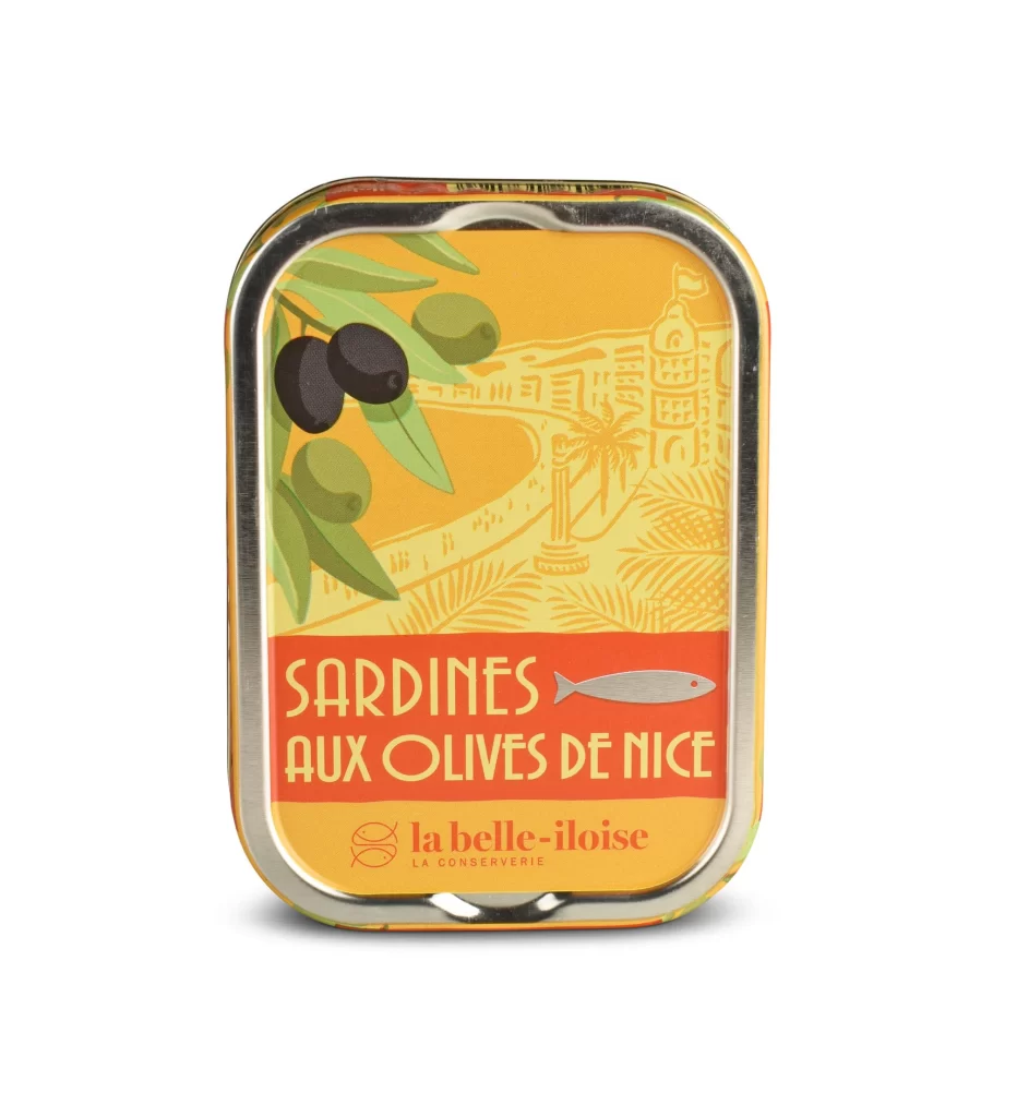
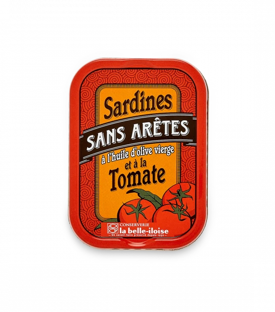
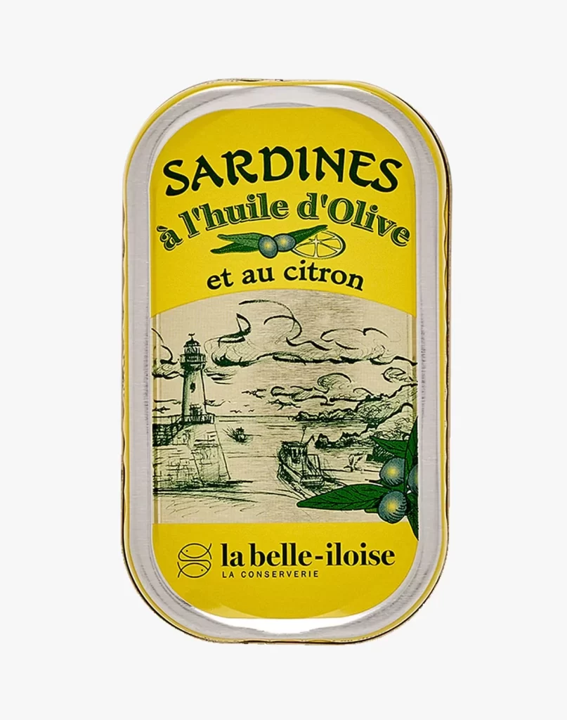
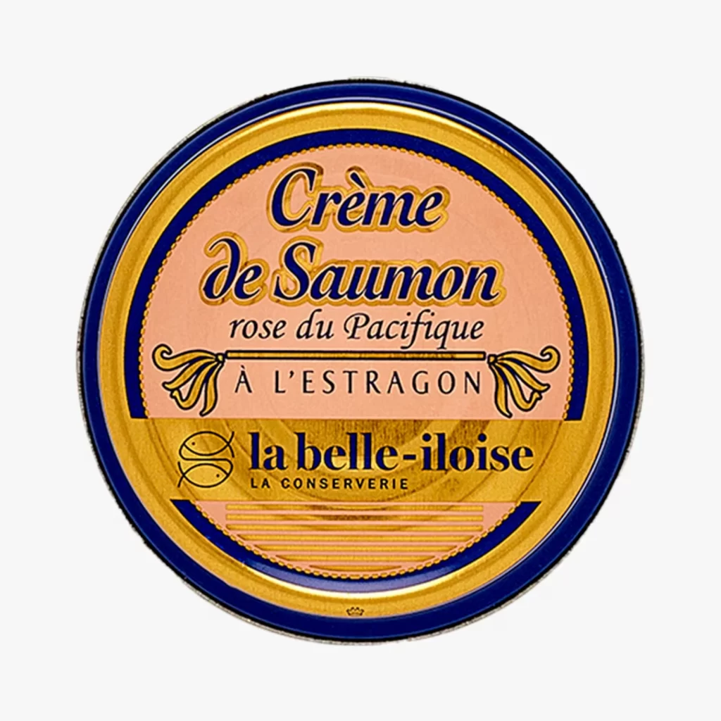
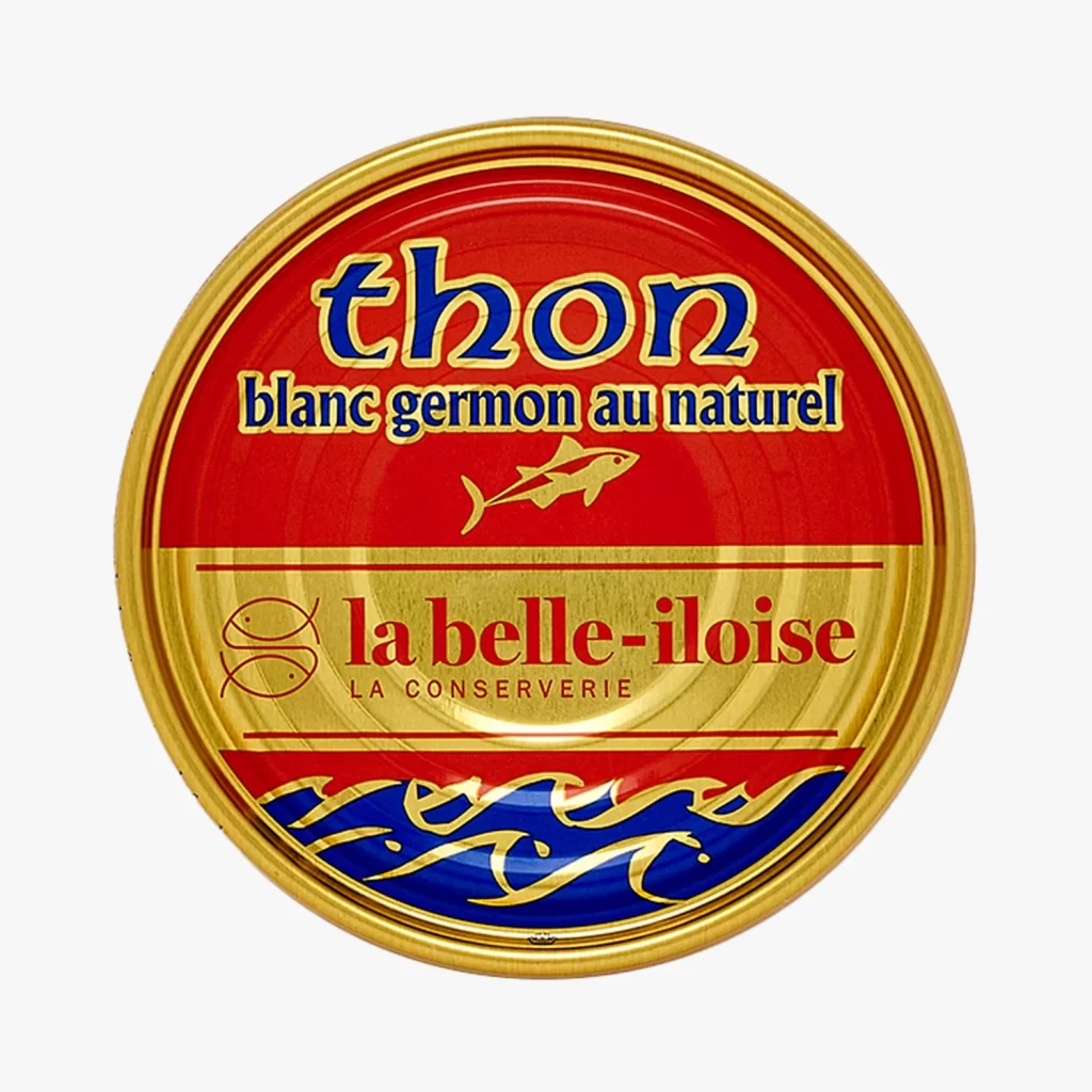
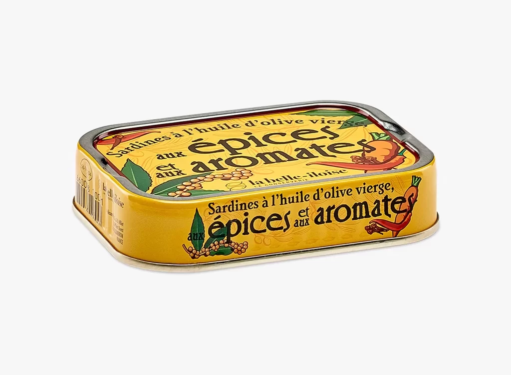
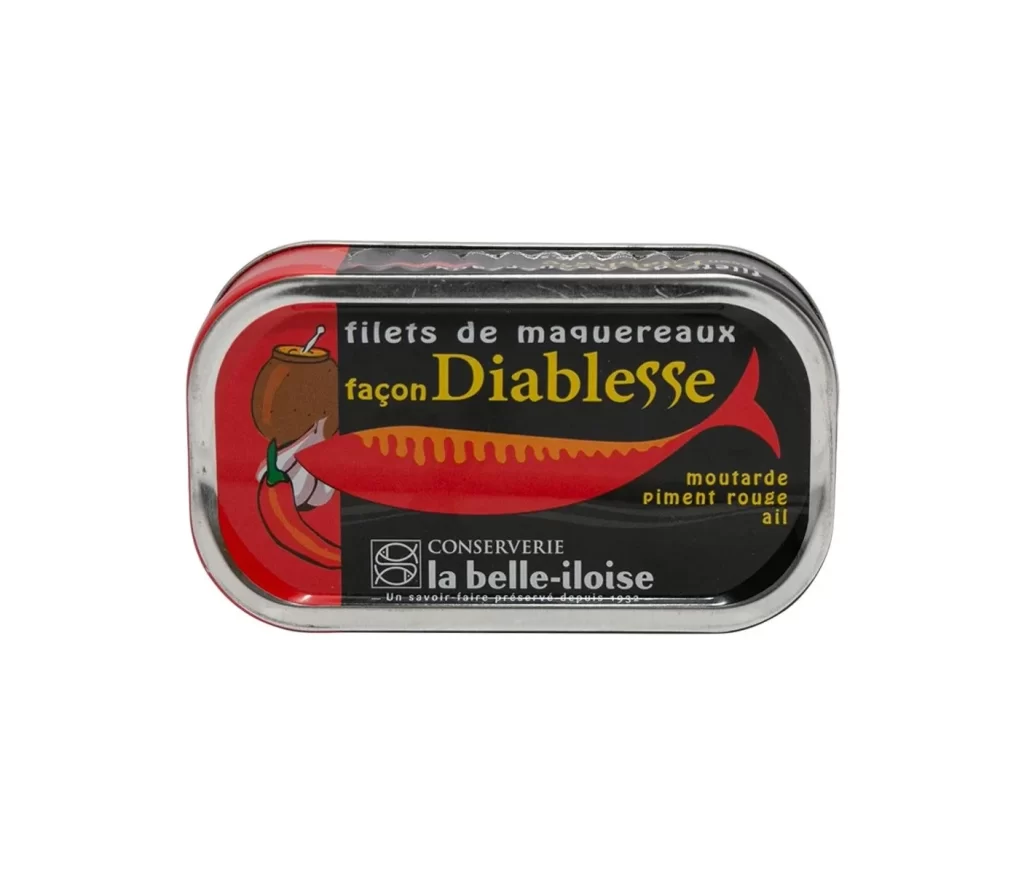
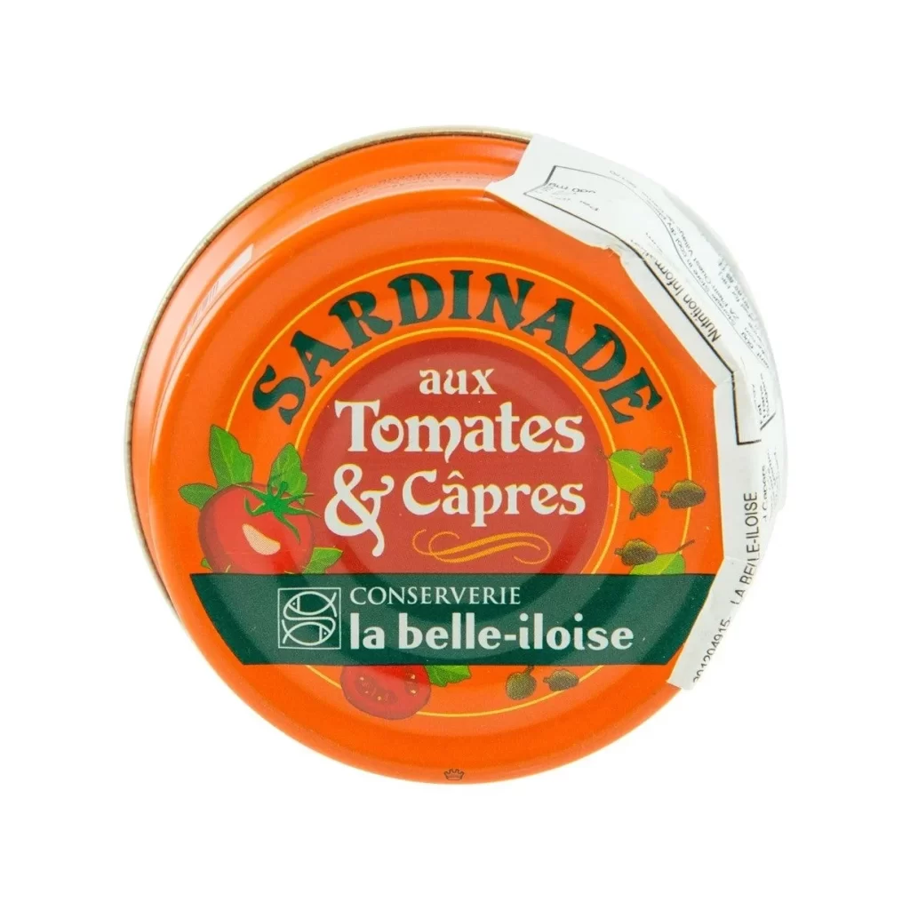
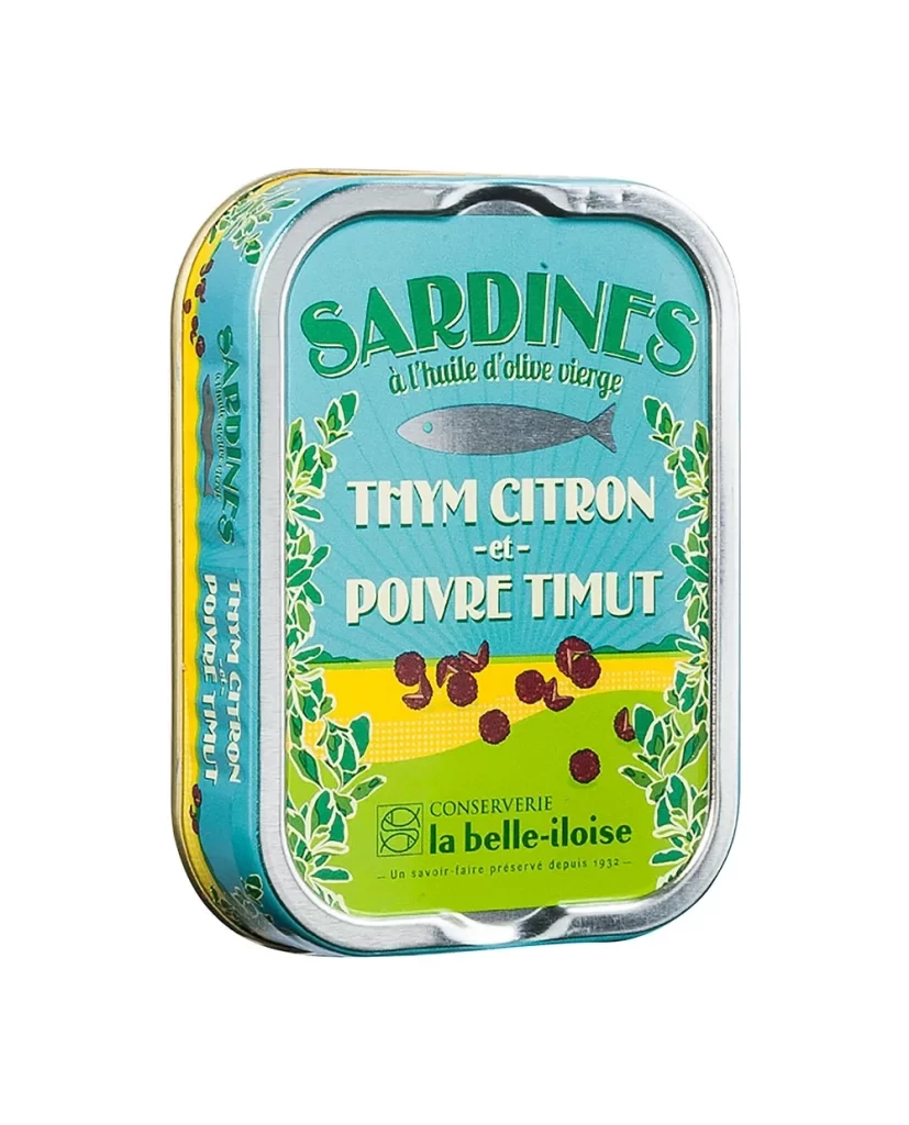
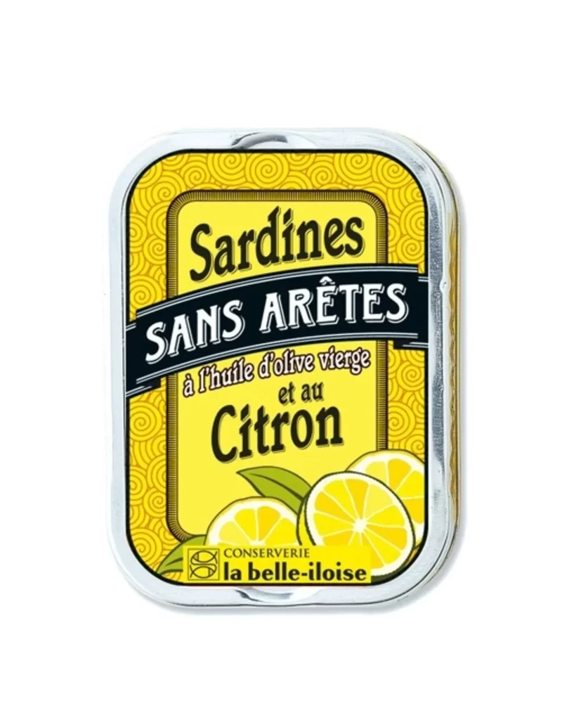
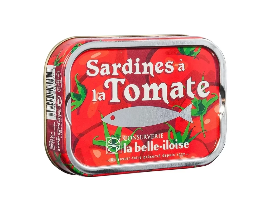
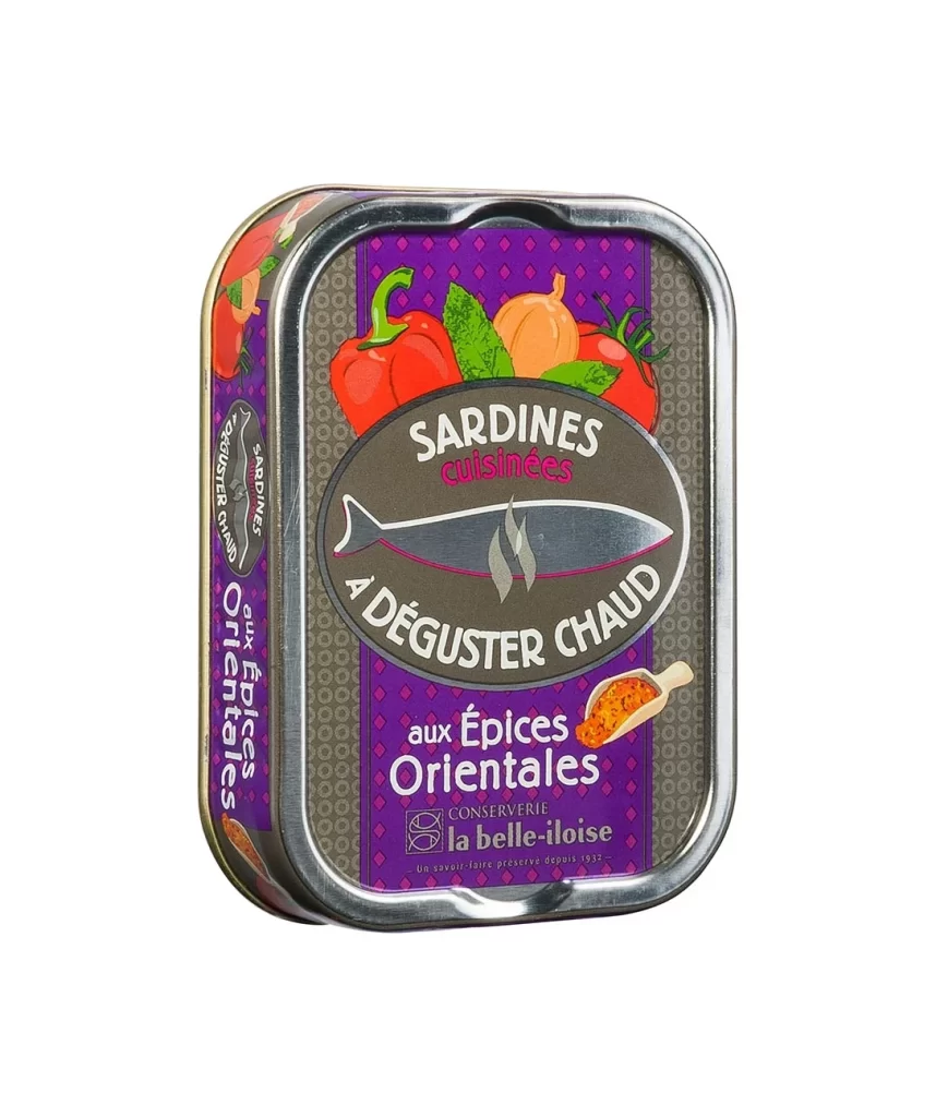
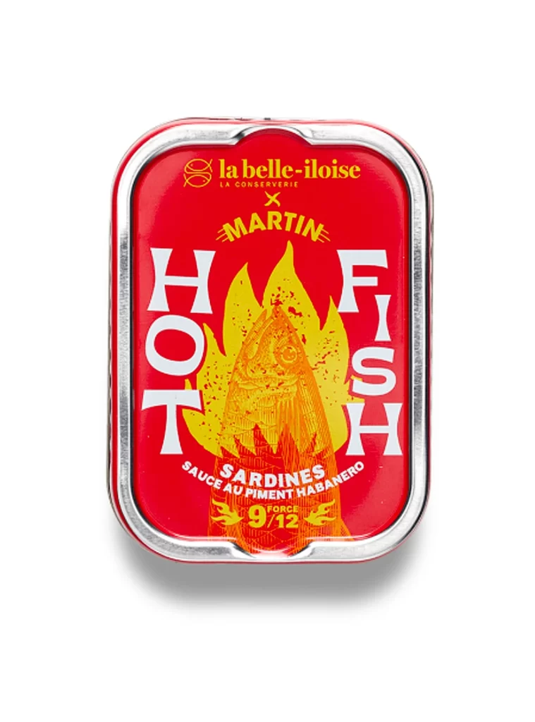
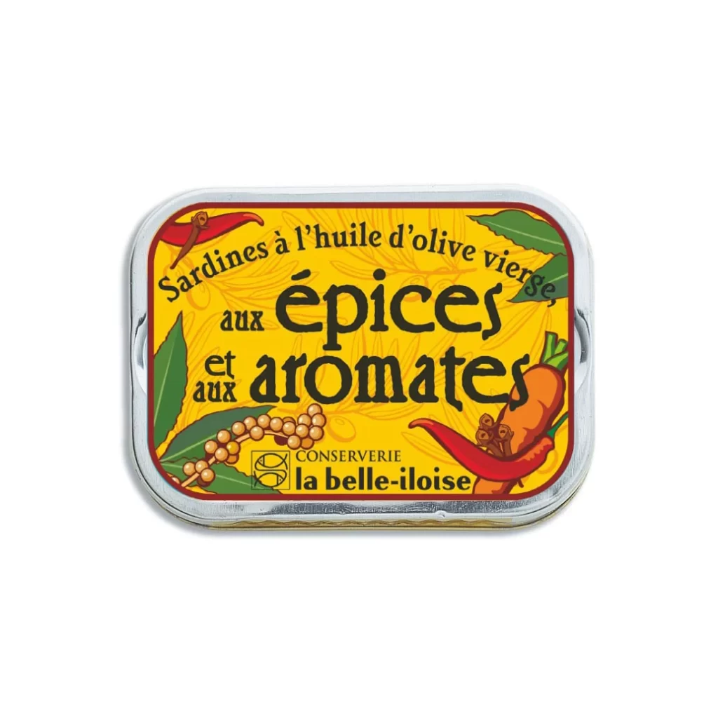
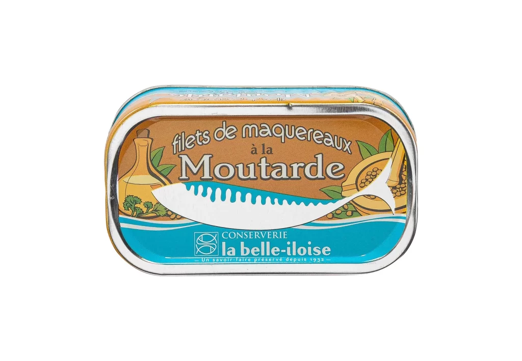
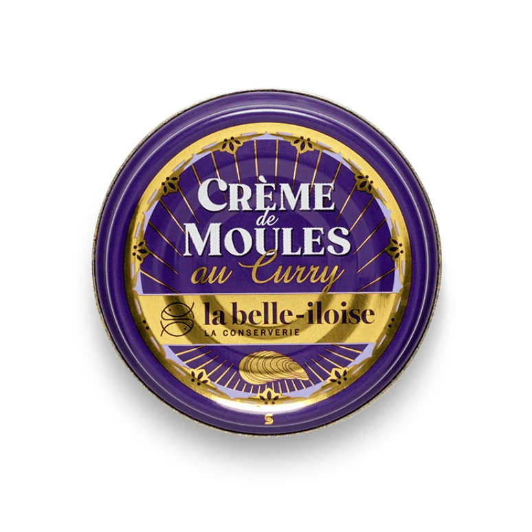
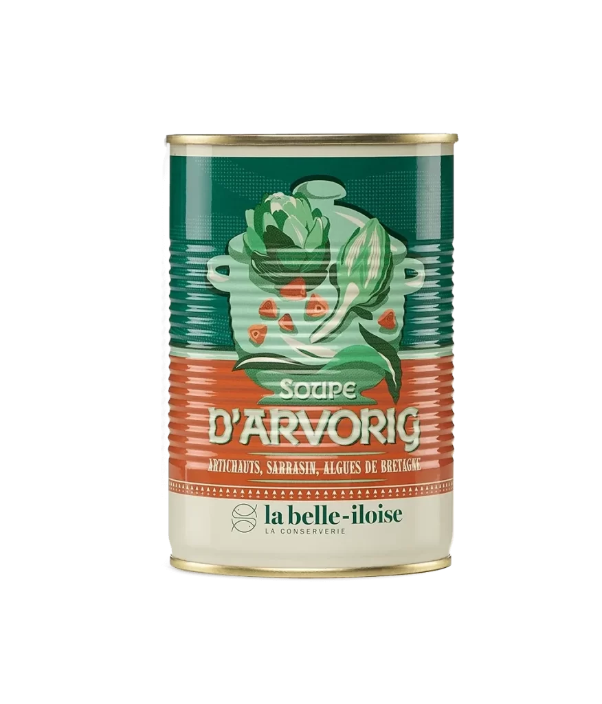
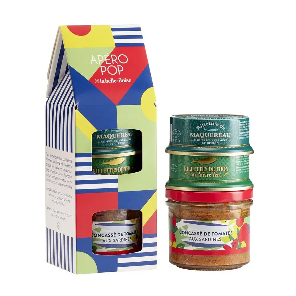
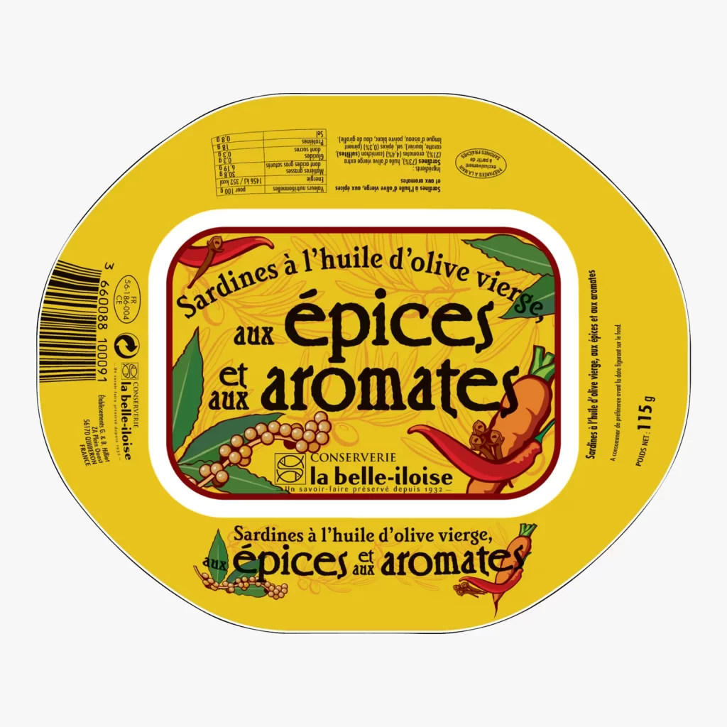
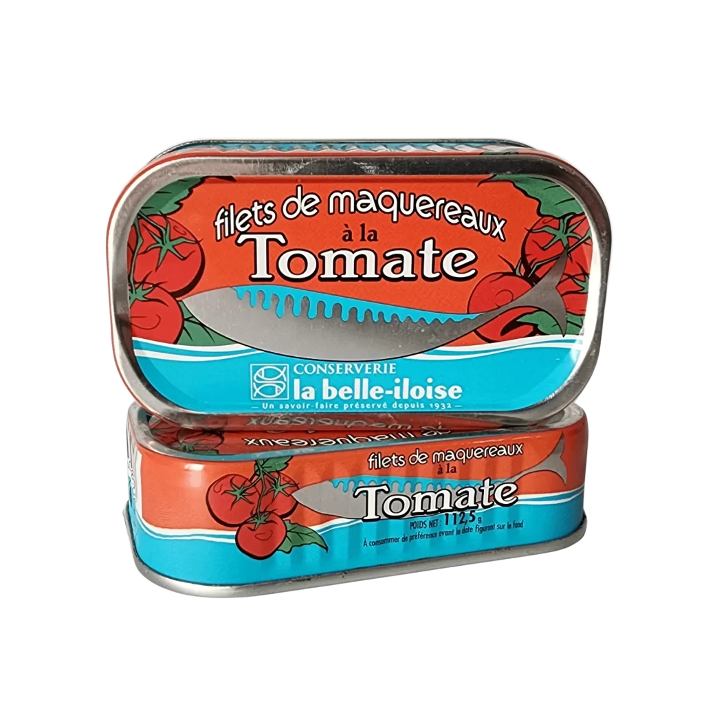
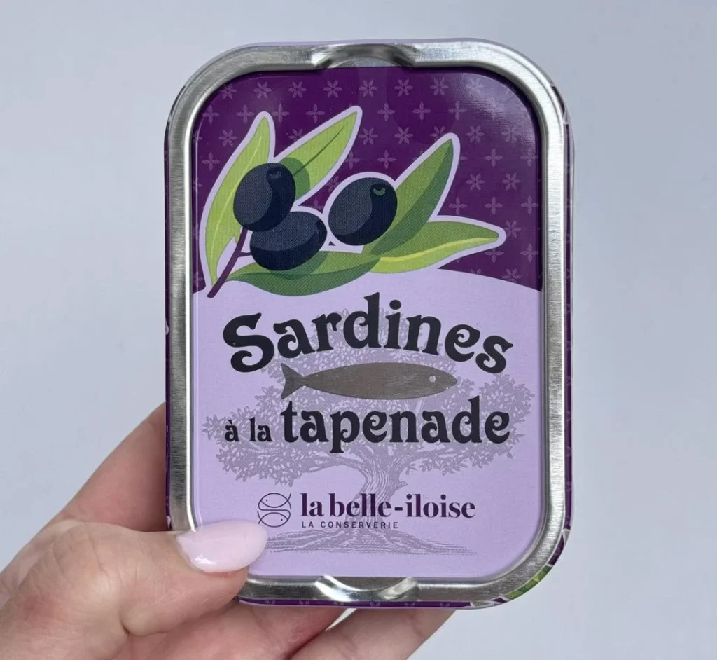
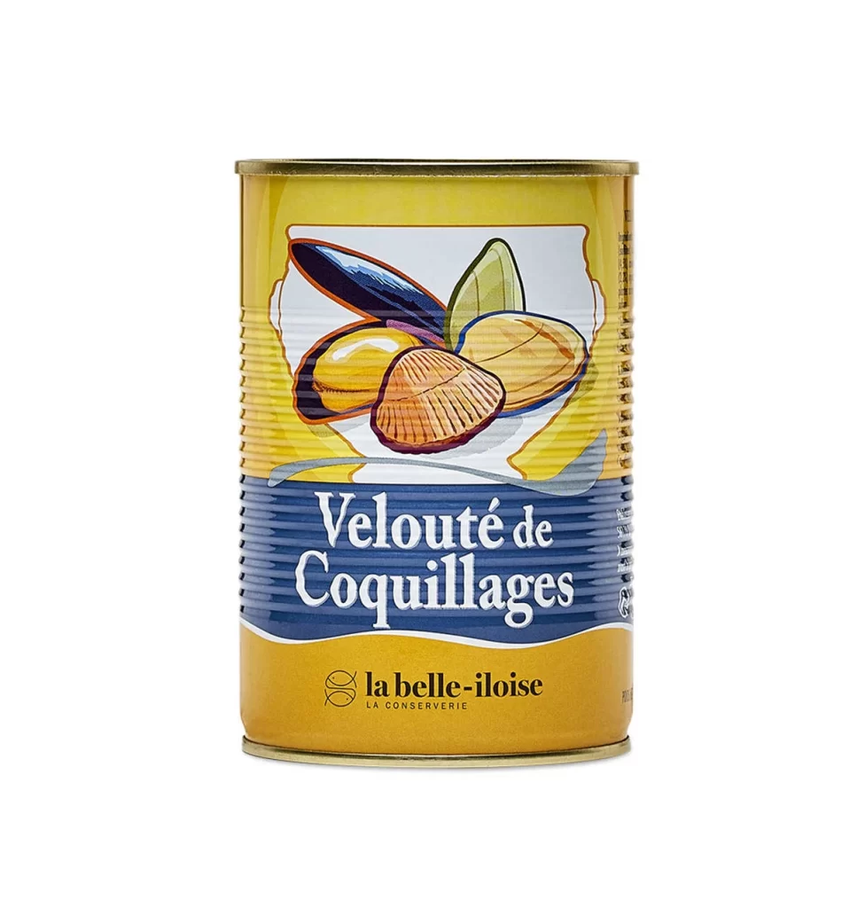
The La Belle Iloise shellfish veloute soup tin is presented in a crisp white studio setting, highlighting the front view of the packaging. Produced by the historic French cannery in Quiberon, Brittany, the product contains a rich, ready to heat seafood soup. Consumers prepare the veloute by gently warming it in a saucepan, creating a convenient yet gourmet meal that showcases traditional coastal French culinary expertise.
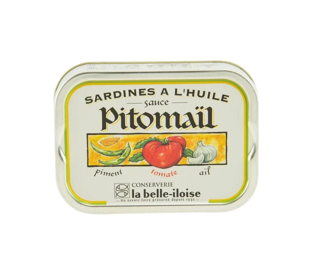
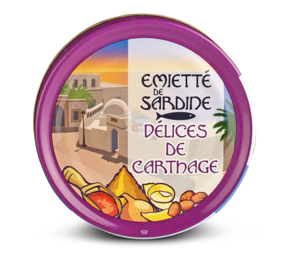
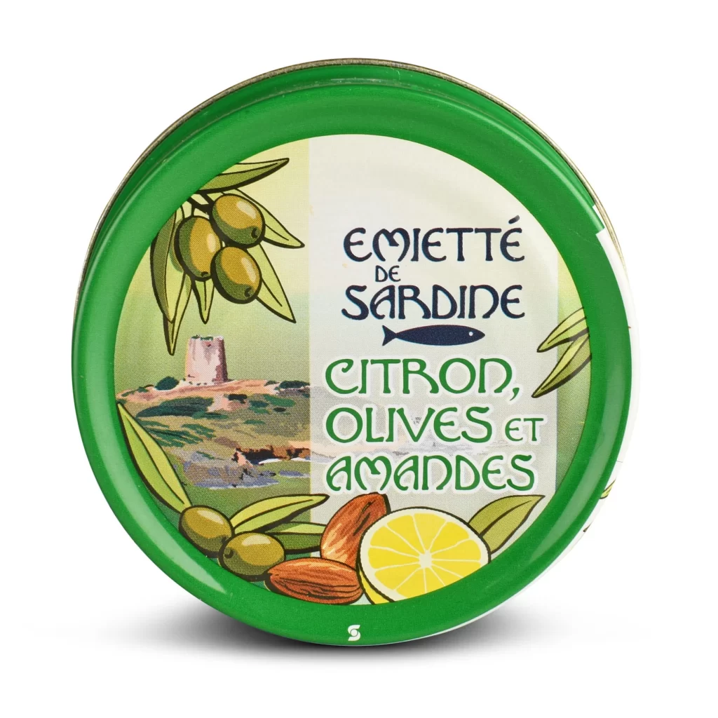
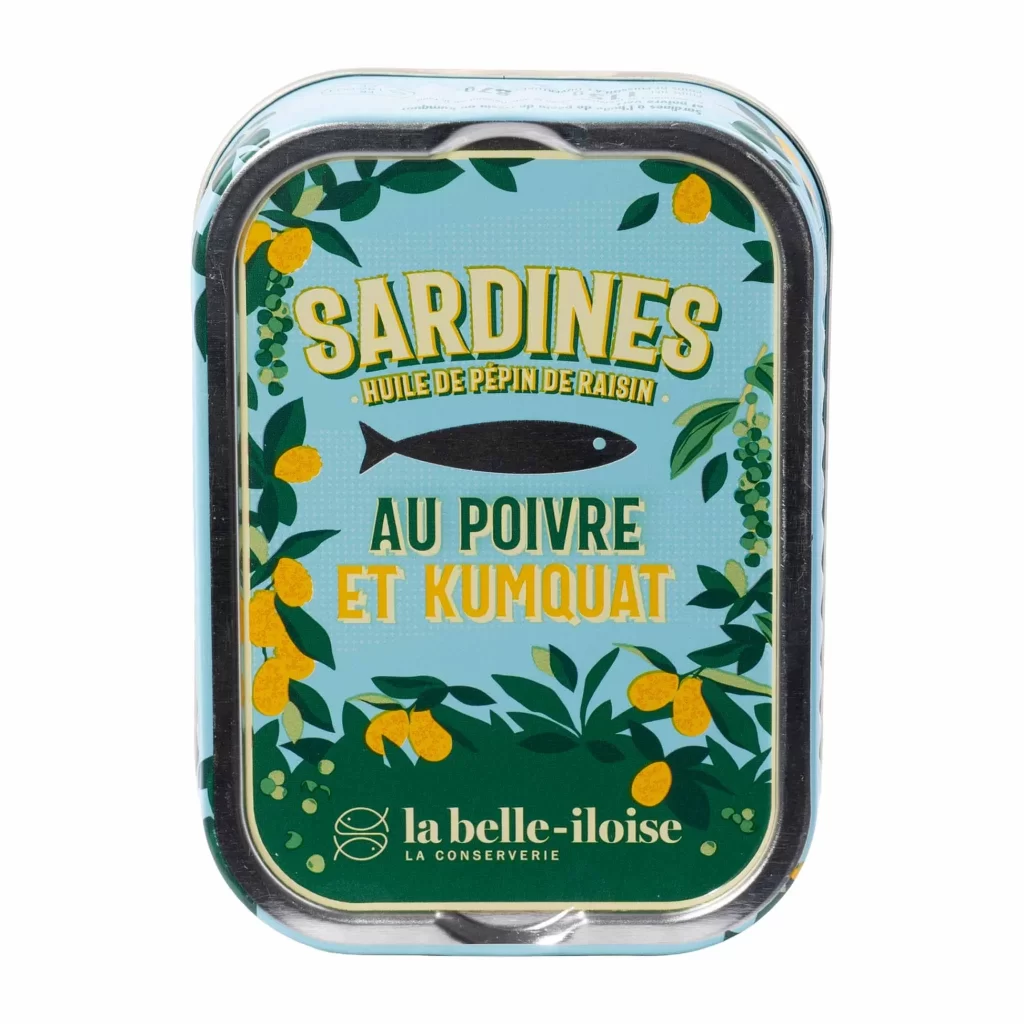
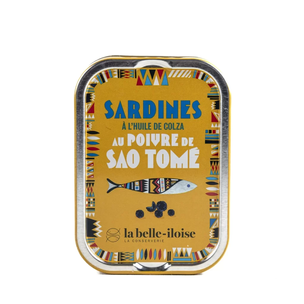
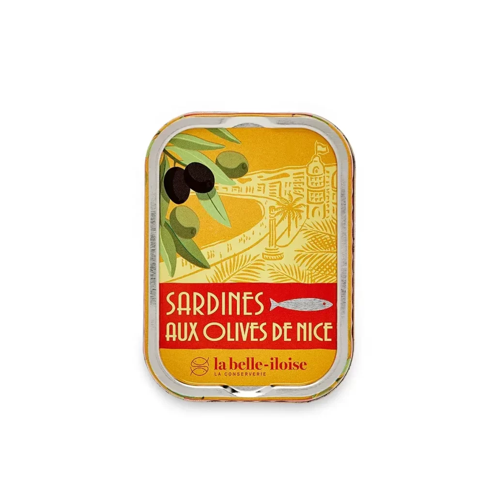
The label design features a warm color palette that evokes coastal charm, utilizing bold typography to clearly display the brand name and product description. The illustration style employs delicate, hand drawn graphics of shellfish and maritime elements, adding an artisanal touch. This combination of clear sans serif text and detailed artwork creates a visually appealing hierarchy that guides the eye seamlessly across the tin.
Such studio photographs serve as essential packaging design references because they isolate the product from environmental distractions, allowing designers to study the precise layout, color theory, and typographic choices. By examining this front view, creatives can understand how to balance illustrative elements with informational text. This clear documentation helps brands achieve cohesive visual identities that communicate quality and authenticity to consumers effectively.