La Belle Iloise Sardines Trio Packaging
Topics
Details
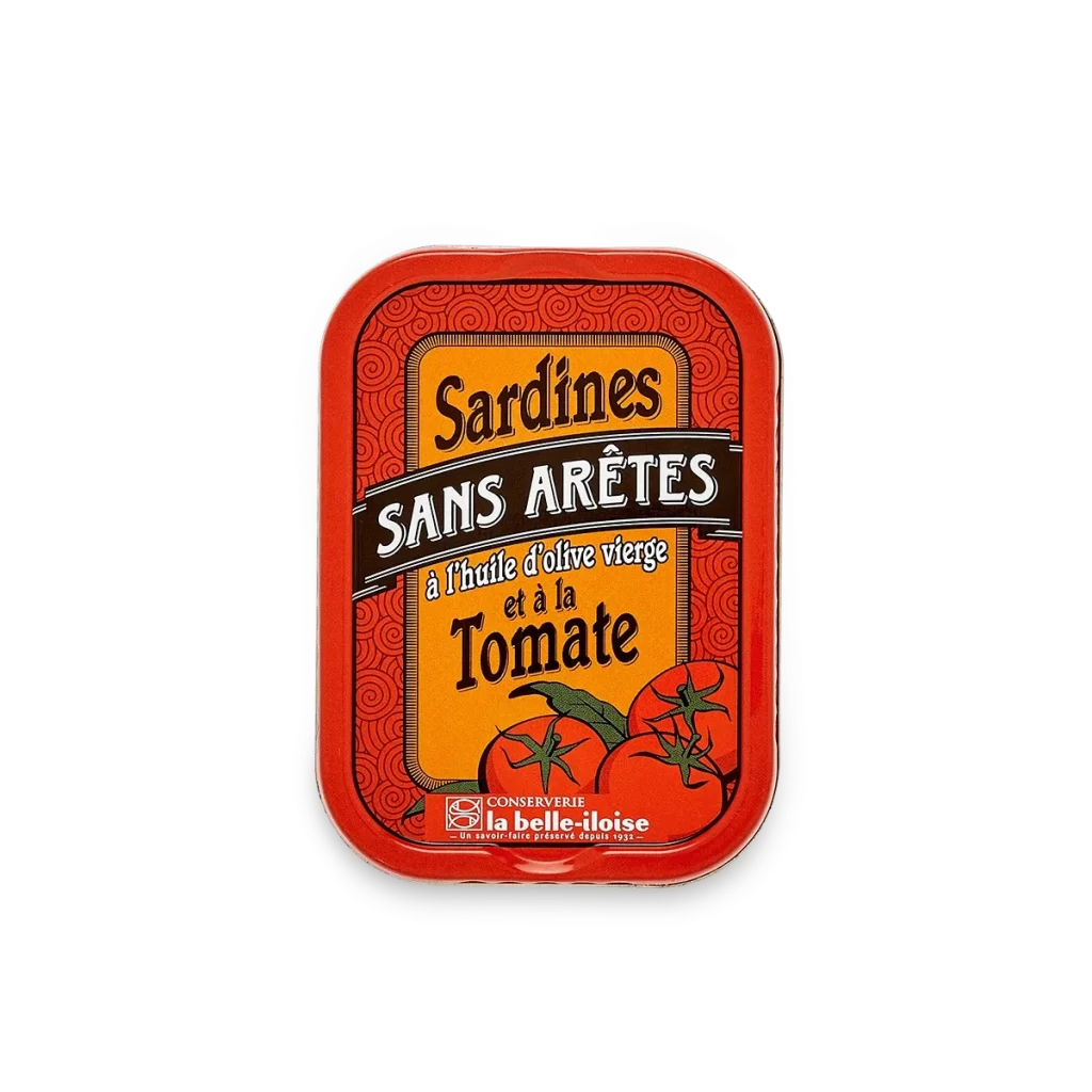
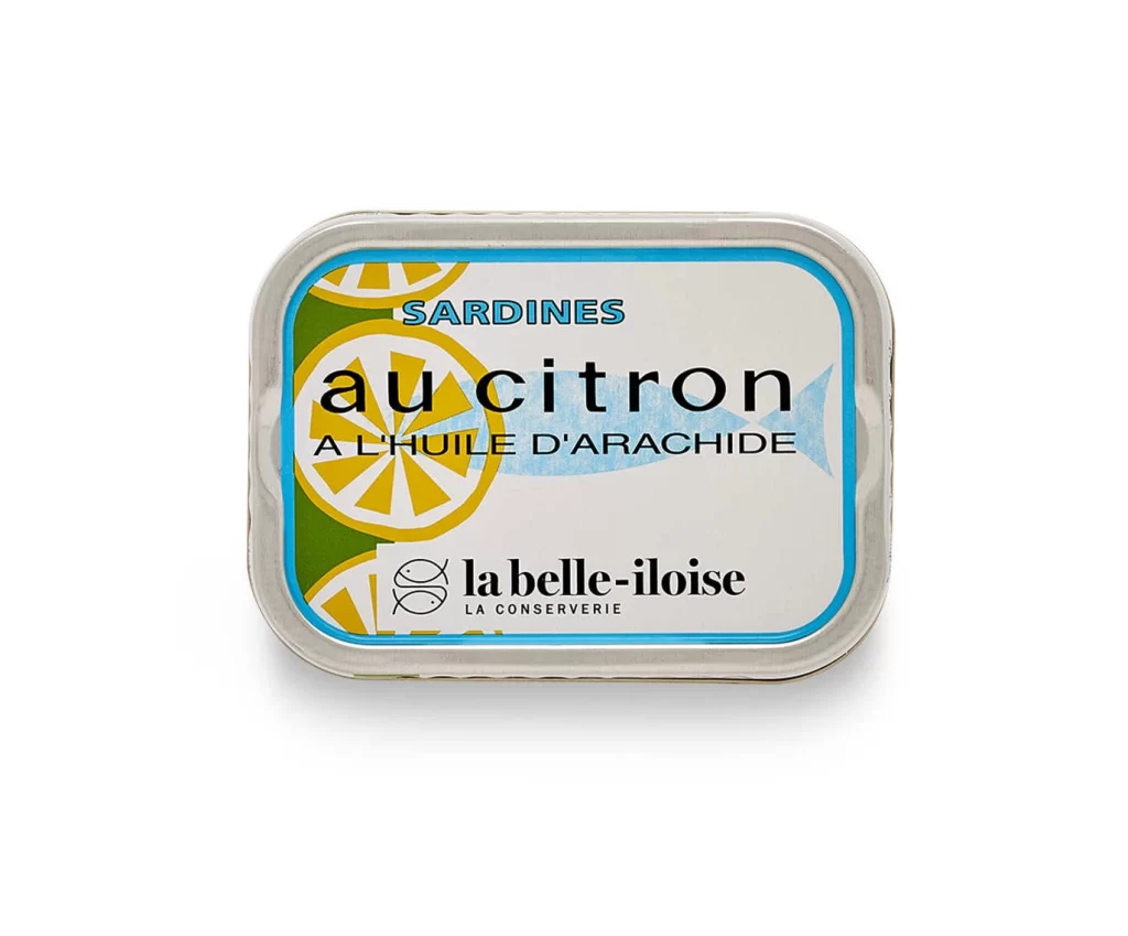
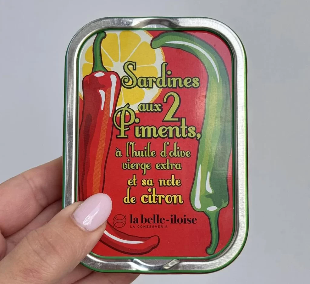
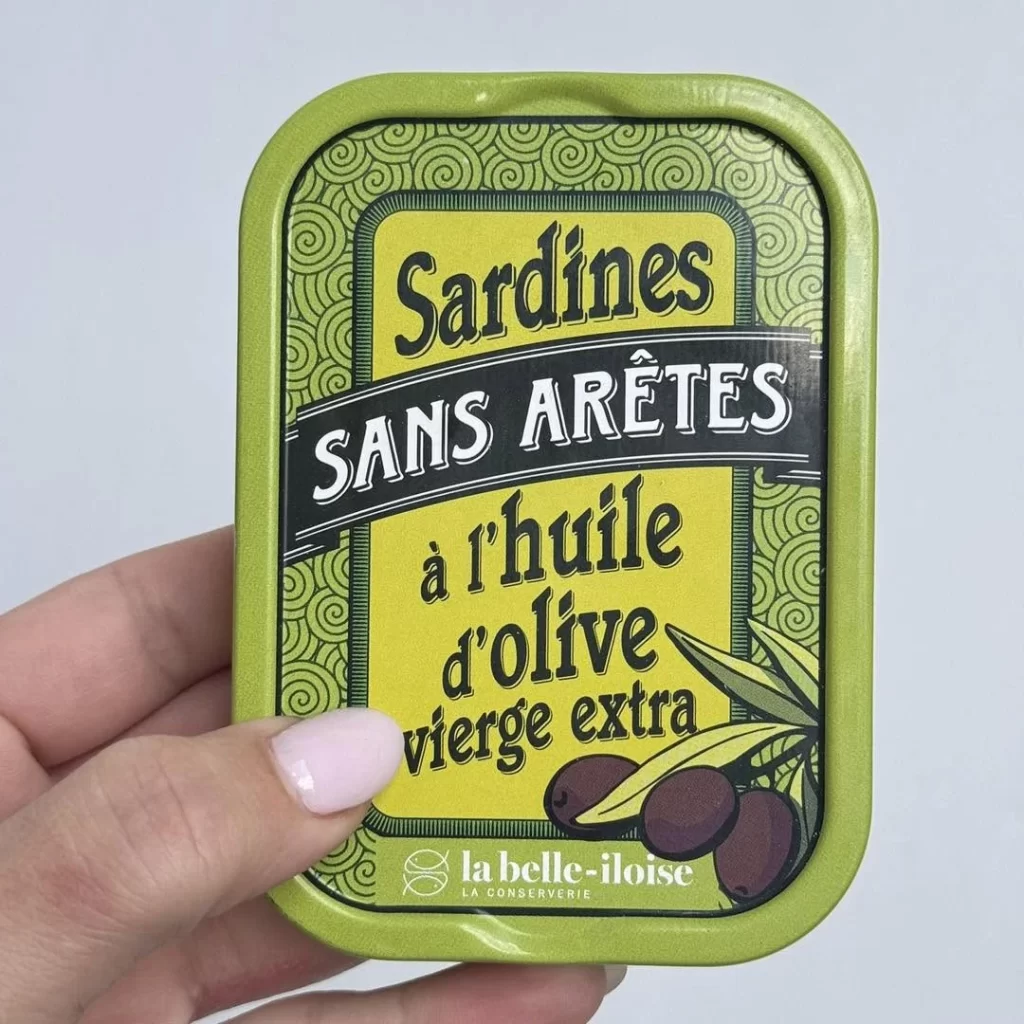
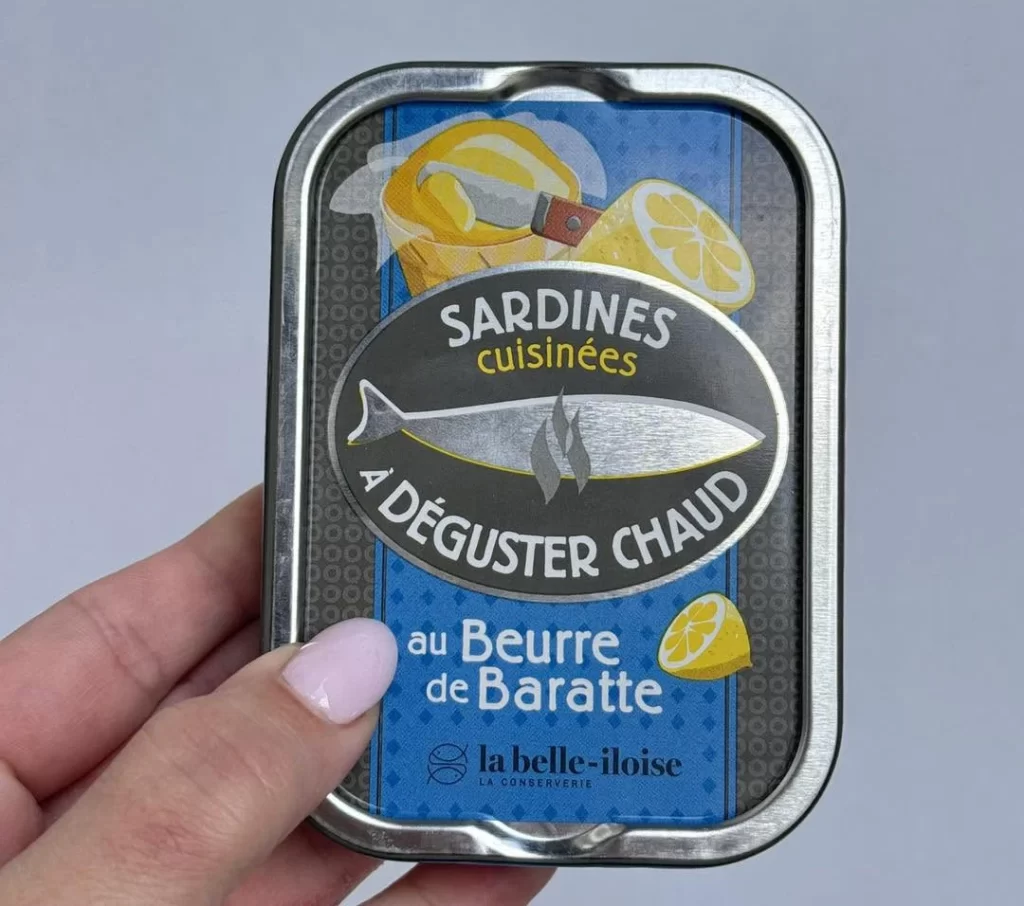
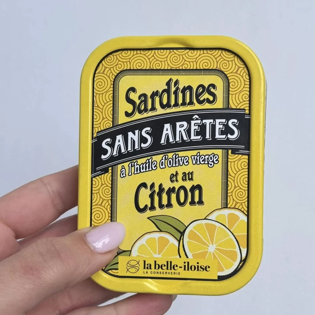
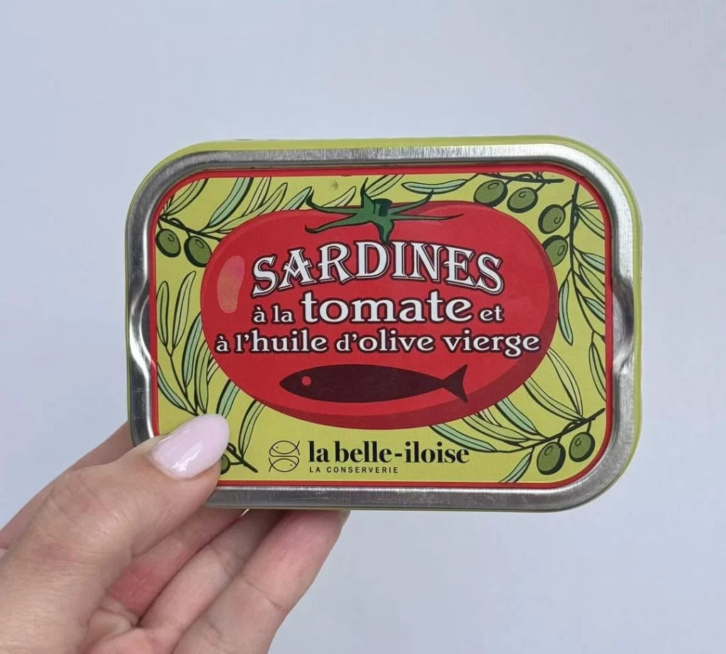
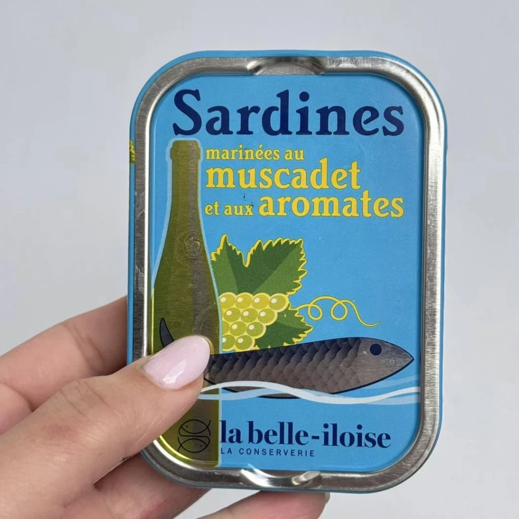
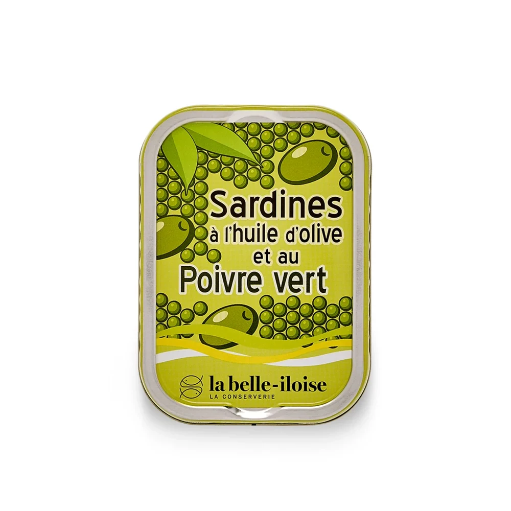
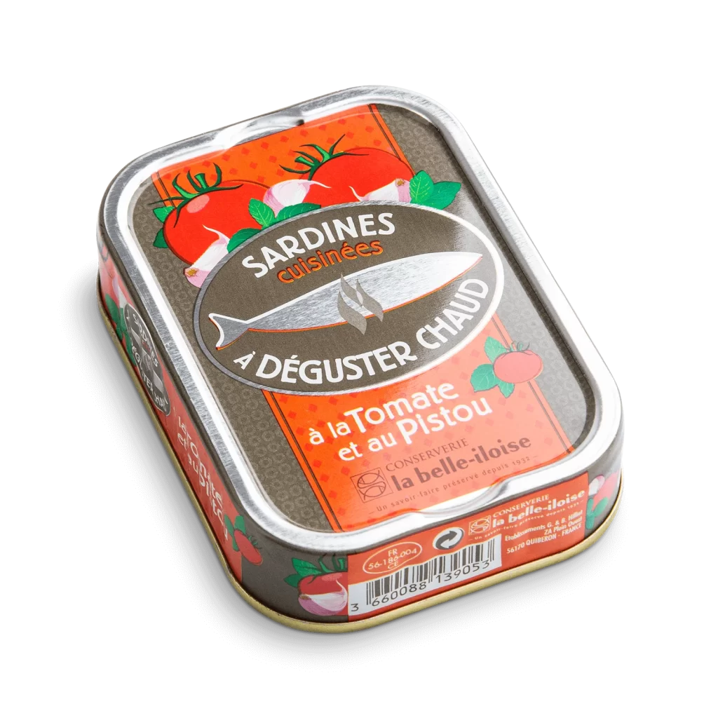
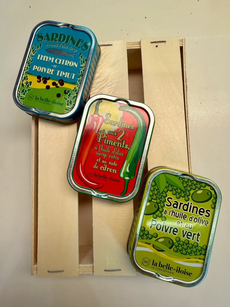
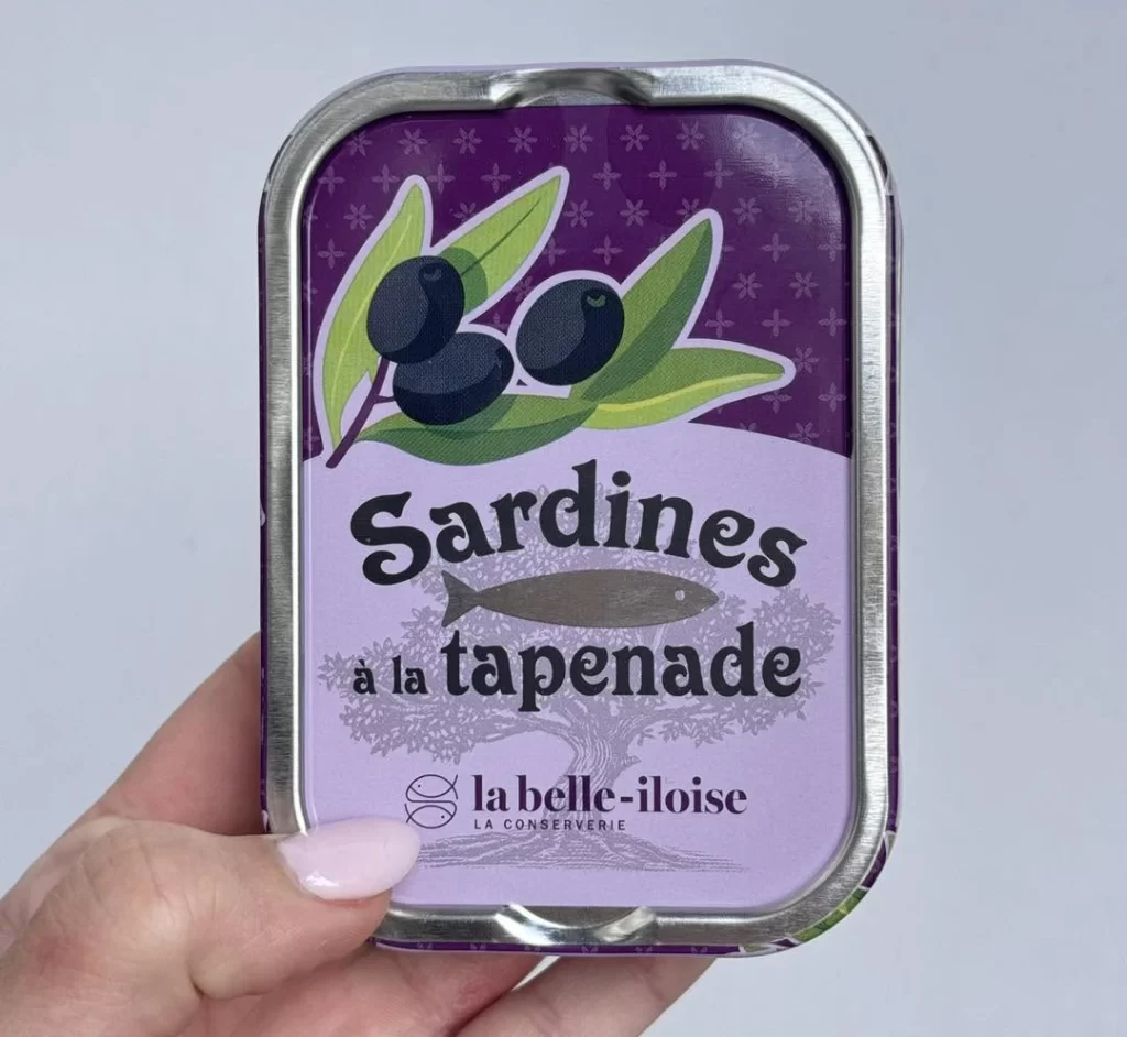
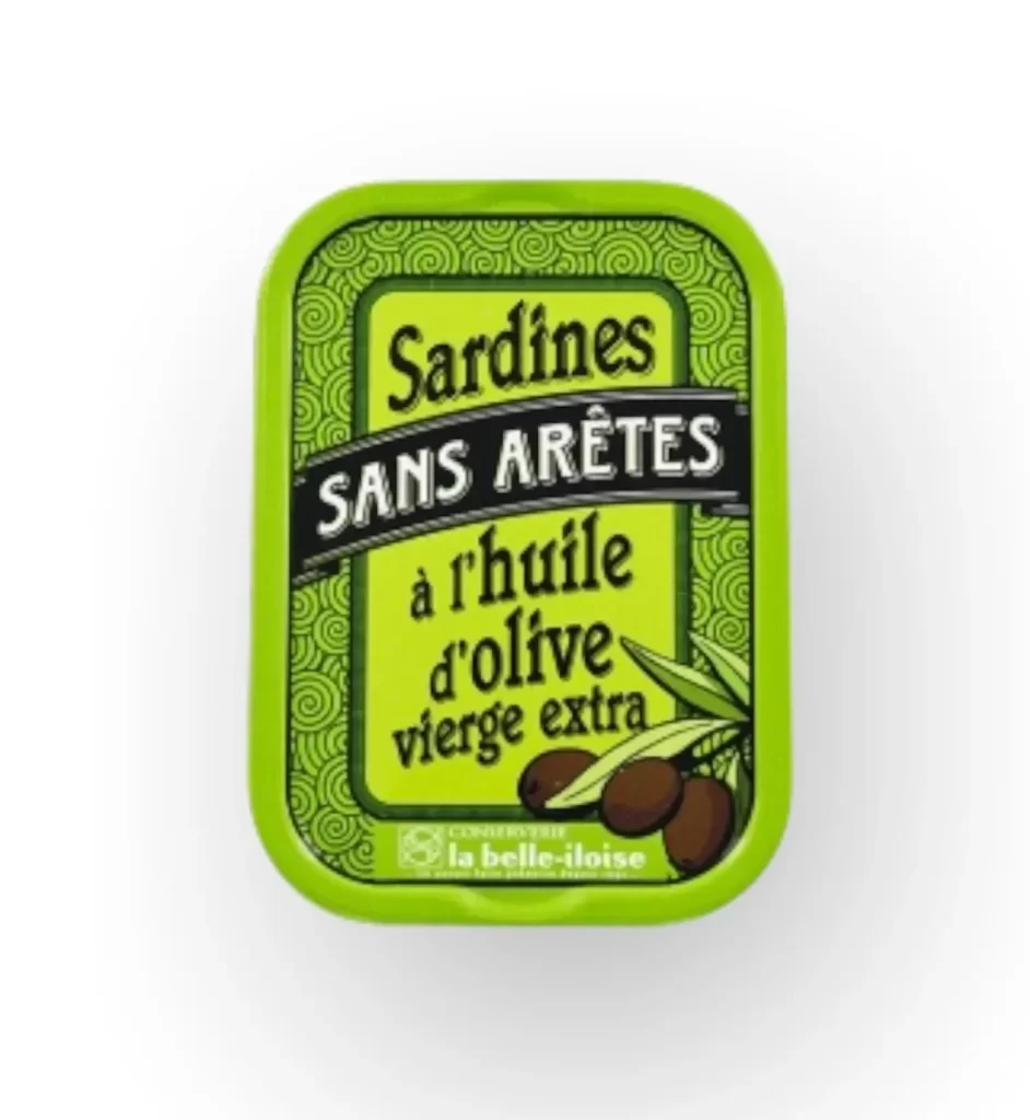
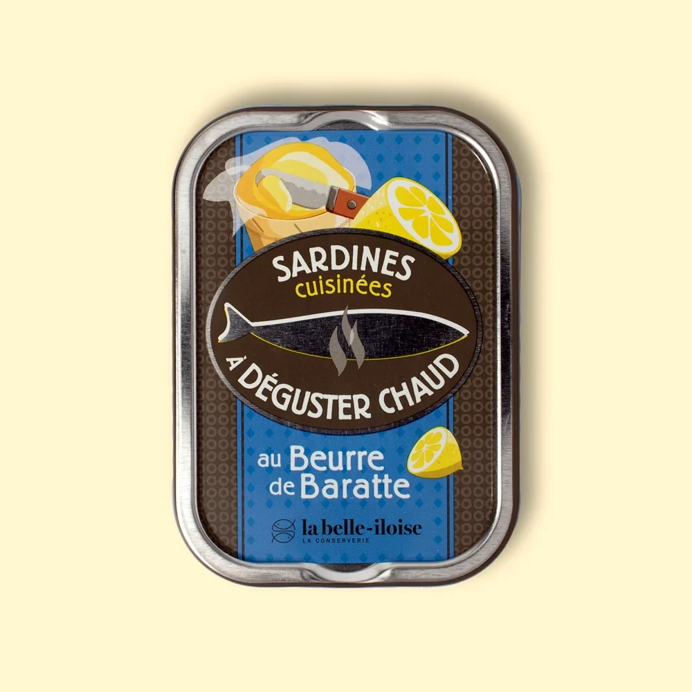
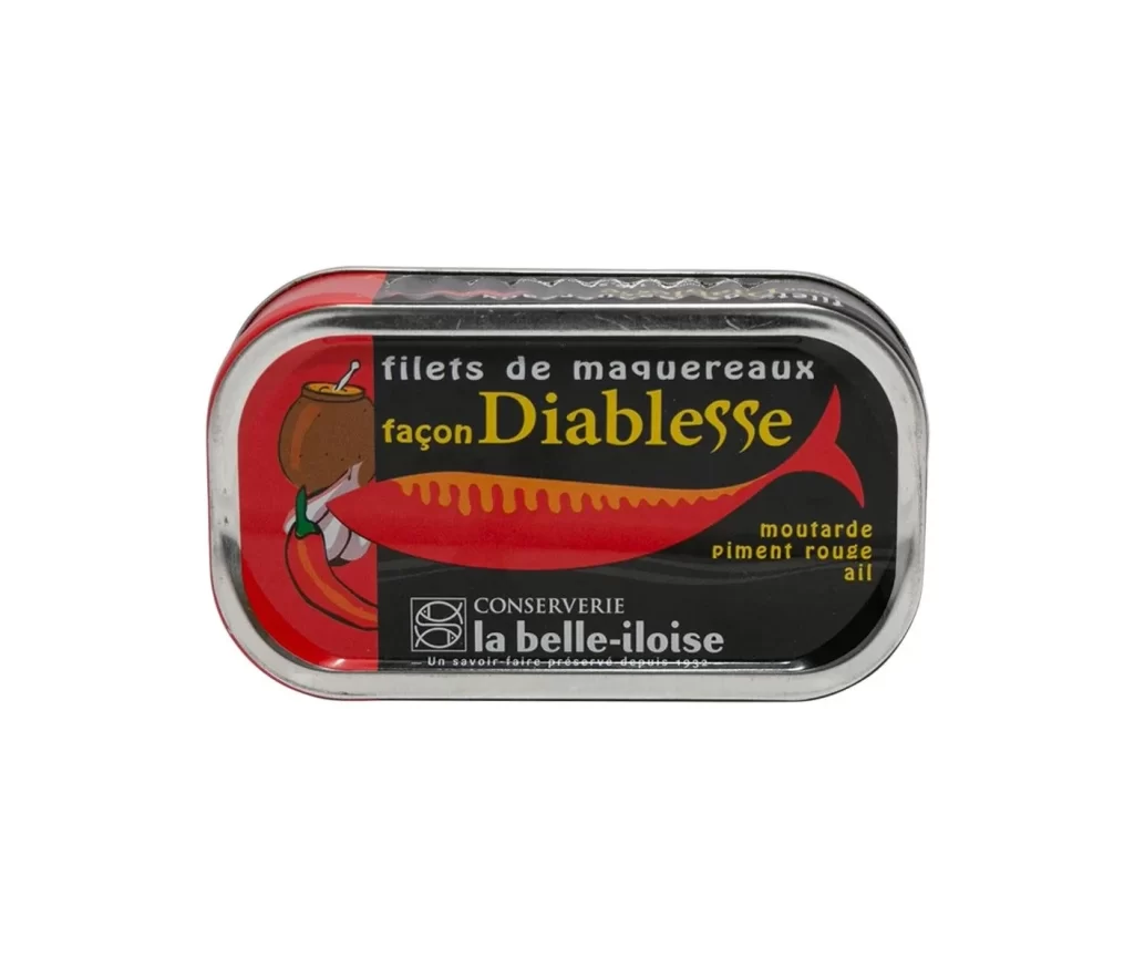
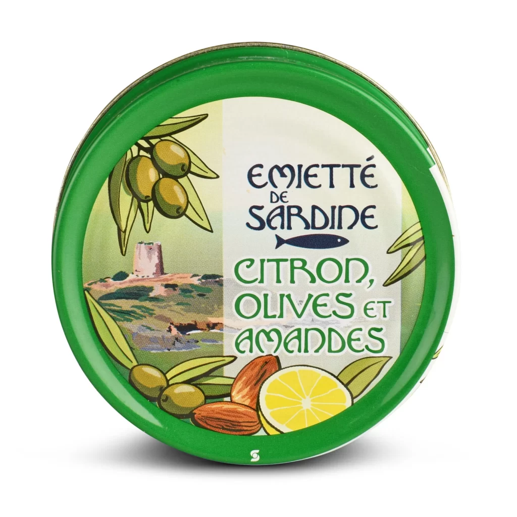
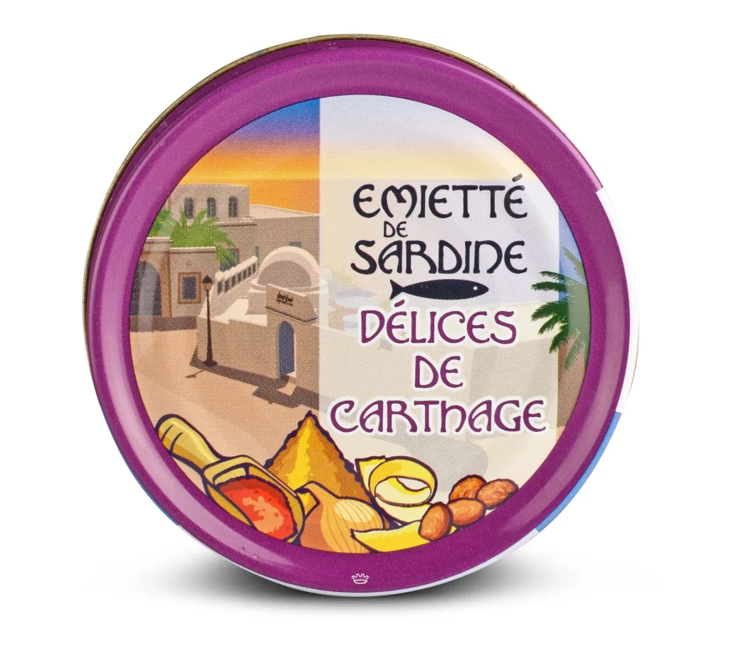
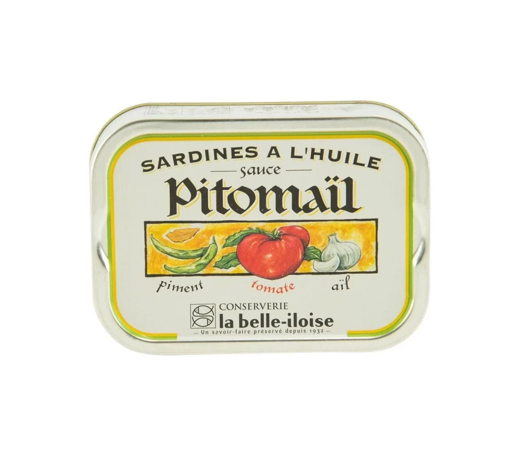
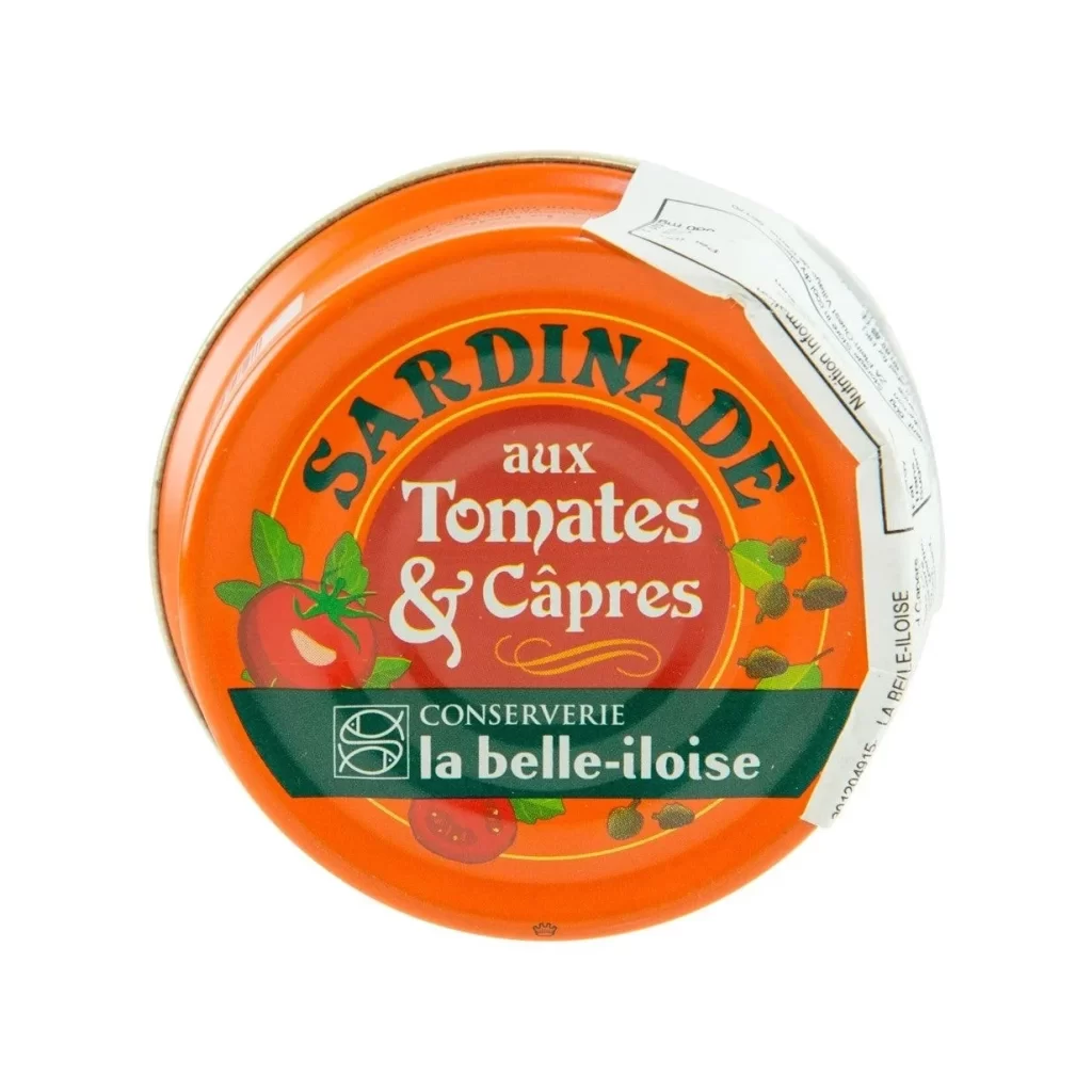
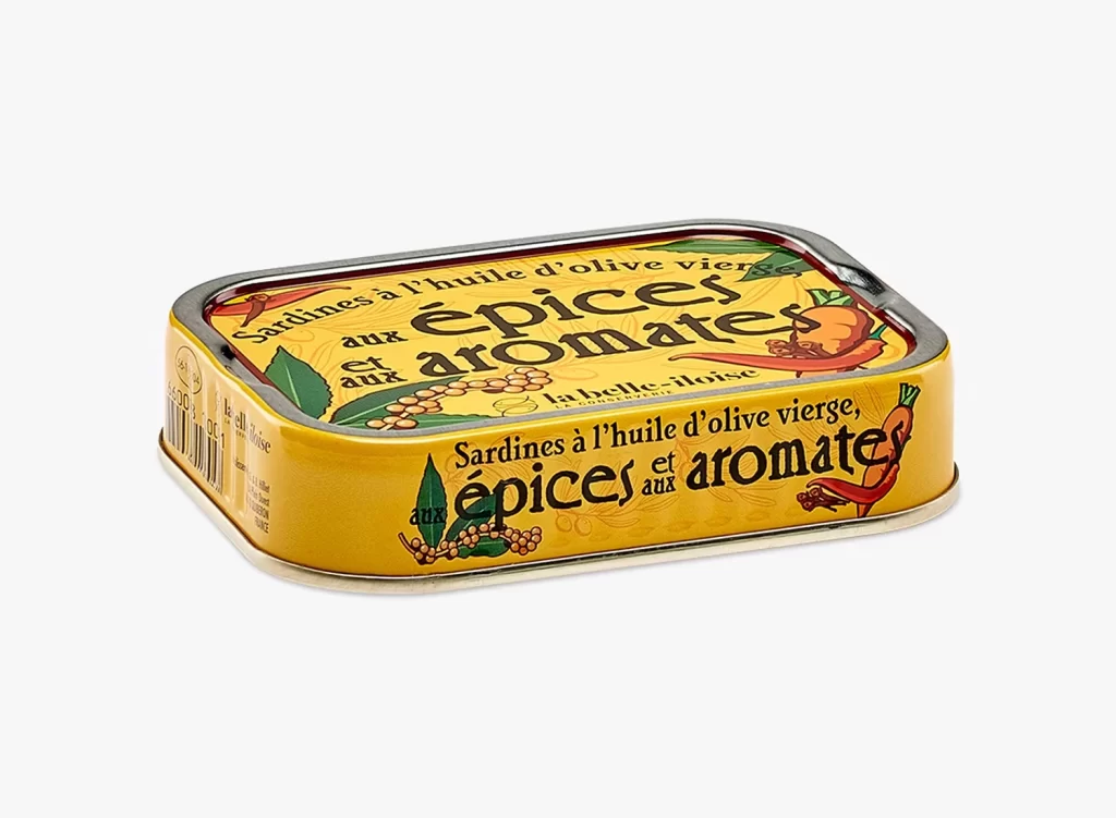
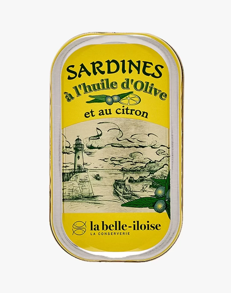
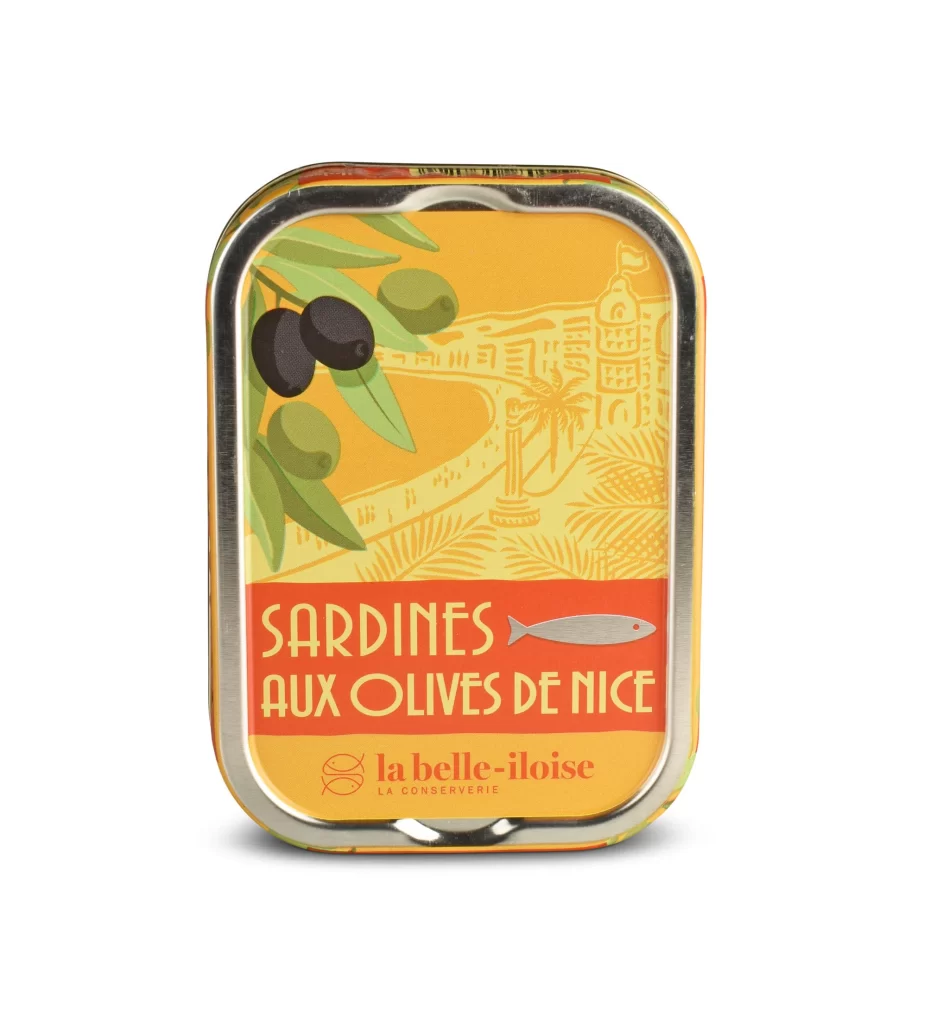
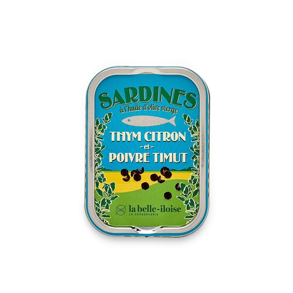
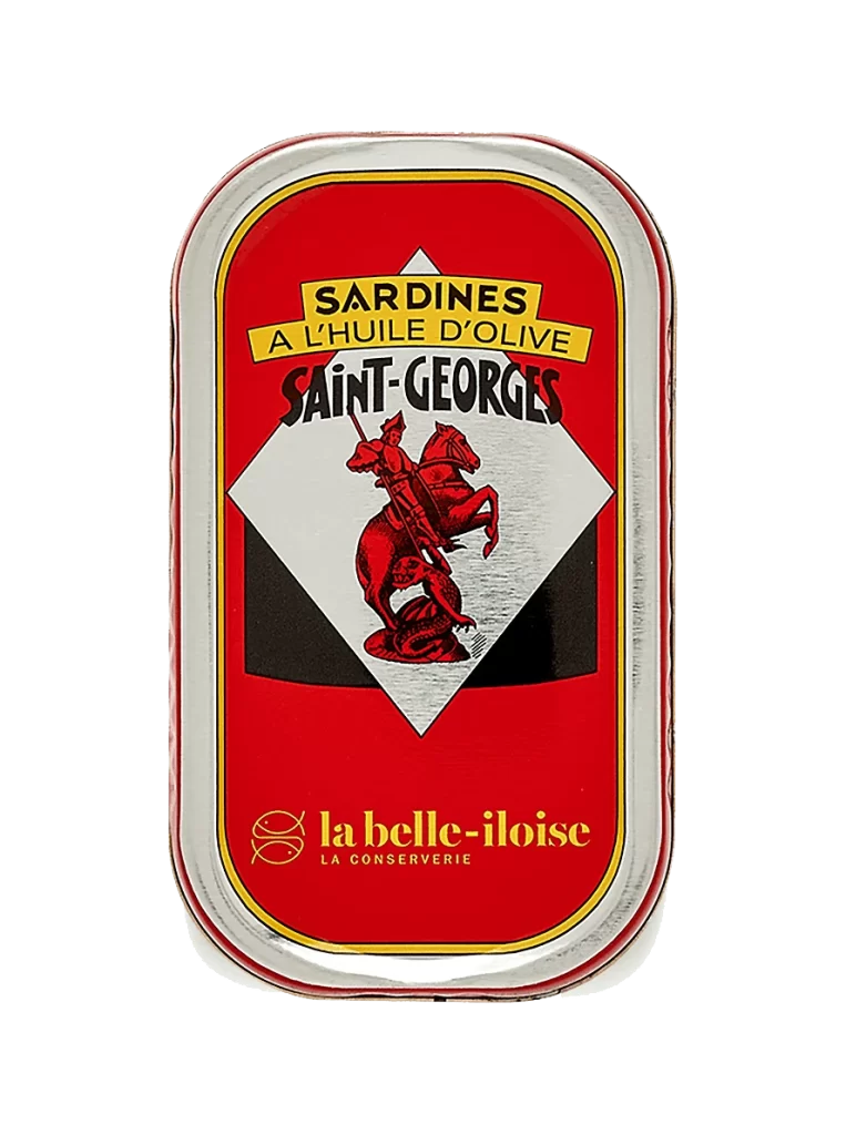
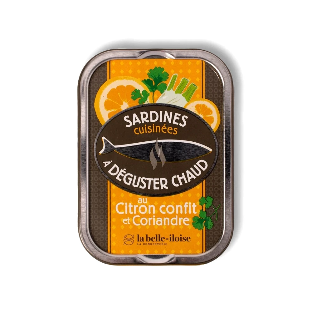
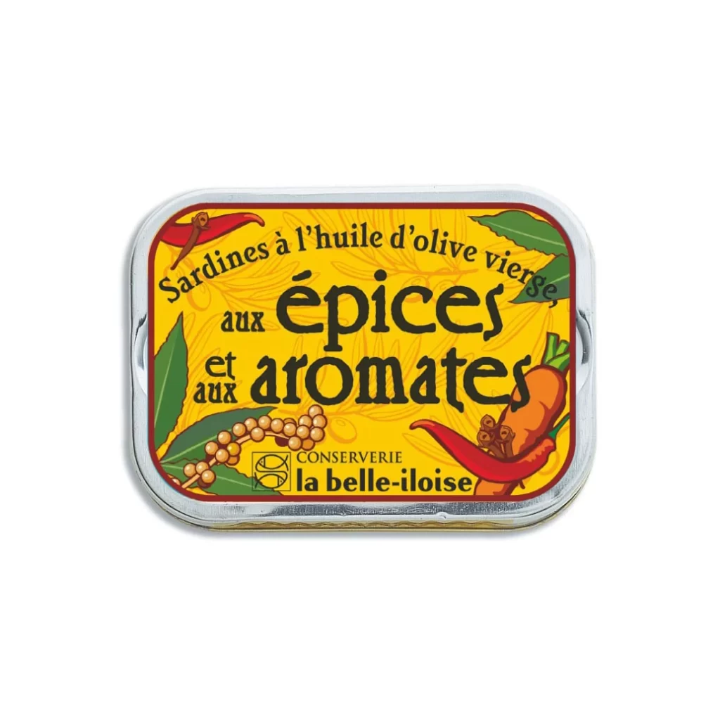
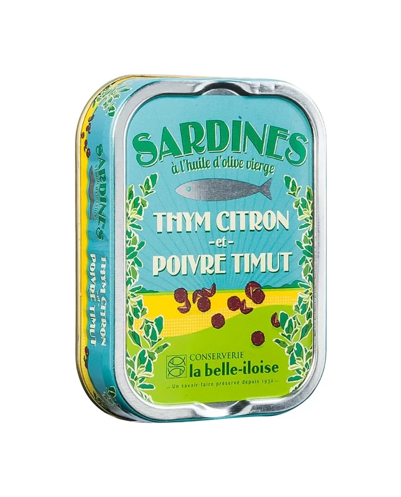
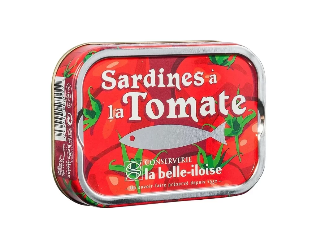
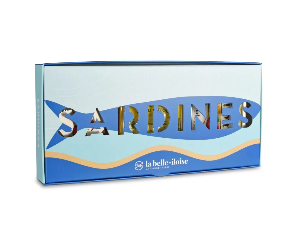
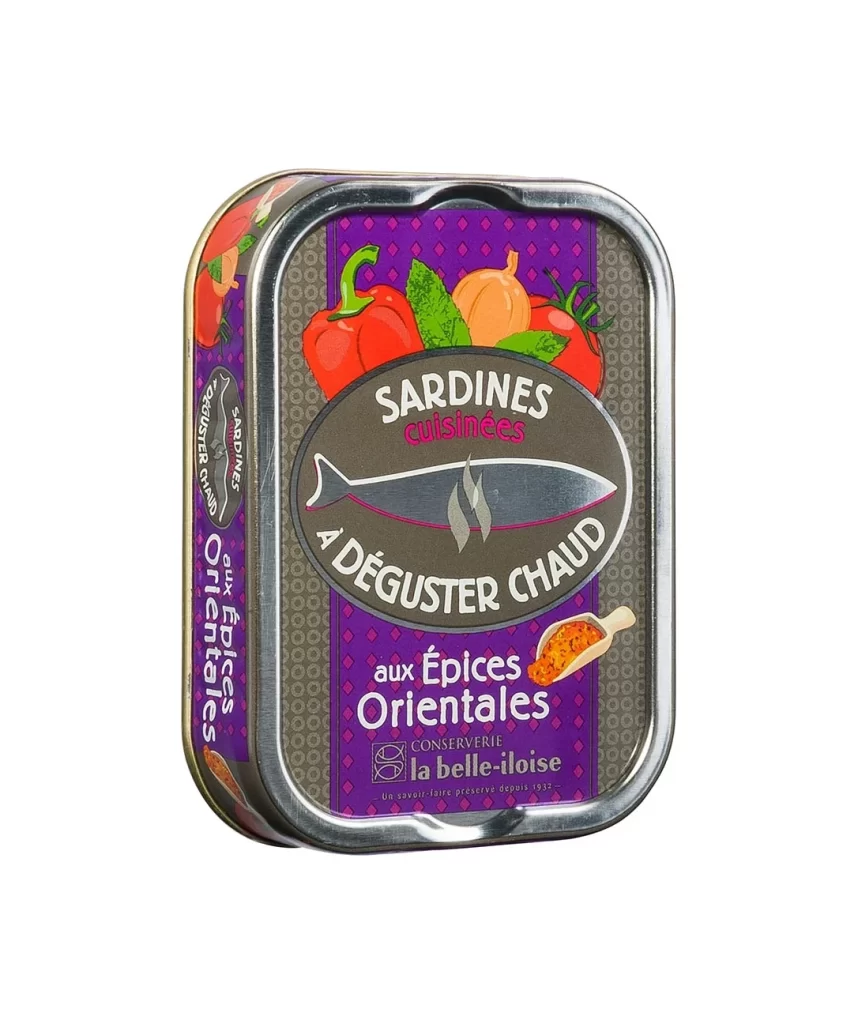
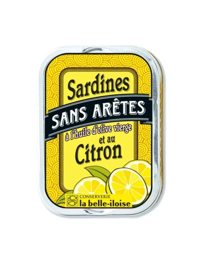
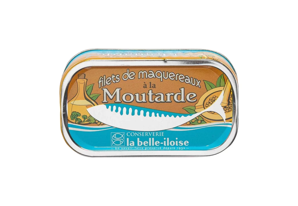
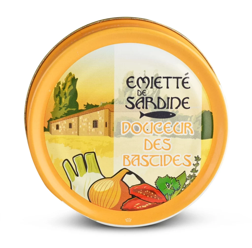
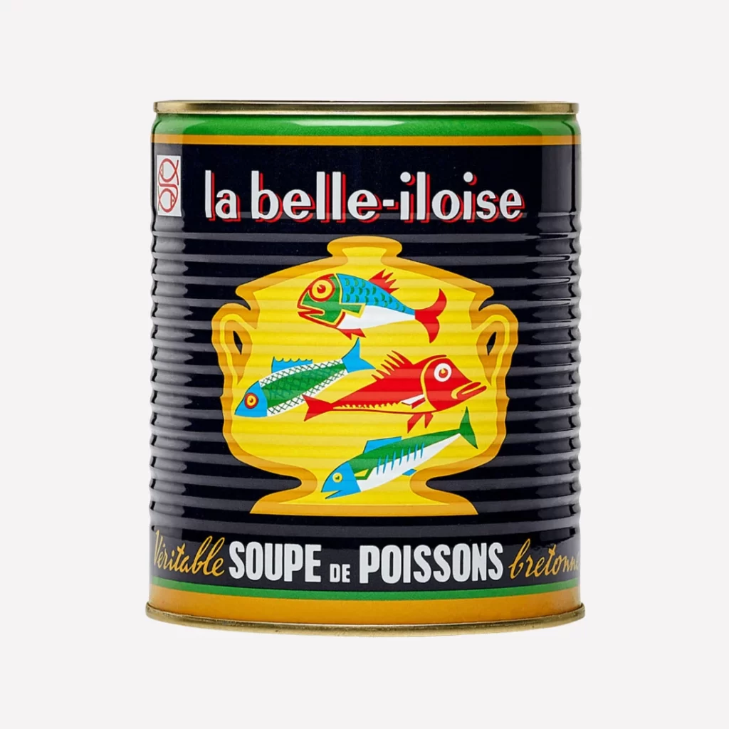
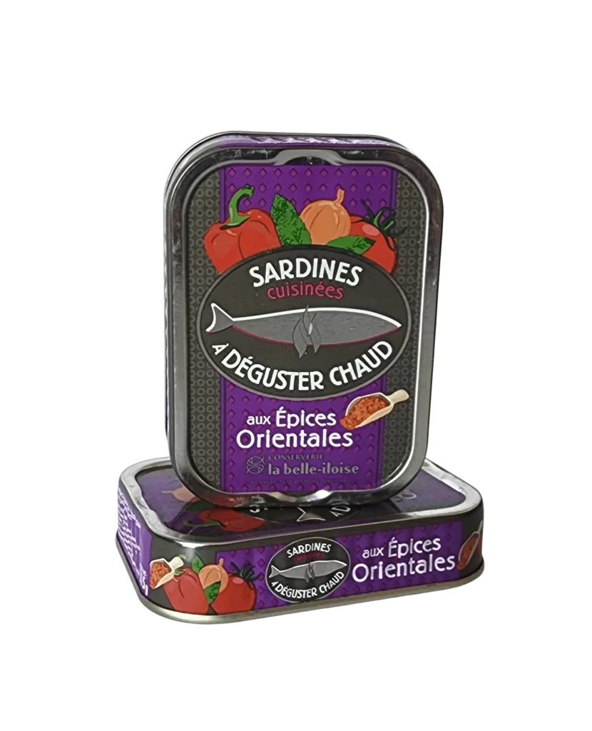
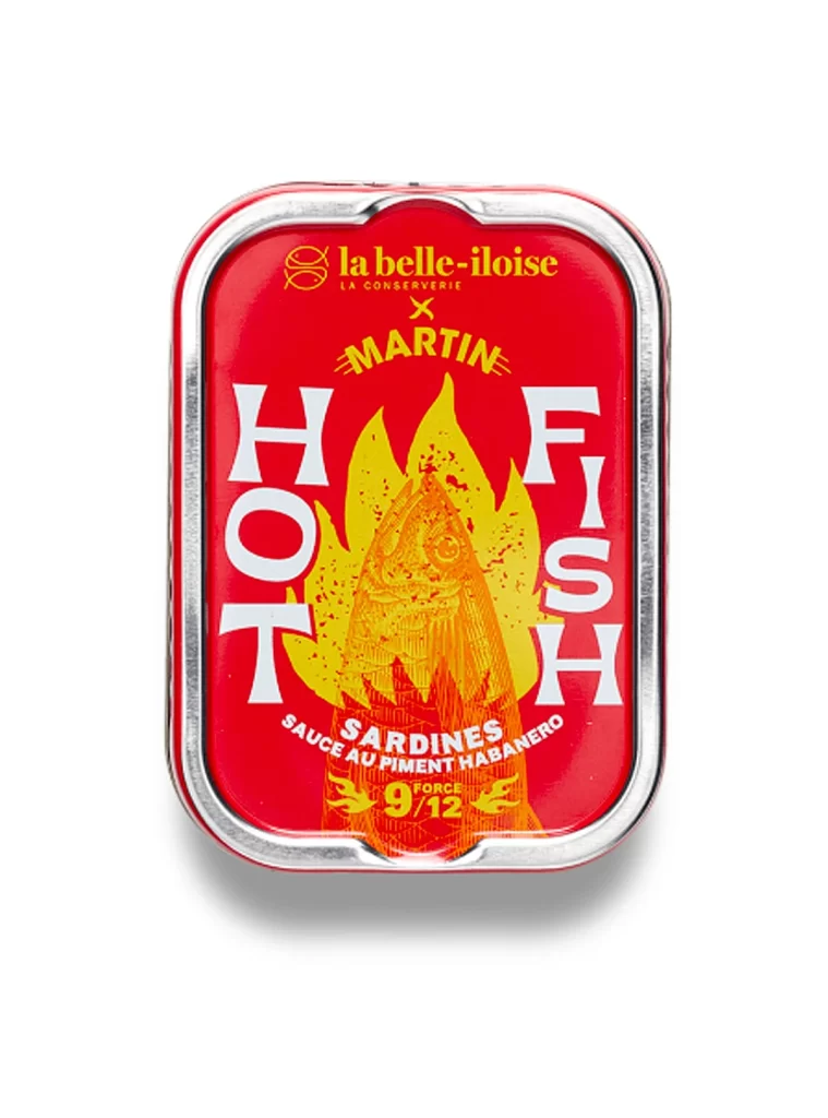
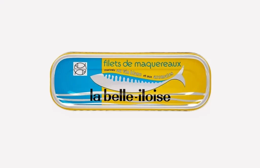
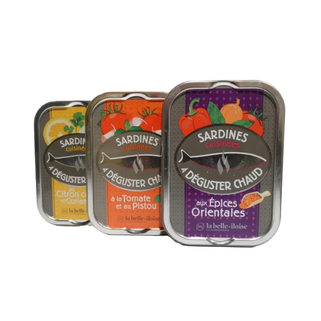
Three tins of cooked sardines stand lined up in a bright white studio, showcasing the culinary range of French cannery La Belle-Iloise. Based in Quiberon, Brittany, the brand prepares these fish in distinct flavor profiles: lemon coriander, tomato pistou, and oriental spices. The pristine studio lighting highlights the metallic finish of the cans while emphasizing the vibrant culinary ingredients that define this carefully curated seafood trio.
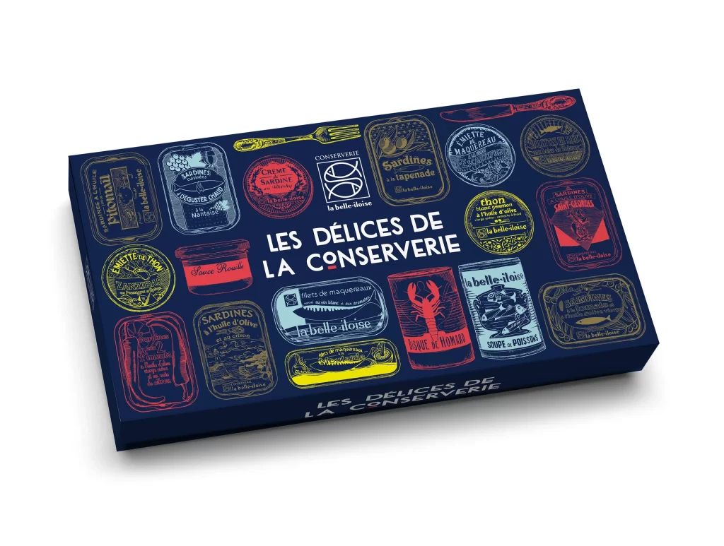
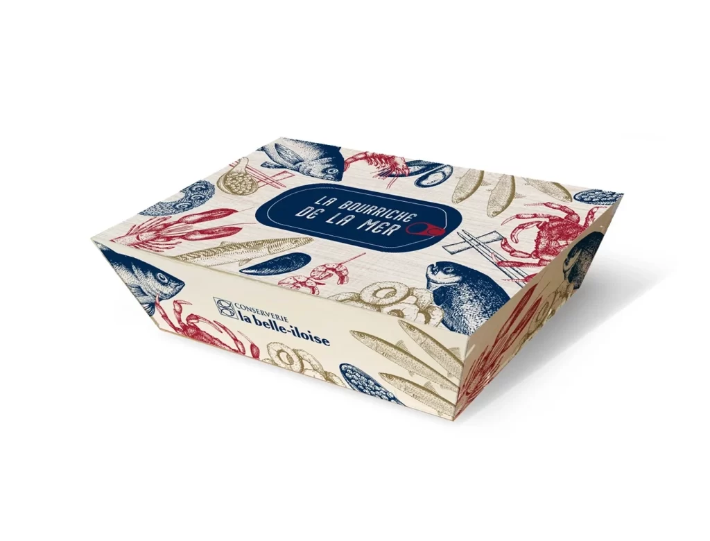
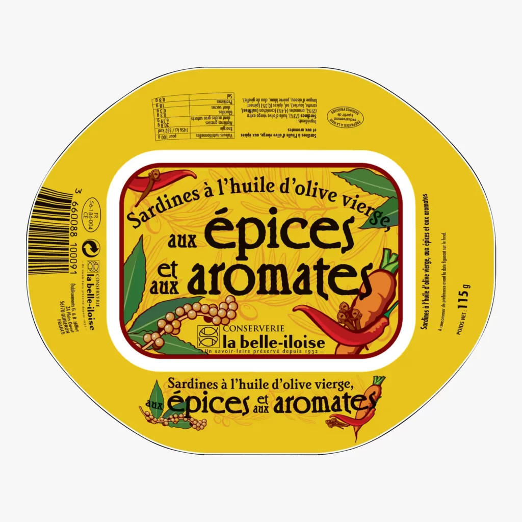
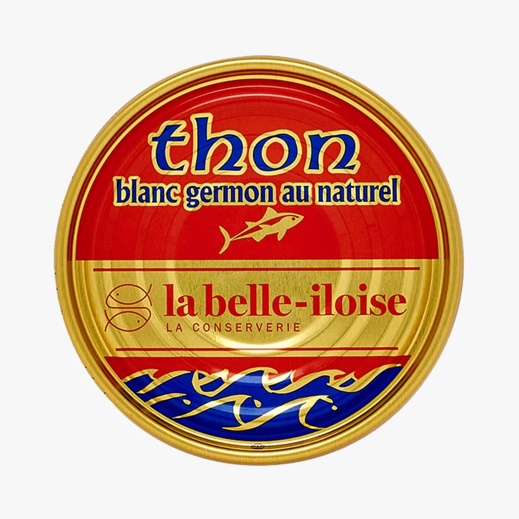
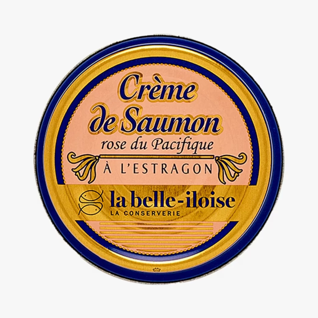
The label design relies on a nostalgic illustration style that depicts regional coastal scenes and botanical elements. Bold, vintage typography anchors the brand name, utilizing a classic color palette of deep blues, warm reds, and bright yellows to differentiate the three recipes. Intricate line work gives the packaging an artisanal feel, while the structured layout ensures the distinct flavor names remain highly legible against the detailed backgrounds.
Designers frequently reference such photography because it effectively demonstrates how illustrated packaging translates into physical products. The stark white background removes environmental distractions, allowing professionals to analyze color accuracy, material texture, and label proportionality. This straightforward visual presentation serves as an excellent study in combining complex illustrative graphics with clear typographic hierarchy, providing valuable insight into creating cohesive product lines that maintain strong shelf presence.