Lealtad Tequila Bottle
Topics
Details
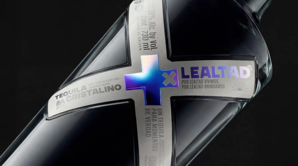
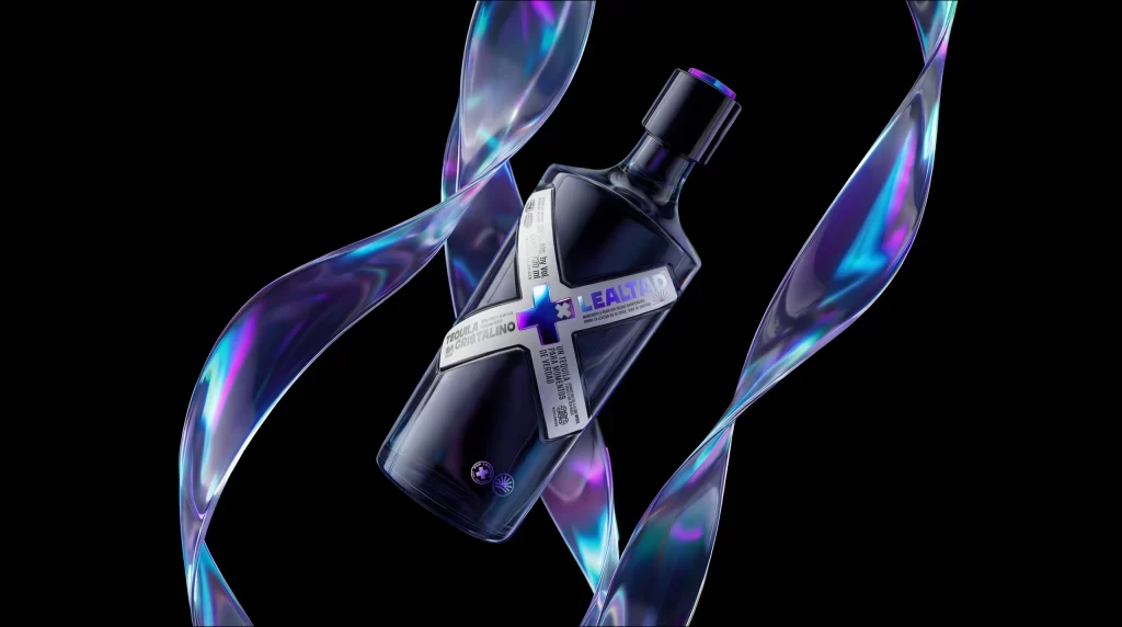
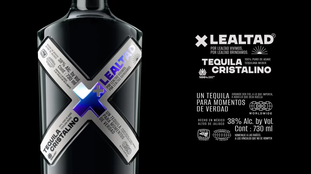
Lealtad Tequila Cristalino is presented in a dark charcoal glass bottle featuring a bold, metallic silver X-shaped label that wraps around the front. The central intersection of the X displays an iridescent blue gradient square with a white plus sign, while the brand name LEALTAD runs diagonally along the upper arm of the cross in white and light blue lettering. Crisp white typography details the 38% alcohol by volume and 730ml contents against the deep black background, with certification marks including DDO Worldwide and Hecho en México printed at the bottom right.
The intersecting label geometry creates immediate visual tension, transforming standard regulatory information into a graphic statement through deliberate angular placement. That central iridescent focal point introduces a singular chromatic accent against the otherwise monochromatic palette of transparent glass, metallic silver, and white ink. Typography scales hierarchically from the oversized brand mark down to fine-print certifications, establishing clear visual priority while maintaining industrial precision throughout the composition.
Packaging designers studying premium spirits branding would examine this specimen for its integration of structural labeling with holographic security elements. Art directors developing campaigns for luxury beverages might reference the typographic rhythm and spatial relationships between bottle form and adjacent copy blocks. Students of commercial photography could analyze how directional lighting emphasizes material transparency while the high-contrast backdrop isolates product details without distraction.