Lealtad Tequila Super Premium Label
Topics
Details
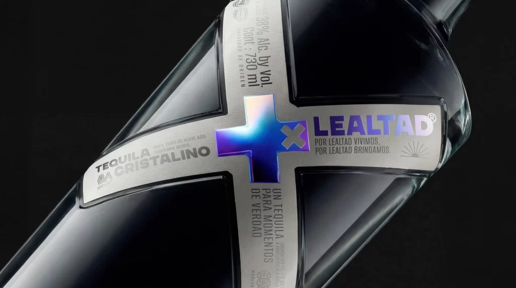
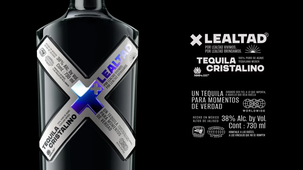
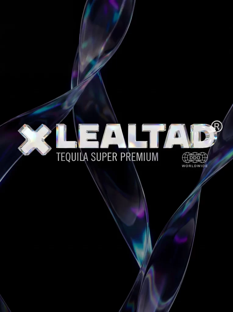
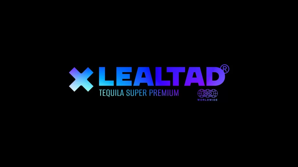
A luminous gradient of cyan, electric blue, and vivid purple illuminates the brand name LEALTAD in bold sans-serif capital letters, accompanied by a stylized white X-shaped emblem to its left. Below the main wordmark, the phrase TEQUILA SUPER PREMIUM appears in smaller white text, while a registered trademark symbol and a circular DDO WORLDWIDE seal occupy the right side. The entire logo arrangement floats on an absolute black background that accentuates the neon-like vibrancy of the color transition.
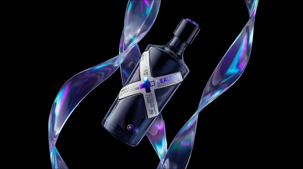
What sets this branding apart is its masterful use of neon-inspired gradients, which transition seamlessly from cool electric blues into deep violet tones. The geometric precision of the cross symbol creates a memorable visual anchor that contrasts beautifully with the rounded, modern sans-serif typography. This chromatic choice evokes a sense of luxury and nightlife energy, positioning the product distinctly within the premium spirits market through color psychology alone.
Brand strategists might study this composition to understand how gradient treatments can elevate traditional alcohol packaging into contemporary visual territory. Packaging designers could reference the spatial relationships between the icon, wordmark, and certification badges when laying out their own premium label systems. Marketing teams analyzing competitive tequila branding would find this useful for identifying current trends in luxury spirit identity design and color application.