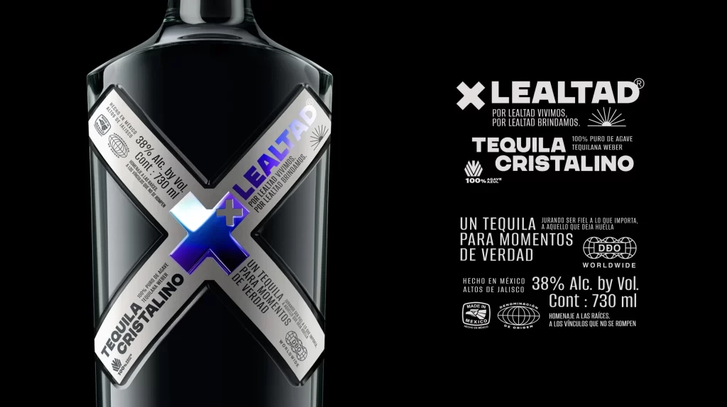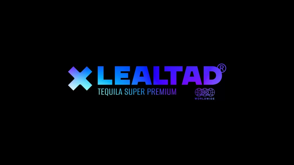
Xlealtad Tequila Super Premium Label
Topics
Details
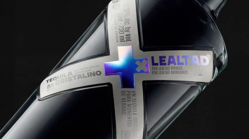
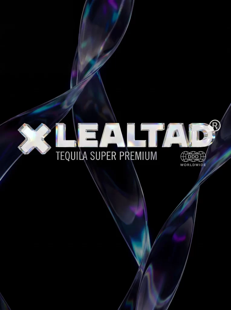
Polished chrome lettering spelling XLEALTAD dominates the center of the frame, its beveled edges catching light like cut crystal. Translucent ribbons of deep indigo and violet twist through the darkness behind the text, their surfaces shimmering with iridescent oil-slick highlights that shift between cyan and magenta. The registered trademark symbol and DDO Worldwide seal anchor the lower right, while 'TEQUILA SUPER PREMIUM' sits in clean sans-serif beneath the main brand name.
Visual distinction arises from the interplay between fluid, organic forms and rigid typographic geometry. The metallic sheen of the text creates a holographic effect that shifts depending on the viewing angle, suggesting luxury and precision manufacturing. These glass-like tendrils introduce movement and depth, preventing the composition from feeling static despite its centered layout.
Brand strategists developing premium spirit identities might study the balance between reflective surfaces and negative space. Packaging engineers could reference the material finishes when conceptualizing high-end bottle treatments or foil stamping techniques. Art directors working on beverage campaigns would find value in analyzing how light interacts with curved transparent elements to convey sophistication.