Nice Typography
Topics
Details
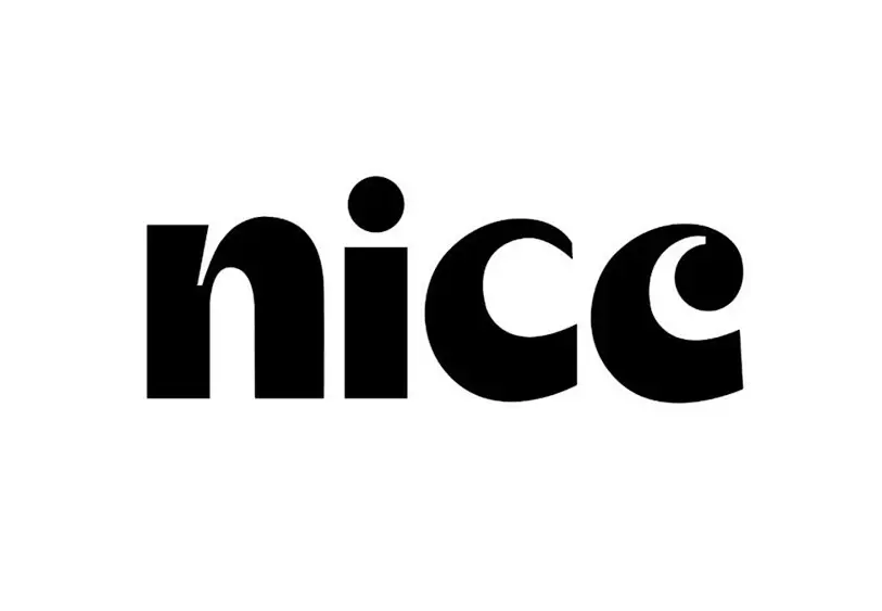
Bold, black sans-serif letterforms spell out the word 'nice' in thick, rounded strokes. The lowercase 'i' bears a perfectly circular dot, while the double 'c' characters curve with smooth, open shapes on a white surface.
What makes this particular rendering compelling is its confident use of weight and negative space, where the substantial stroke width creates a sense of warmth and approachability despite the monochrome palette. The geometric precision of each character—particularly the consistent curve of the final ‘e’—demonstrates how modern typefaces balance personality with readability. Such deliberate simplicity allows the intrinsic rhythm of the word to become the primary visual experience.
Brand identity specialists might study this example when developing friendly yet authoritative visual languages for lifestyle or wellness companies. Typography students could analyze the letter spacing and x-height proportions to understand how rounded terminals influence emotional perception. Anyone crafting headlines for digital interfaces would benefit from examining how this weight performs at various scales without losing its distinctive character.