Odd One Out Perfume Box
Topics
Details
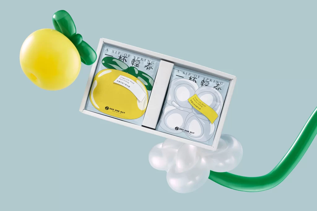
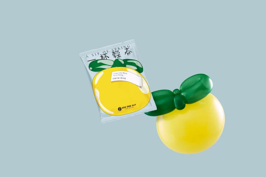
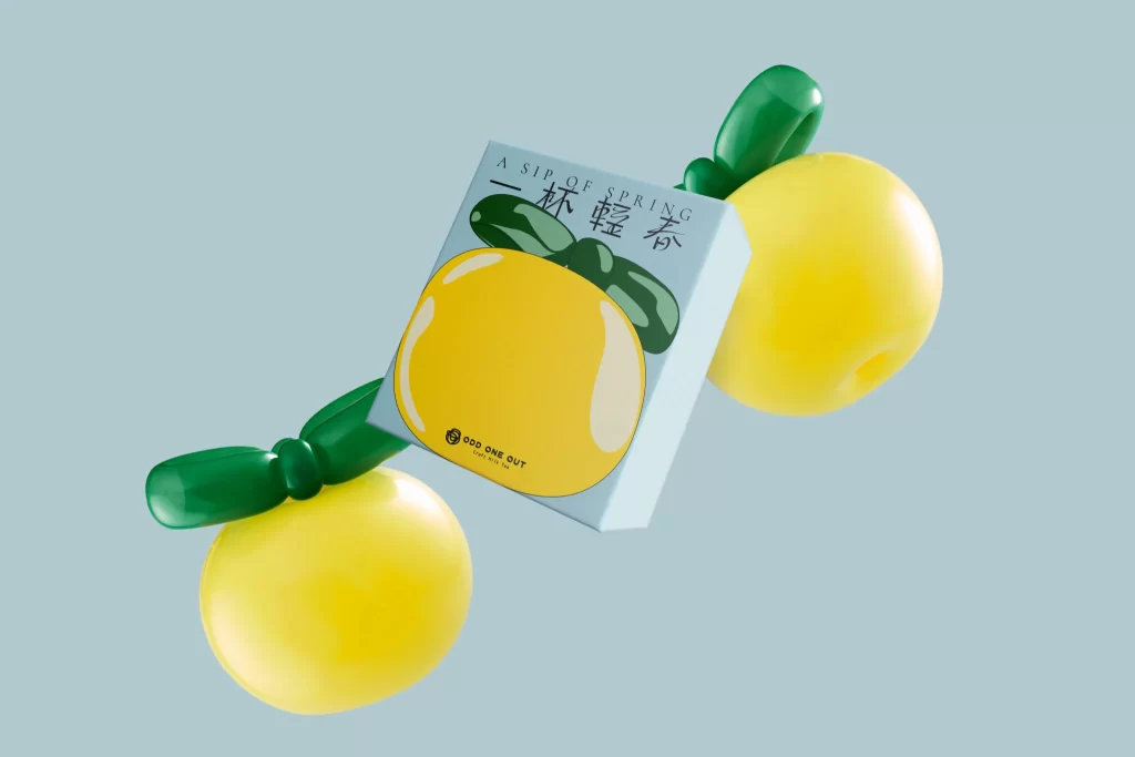
A pale blue rectangular box displays a graphic of a round yellow citrus fruit with green leaves, printed with the text 'A SIP OF SPRING' and Chinese characters above the brand name 'ODD ONE OUT'. Two glossy, three-dimensional yellow spheres with curved green stems float on either side of the packaging, rendered in a smooth, balloon-like material. Soft studio lighting creates gentle highlights across the rounded surfaces, while the entire arrangement sits at a slight three-quarter angle against a uniform light blue background.
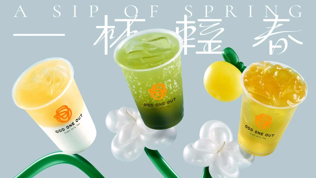
Visual interest stems from the deliberate contrast between matte paper packaging and high-gloss plastic or resin fruit forms that appear to be three-dimensional product replicas. The color palette restricts itself to lemon yellow, forest green, and powder blue, creating a cohesive spring-themed aesthetic without unnecessary complexity. Typography mixes clean sans-serif Latin characters with traditional Chinese script, suggesting cross-cultural market positioning while maintaining minimalist layout principles.
Product photographers studying still-life arrangements with mixed material textures will find value in how light interacts with both porous and reflective surfaces simultaneously. Packaging designers exploring fruit-motif branding for beverage or cosmetic lines can analyze the balance between illustrative graphics and physical form. Art directors planning seasonal campaigns might reference the spatial relationship between flat packaging and dimensional props to create depth in their own compositions.