Tom Ford Eau de Parfum Bottle
Topics
Details
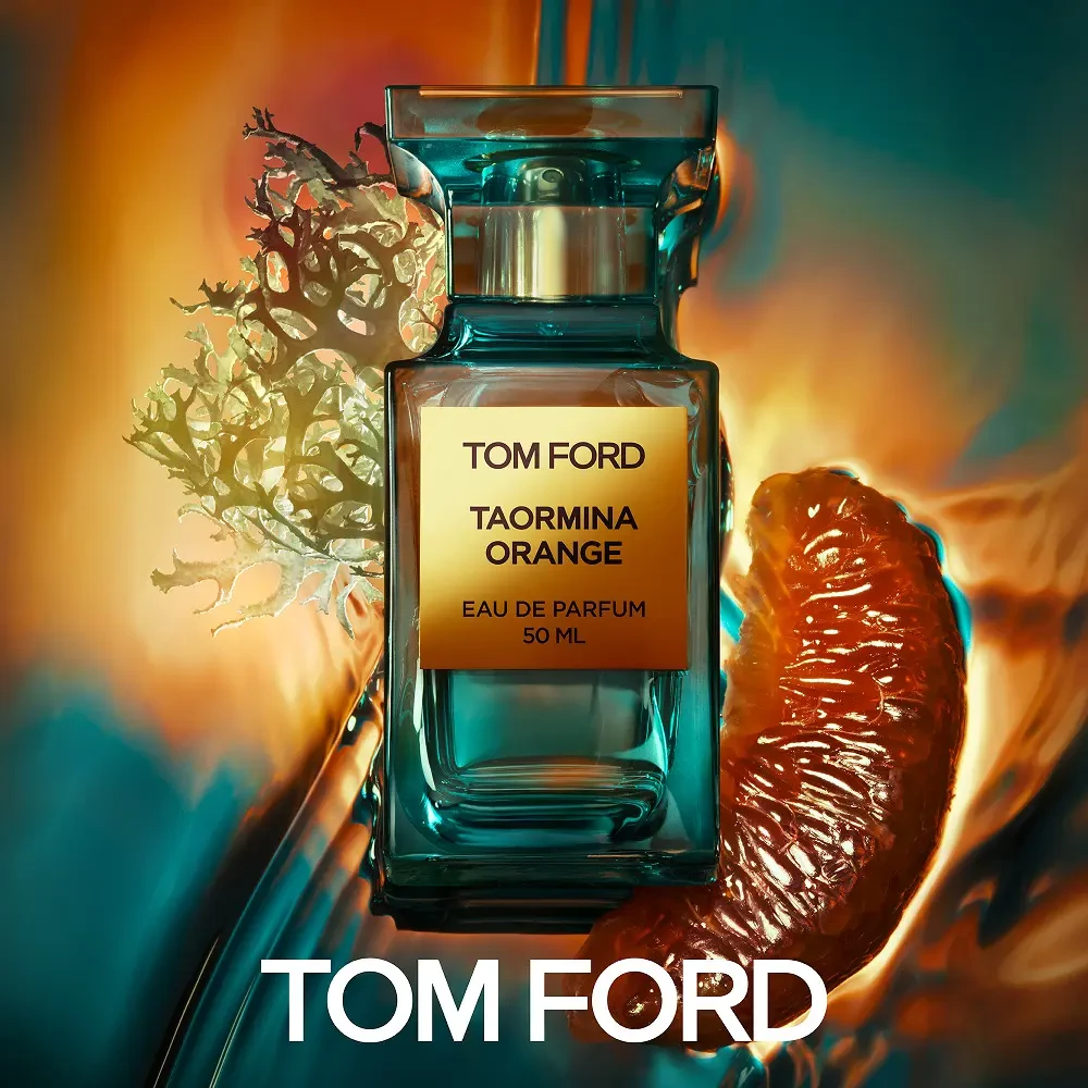
Centered within a luminous gradient that shifts from burnt amber to deep teal, a rectangular Tom Ford perfume bottle commands the frame with its translucent aquamarine glass and polished silver cap. The golden label displays 'TOM FORD', 'TAORMINA ORANGE', 'EAU DE PARFUM', and '50 ML' in crisp black typography, while a glistening orange slice and crystalline lichen flank the vessel to suggest olfactory notes. Warm backlighting creates a halo effect around the composition, emphasizing the liquid's clarity and the organic textures of the botanical elements.
Visual distinction emerges from the interplay between industrial precision and natural irregularity, where the bottle's geometric rigidity contrasts with the organic forms of citrus and moss. The color palette deliberately bridges warm Mediterranean oranges against cool aquatic blues, evoking the Sicilian coastal inspiration without relying on literal imagery. Lighting choices highlight material properties—glass refraction, metallic reflection, and fruit translucency—to create a multi-sensory visual experience.
Commercial photographers studying product lighting techniques will find value in how the gradient background enhances transparency without overwhelming the subject. Packaging designers examining luxury branding can analyze the hierarchy between label typography and surrounding decorative elements for similar high-end cosmetic presentations. Art directors developing fragrance campaigns might reference this composition when balancing literal ingredient imagery with abstract atmospheric effects.