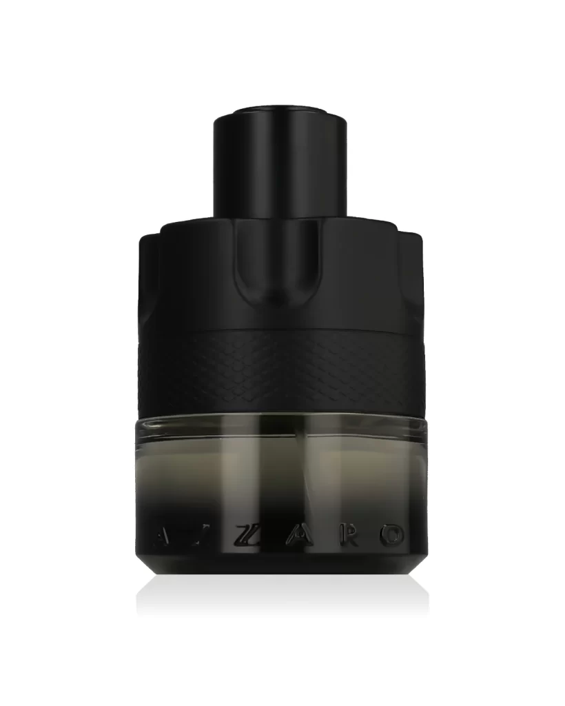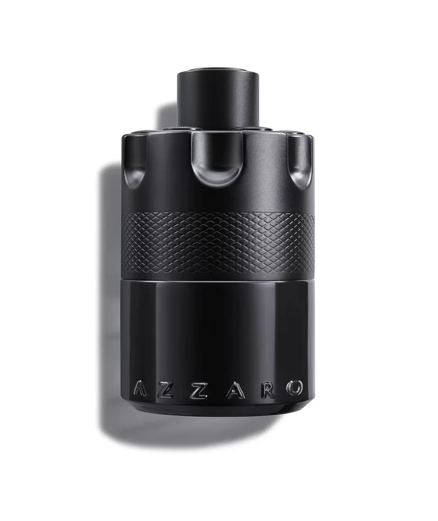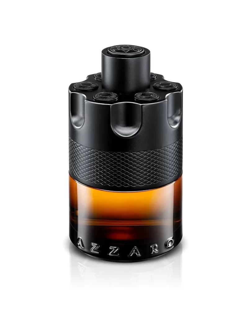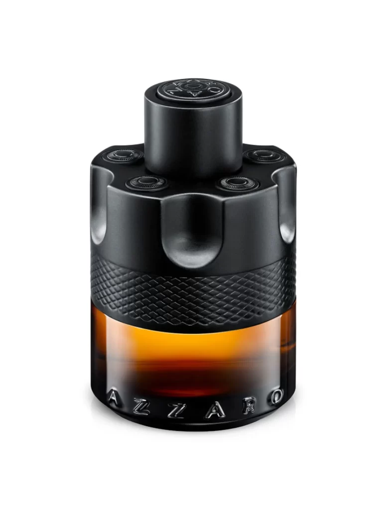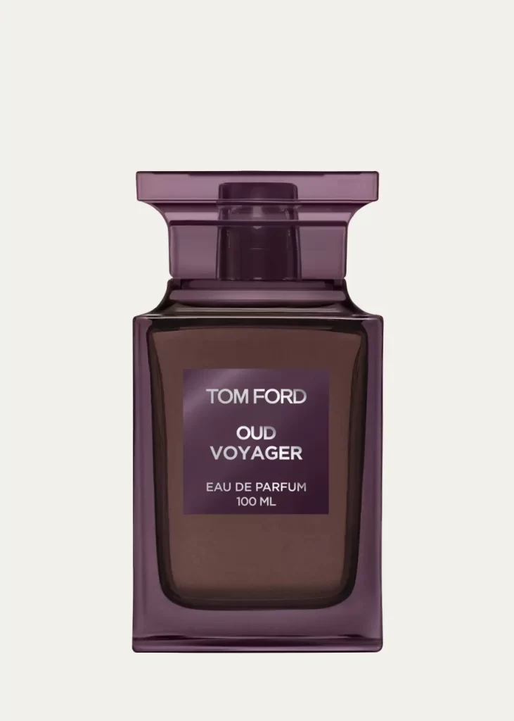
Tom Ford Eau de Parfum Bottle Closeup
Topics
Details
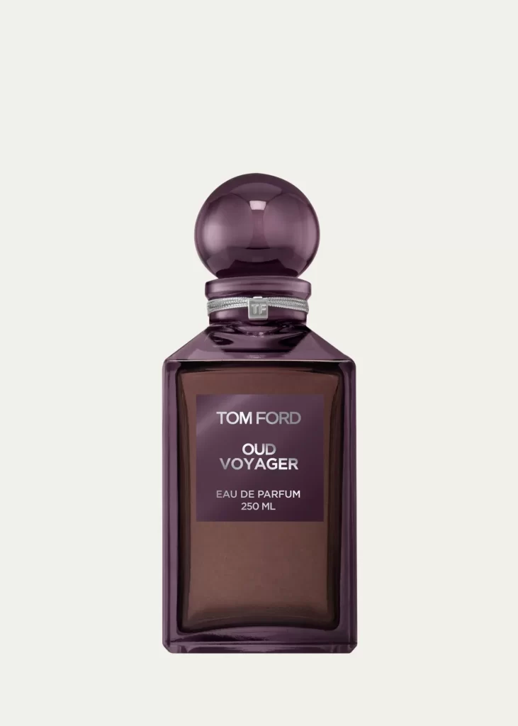
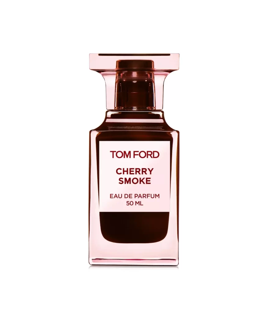
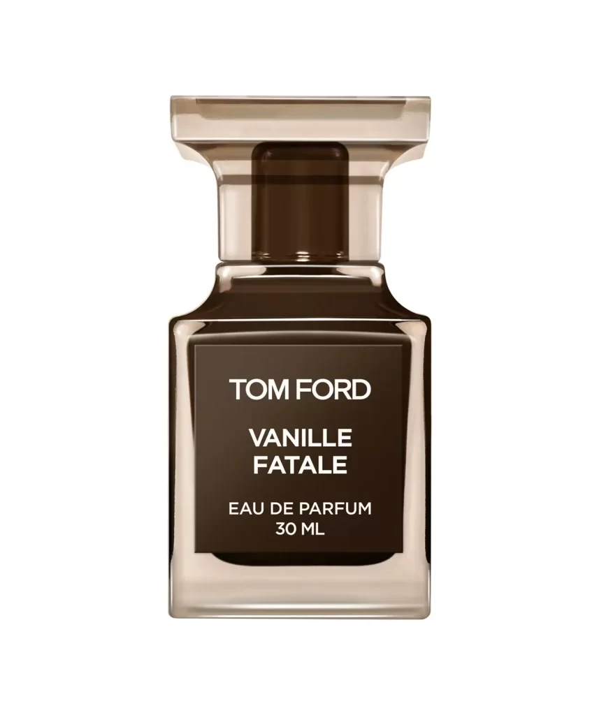
Deep plum glass forms the architectural silhouette of this Tom Ford Oud Voyager bottle, its square shoulders rising to a tiered cap that echoes the same translucent violet hue. A matte charcoal label anchors the front face with crisp white typography spelling out the brand name, fragrance title, and 100ml Eau de Parfum designation. The composition sits flush against a pale cream backdrop, illuminated by soft frontal lighting that reveals the rich amber liquid within while casting subtle shadows beneath the heavy base.
What distinguishes this particular iteration is the moody interplay between the darkened glass exterior and the warm brown perfume visible through the material, creating a sense of depth and luxury that lighter bottles cannot achieve. The geometric precision of the cap's stepped design contrasts elegantly with the fluid opacity of the main vessel, establishing a visual language of restrained opulence. Such careful attention to color temperature and material finish demonstrates how packaging can communicate sophistication before the fragrance is even experienced.
Industrial designers studying premium cosmetic packaging will find this reference invaluable for analyzing how color saturation affects perceived value in glass manufacturing. Photographers working on product campaigns can study the lighting technique used to maintain detail in both reflective surfaces and printed text simultaneously. Brand strategists might examine the typographic hierarchy on the label as a case study in balancing legibility with minimalist aesthetic principles.