Tom Ford Perfume Bottle Design
Topics
Details
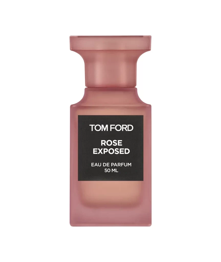
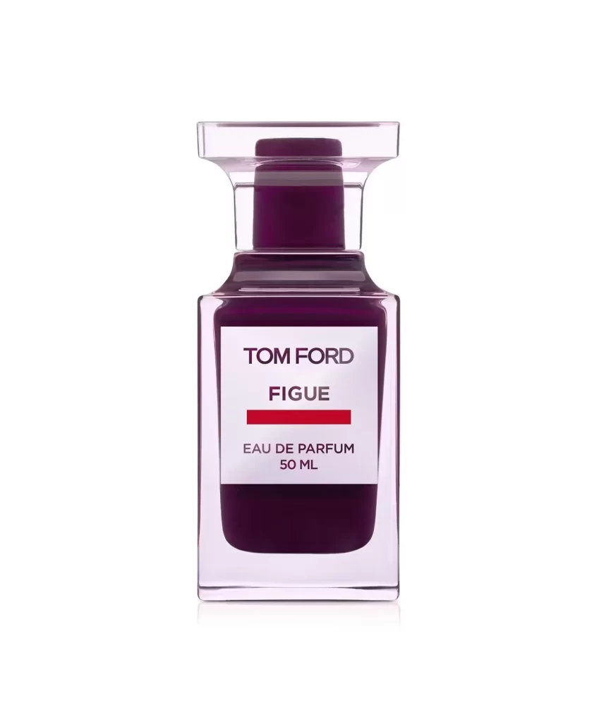
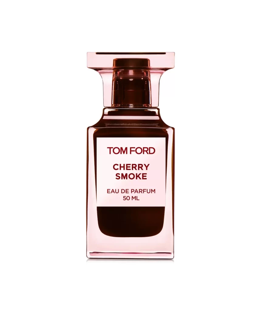
Centered within a pristine white void, the Tom Ford Cherry Smoke bottle presents a study in architectural elegance. Its rectangular glass body glows with a translucent pink tint, revealing a deep burgundy liquid that fills roughly two-thirds of the container. A crisp white label anchors the composition, displaying 'TOM FORD' and 'CHERRY SMOKE' in bold crimson lettering above the smaller 'EAU DE PARFUM 50 ML' designation. The flared cap assembly rises with geometric precision, featuring a wide flat top and dark inner mechanism that contrasts sharply against the luminous base.
Visual tension emerges from the interplay between the bottle's delicate rose-tinted transparency and the ominous darkness of the perfume itself. This particular iteration leverages color psychology effectively, where the feminine softness of the pink glass meets the mysterious depth of the cherry-black liquid. The typography choices—crimson sans-serif against stark white—create immediate brand recognition while maintaining an air of luxury minimalism. Such deliberate material contrasts elevate this beyond standard packaging into sculptural object territory.
Product photographers might analyze the lighting setup used to achieve such clean reflections without harsh glare. Packaging designers could study how the label proportions balance the visual weight of the dark liquid below. Brand strategists examining luxury market positioning would find value in the color palette's emotional resonance. Even 3D artists seeking to model glass materials with specific refractive properties would benefit from observing how light interacts with these curved surfaces and sharp edges.