Pasta Bucatini Bronze Blue Gold Elegant
DownloadTopics
Details
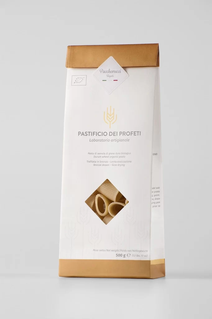
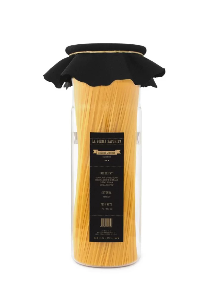
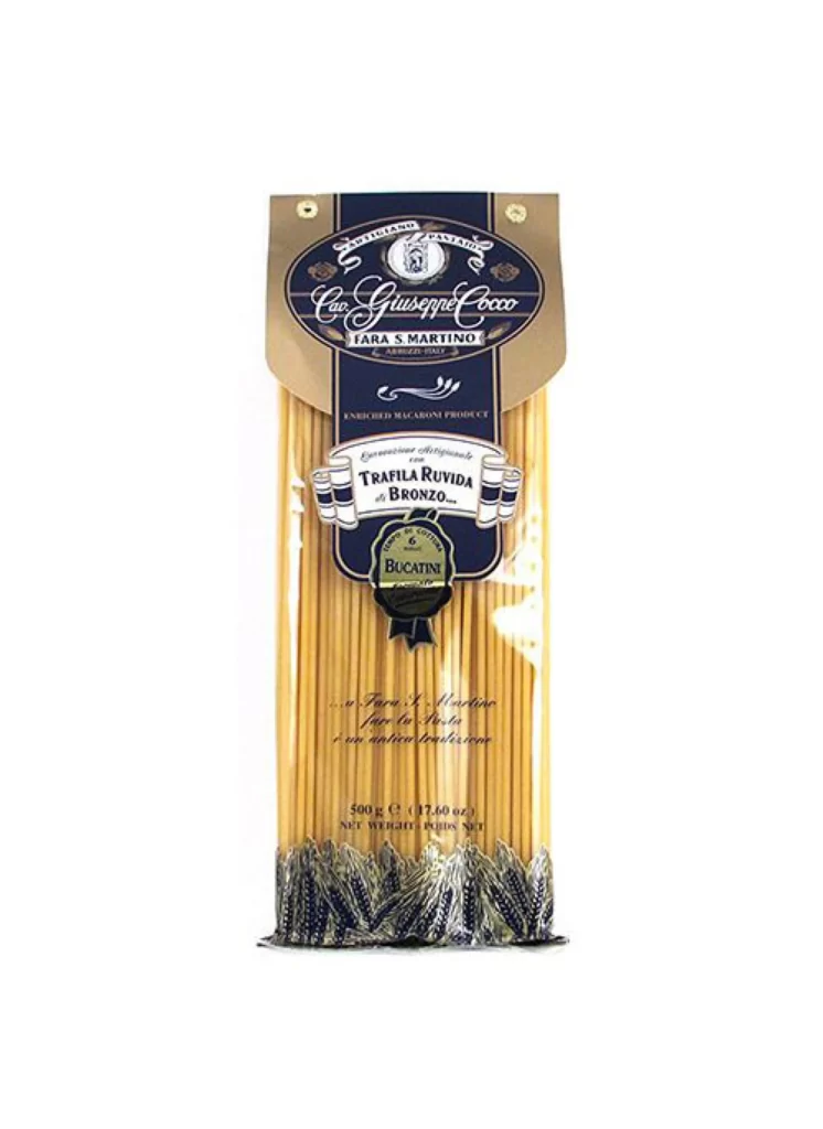
A vertical package of Cav. Giuseppe Cocco Bucatini pasta stands in a straight-on studio shot, its contents visible through clear plastic wrapping that reveals long, golden-yellow strands of dried pasta. The upper portion features a dark navy blue label with elegant white cursive script reading 'Cav. Giuseppe Cocco' and 'FARA S. MARTINO', topped by an oval crest containing a small portrait, while a cream-colored cardboard flap extends above the blue field. Below the brand name, a white ribbon banner announces 'TRAFILA RUVIDA al BRONZO' in bold serif type, and a dark green seal stamped with 'BUCATINI' hangs centered on the navy background; the bottom edge displays decorative black wheat stalk illustrations against the pale backdrop.
Navy blue and antique gold create a regal color palette that distinguishes this packaging from typical grocery-store pasta containers, lending it an artisanal, heritage-brand appearance. The combination of classical typography—flowing script alongside formal serifs—with traditional Italian heraldic elements like crests and ribbon banners establishes visual authority and craftsmanship cues. Designers studying luxury food packaging or vintage-inspired labeling systems will find the layering of translucent materials over printed elements particularly instructive for understanding depth and texture in product photography.
Food photographers can analyze the lighting setup used to highlight the pasta's matte surface texture without creating harsh glare on the plastic film. Brand identity developers working on premium Italian imports might reference the typographic hierarchy and color blocking when constructing their own packaging mockups. The full-resolution source file is accessible at no cost for those needing to examine fine details such as the embossed texture effects on the green seal or the precise kerning of the smaller text elements.