Title

PGG Skincare Packaging


Topics

PGGSkincare

Details

Uploaded user: Leo

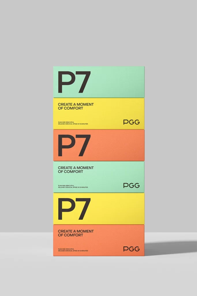
Five rectangular boxes stack vertically against a neutral gray backdrop, each displaying a distinct pastel hue—mint green, lemon yellow, and coral orange—in a repeating sequence. Bold black typography dominates the surfaces, with the oversized 'P7' identifier occupying the primary face of alternating units while the slogan 'CREATE A MOMENT OF COMFORT' appears in smaller caps on the intervening layers. The 'PGG' brand mark anchors the right edge of every package, accompanied by microscopic product claims regarding cervical spine relief, all captured from a straight-on perspective that emphasizes the clean geometric alignment and soft studio lighting.
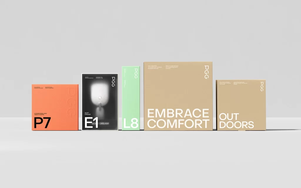
Visual rhythm emerges through the disciplined alternation of color fields and typographic scales, creating a modular system that feels both clinical and approachable. By restricting the palette to three muted tones and employing stark sans-serif lettering, the design achieves a contemporary minimalism that communicates wellness without resorting to organic or soft-focus imagery. The rigid vertical composition transforms individual containers into a unified architectural element, suggesting consistency across a product line while maintaining clear differentiation between variants.

Brand strategists developing identity systems for health-tech startups could analyze this layout to understand how color coding reinforces product hierarchy without clutter. Packaging engineers tasked with creating shelf-ready sequences for retail environments might study the spacing ratios to optimize visual impact within confined display areas. Art directors overseeing pharmaceutical or supplement rebrands would find value in examining how technical benefits integrate seamlessly into an aesthetic-first presentation.