PGG Packaging A
Topics
Details
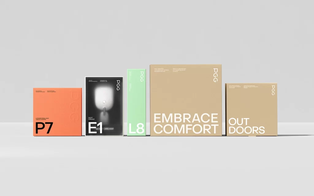
Five rectangular boxes stand in a horizontal row against a seamless light gray backdrop, illuminated by soft, even studio lighting that casts subtle shadows beneath each object. The collection features a vibrant orange square box marked with bold black 'P7' lettering, a tall black box displaying a glowing white oval graphic and the text 'E1', a slender mint green box with white 'L8' characters, and two kraft paper boxes in varying sizes bearing the phrases 'EMBRACE COMFORT' and 'OUT DOORS'. Each package displays the 'PGG' logo in its upper right corner, while smaller descriptive text appears in the lower left areas of the colored boxes and along the top edges of the cardboard pieces.
Visual hierarchy emerges through deliberate typographic scaling, where alphanumeric codes dominate the colored packaging while full words command attention on the natural fiber boxes. The material contrast between matte coated surfaces and raw unbleached cardboard creates tactile differentiation across the product line, suggesting distinct categories or usage scenarios. Minimalist layout principles govern every element, with generous negative space allowing the limited color palette—orange, black, mint, and kraft—to establish clear visual separation between items.
Brand managers developing identity systems for lifestyle or home goods might study this arrangement to understand how color coding communicates product variants without verbal explanation. Packaging engineers could reference the structural proportions when designing retail display sequences that require immediate visual scanning. Art directors planning e-commerce photography setups would find value in analyzing how neutral backgrounds enhance product color accuracy while maintaining professional presentation standards.