Poopy Packs Dog Waste Bags Red Pink Black White Plaid
Topics
Details
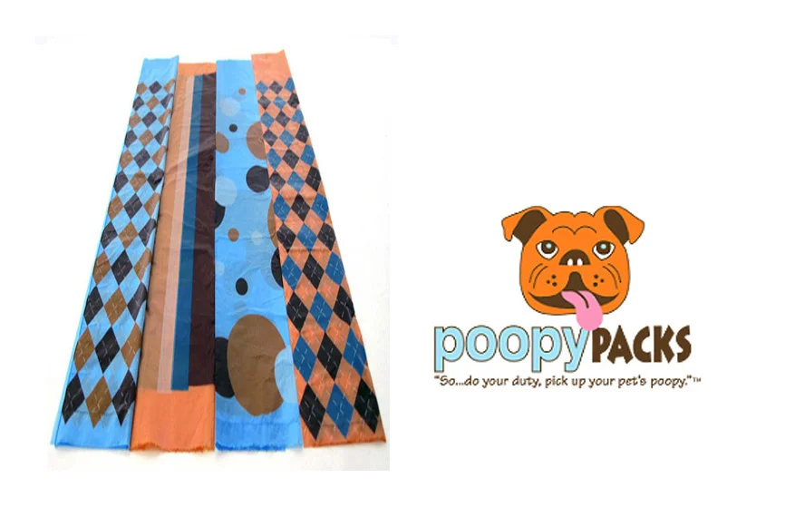
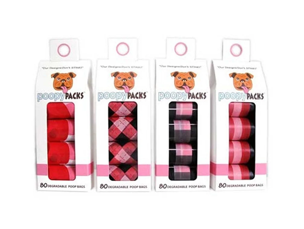
Four rectangular cardboard packages of Poopy Packs dog waste bags stand in a neat row, each featuring a white body with a pink horizontal band near the bottom and a circular hang hole at the top. The brand name appears in light blue lowercase letters above a cartoon bulldog face with a protruding tongue, while the text "80 DEGRADABLE POOP BAGS" sits in black at the base of each box. Through clear plastic windows, rolled bags display distinct patterns: solid red, red-and-black plaid, black with pink stripes, and pink with darker pink stripes, all photographed from a straight-on perspective under even lighting.
What sets this particular product line apart is its bold departure from the typical solid-color waste bag aesthetic by embracing playful, almost fashion-forward patterns that turn a utilitarian item into something visually engaging. The consistent use of the cheerful bulldog mascot across all four variants creates strong brand cohesion, while the palette of reds, pinks, and blacks gives the collection a cohesive yet varied look that feels modern rather than clinical. Packaging design choices like the transparent windows allowing the patterned rolls to serve as the primary visual element demonstrate smart visual merchandising for retail environments.
Product photographers studying consumer goods packaging could analyze how these boxes balance information hierarchy with personality, noting how the mascot and color blocking draw the eye before the functional text. Brand designers working on pet supplies might examine how pattern variation within a unified color scheme allows for SKU differentiation without fragmenting visual identity. E-commerce teams listing similar items could reference this composition as an example of how to present multiple product variants clearly in a single promotional shot.