Dog Poo Bags White Black Red Blue Green Yellow
Topics
Details
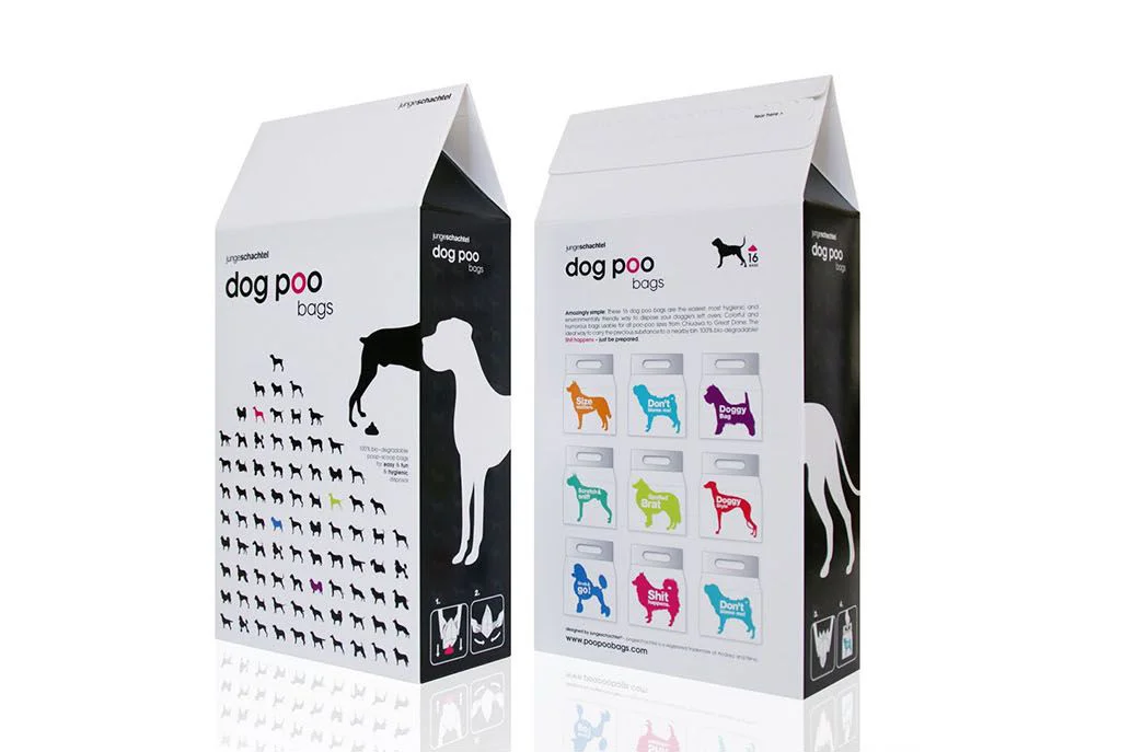
Two gable-top cartons of 'dog poo bags' stand side by side, their surfaces divided into white and black panels with crisp, geometric precision. The left carton displays a dense grid of black dog silhouettes ascending toward a larger profile, while the right reveals a 3x3 matrix of colorful bag illustrations in orange, cyan, magenta, teal, lime, red, blue, pink, and turquoise, each bearing bold typographic commands like 'Scoop', 'Don't Poo', and 'Shit'. Clean sans-serif typography anchors the composition alongside the 'unratcheted' brand mark, all captured under even studio lighting that emphasizes the matte paper texture and sharp fold lines of the packaging.
Visual tension arises from the deliberate juxtaposition of monochrome massing against vibrant, irreverent color accents that disrupt the otherwise minimalist palette. The systematic arrangement of canine silhouettes creates a rhythmic pattern that draws the eye upward, while the cheeky copy on the individual bag previews injects personality into an otherwise utilitarian product category. This duality between serious structural design and playful content messaging establishes a distinctive brand voice that balances functionality with humor.
Packaging designers studying eco-friendly pet product branding would find this composition valuable for analyzing how limited color palettes can maximize shelf impact through strategic accent placement. Art directors developing identity systems for lifestyle brands could reference the way typography integrates with iconography to create memorable visual hierarchies. Students of industrial design might examine the gable-top structure as a case study in sustainable packaging formats that differentiate from conventional plastic pouches.