Title

Olay ADVANCED Skincare Packaging


Topics

OlaySkincare

Details

Uploaded user: Leo

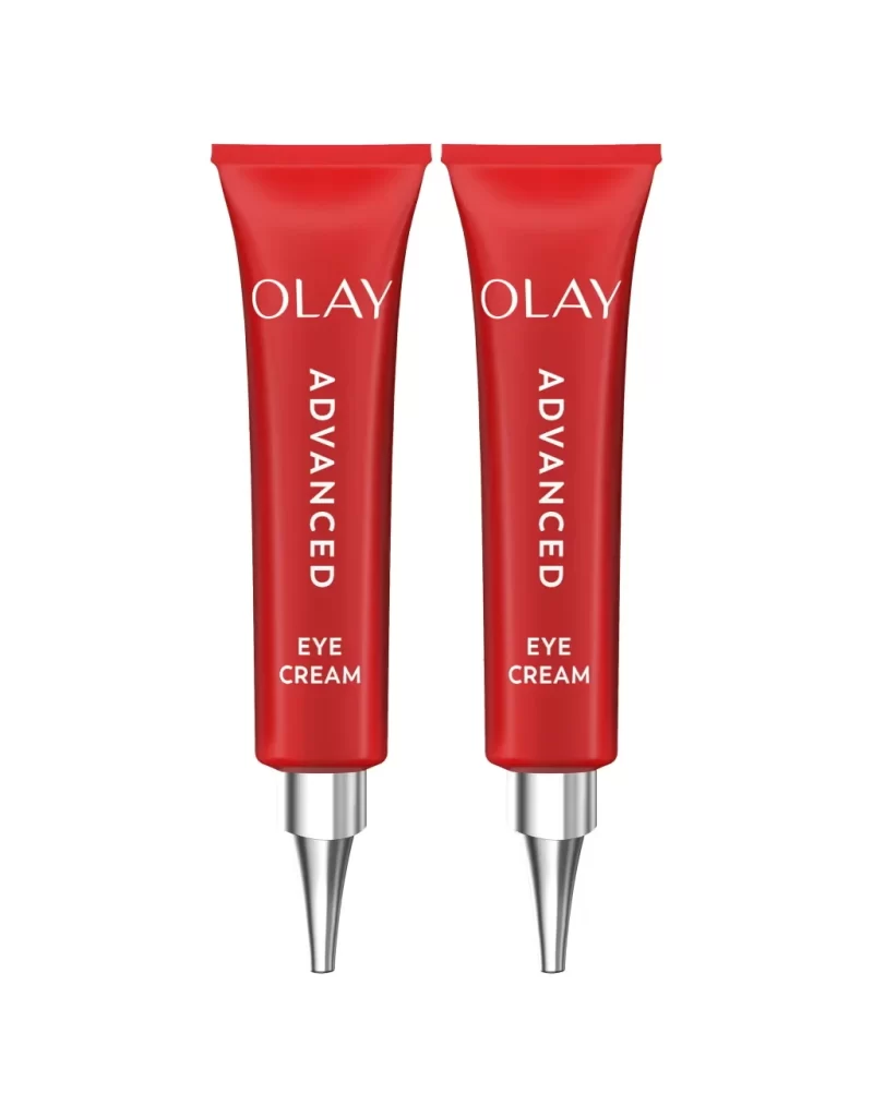
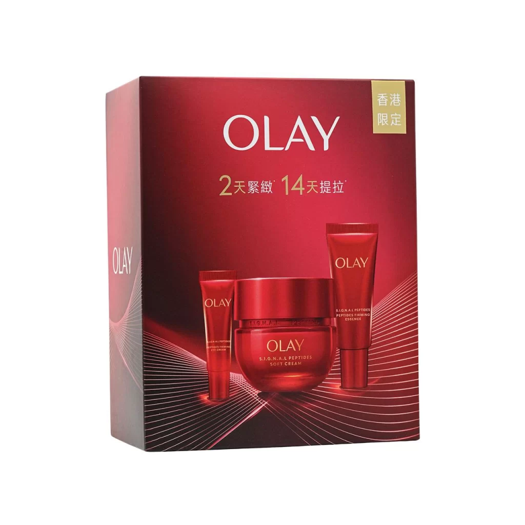
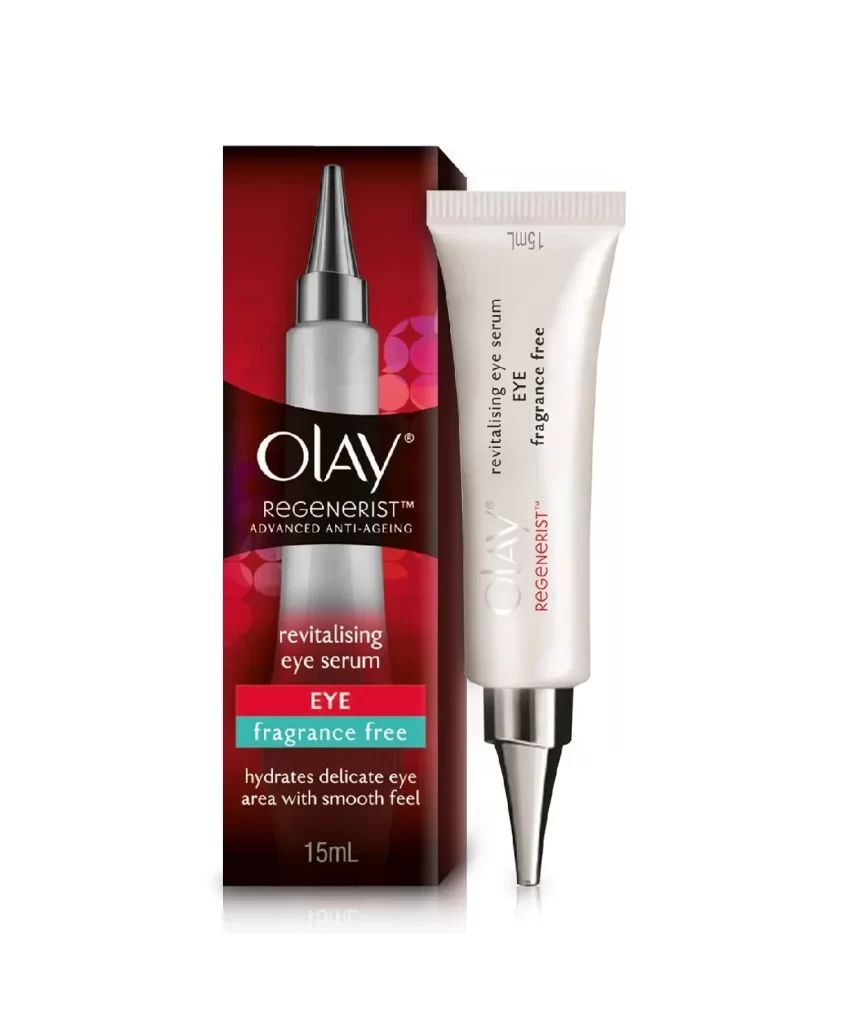
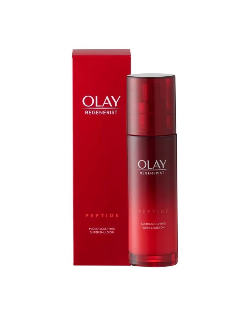
Two identical crimson tubes stand side-by-side on a white surface, their metallic silver caps and pointed nozzles catching light from a direct frontal angle. Each container displays the brand name 'OLAY' in a clean serif font at the top, with 'ADVANCED' running vertically down the center and 'EYE CREAM' positioned near the base. The symmetrical composition emphasizes the bold red packaging and precise typographic hierarchy.
What makes this particular design compelling is its confident use of a single, saturated hue to create immediate brand recognition without relying on complex graphics. The vertical orientation of the middle text element breaks up the tube’s length in an elegant way, guiding the eye naturally from the logo to the product type. Such minimalist yet striking color choices often signal premium positioning in the skincare market, making the item pop on both physical shelves and digital storefronts.

Packaging designers studying color theory in cosmetics would find this a useful case study for how monochromatic schemes can convey sophistication. Marketing teams could utilize this visual to brainstorm layouts for e-commerce product pages where clarity and speed of recognition are paramount. Furthermore, 3D artists looking to practice rendering translucent plastics and brushed metals might use this as a baseline for texture and lighting experiments.