Title

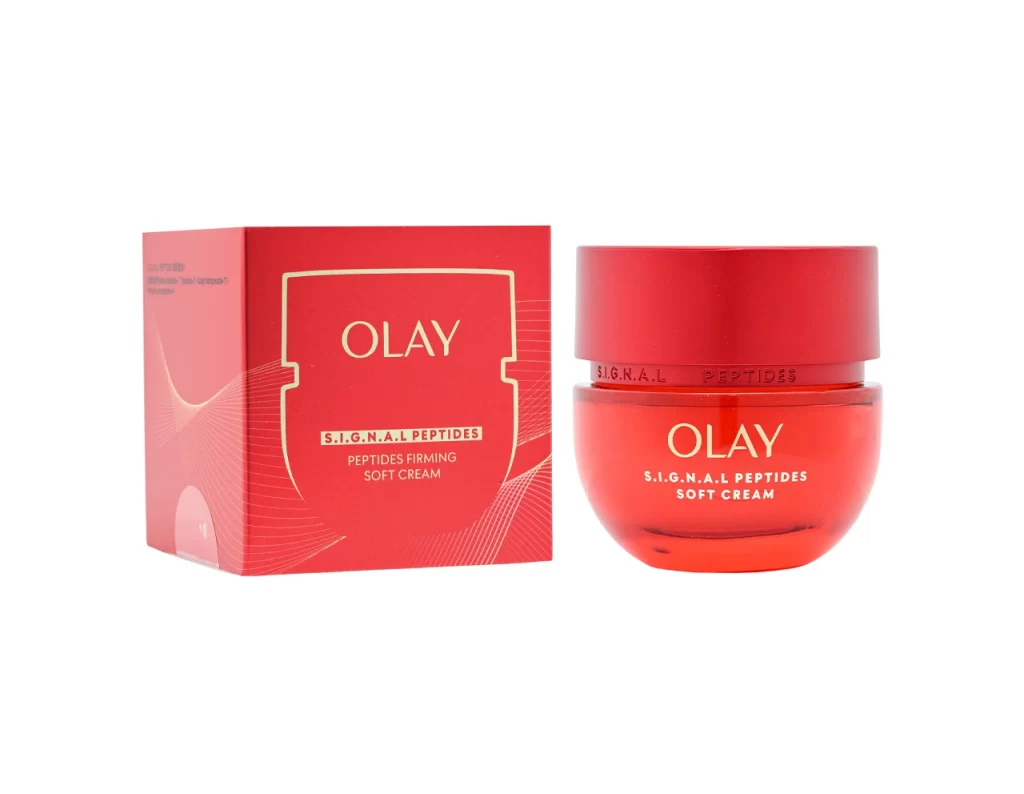
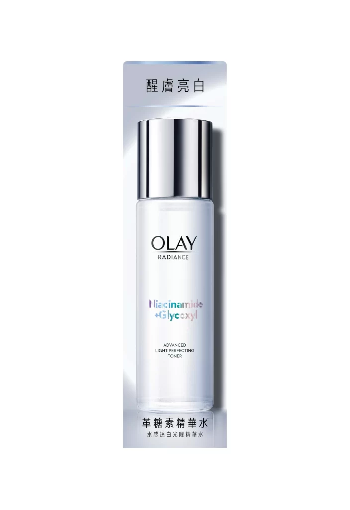
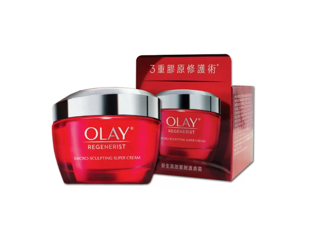
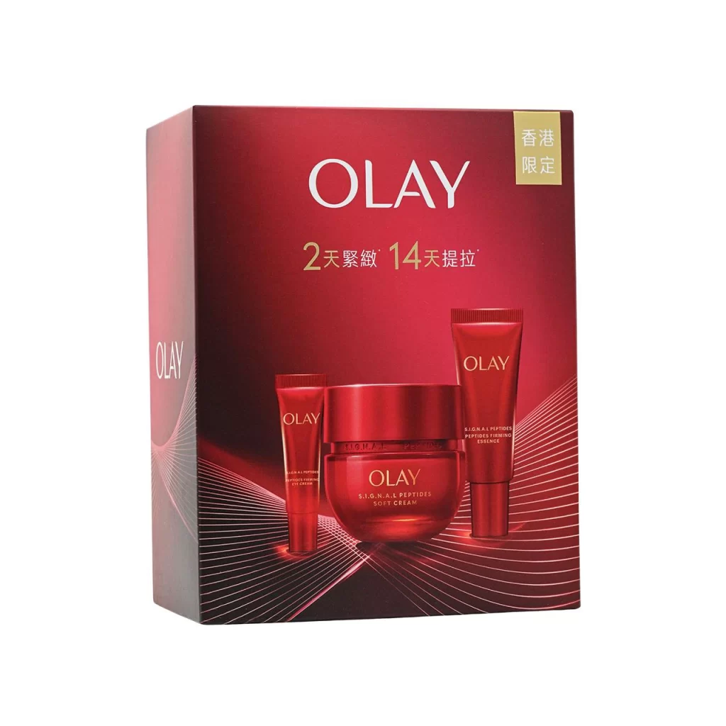
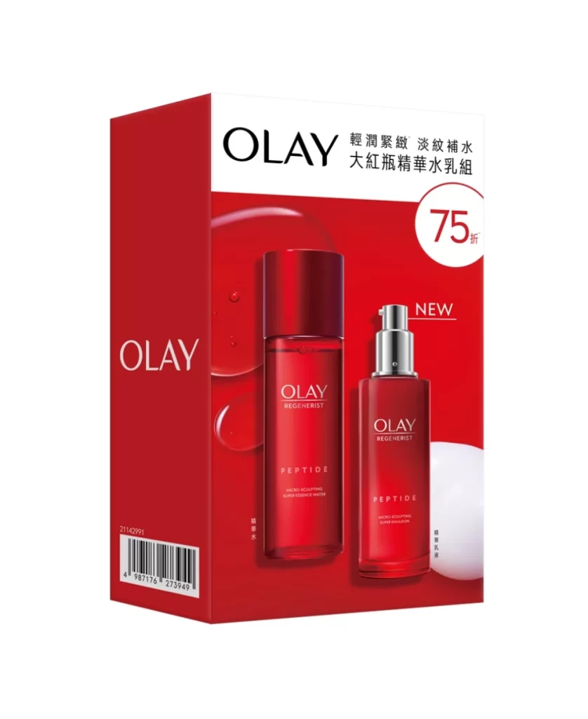
Olay REGENERIST 10 NIACINAMIDE Skincare Packaging


Topics

OlaySkincare

Details

Uploaded user: Leo

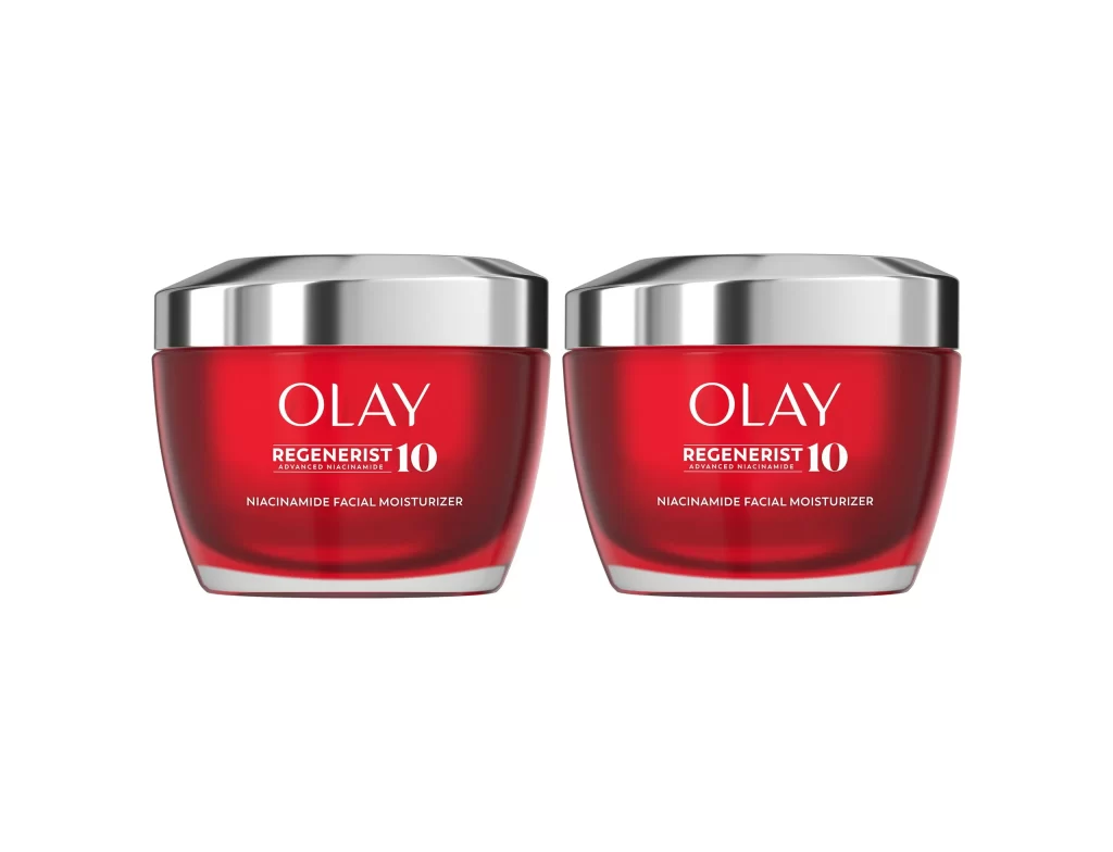
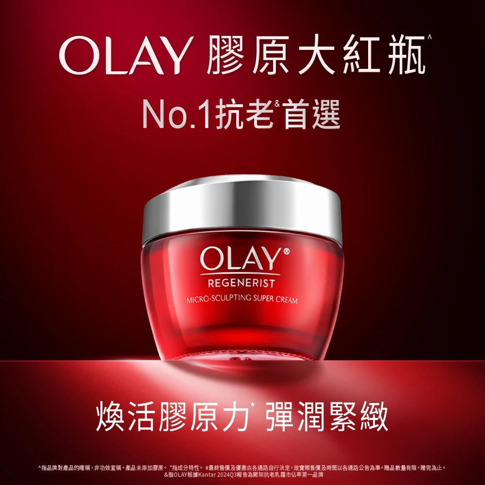
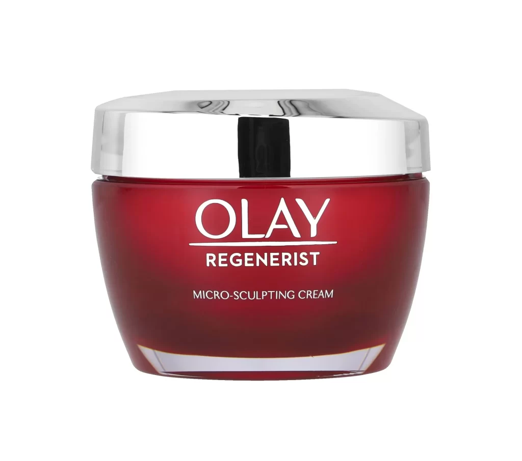
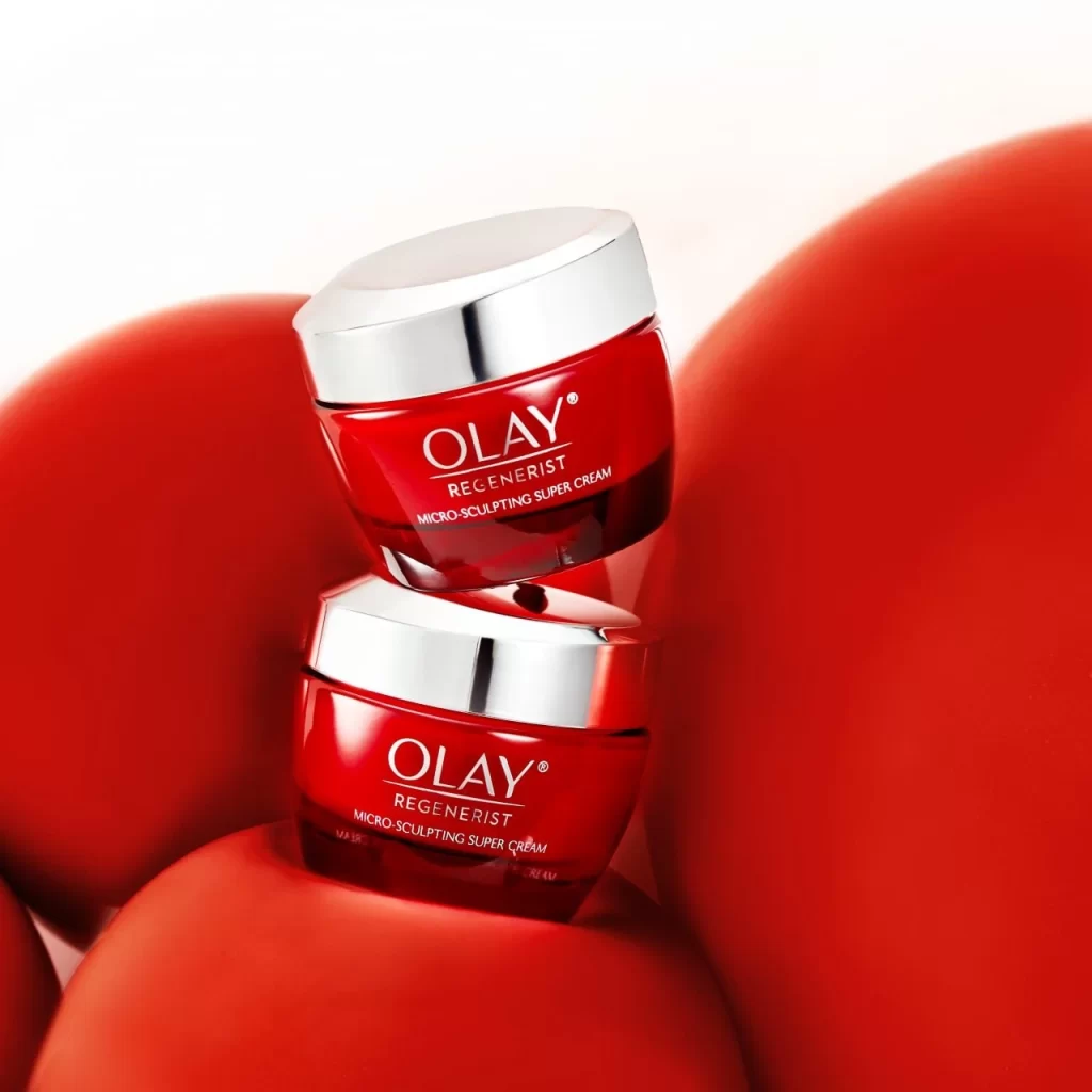
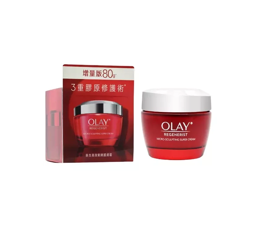
Two identical crimson jars of Olay Regenerist 10 Niacinamide Facial Moisturizer sit side by side on a white surface, their glossy red bodies catching the light with a subtle sheen. Each vessel features a polished silver lid that curves gently over the top, reflecting a clean metallic gleam that contrasts sharply with the deep red hue of the containers. The camera maintains a straight-on, eye-level perspective that captures both products in perfect symmetrical alignment.
Visual impact here is driven by the aggressive use of the signature Olay red, a color choice that commands immediate attention on retail shelves while signaling the premium nature of the Regenerist line. The interplay between the matte-finish lettering and the high-gloss jar surface creates a sophisticated tactile quality, suggesting a product that is both scientifically advanced and luxurious to the touch. Furthermore, the heavy, substantial appearance of the silver caps adds a sense of weight and durability that reinforces the brand’s promise of efficacy and long-term skin regeneration.

Marketing teams analyzing mass-market beauty trends would find this composition invaluable for studying how established brands utilize color psychology to differentiate product tiers. Industrial designers tasked with creating new cosmetic packaging can study the proportions of the lid-to-body ratio to understand how to balance elegance with practical usability. Additionally, visual merchandisers planning digital storefronts might look to this layout as a prime example of how to present multi-pack offerings clearly without cluttering the consumer’s field of vision.