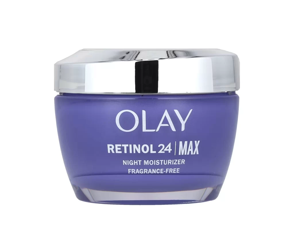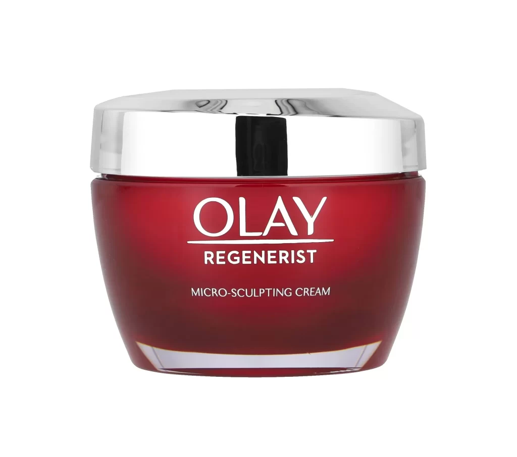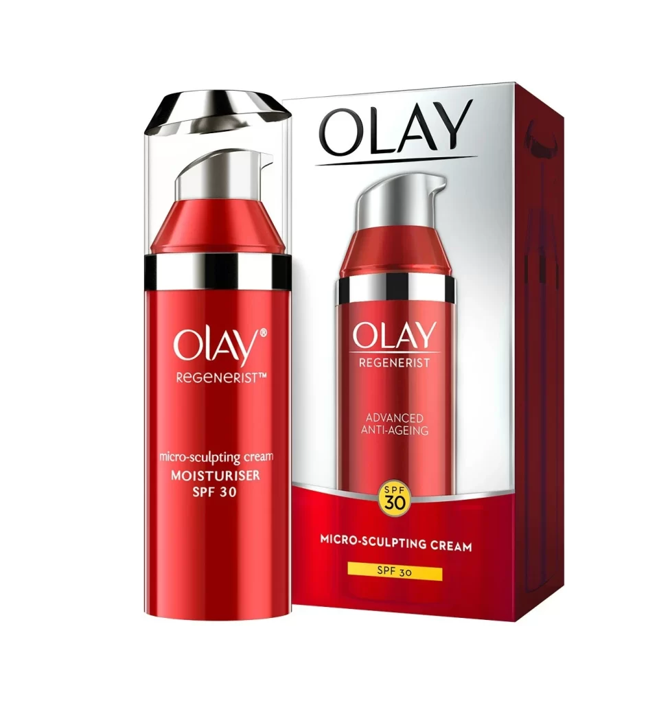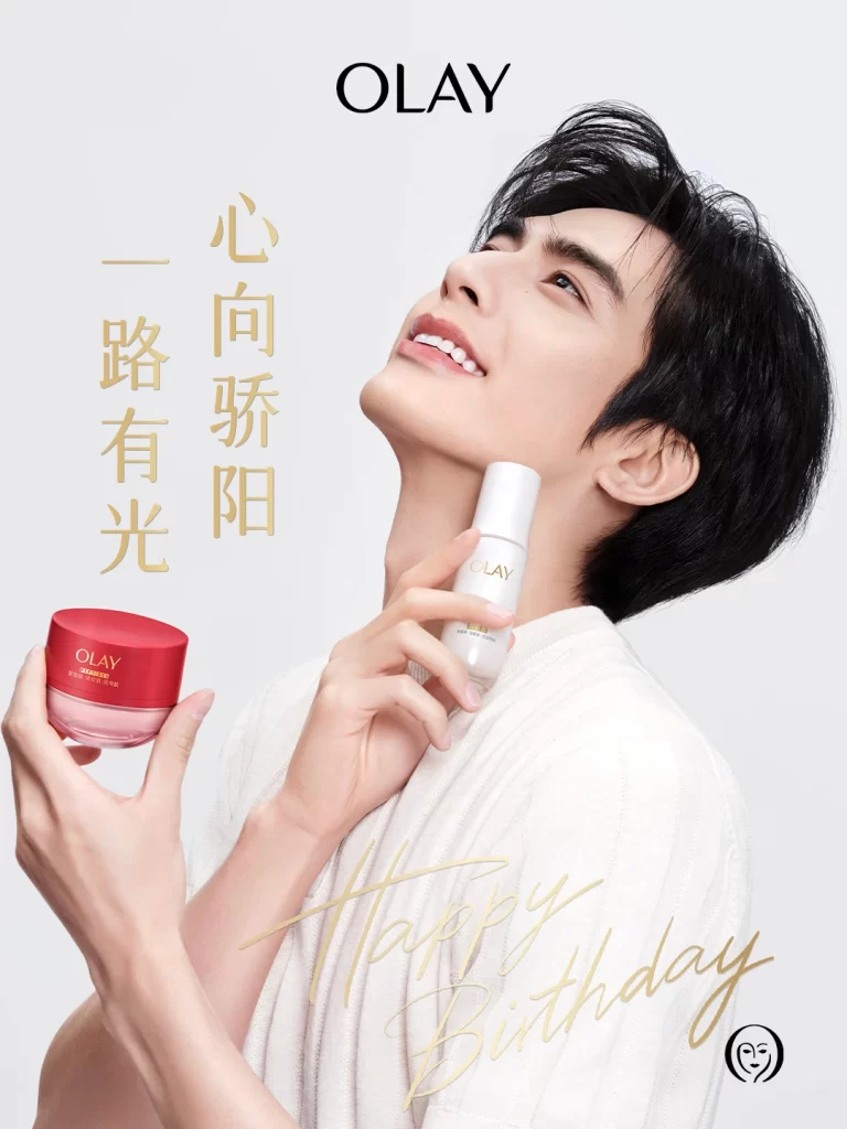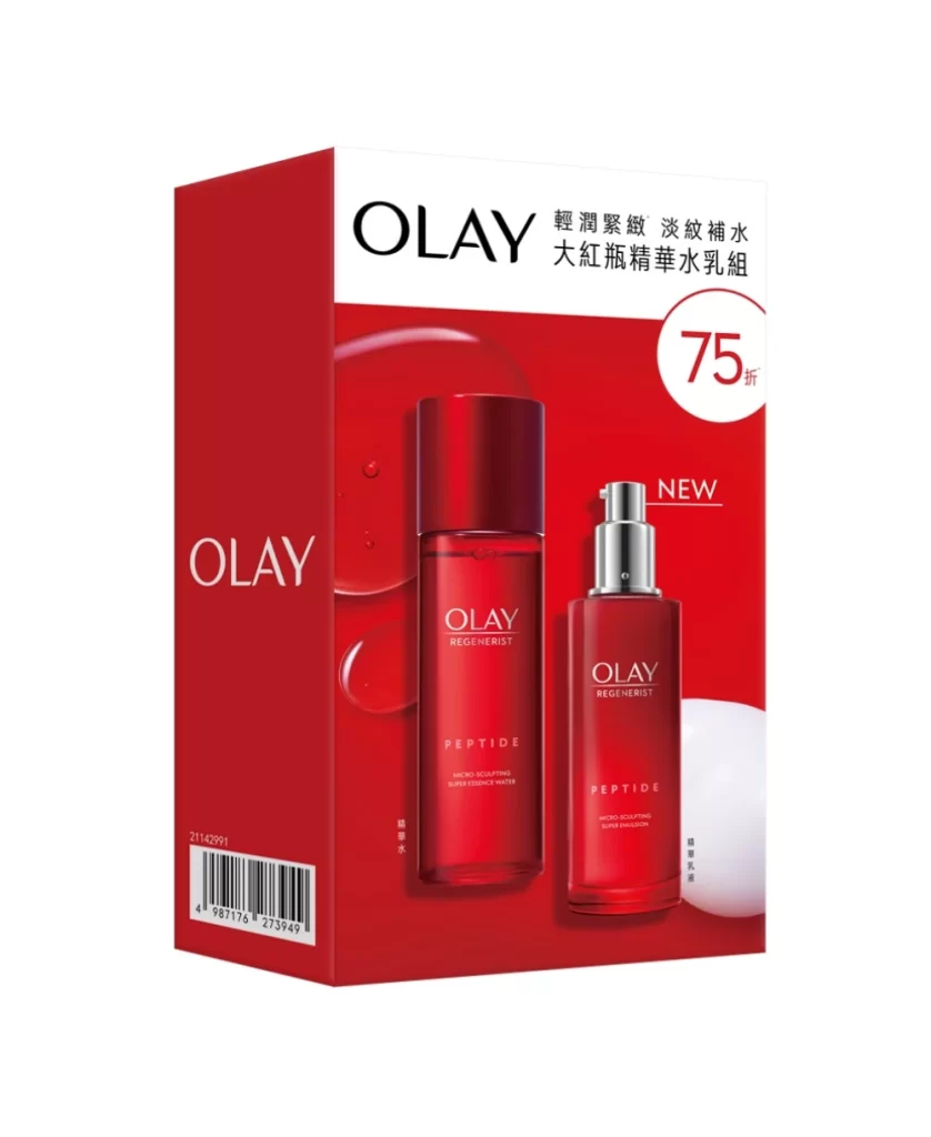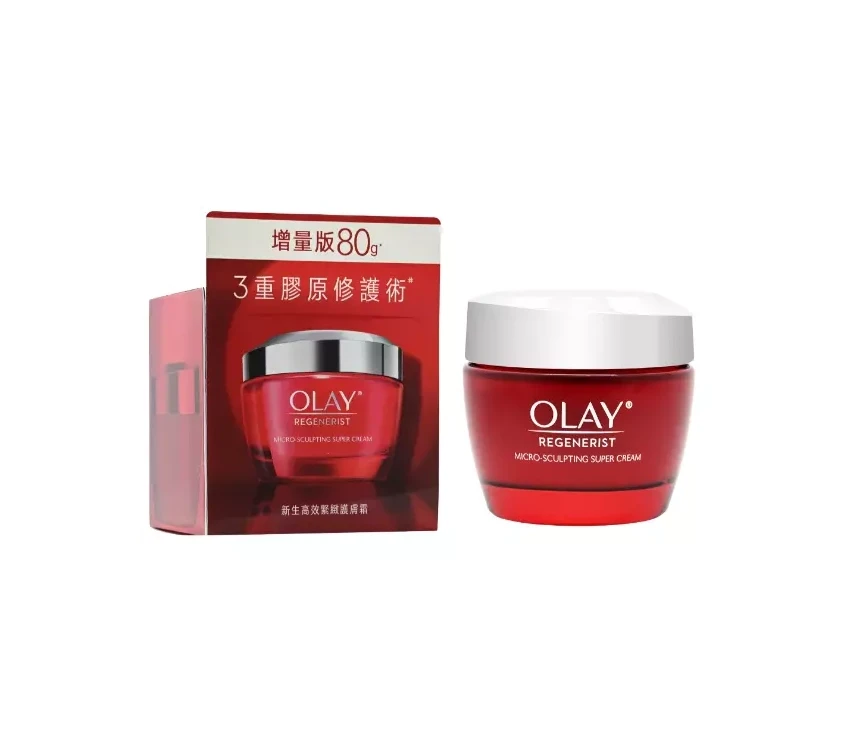
Olay REGENERIST Advanced Anti-Aging Skincare Packaging
Topics
Details
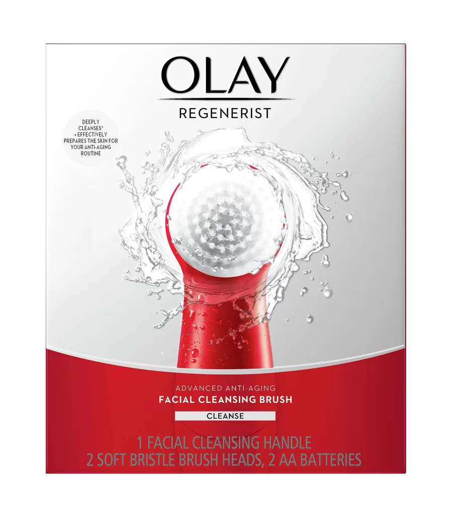
A vibrant red facial cleansing brush handle rises from the bottom center of the composition, its translucent, textured white brush head encircled by dynamic water splashes that create a sense of motion and freshness. Bold black serif lettering spells out 'OLAY' in the upper portion of the packaging, with 'REGENERIST' positioned directly beneath it on a clean white background.
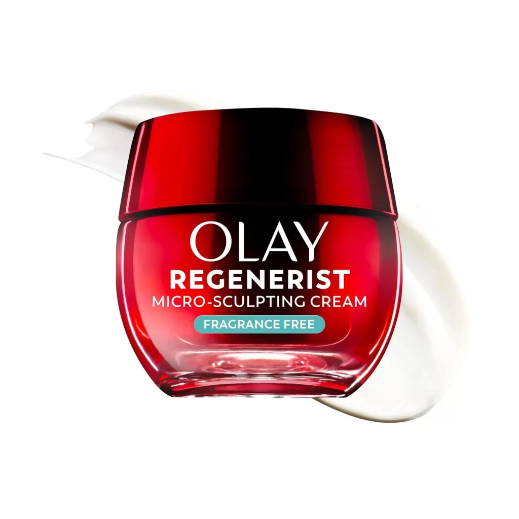
Visual hierarchy is established through the sharp contrast between the clinical white space and the deep crimson of the lower panel. The photographic realism of the water droplets and the device’s material texture provides a tactile quality that emphasizes the product’s functional benefits. Typography is utilized strategically to separate the premium brand identity from the specific utility of the cleansing tool, guiding the viewer’s eye from the logo to the action-oriented imagery.
Marketing teams analyzing competitive beauty packaging can utilize this visual to study color psychology in anti-aging product lines. Industrial designers might examine the way the brush head is framed to emphasize its mechanical features. Furthermore, art directors could reference this layout when developing campaigns for skincare technology that require a balance between scientific authority and consumer-friendly aesthetics.