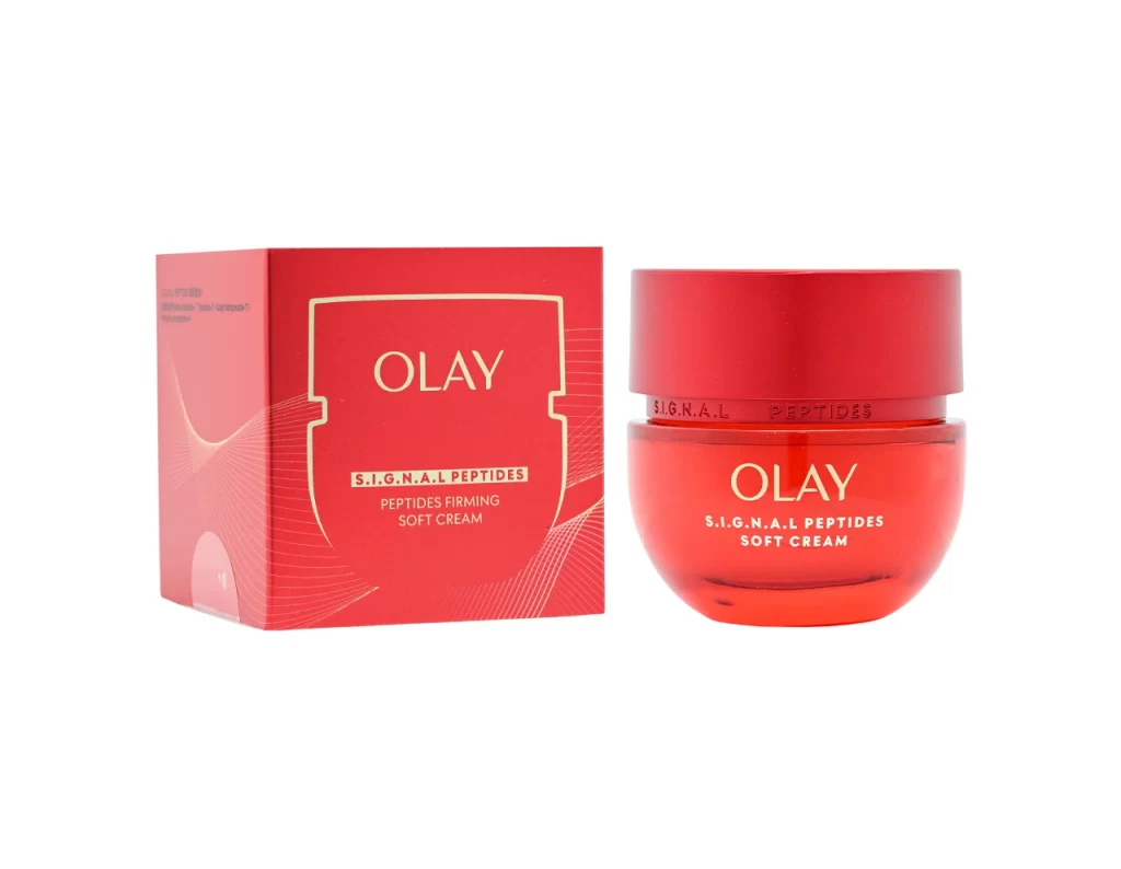
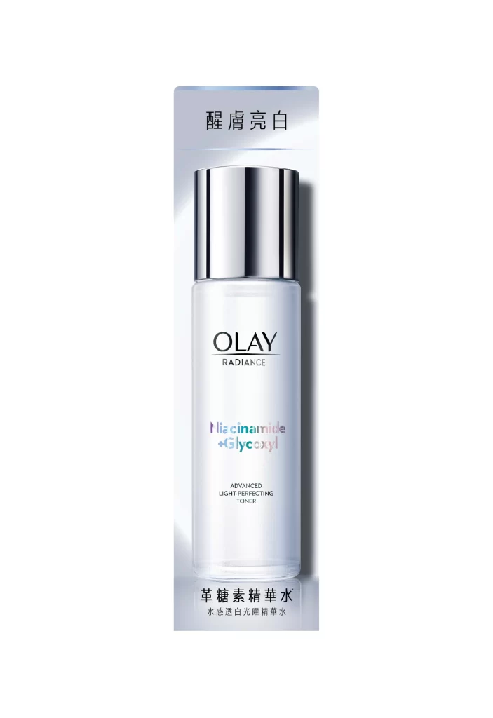
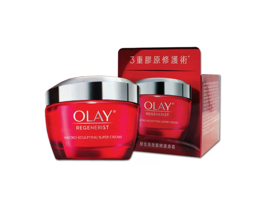
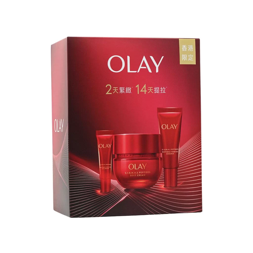
Olay Red Box Series Pink Skincare Packaging
Topics
Details
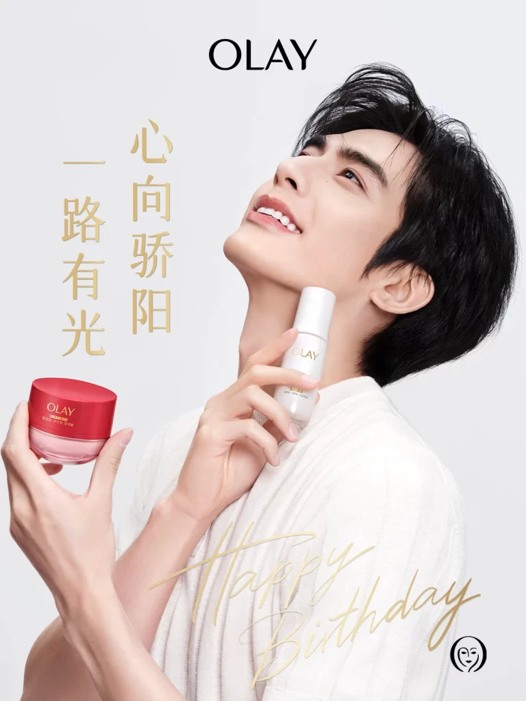
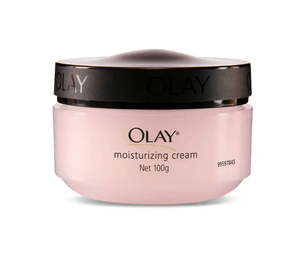
A male subject in a white ribbed top tilts his head back with a serene expression, holding a cylindrical white bottle near his neck while presenting a round red-lidded jar with a translucent pink base in his other hand. Gold serif characters reading '心向骄阳 一路有光' (Heart towards the proud sun, light all the way) flank the figure against a clean white backdrop. The composition highlights Olay's Red Box Series Pink Skincare Packaging through elegant product placement and refined typography.
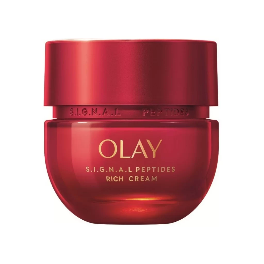
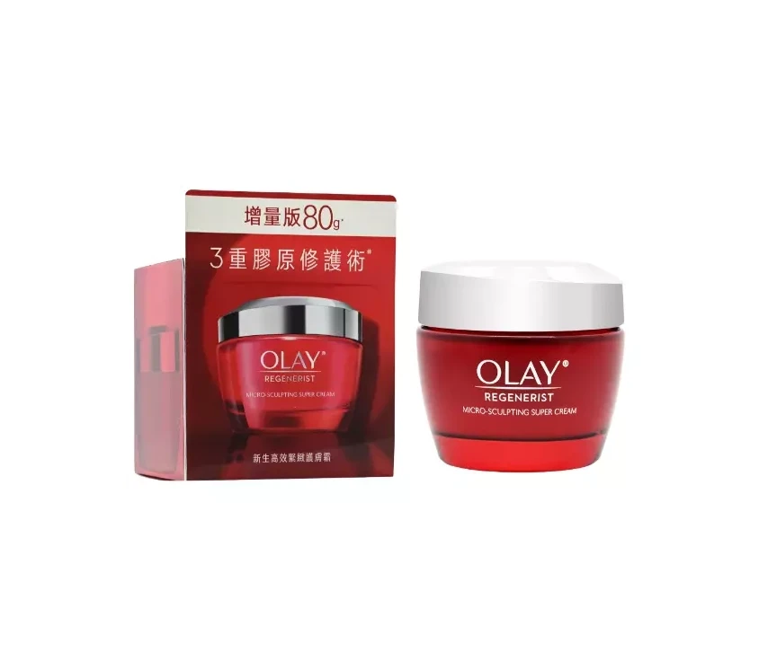
The visual distinction lies in the striking contrast between the vibrant crimson lid of the jar and its soft pink body, a color palette that deviates from standard clinical packaging. This specific iteration utilizes metallic gold typography to elevate the promotional aesthetic, blending celebratory text with product placement. The lighting emphasizes the smooth, matte texture of the containers against the model’s skin, creating a cohesive look that feels both luxurious and approachable.
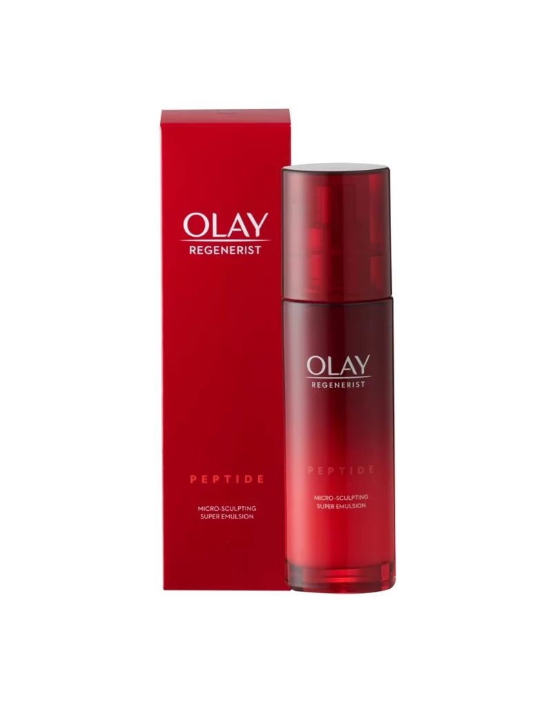
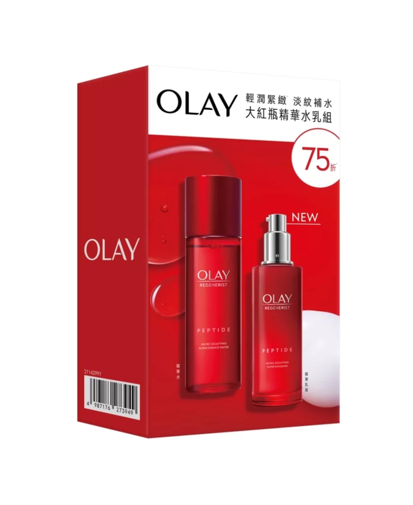
Marketing teams analyzing celebrity endorsement layouts will find value in the balanced integration of text and product within the frame. Packaging designers can study the specific hue relationships between the red cap and pink vessel for future cosmetic line developments. Art directors might reference the spatial arrangement to understand how to effectively position multiple SKUs without cluttering the visual field.