Title

Olay Supercream Broad Spectrum SPF 30 Skincare Packaging


Topics

OlaySkincare

Details

Uploaded user: Leo

A translucent glass jar with a rounded, bulbous silhouette displays an iridescent gradient shifting from soft rose to pale lavender, accented by a thin metallic rose-gold band encircling the shoulder and a matching pink threaded rim. A thick, sculpted dollop of white cream sits prominently on the opening, while dark charcoal typography spells out 'OLAY Super CREAM WITH SUNSCREEN BROAD SPECTRUM SPF 30' across the front, with 'NET WT 50 g (1.7 OZ)' printed at the base. The vessel stands on a clean white surface that allows the pastel hues and reflective surfaces of the packaging to remain the central focus.
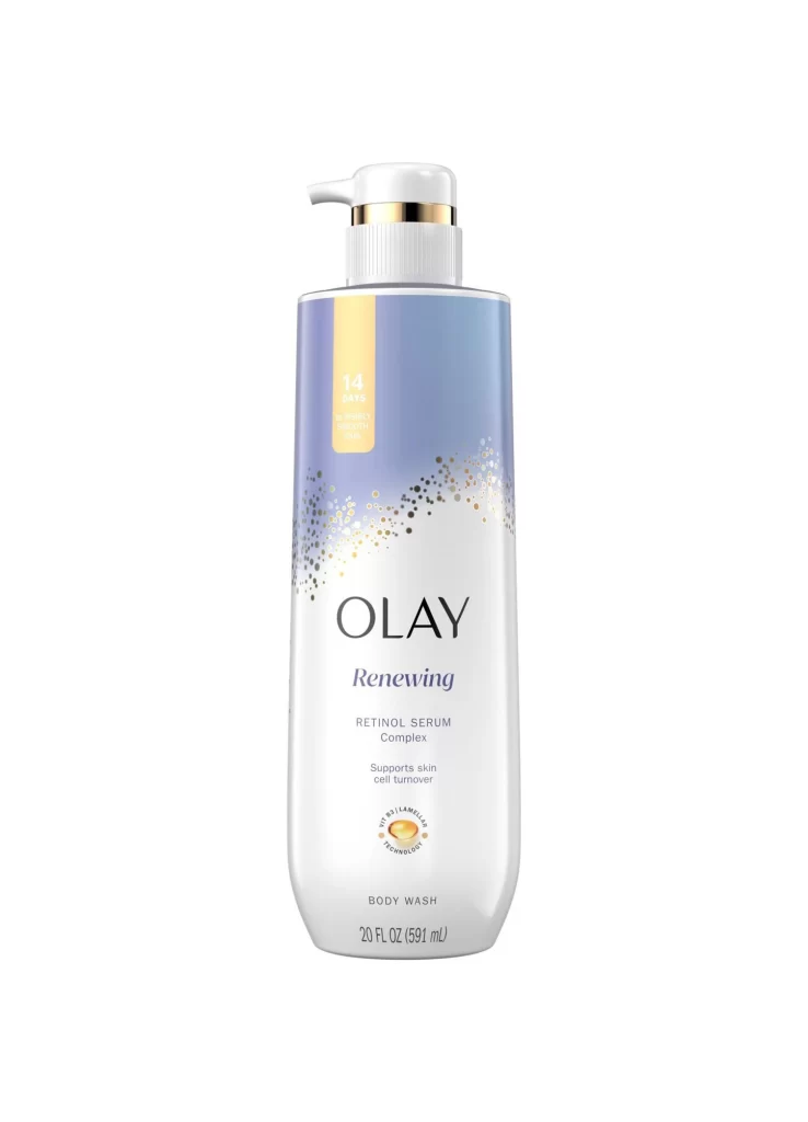
Visual distinction arises from the interplay between the ethereal, oil-slick sheen of the glass and the substantial, tactile presence of the product peeking over the edge. The typographic hierarchy balances the authoritative weight of the brand name with the fluid, handwritten motion of the word ‘Super,’ suggesting both scientific reliability and sensory luxury. Subtle studio lighting catches the metallic trim and the glossy texture of the cream, emphasizing the premium quality of the container’s finish.

Product photographers might utilize this composition to study how to effectively stage viscous textures without obscuring label information. Packaging engineers could examine the specific proportions of the jar’s curvature and the placement of decorative bands relative to the text block. Marketing teams analyzing competitive skincare aesthetics will find value in the specific color palette and font pairings used to convey sun protection benefits.