Title

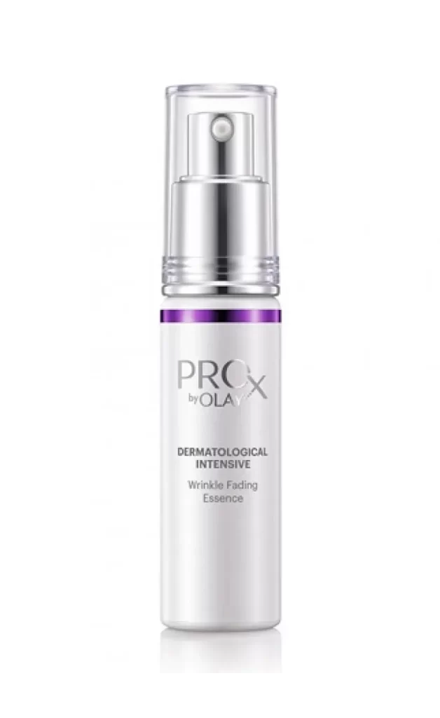
Olay PROX by Olay NIA-SEPI-TXA AB5D Skincare Packaging


Topics

OlaySkincare

Details

Uploaded user: Leo

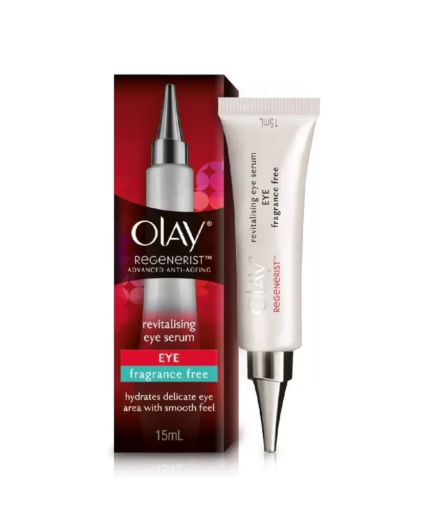
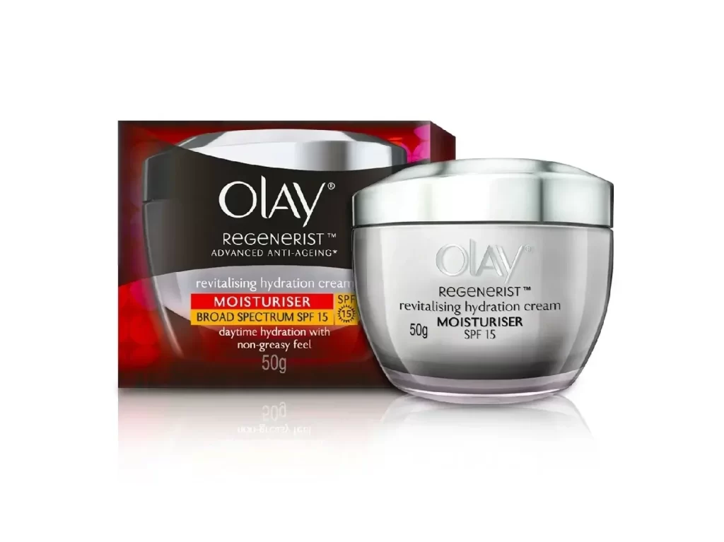
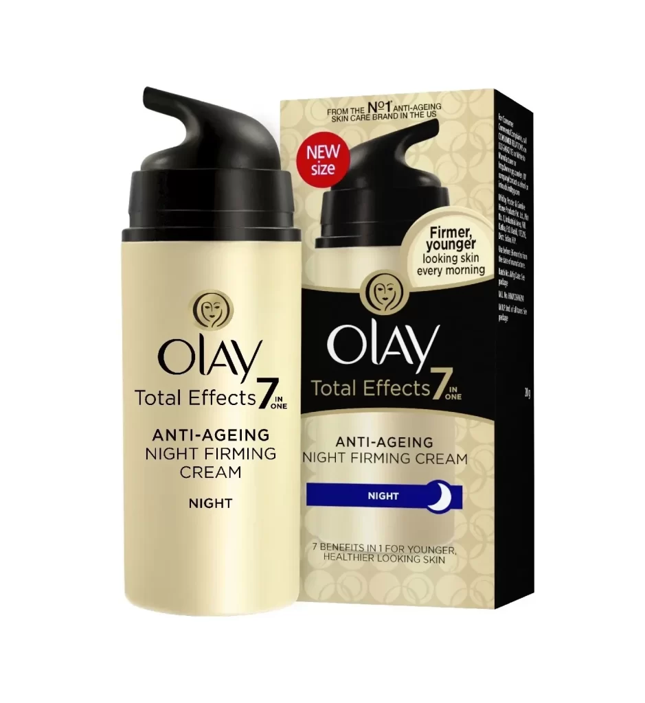
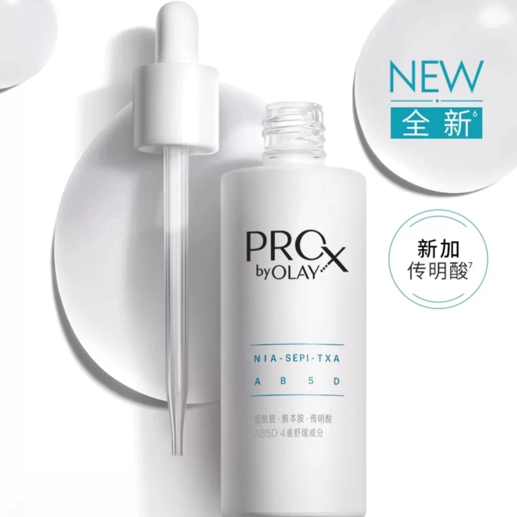
A cylindrical white bottle with a transparent glass dropper stands on a white surface, its label featuring 'PROX by OLAY' in bold black typography above the teal alphanumeric string 'NIA-SEPI-TXA AB5D'. Soft, diffused lighting casts subtle shadows beneath the objects while circular graphic overlays in teal and blue announce 'NEW' and additional product information.

Visual hierarchy is established through the stark contrast between the matte bottle surface and the glossy liquid textures implied by the background shapes. The integration of bilingual text elements—English branding paired with Mandarin descriptors—suggests a localized market strategy that balances global identity with regional specificity. Minimalist aesthetics dominate, utilizing negative space to emphasize the scientific nomenclature and the clean, medical-grade appearance of the dropper mechanism.

Brand strategists might analyze this layout to understand how pharmaceutical visual cues are adapted for consumer skincare marketing. Packaging engineers could study the spatial relationship between the vessel and the applicator to optimize similar product presentations. Marketing teams developing cross-regional campaigns would find value in examining how typographic weight and color coding direct attention toward key ingredient claims.