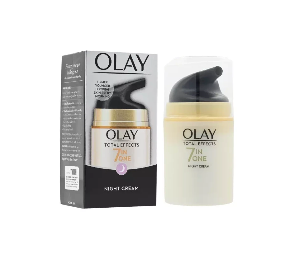
Olay S.I.G.N.A.L PEPTIDES Skincare Packaging
Topics
Details
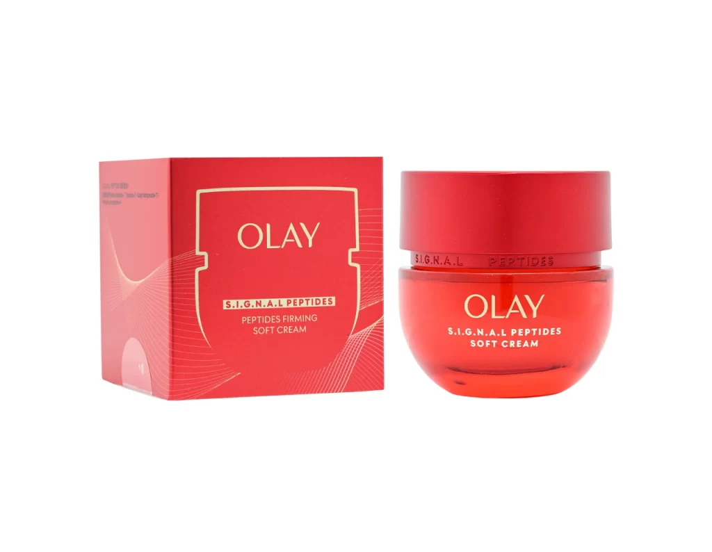
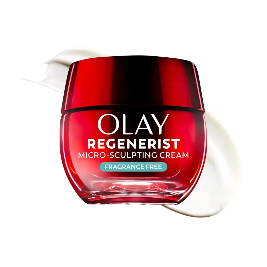
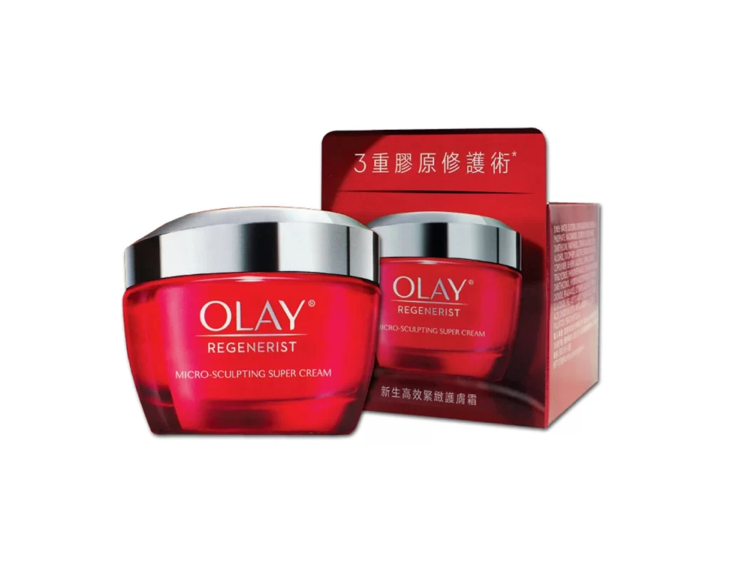
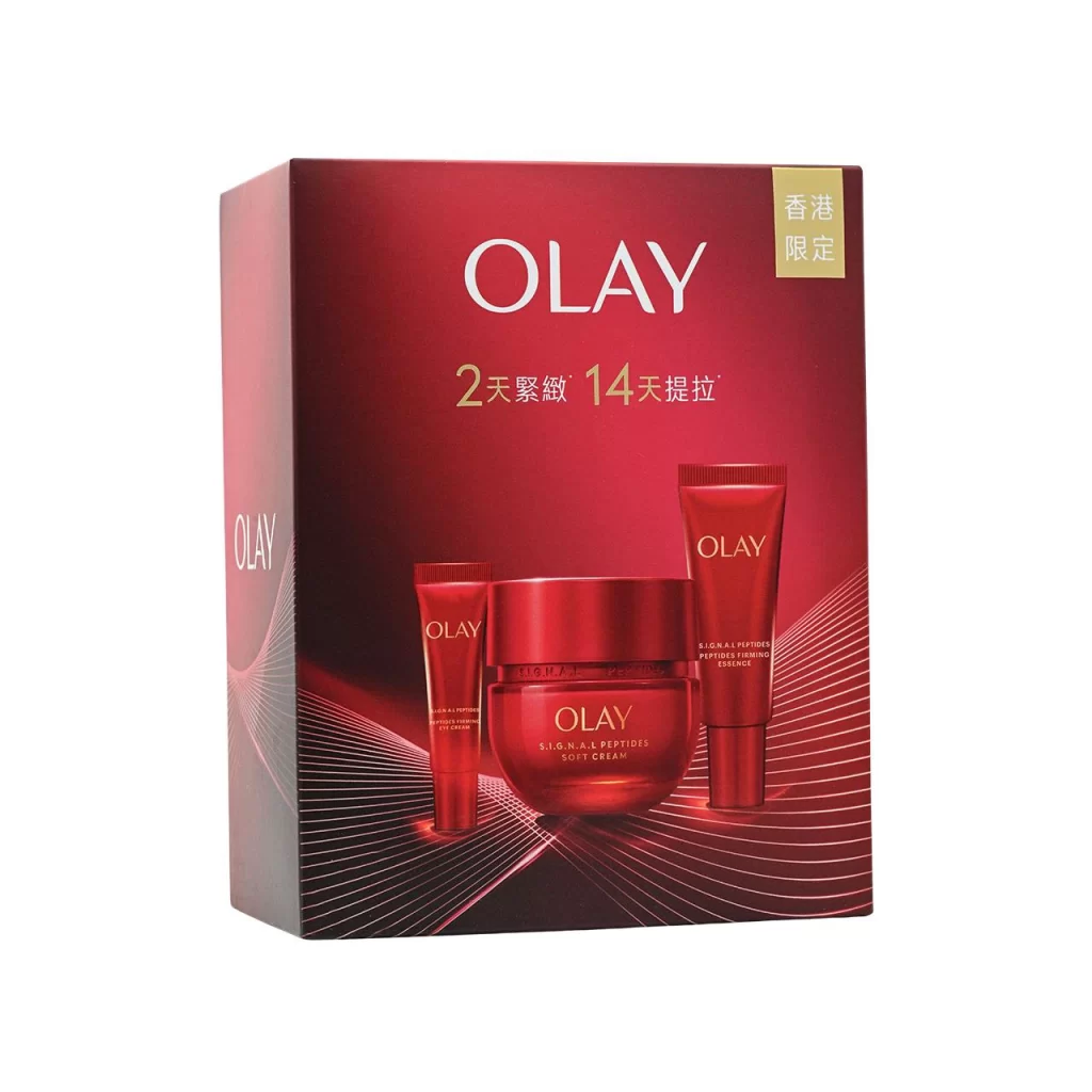
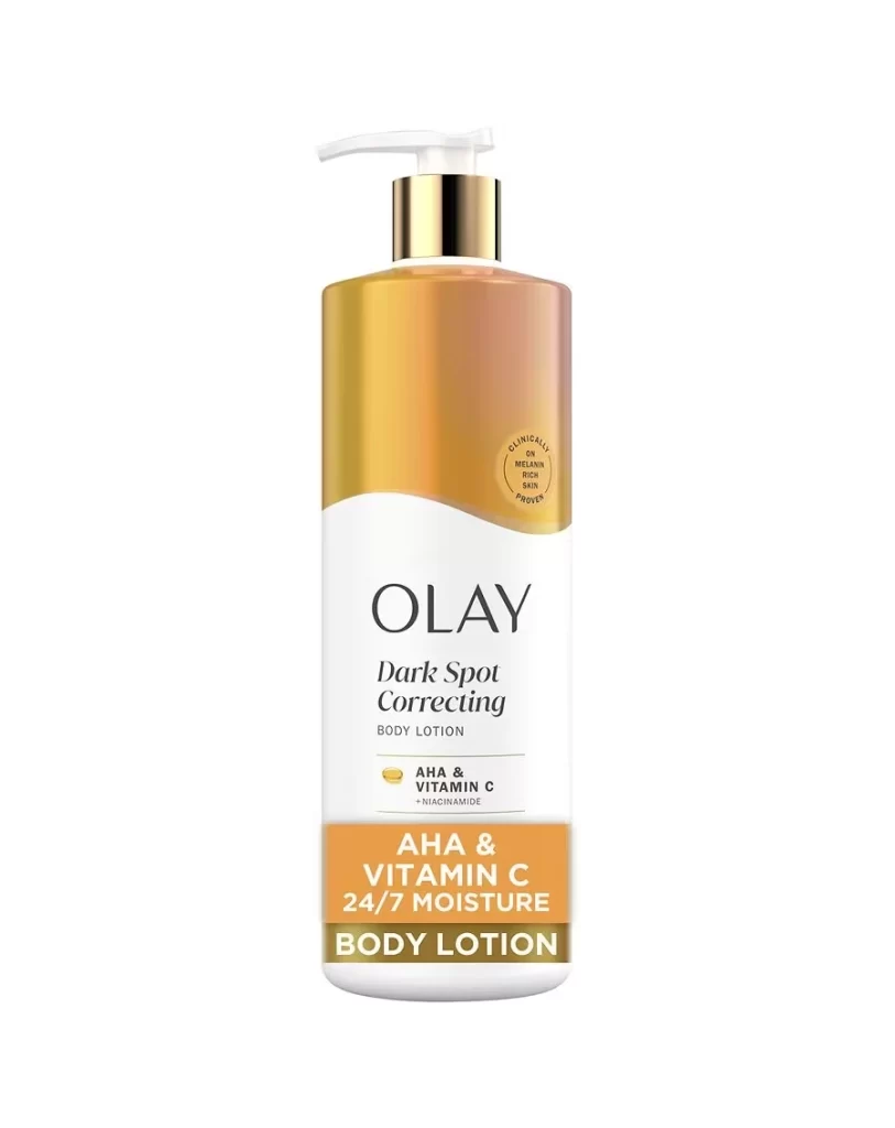
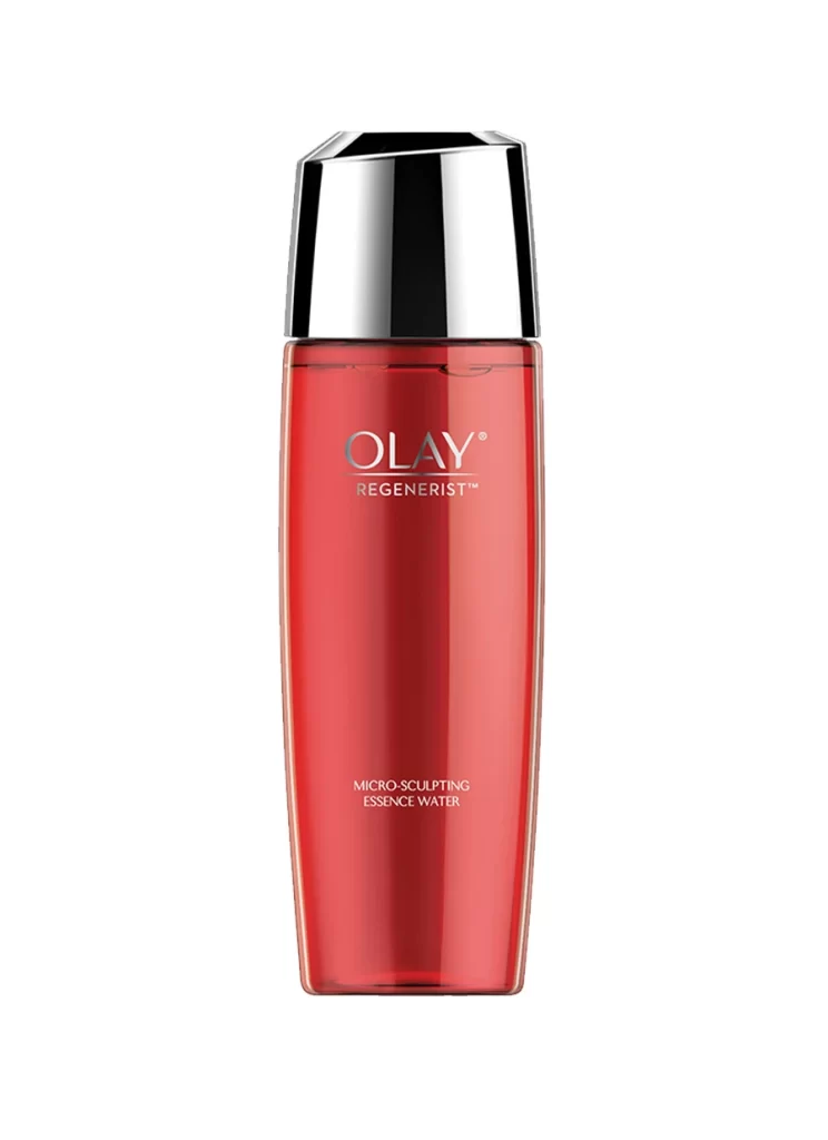
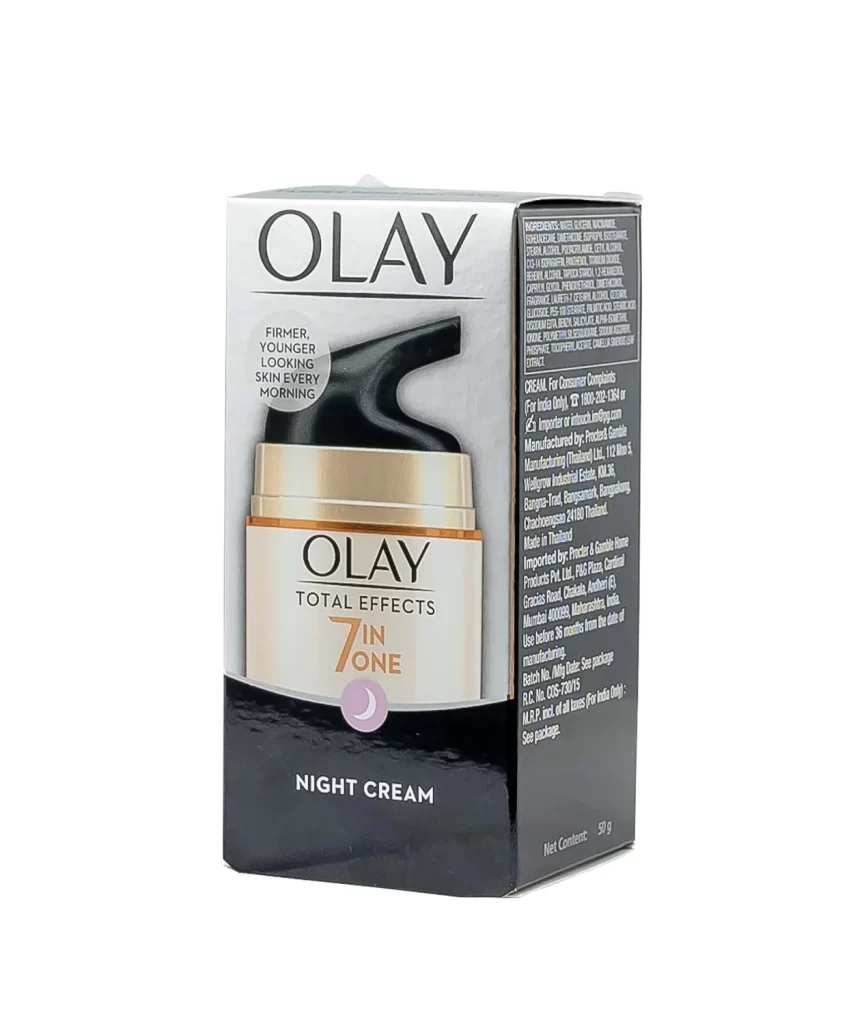
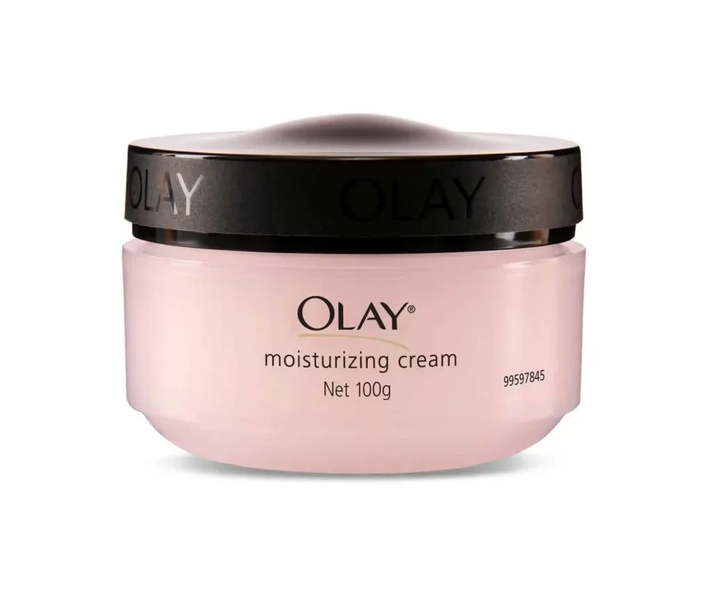
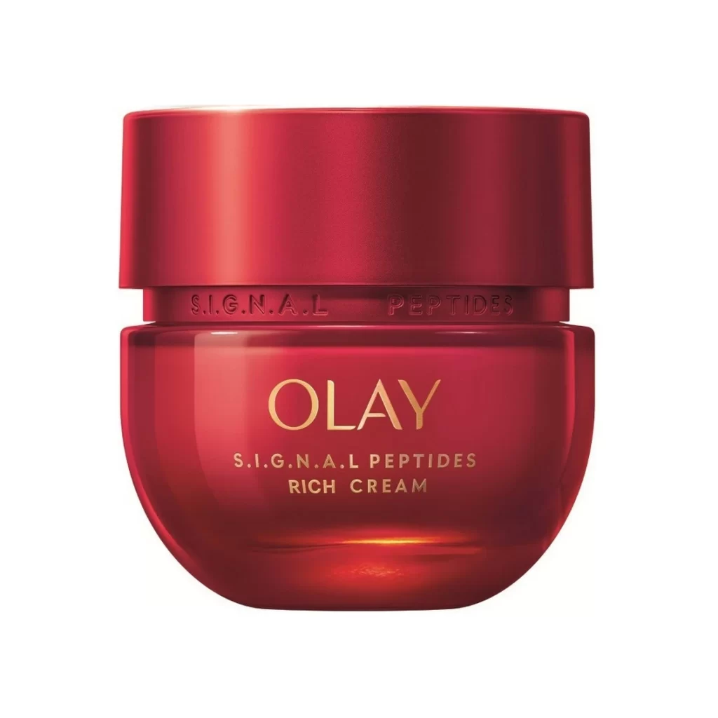
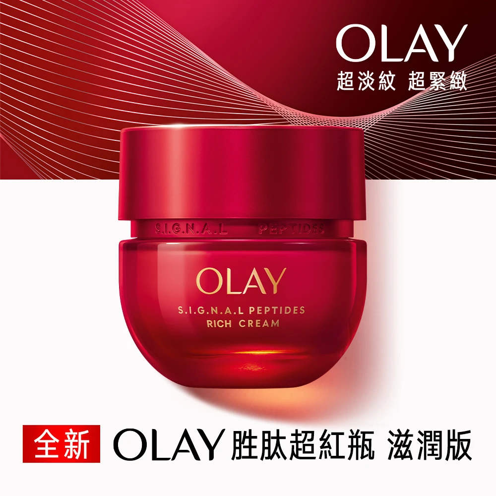
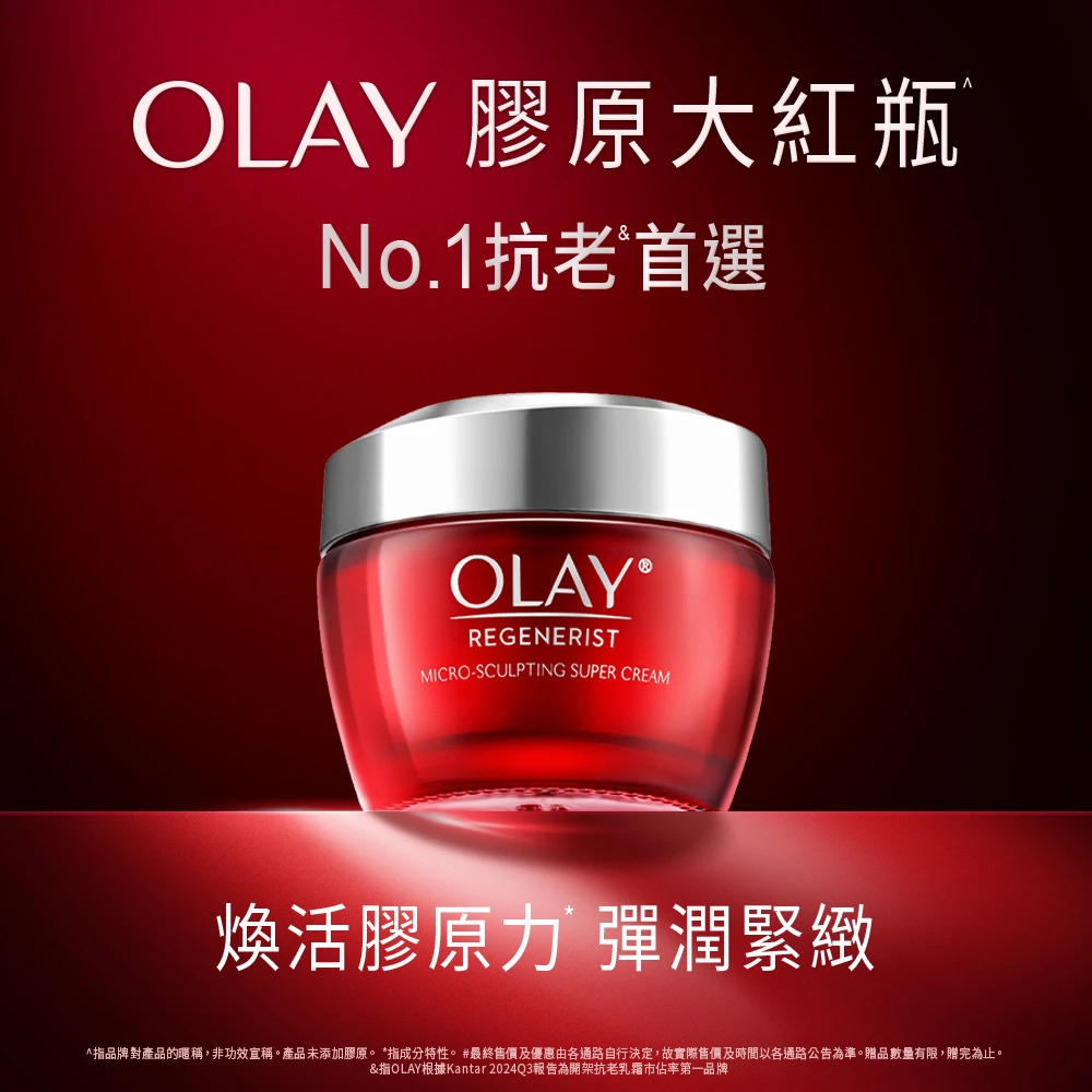
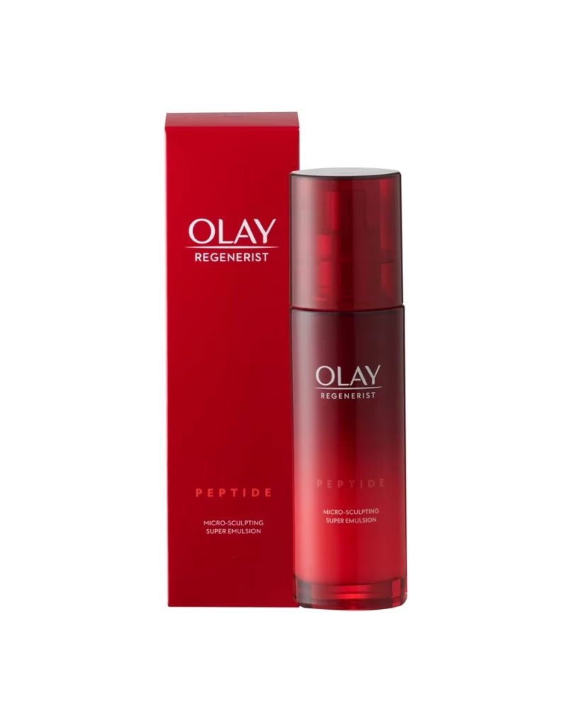
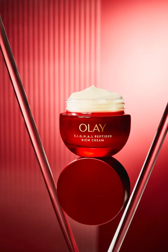
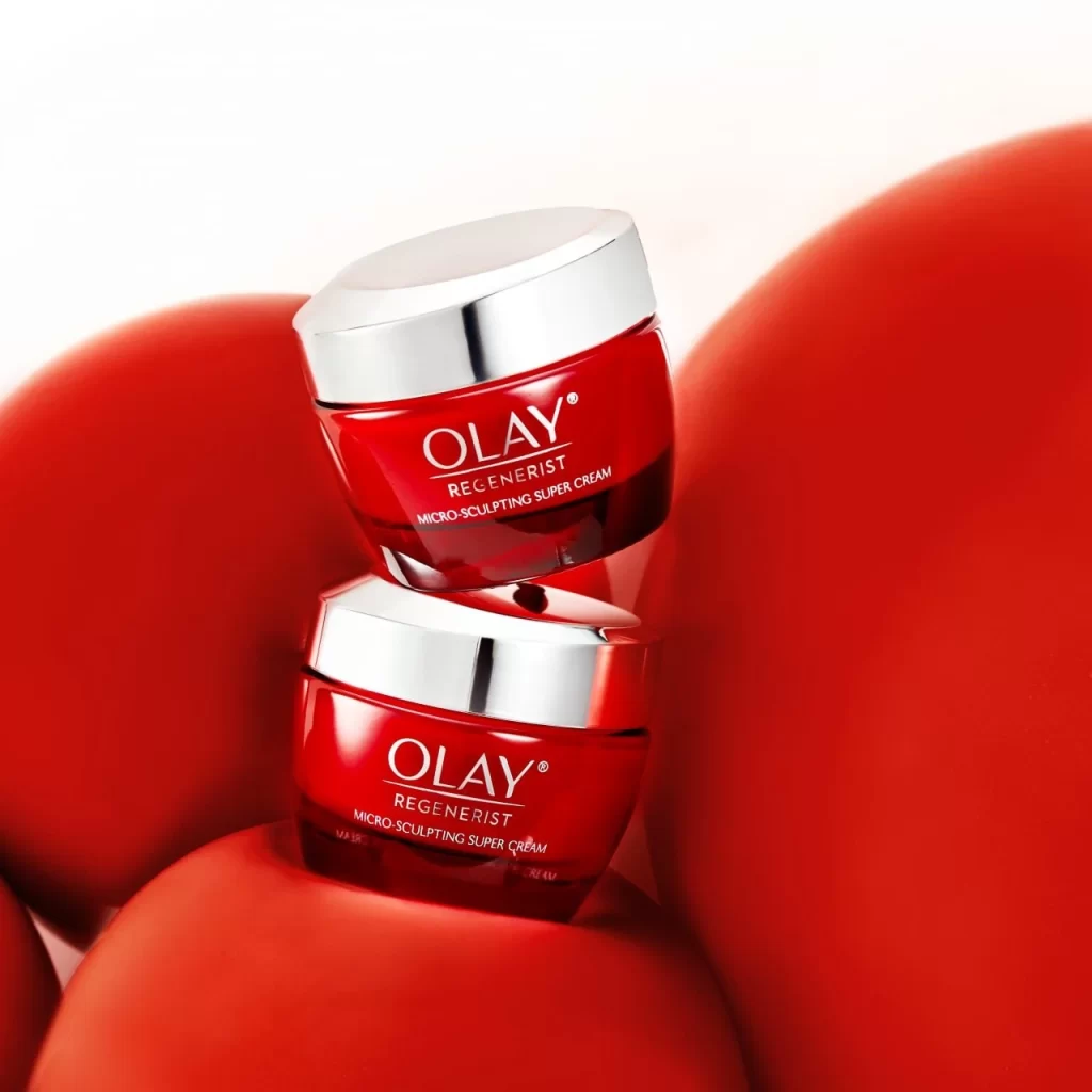
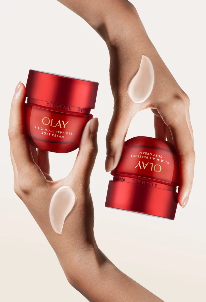
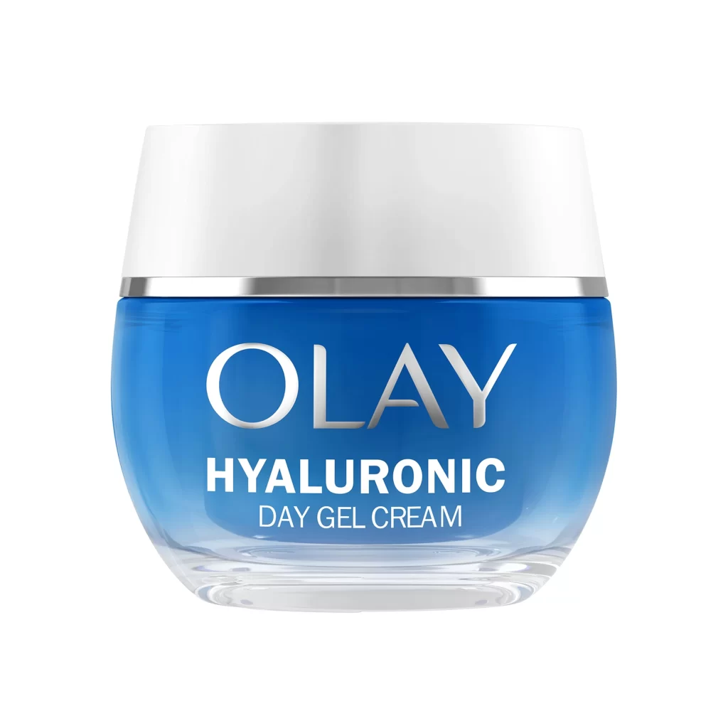
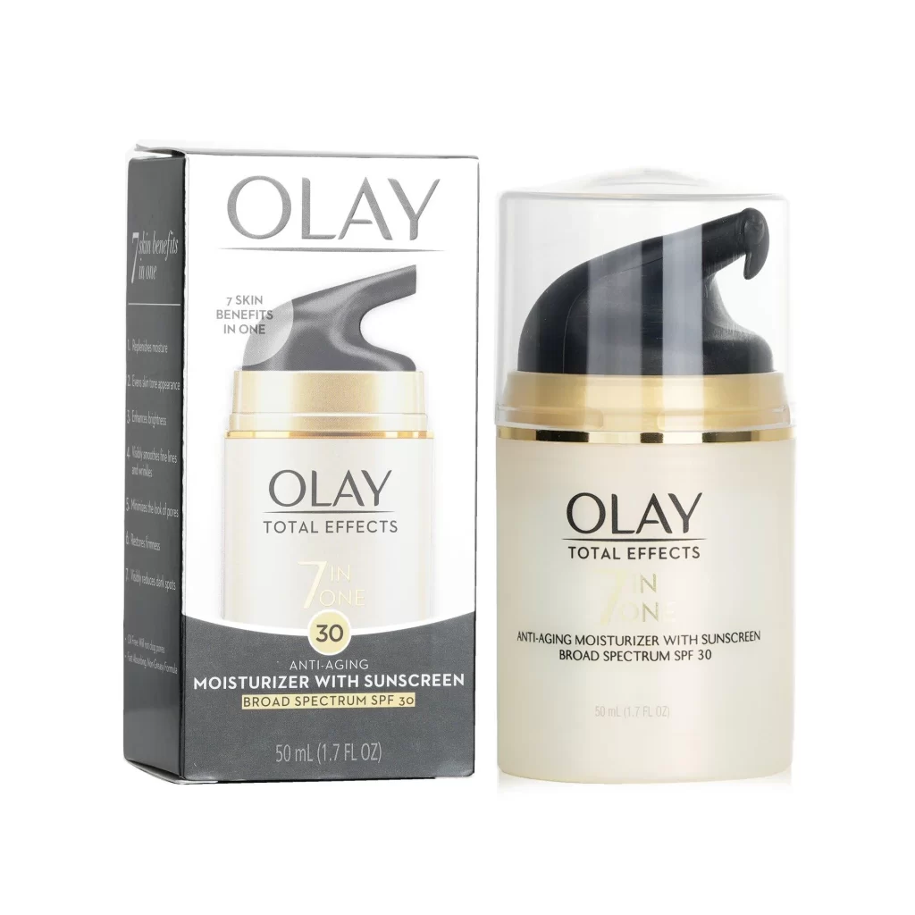
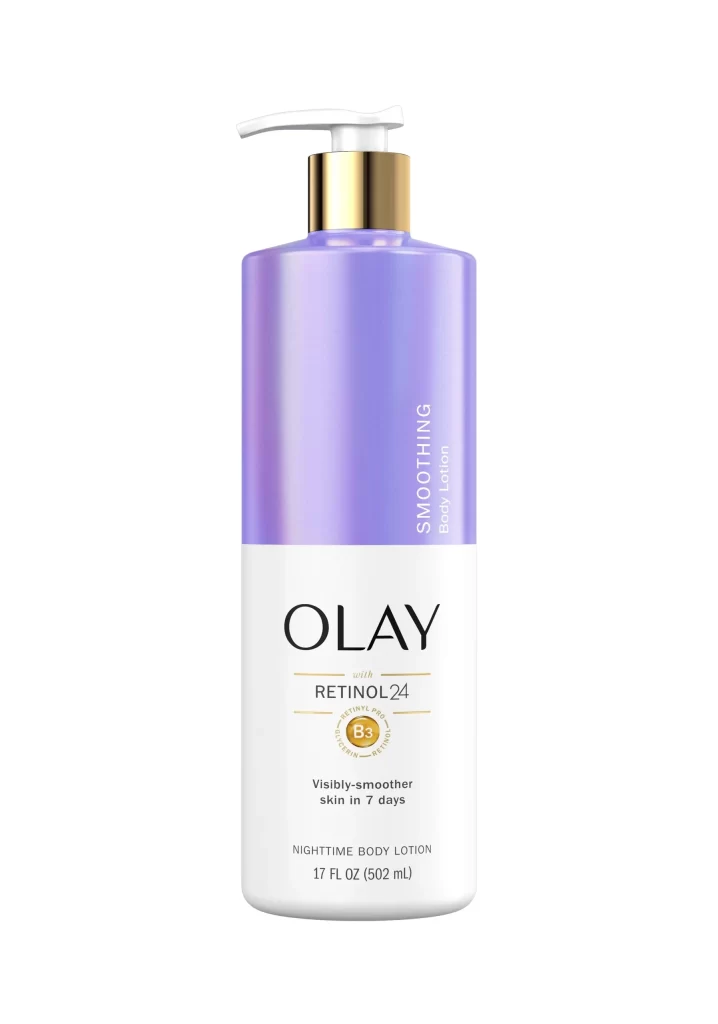
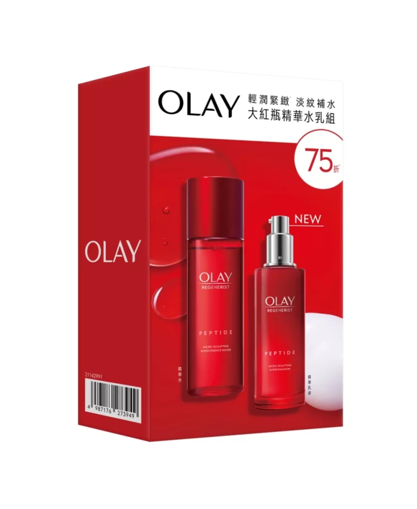
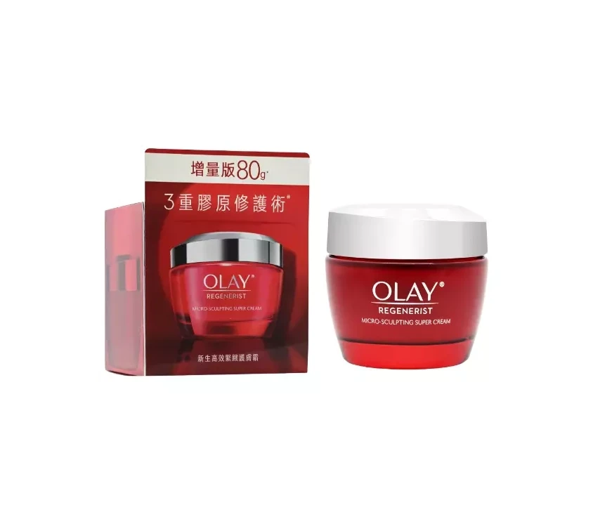
Saturated crimson defines the Olay S.I.G.N.A.L Peptides packaging, enveloping both the rectangular carton and the rounded jar in a bold monochromatic statement. Metallic gold typography spells out the brand name and product line across the matte box surface, while the translucent glass vessel reveals the soft cream within. Soft studio lighting accentuates these material contrasts—matte versus glossy, opaque versus transparent—against a clean white backdrop.
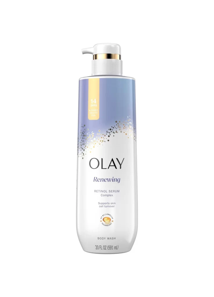
Visual distinction arises from the interplay between the rigid geometry of the outer carton and the organic curvature of the inner container. Gold line-art detailing on the box suggests structural integrity or scientific precision, contrasting sharply with the bold, sans-serif lettering of the product name. This specific iteration relies on a limited palette to convey premium positioning, using the reflective properties of the lid’s band to break the solid red mass and guide the viewer’s eye toward the key ingredient claims.
Brand strategists might utilize this visual data to analyze how color psychology influences consumer perception of anti-aging efficacy. Packaging engineers could examine the spatial relationship between the primary and secondary containers to optimize shelf presence. Furthermore, retail merchandisers would benefit from studying the legibility of the typographic hierarchy when planning point-of-sale displays for crowded cosmetic aisles.