Title

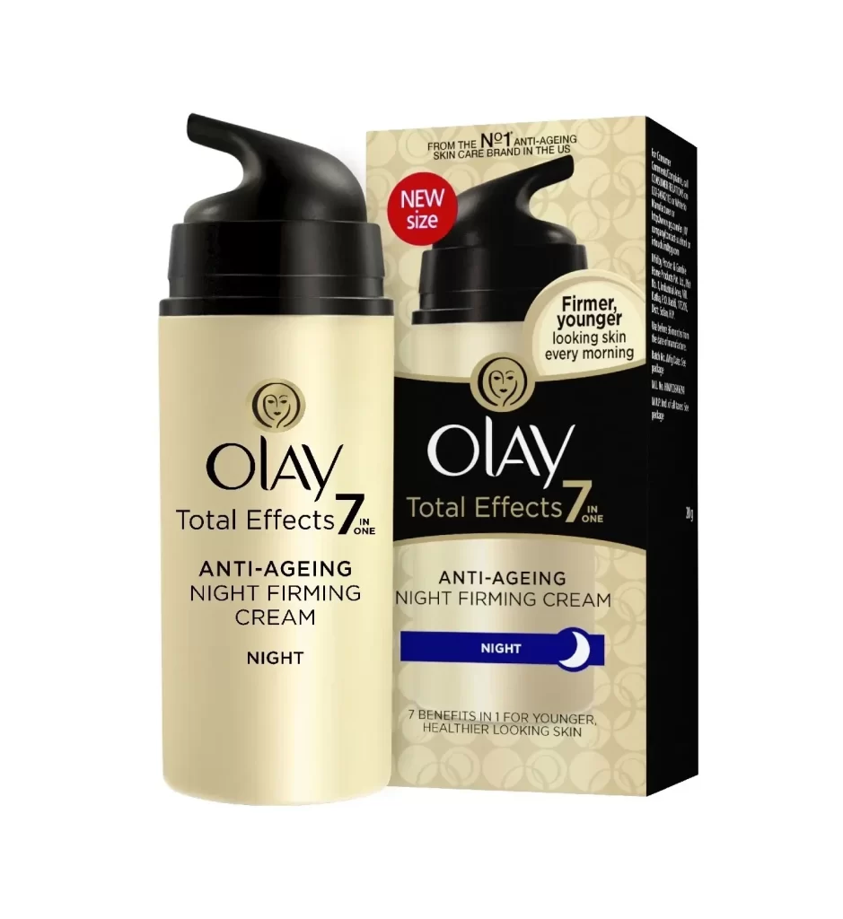
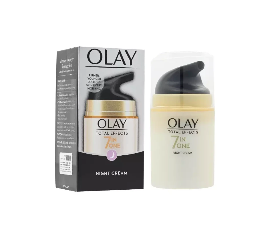
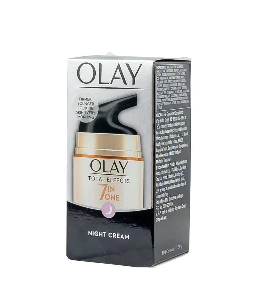
Olay Total Effects 7 in One Night Cream Box Packaging


Topics

OlaySkincare

Details

Uploaded user: Leo

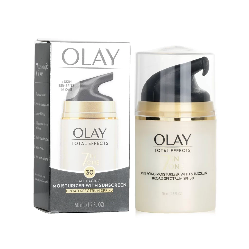
The Olay Total Effects 7 in One Night Cream box stands upright on a white surface, presenting a direct frontal view of its packaging design. A sophisticated color palette divides the container into a crisp white upper section and a matte black lower half, with a subtle gradient bridging the two zones. Dominating the front face is a prominent product image displaying a cream-colored jar accented by a gold band.
Visual hierarchy is established through the strategic use of scale and color contrast, particularly with the large orange numeral ‘7’ that anchors the ‘7 IN ONE’ claim. A small purple crescent moon icon sits beneath this text, immediately signaling the product’s nocturnal purpose without relying solely on the ‘NIGHT CREAM’ label printed at the bottom. The side panel reveals dense typographic information regarding ingredients and manufacturing details, demonstrating how regulatory text is integrated into the overall aesthetic without disrupting the clean front-of-pack design.

Brand managers analyzing competitive skincare packaging will find this example useful for studying how to balance premium aesthetics with functional information density. Packaging engineers can examine the structural layout of the side panels to understand standard placement for legal disclaimers and net weight declarations. Retail merchandisers might utilize this visual to plan shelf arrangements, noting how the high-contrast black and white scheme ensures visibility in various lighting conditions.