Title

Olay PROX Wrinkle Fading Skincare Packaging


Topics

OlaySkincare

Details

Uploaded user: Leo

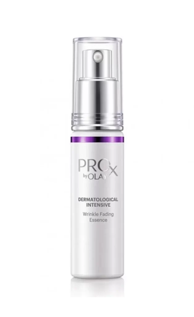
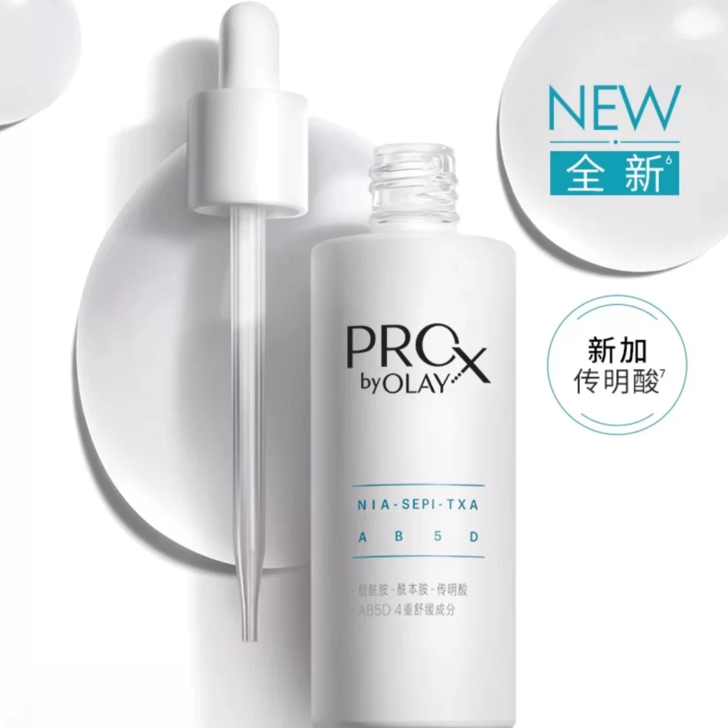
A cylindrical white bottle stands upright, crowned by a multi-tiered silver pump mechanism with a clear plastic cap. A singular purple band encircles the upper shoulder of the vessel, providing the only chromatic deviation from the otherwise monochromatic scheme. The front face displays 'PROX by OLAY' in bold silver lettering above the smaller text 'DERMATOLOGICAL INTENSIVE' and 'Wrinkle Fading Essence', all set against a white background.
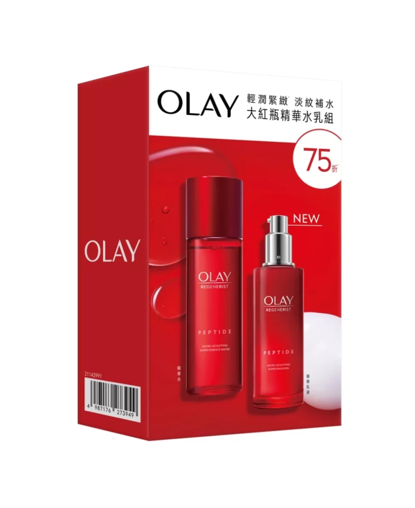
Visual hierarchy is established through the stark contrast between the matte white substrate and the metallic pump assembly, which suggests clinical precision and premium quality. That thin purple accent serves as a critical branding anchor, drawing the eye upward while subtly differentiating this specific formulation within a broader product line. Typography remains restrained and sans-serif, reinforcing a modern, scientific aesthetic that appeals to consumers seeking dermatological efficacy.

Brand strategists might analyze this composition to understand how minimal color palettes convey trustworthiness in the anti-aging market segment. Packaging engineers could study the structural relationship between the pump housing and the bottle neck to inform future dispenser designs. Marketing teams would benefit from examining how the placement of the purple band creates immediate visual recognition without overwhelming the clean, medical-grade presentation.