Title

Olay ACTIVE HYDRATING Original Skincare Packaging


Topics

OlaySkincare

Details

Uploaded user: Leo

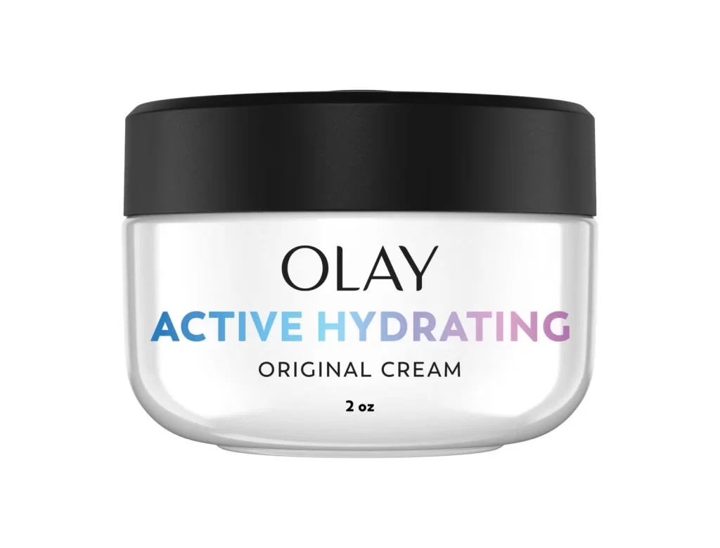
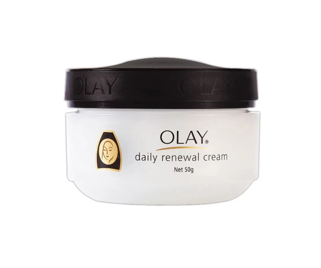
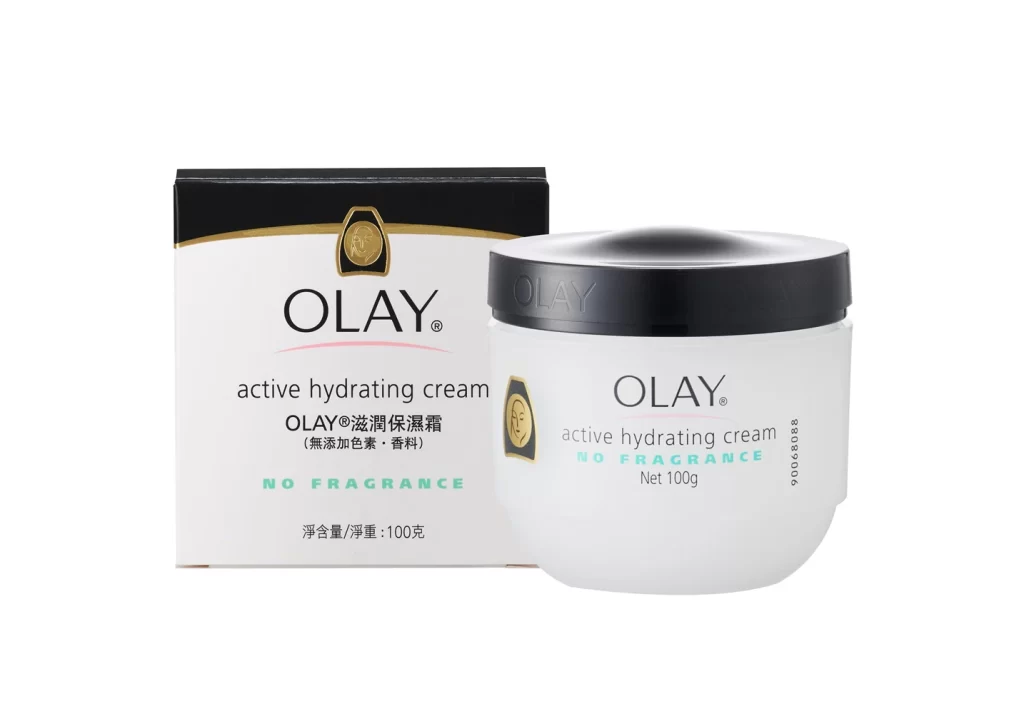
A semi-opaque white cylindrical jar supports a wide, flat black lid that creates a bold horizontal band across the upper third of the container. The typography is precisely arranged: 'OLAY' appears in a clean black serif font above the product name, which transitions through a blue-to-purple gradient reading 'ACTIVE HYDRATING,' with 'ORIGINAL CREAM' and '2 oz' printed in smaller black text beneath. The entire object sits on a white surface, emphasizing the contrast between the dark cap and the light body.

Visual interest derives primarily from the sophisticated color treatment applied to the central text. By utilizing a linear gradient that shifts from cool cyan to soft lavender, the branding breaks away from traditional monochrome cosmetic labeling. This choice introduces a modern, almost digital aesthetic to an otherwise classic silhouette. The high contrast between the matte black cap and the bright body further emphasizes the product’s structural simplicity and legibility.
Brand strategists might examine this asset to understand how gradient applications affect consumer perception of moisture and freshness. Packaging engineers could utilize the proportions to draft specifications for similar wide-mouth containers. Additionally, color theorists will find value in analyzing how the specific blue-purple spectrum interacts with neutral backgrounds to create visual hierarchy without overwhelming the primary logo.