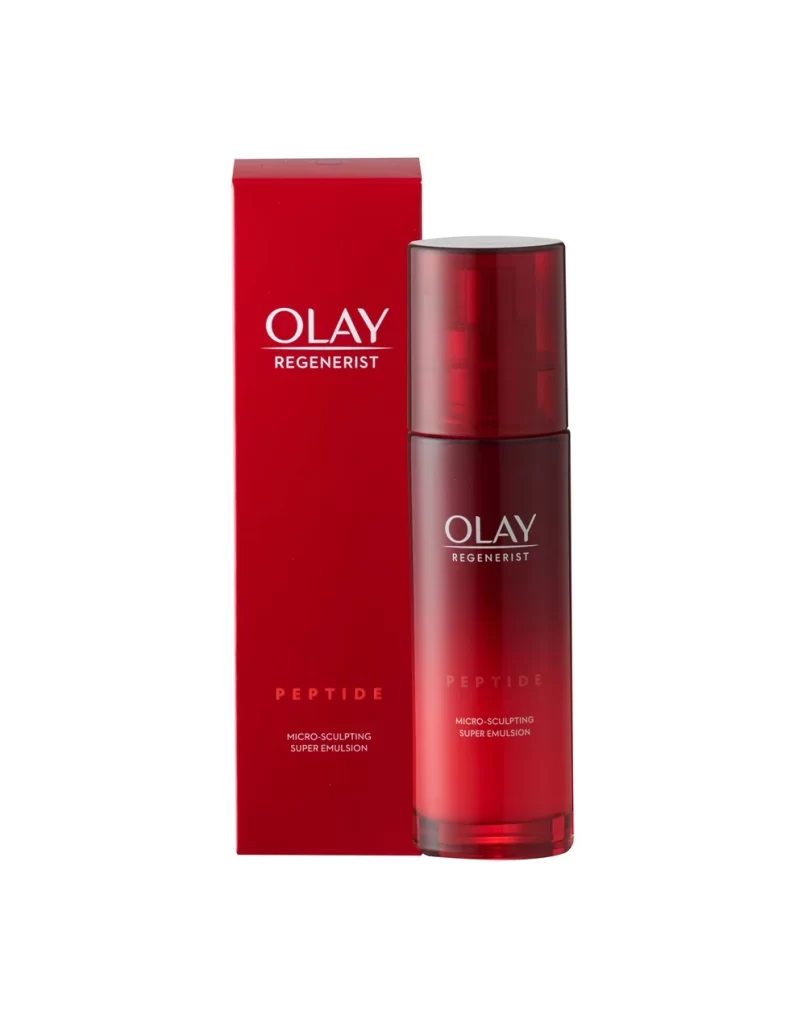
Olay Regenerist Peptide Micro Sculpting Emulsion Packaging
Topics
Details
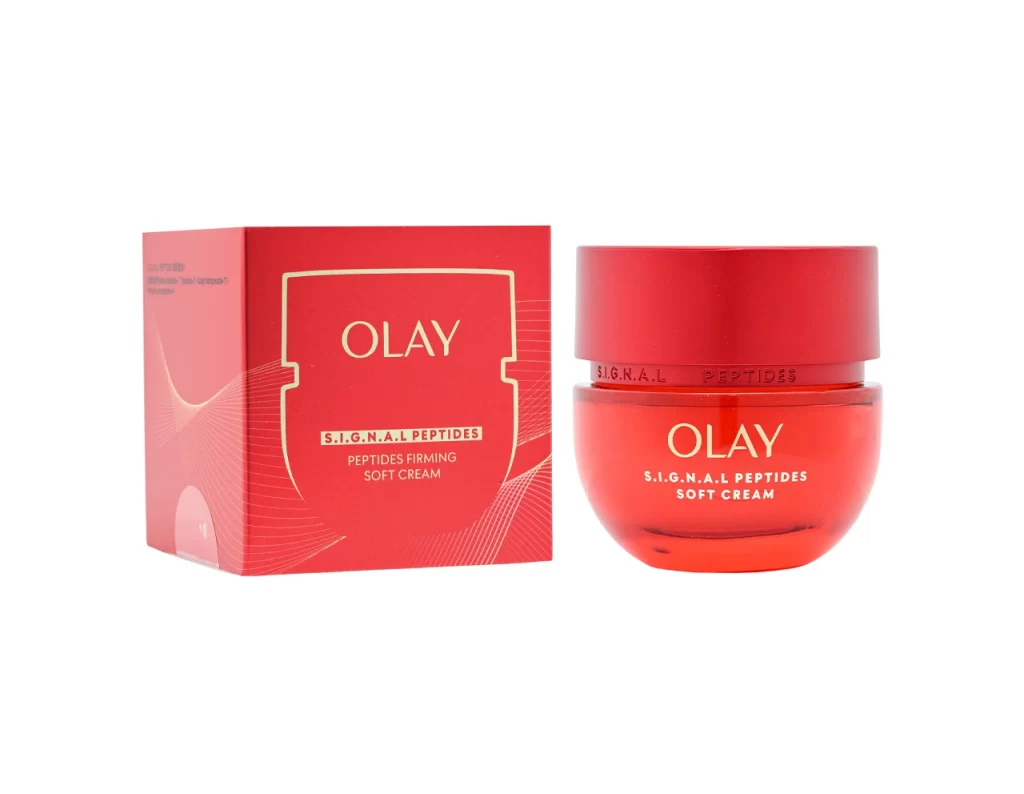
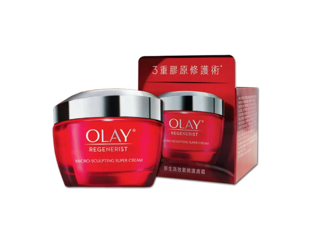
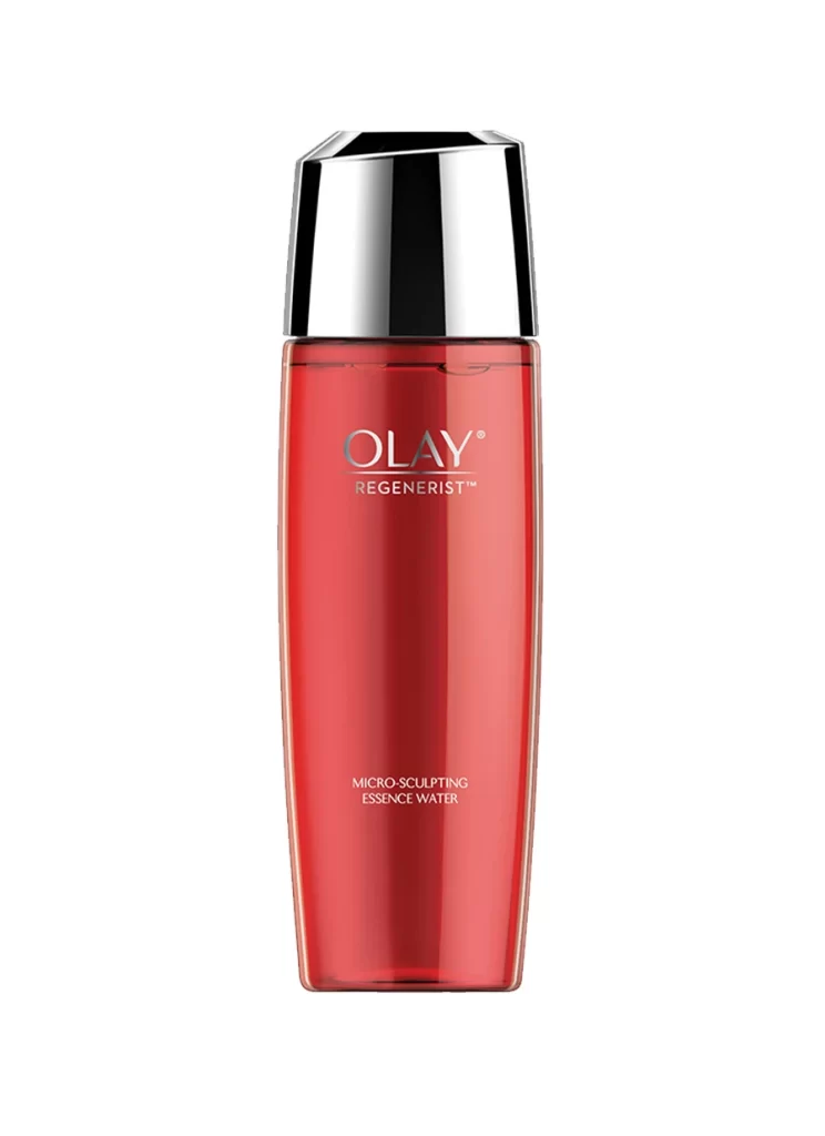
A cylindrical bottle with a translucent deep red body and a darker crimson cap stands to the right of its matching rectangular box, both featuring crisp white typography for the brand name Olay Regenerist. The word PEPTIDE appears in red lettering below the branding, with MICRO-SCULPTING SUPER EMULSION printed in smaller white text beneath it on both the bottle and the packaging. The product pair sits on a clean white surface in a straightforward front-facing view.
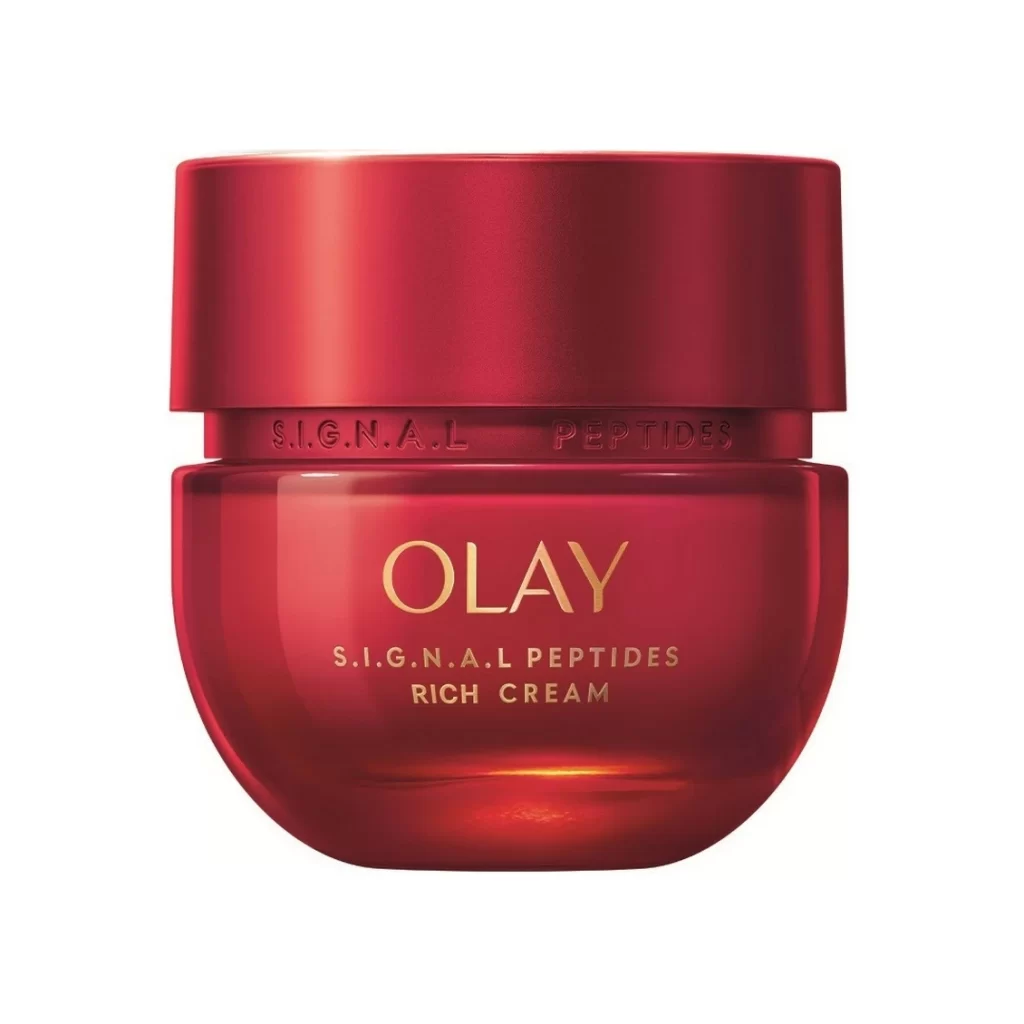
The visual identity relies heavily on a monochromatic red palette that conveys energy and premium anti-aging efficacy. By utilizing a gradient effect on the bottle’s plastic surface, the packaging creates depth and a sense of liquid luxury without the cost of glass. This cohesive color strategy ensures immediate shelf recognition while the minimalist layout keeps the focus on the key ingredient claims.
Brand strategists might analyze this composition to understand how mass-market skincare balances clinical authority with approachable aesthetics. 3D artists could use the soft shadows and material reflections as a benchmark for rendering cosmetic containers realistically. Marketing teams reviewing this reference would likely note how the consistent use of the red gradient ties the physical product experience to its outer packaging.