Title

Olay daily renewal cream Skincare Packaging


Topics

OlaySkincare

Details

Uploaded user: Leo

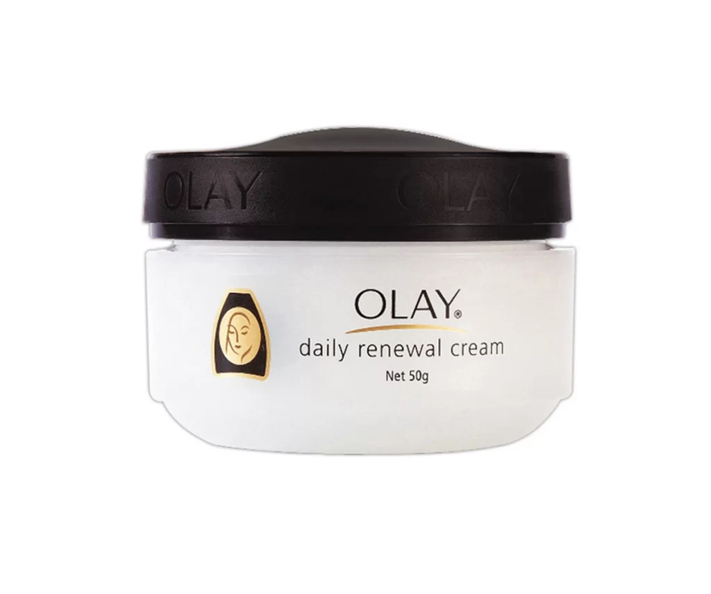
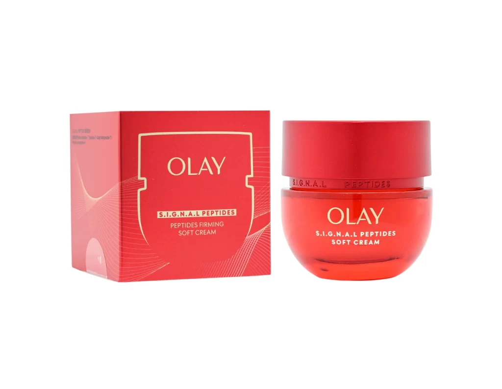
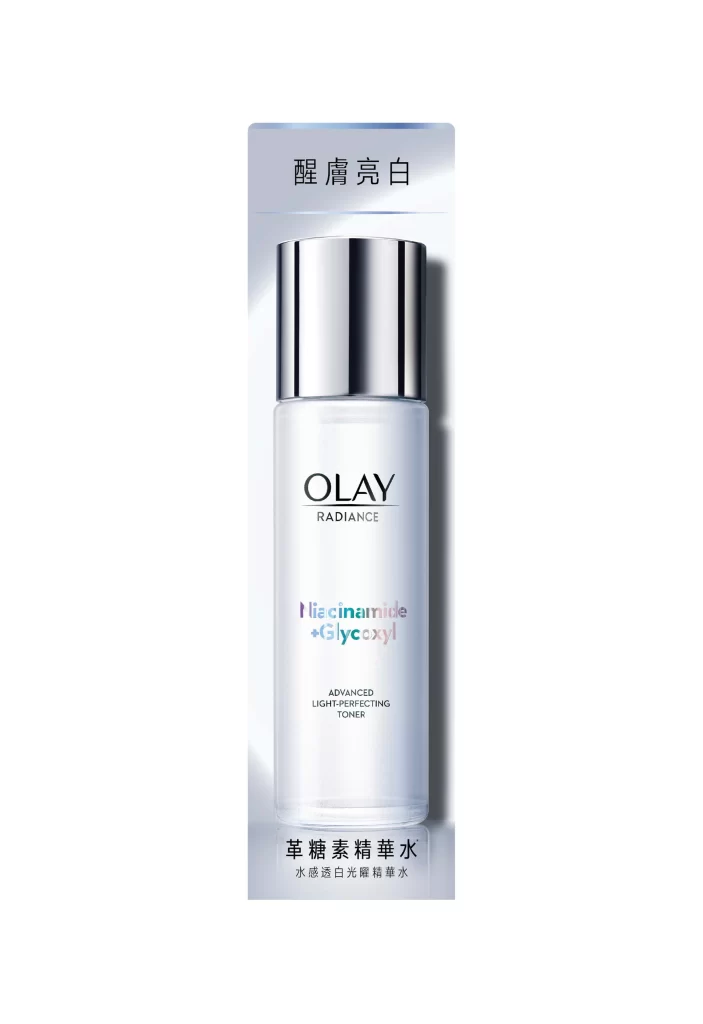
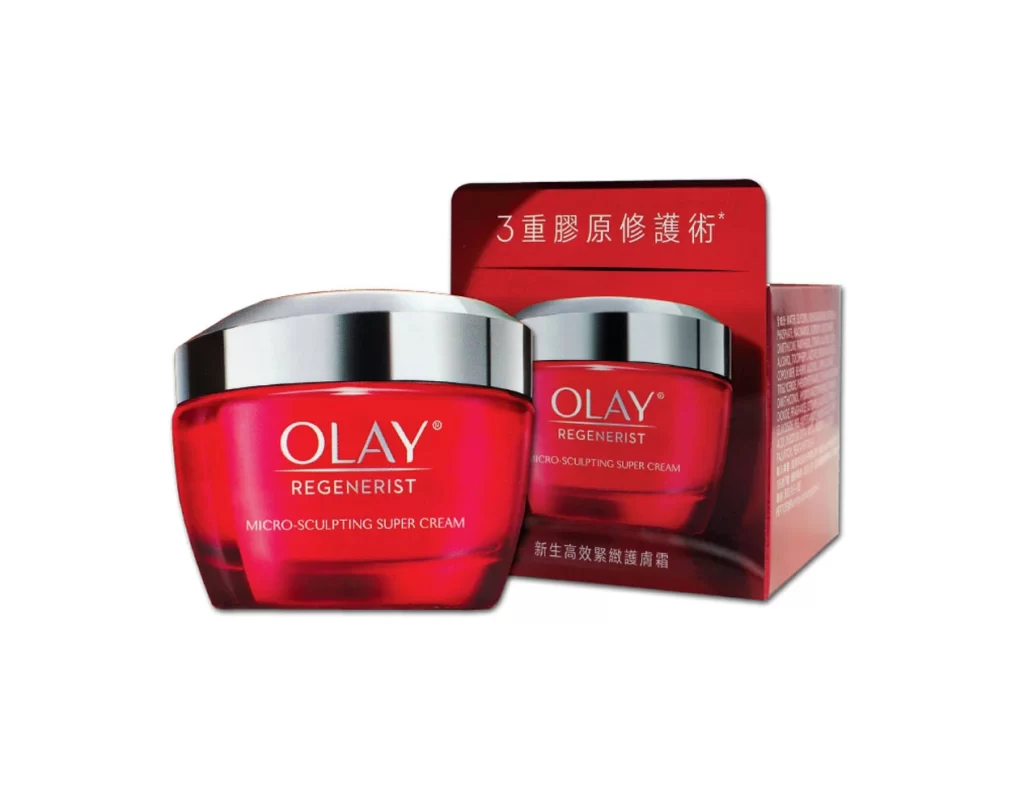
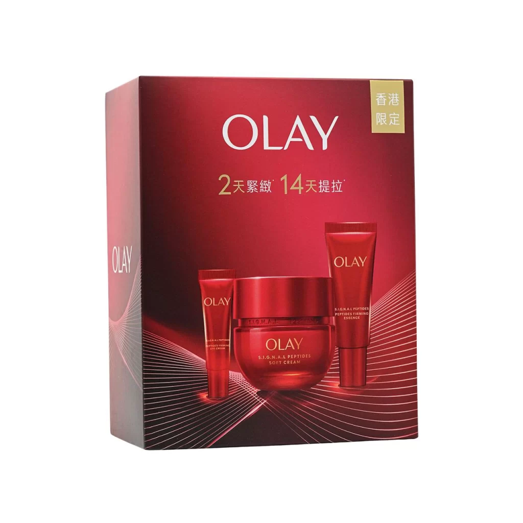
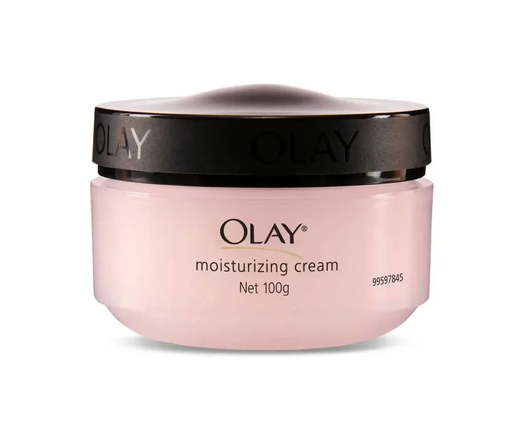
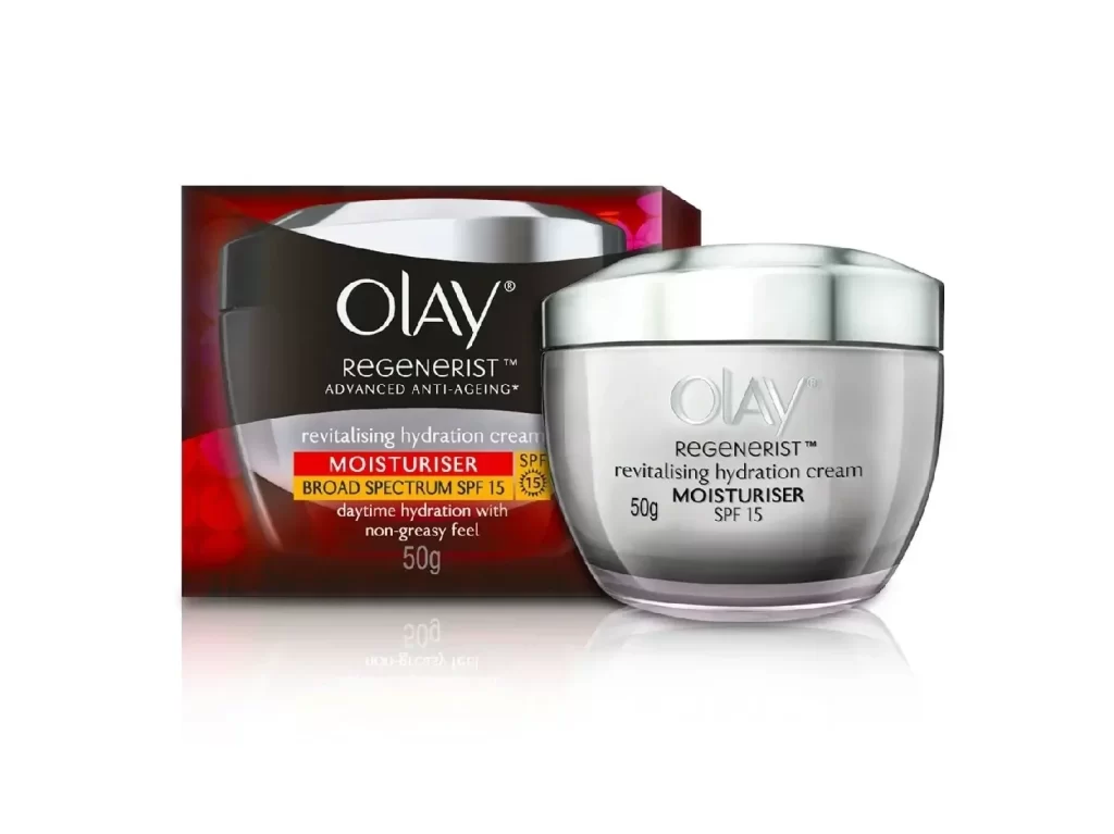
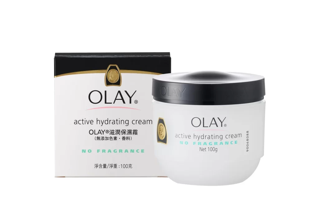
A cylindrical white jar with a slightly flared base supports a wide, matte black lid embossed with the brand name in raised lettering. The front label features the iconic gold and black woman's silhouette logo alongside the product name 'OLAY daily renewal cream' in a clean sans-serif typeface, with the net weight of 50g noted below on a white surface.
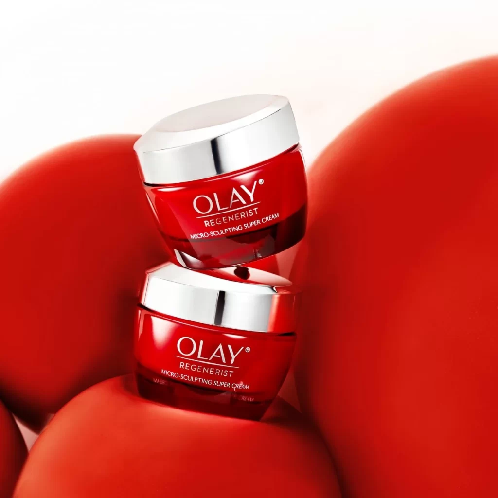
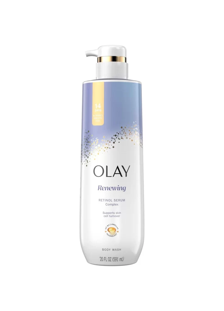
Visual distinction emerges from the deliberate interplay between the opaque black cap and the translucent white body, creating a bold two-tone aesthetic typical of premium skincare lines. The embossed typography on the lid adds tactile dimension that elevates the packaging beyond basic utilitarian design. Balanced asymmetry characterizes the composition, as the left-aligned logo anchors the text block while maintaining generous negative space across the jar’s curved surface.

Product photographers might utilize this reference to master lighting techniques for reflective cosmetic containers without creating glare. Packaging designers could analyze the hierarchy of branding elements and spatial relationships between logo placement and typographic weight. Marketing teams examining competitor positioning would find value in documenting how color blocking communicates product efficacy and market segment within the beauty industry.