PoopyPacks Dog Waste Bags Blue Orange Black Brown Patterned
Topics
Details
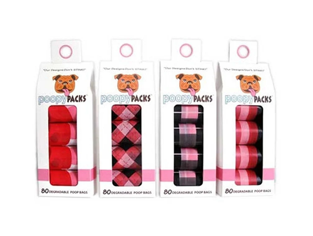
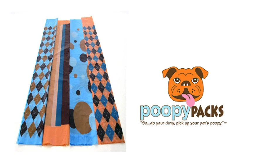
Four elongated plastic waste bags lie flat in a row, displaying a coordinated palette of sky blue, burnt orange, chocolate brown, and charcoal black. The outer bags feature repeating diamond argyle patterns in alternating colorways, while the inner specimens showcase vertical stripes and irregular organic blob shapes. To the right, the PoopyPacks brand identity appears as a cartoon bulldog head with a protruding pink tongue, accompanied by lowercase sans-serif lettering and the tagline "So...do your duty, pick up your pet's poopy" beneath it.
Visual interest derives from the juxtaposition of geometric precision against playful irregularity within a restricted four-color scheme. The argyle motifs introduce a preppy textile aesthetic typically absent from utilitarian pet supplies, while the polka-dot variation adds whimsical contrast. Branding leverages anthropomorphic warmth through the bulldog illustration, softening the functional nature of waste disposal through approachable character design.
Product photographers might study this arrangement to understand how flat-lay compositions effectively display pattern variations across a product line. Packaging designers could reference the color coordination between physical items and logo elements for cohesive brand identity systems. E-commerce merchandisers would benefit from analyzing how multiple SKUs are presented simultaneously without visual clutter.