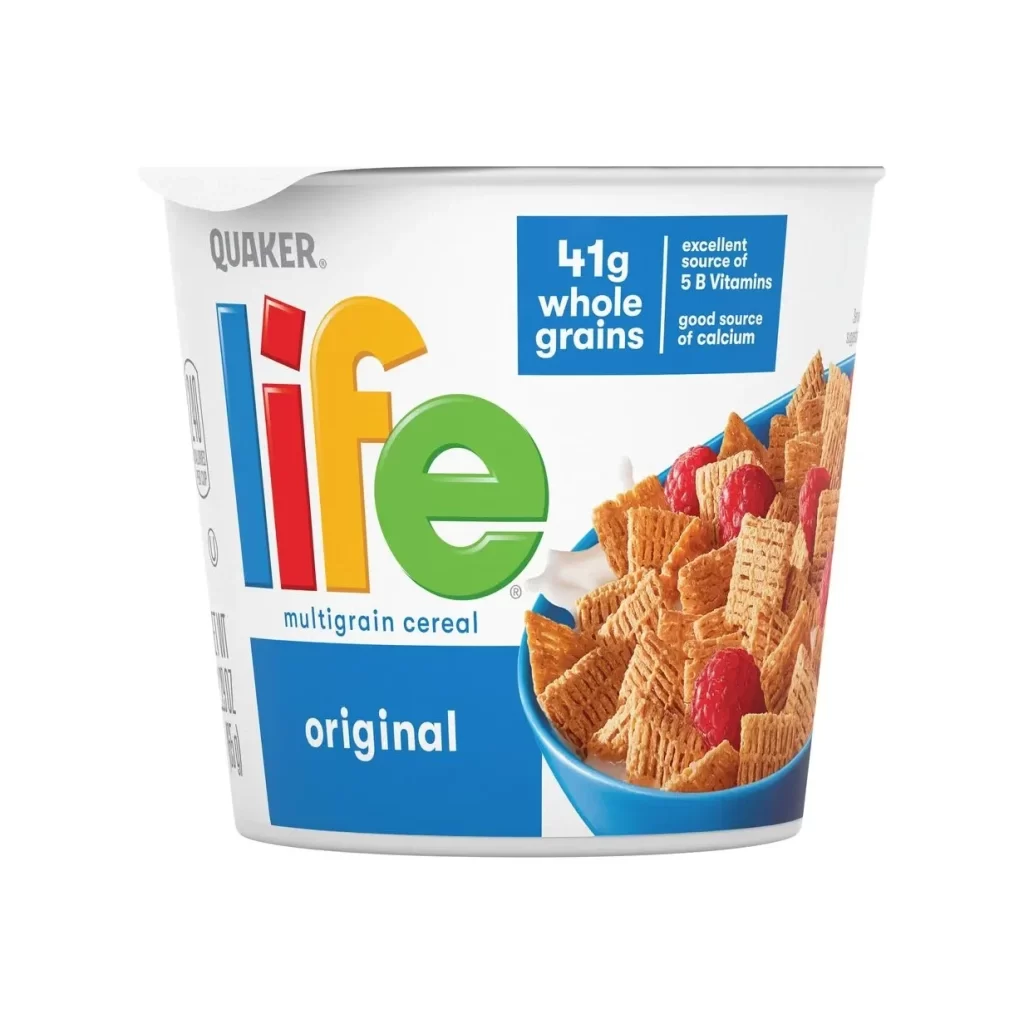
Quaker Life Multigrain Cereal Cup Packaging
Topics
Details
The packaging features a clean background that highlights the colorful Life logotype, composed of blue, red, yellow, and green letters. A nutritional callout box prominently highlights 41g whole grains. The product photography shows square-shaped cereal flakes with raisins, presented in a convenient cup form. This visual approach ensures the Quaker Life Multigrain Cereal Original stands out clearly on shelves.
The design leverages a vibrant multicolor logotype to create an approachable, energetic brand identity. By contrasting this playful typography against a minimal background, the layout directs attention to the nutritional callout. The cup format is visually emphasized through crisp product photography, balancing practical convenience with wholesome appeal. This strategic composition effectively communicates both the fun and health aspects of the cereal.
This packaging reference is essential for graphic designers and brand strategists working on single-serve food products. It offers excellent inspiration for combining playful typography with functional nutritional messaging. Design students studying commercial packaging will also find this example valuable for understanding how to use clean layouts and vibrant colors to market healthy, on-the-go breakfast items effectively.