Quaker Corn Squares Cereal Box Packaging
Topics
Details
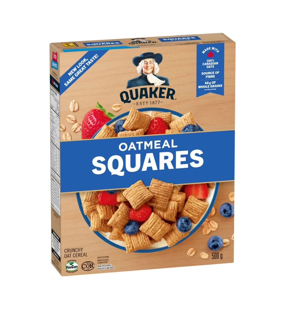
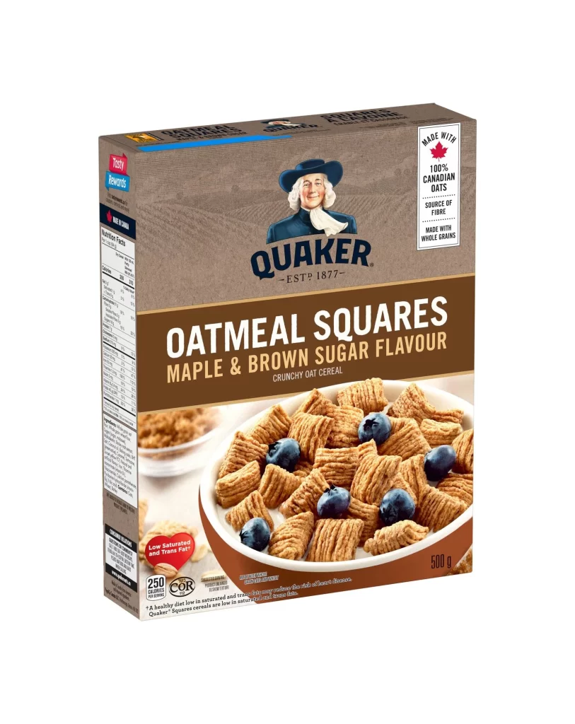
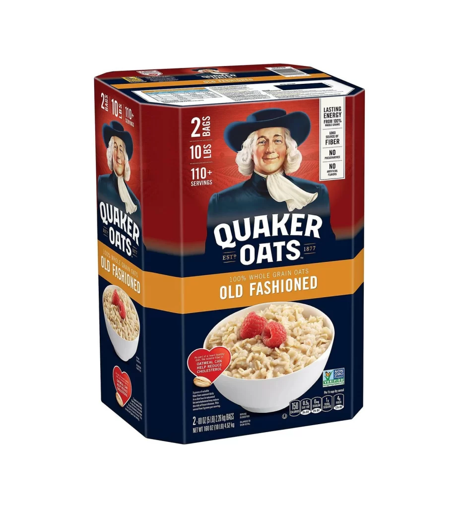
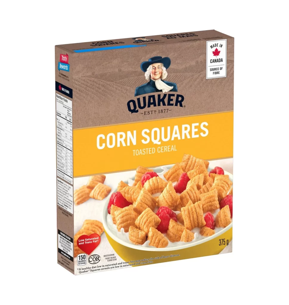
The styled packaging for this box showcases the QUAKER SQUARES line, specifically the CORN SQUARES TOASTED CEREAL. The design prominently displays the iconic Quaker mascot wearing his familiar blue hat. Bilingual English and French labeling ensures broad market appeal. A prominent Made in Canada badge sits alongside a Source of Fibre claim and a Low Saturated and Trans Fat heart icon, completing the visual layout.
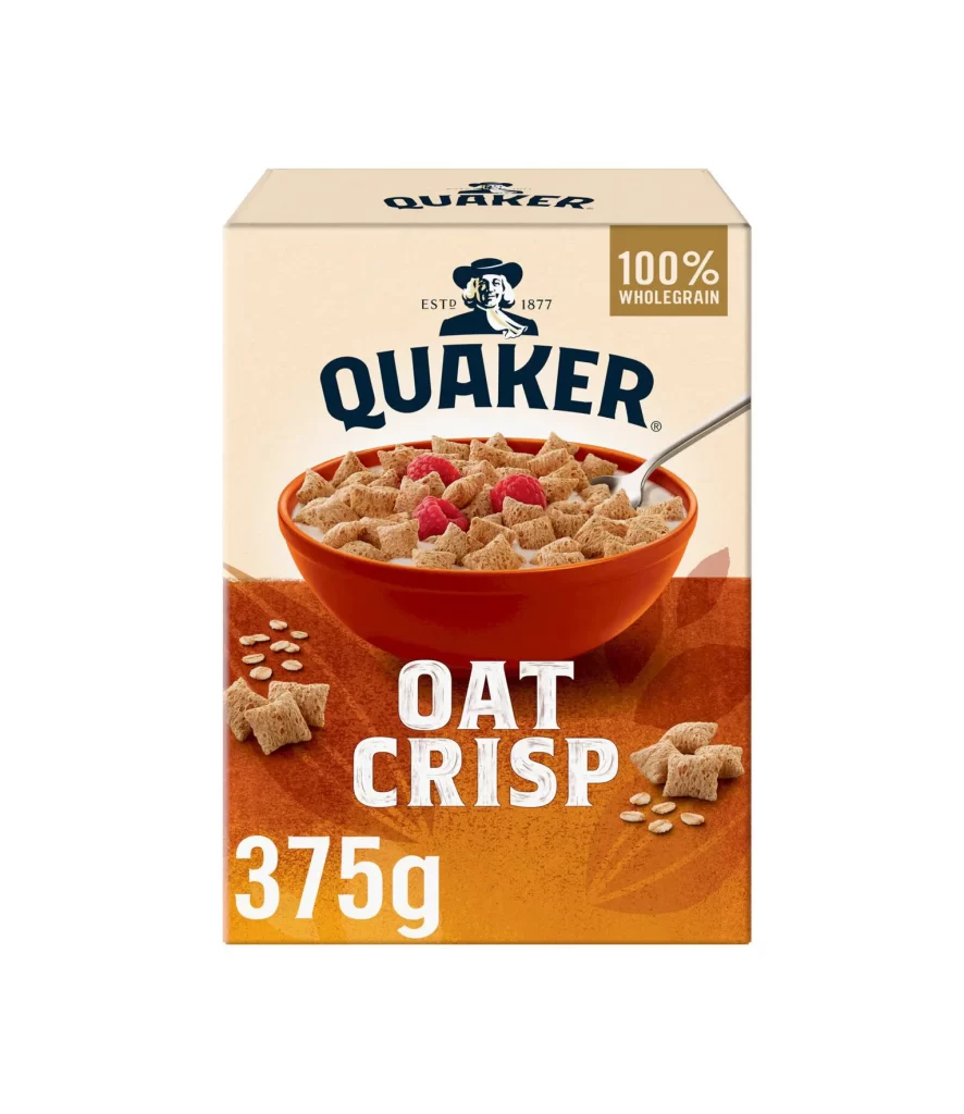
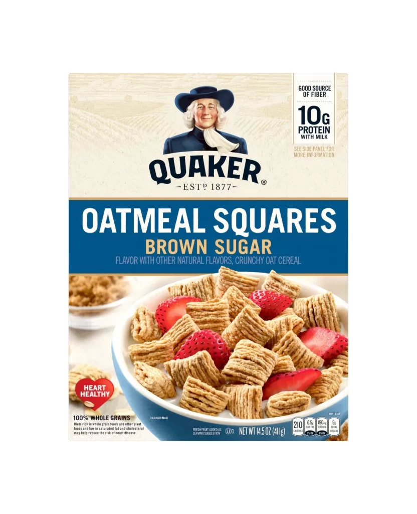
Analyzing the box design reveals a structured approach to consumer trust and brand recognition. The established Quaker logo anchors the composition, while the bold typography ensures shelf visibility. Health icons are strategically placed to catch the eye quickly. The styled form utilizes a clean layout, balancing the nostalgic mascot imagery with modern nutritional callouts, creating an effective and highly recognizable retail packaging design.
This packaging reference is essential for graphic designers studying cereal box layouts and brand evolution. Marketing professionals can use it to analyze how bilingual requirements and health claims are integrated seamlessly. Additionally, packaging students examining Canadian food industry standards will find the combination of regulatory badges, iconic mascots, and structured typography highly valuable for their academic or commercial design projects.