Quaker Oat Shake Go Strawberry Banana Bottle Packaging
Topics
Details
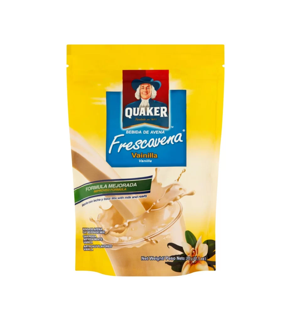
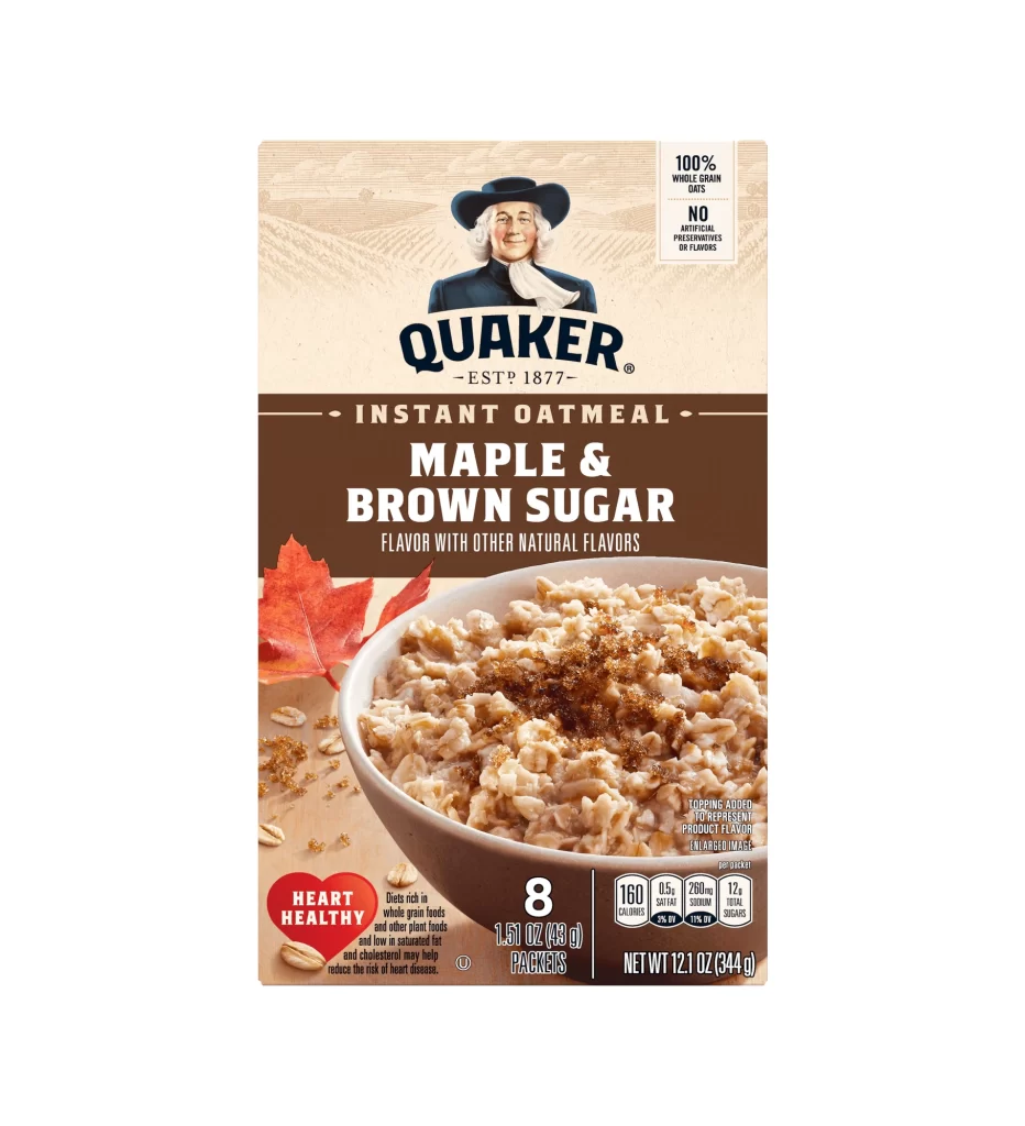
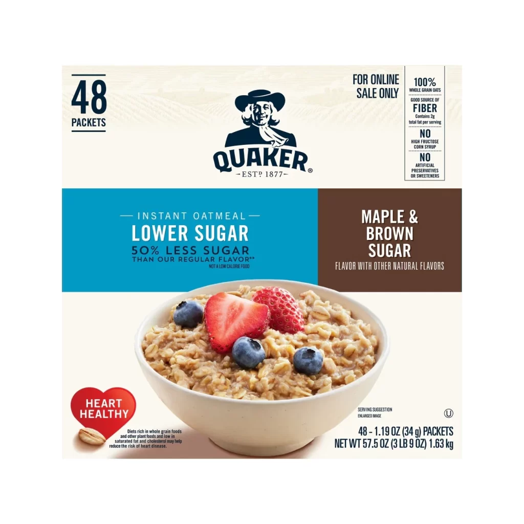
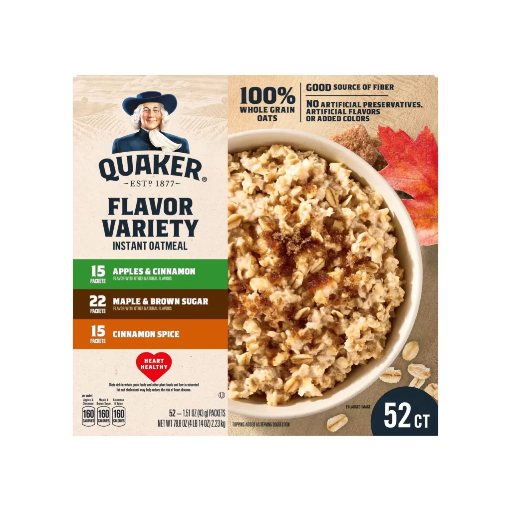
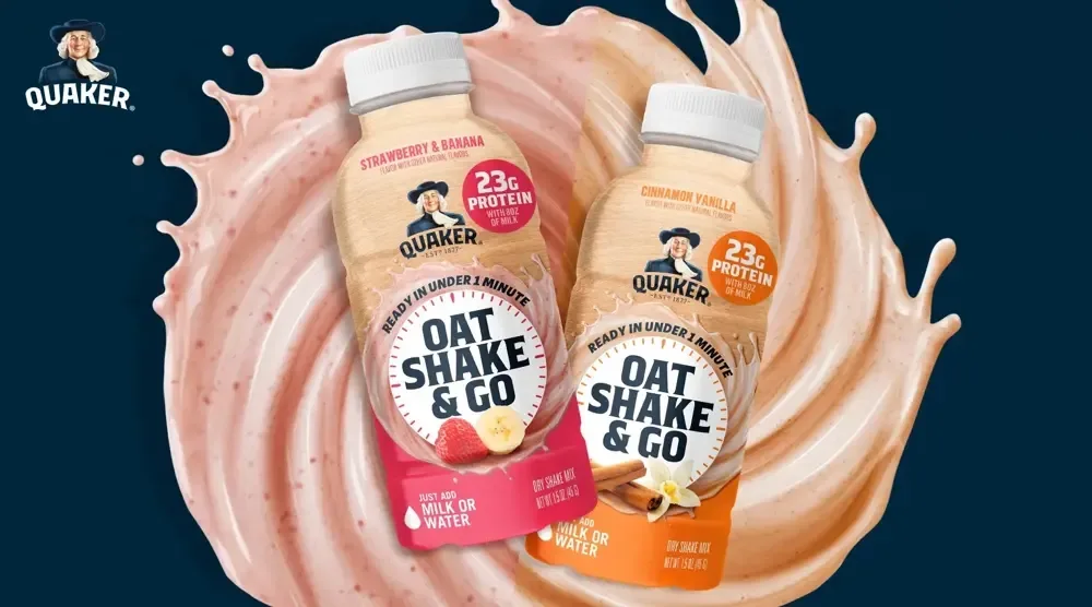
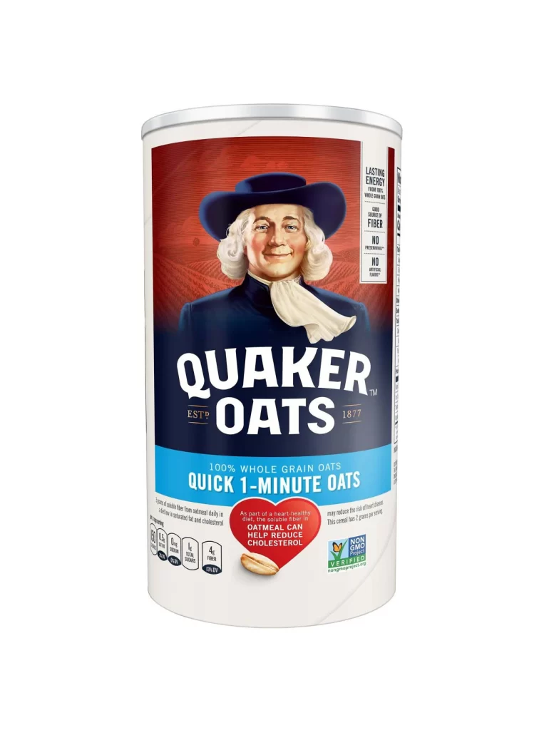
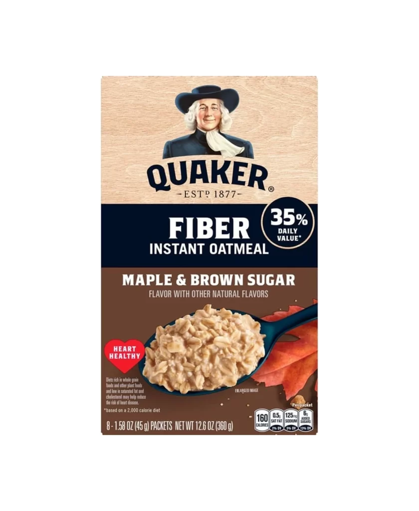
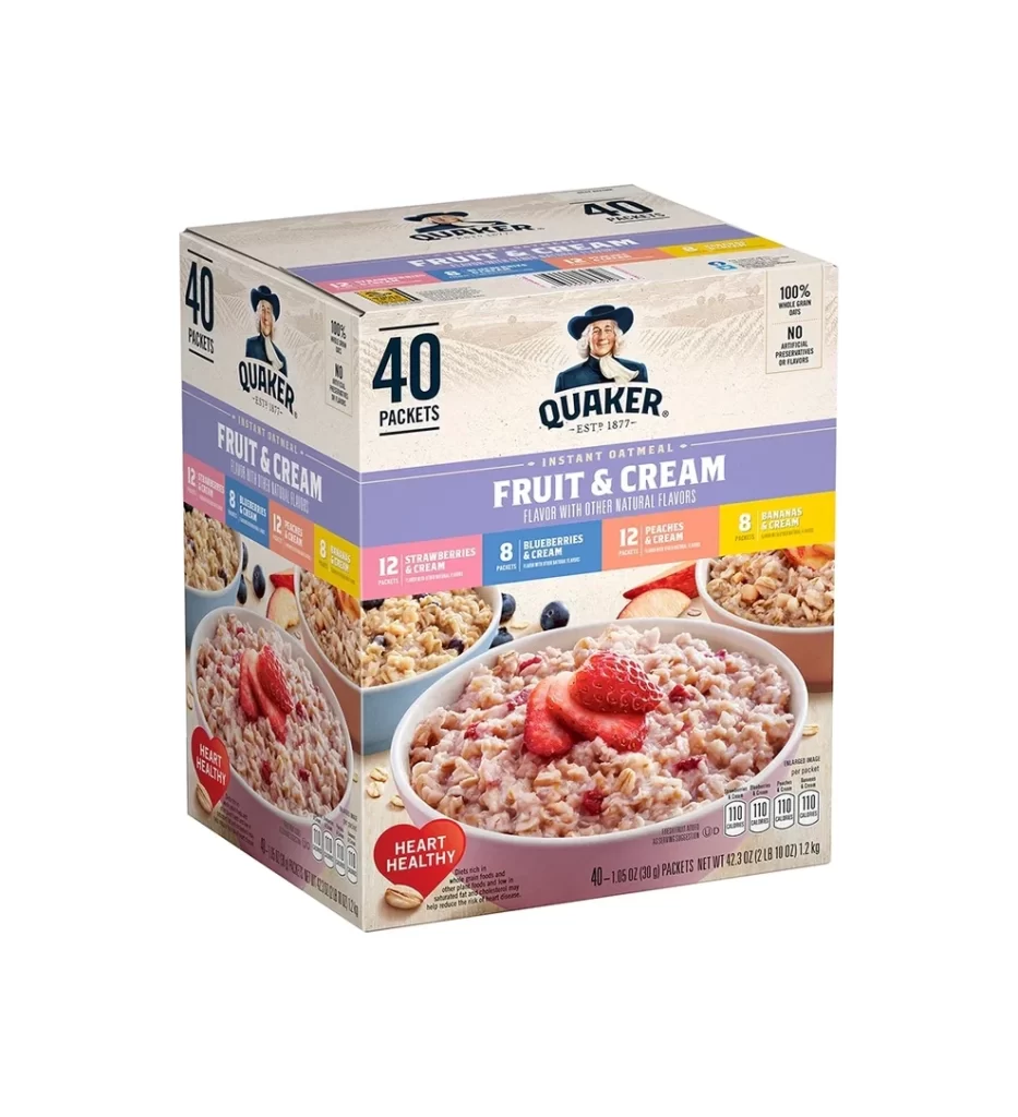
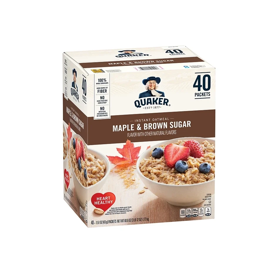
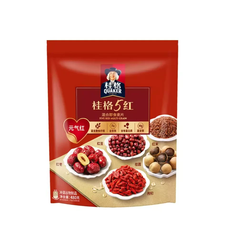
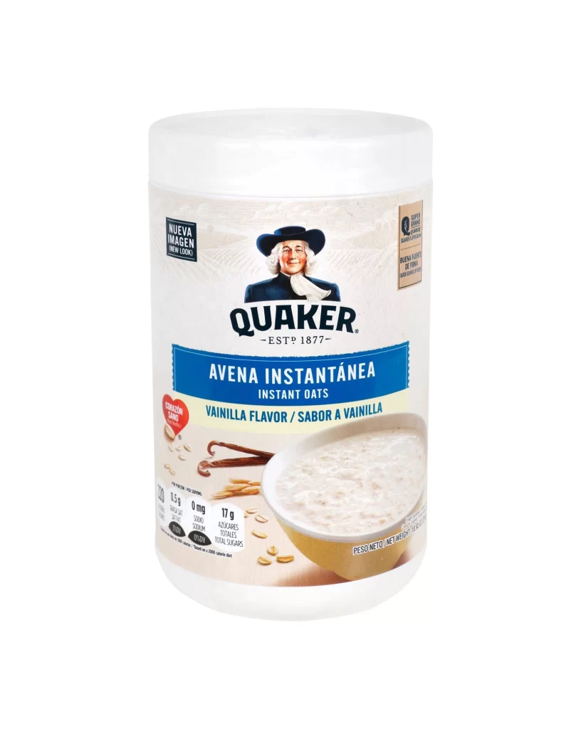
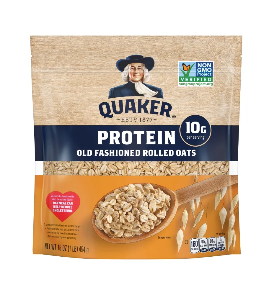
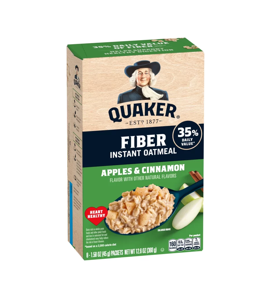
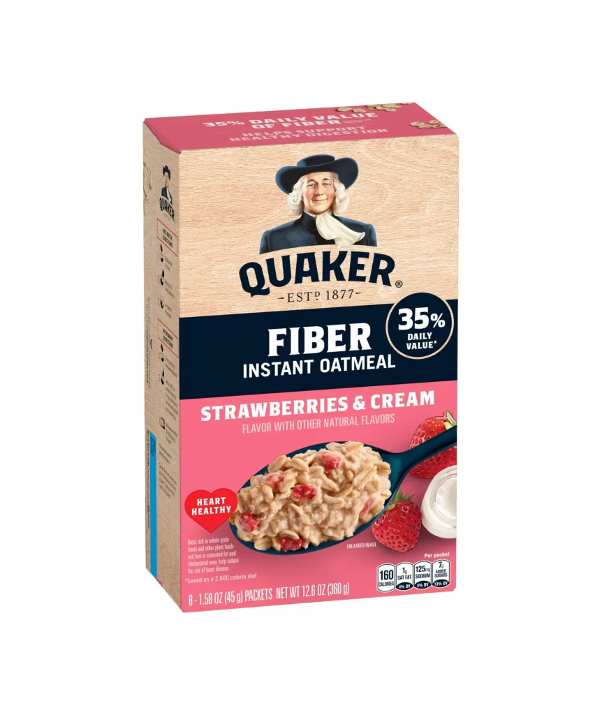
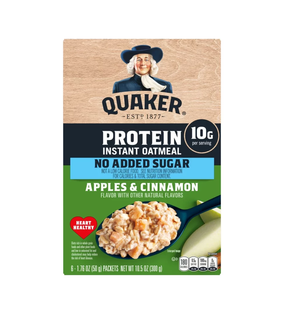
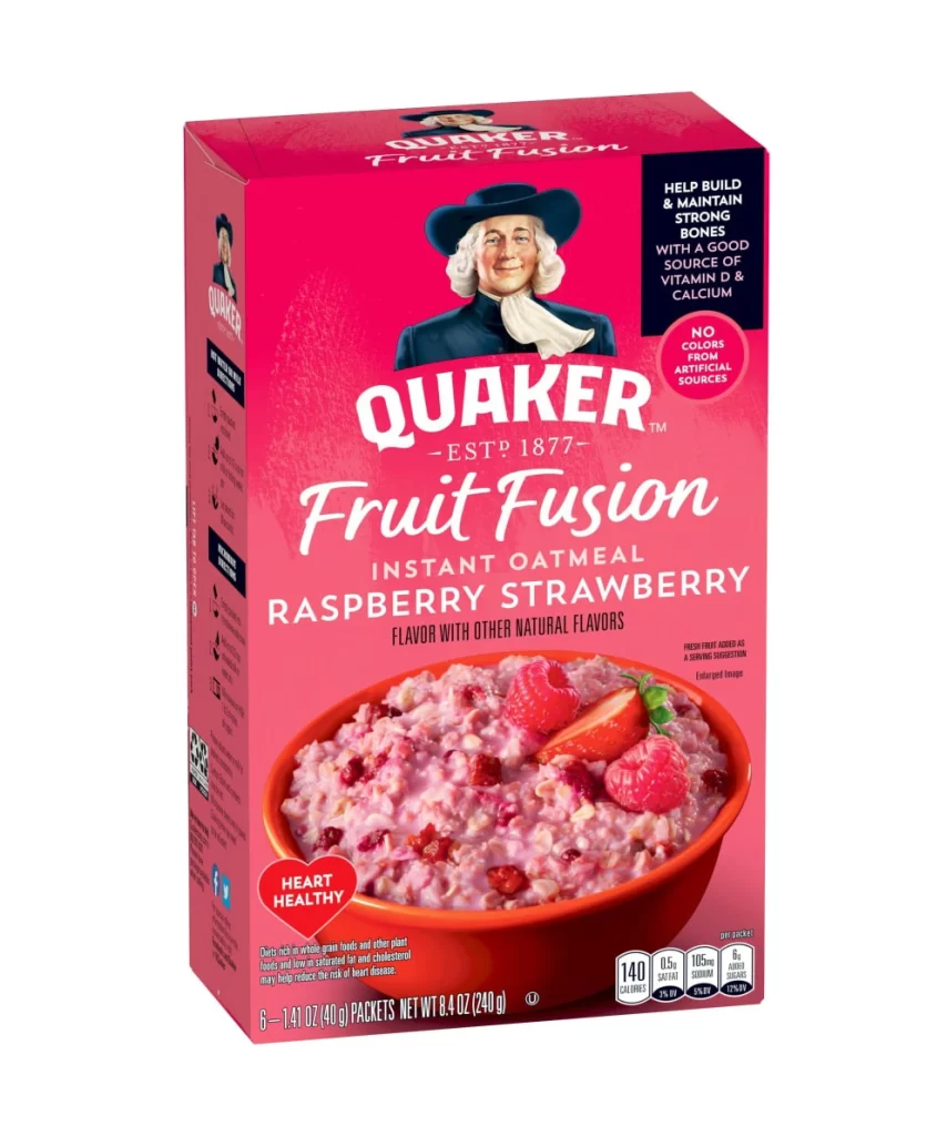
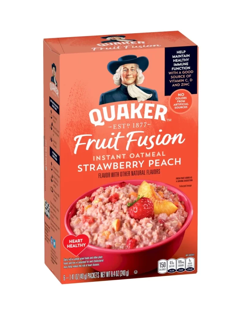
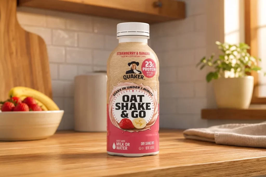
The styled packaging for the Quaker Oat Shake & Go Strawberry Banana bottle features a vibrant, appetizing aesthetic. Bright red and yellow fruit imagery instantly communicates the dual flavor profile. The iconic Quaker mascot anchors the front, while bold typography highlights the 23g protein claim. A clean background ensures the convenience messaging and instructions stand out clearly to the consumer.
Design analysis reveals a strategic balance between heritage and modern utility. The classic Quaker logo provides trusted brand authority, contrasting with the dynamic, high-protein positioning. Vibrant fruit illustrations create visual appetite appeal, effectively signaling the strawberry and banana blend. Typography hierarchy expertly guides the eye from the brand to the quick preparation instructions, maximizing shelf impact.
This packaging reference is essential for brand designers and packaging specialists focusing on the functional beverage category. Creators exploring how to merge legacy brand equity with fast-paced convenience messaging will find valuable inspiration here. It serves as an excellent study for effectively communicating nutritional benefits and flavor combinations without overwhelming the consumer visually.