Quaker Oats Logo
Topics
Details
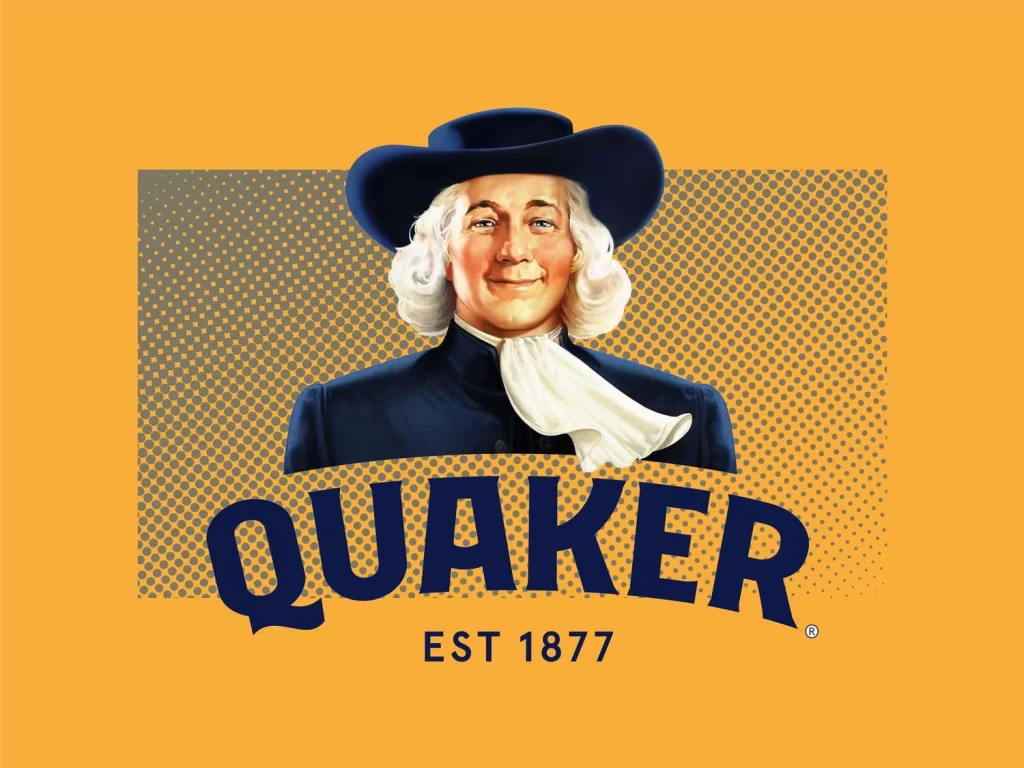
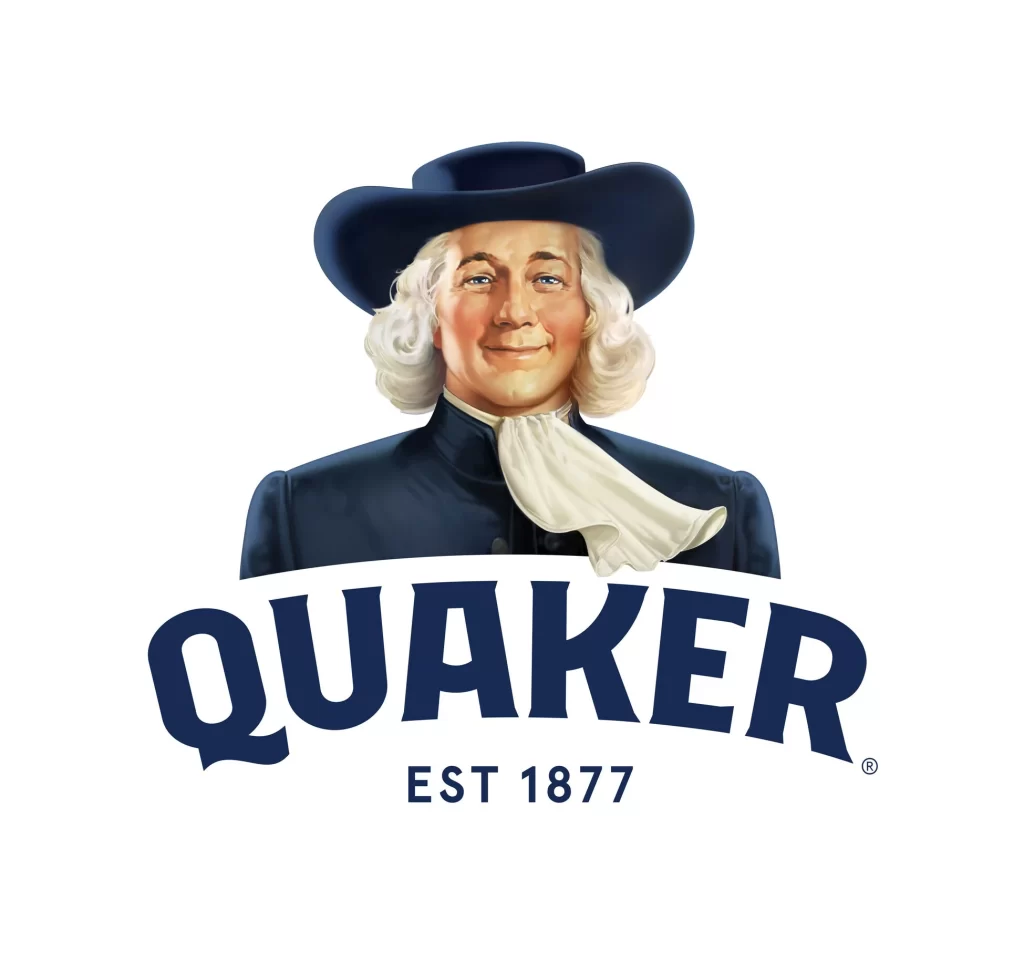
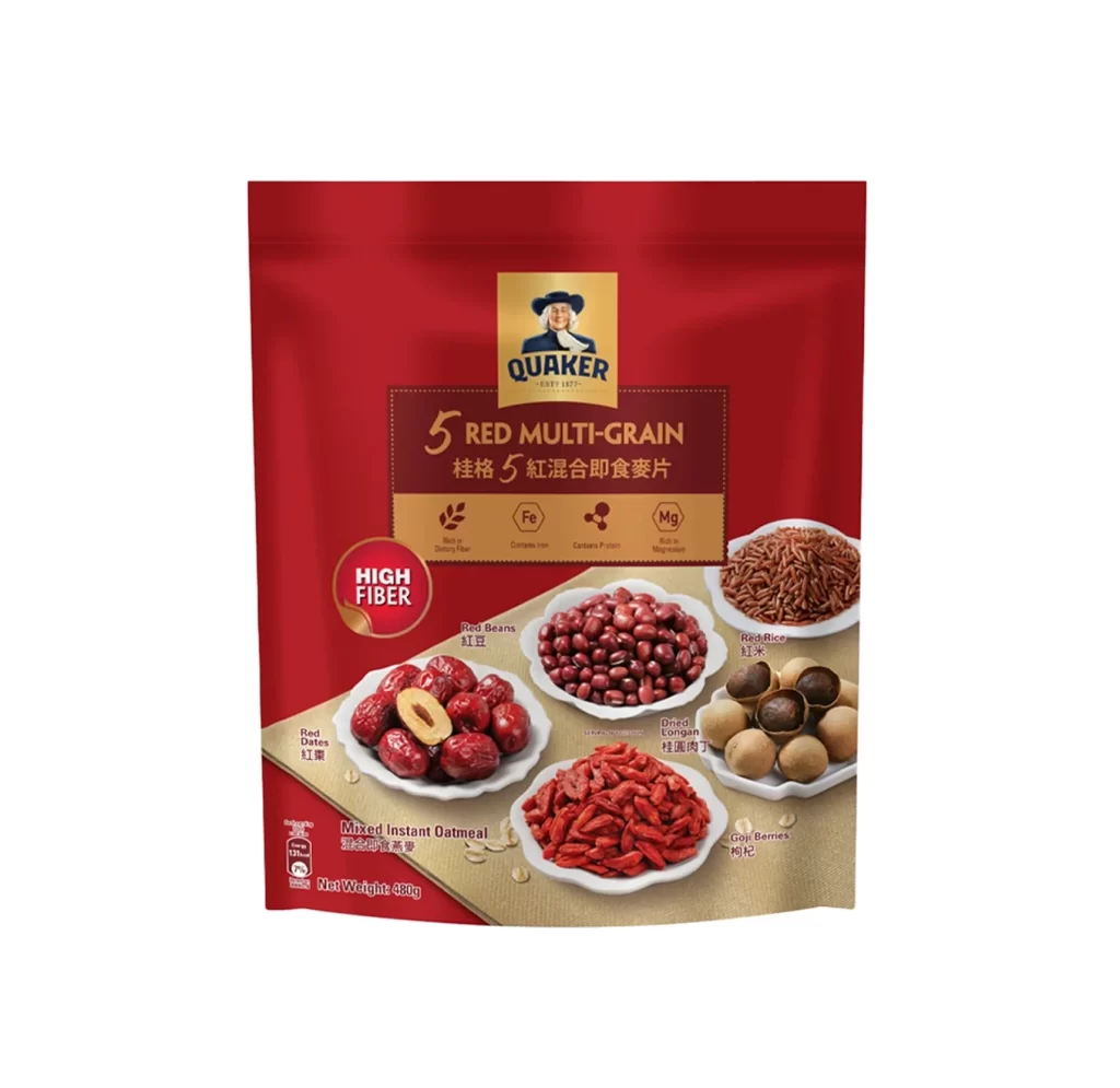
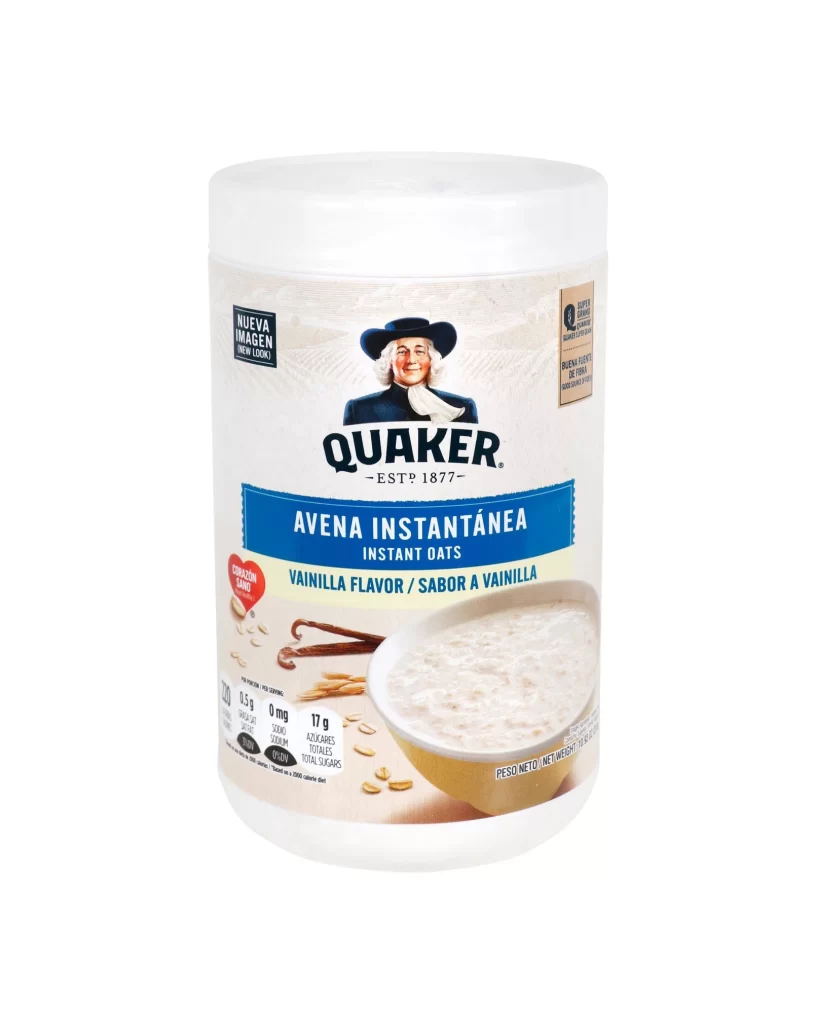
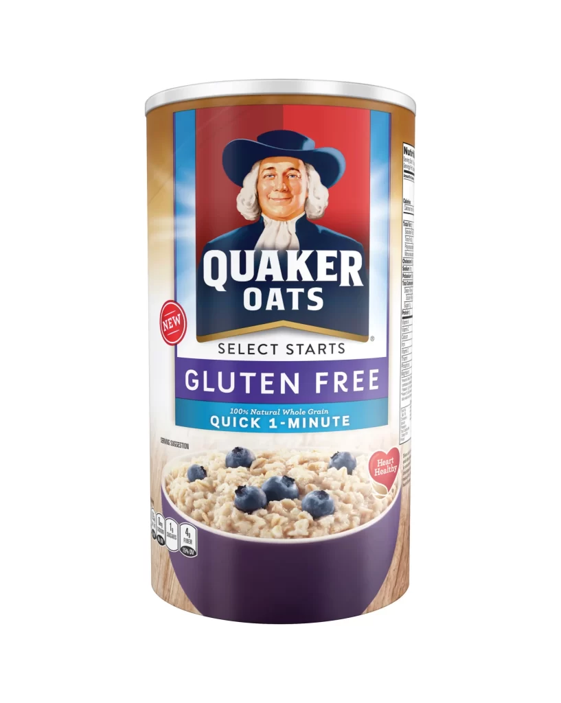
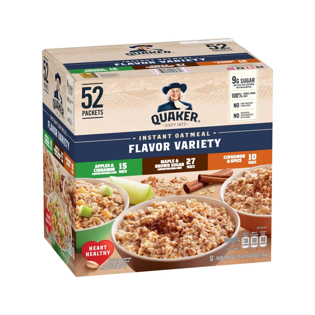
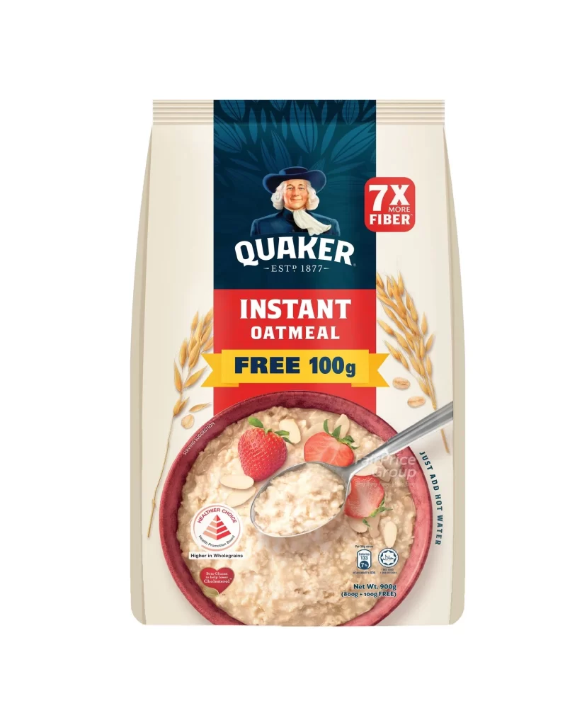
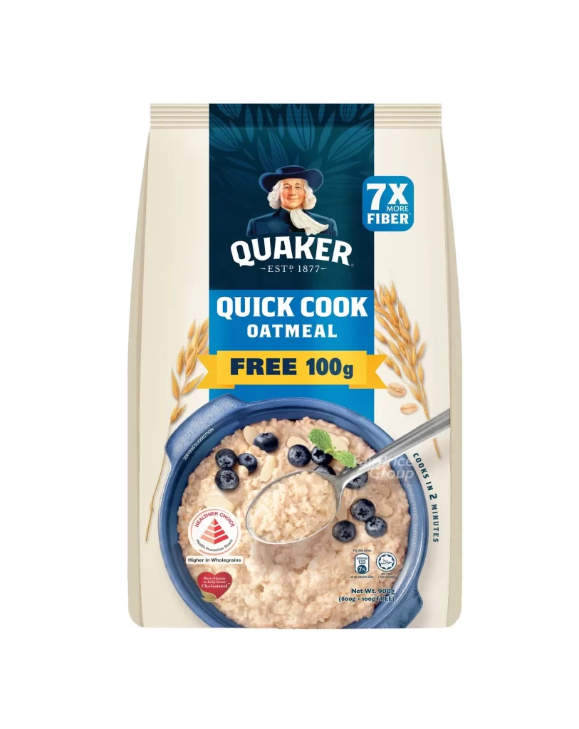
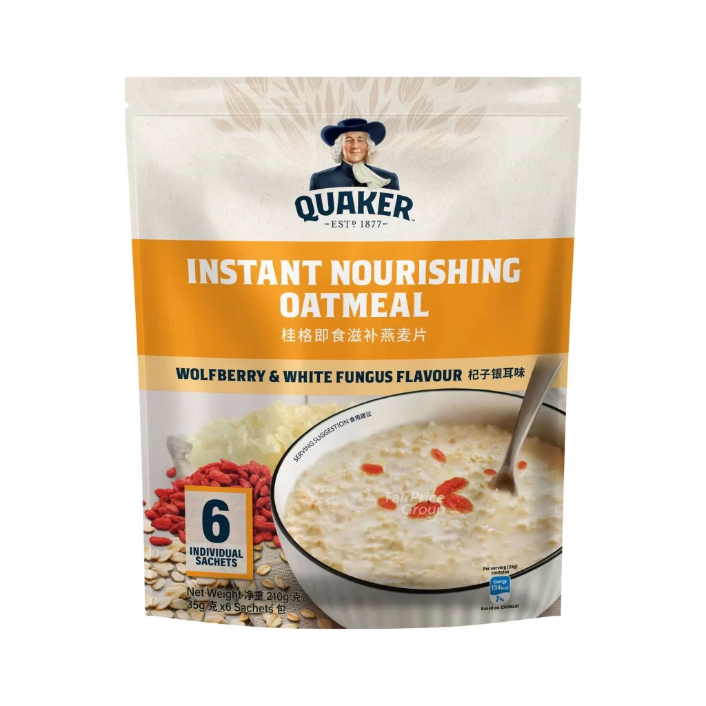
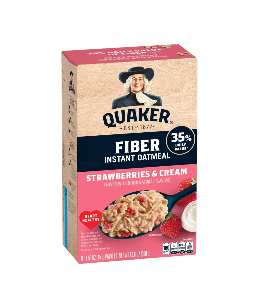
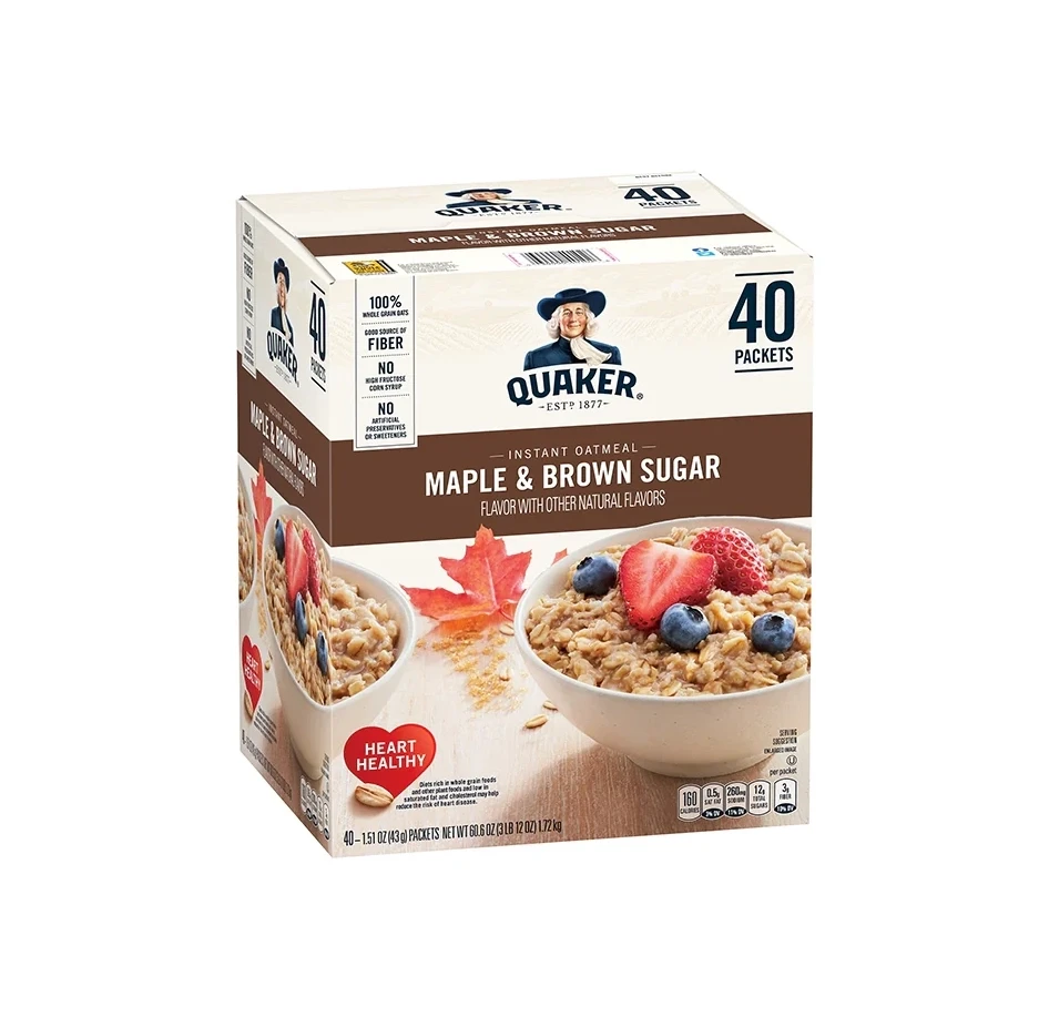
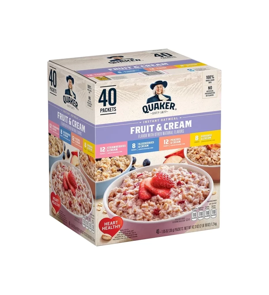
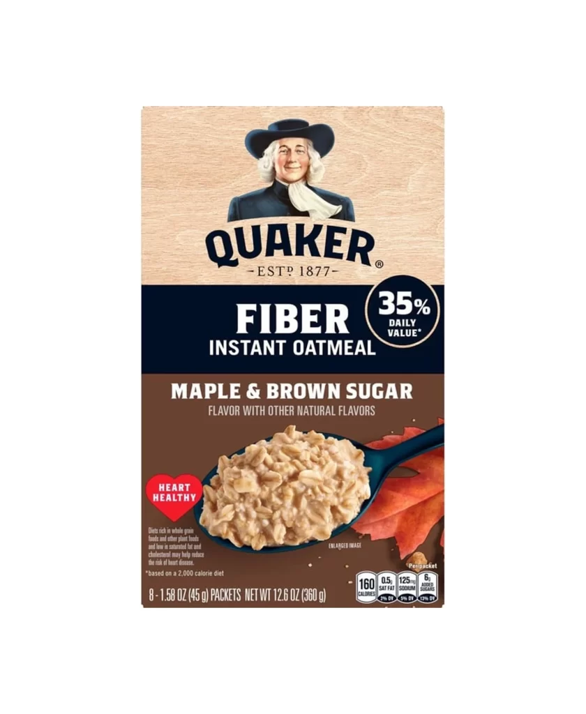
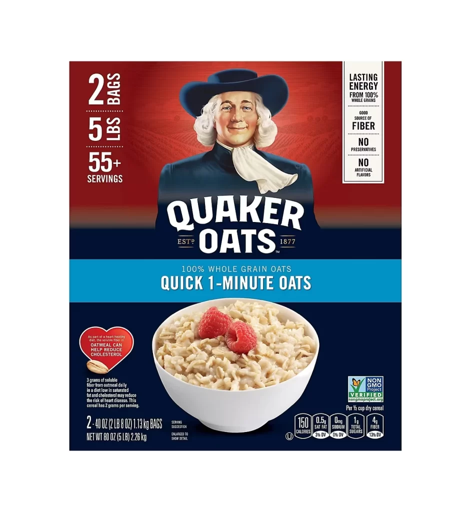
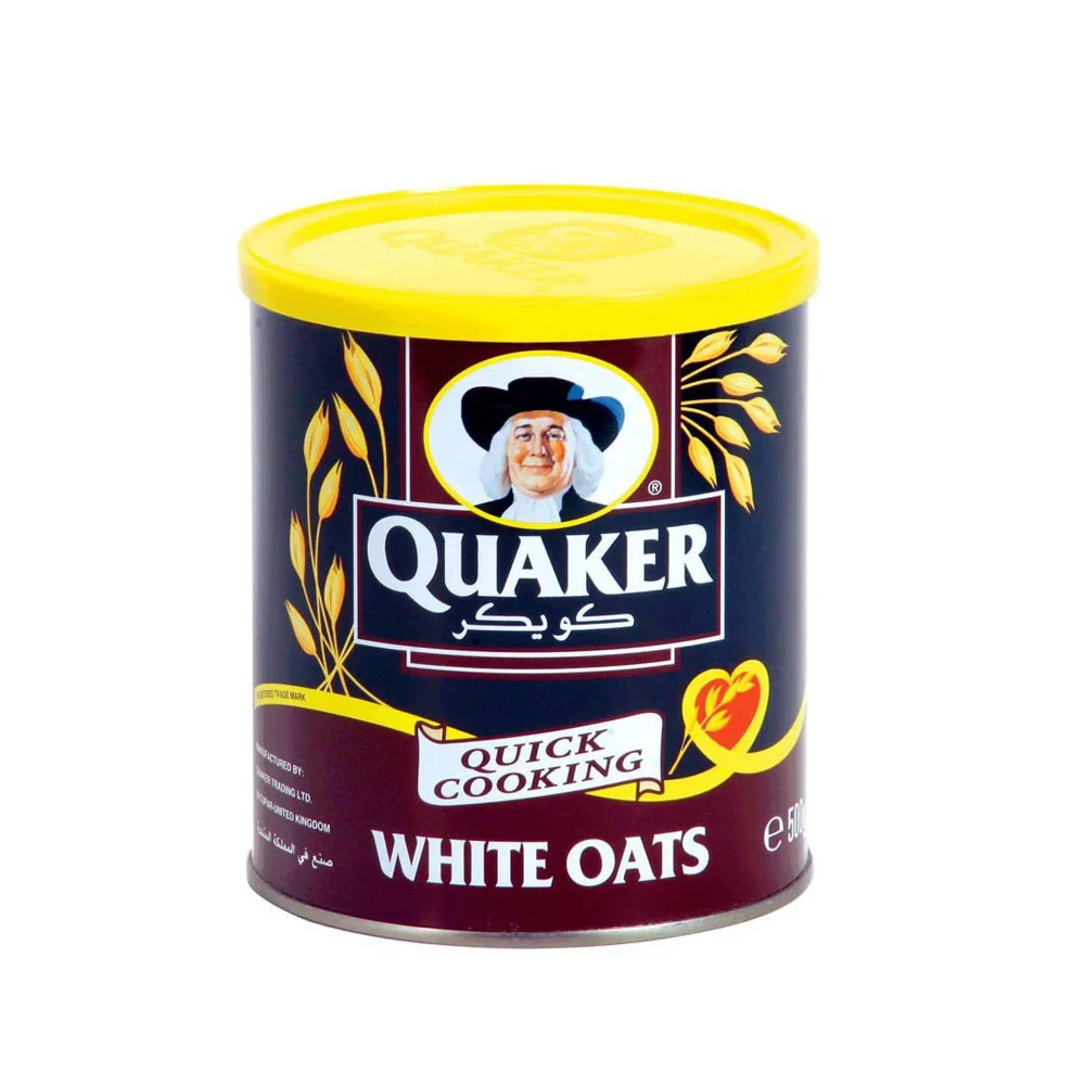
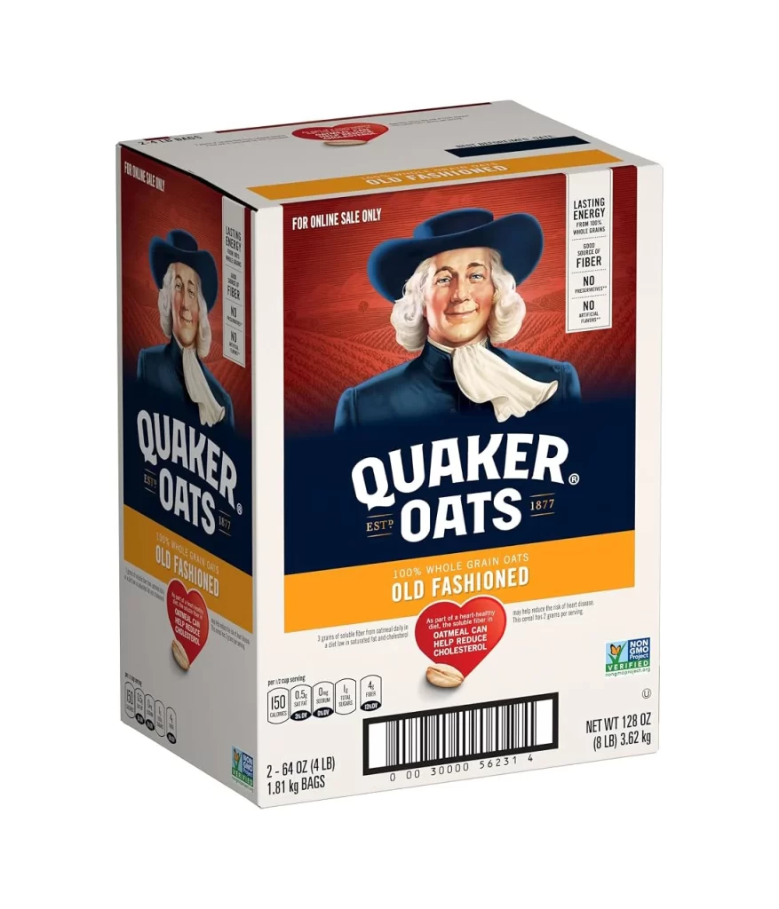
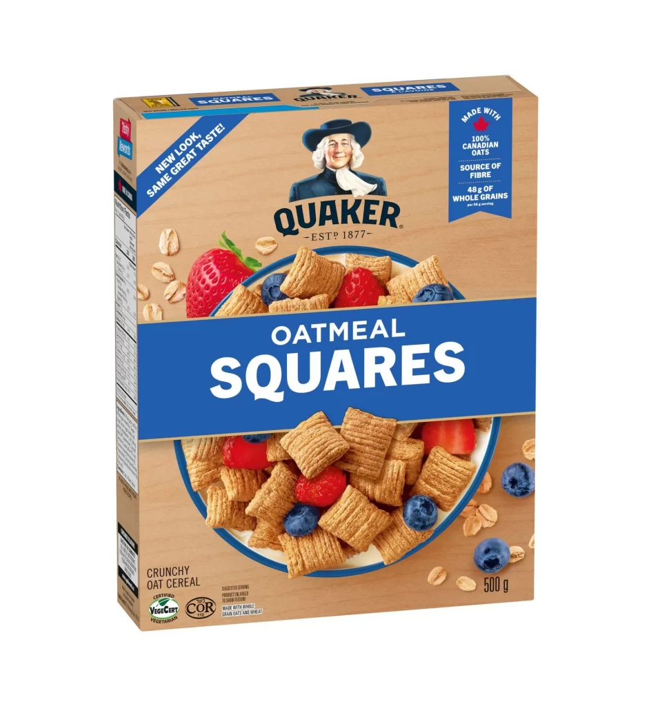
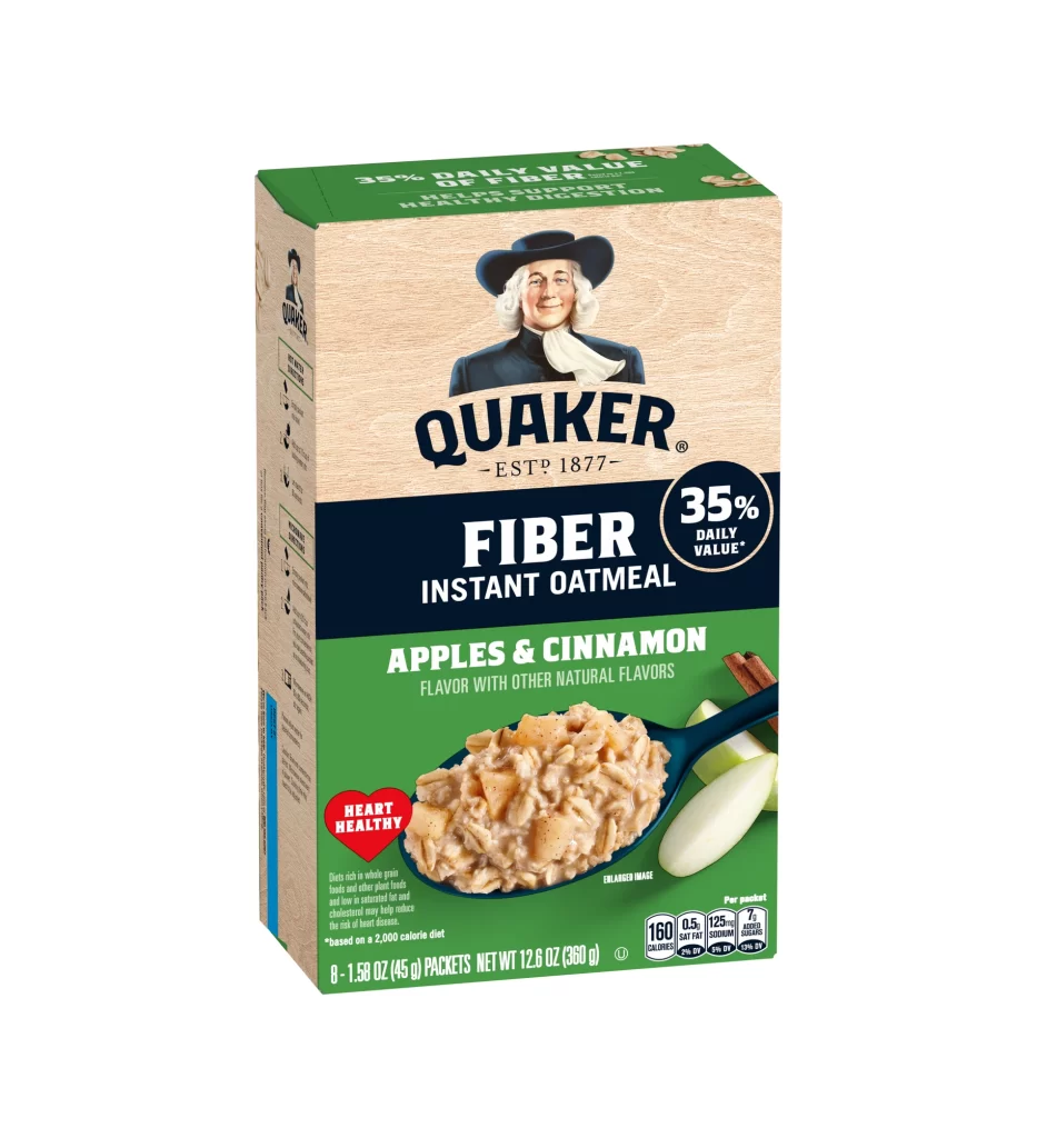
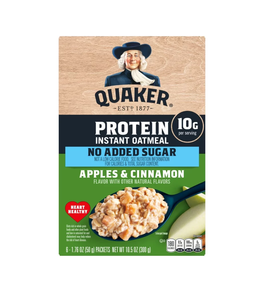
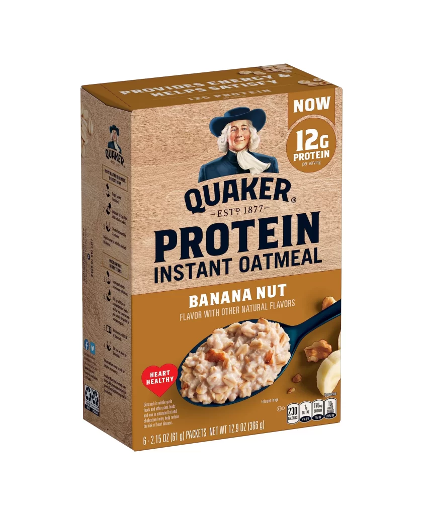
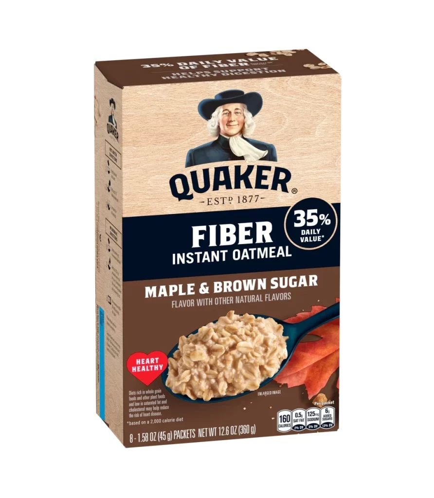
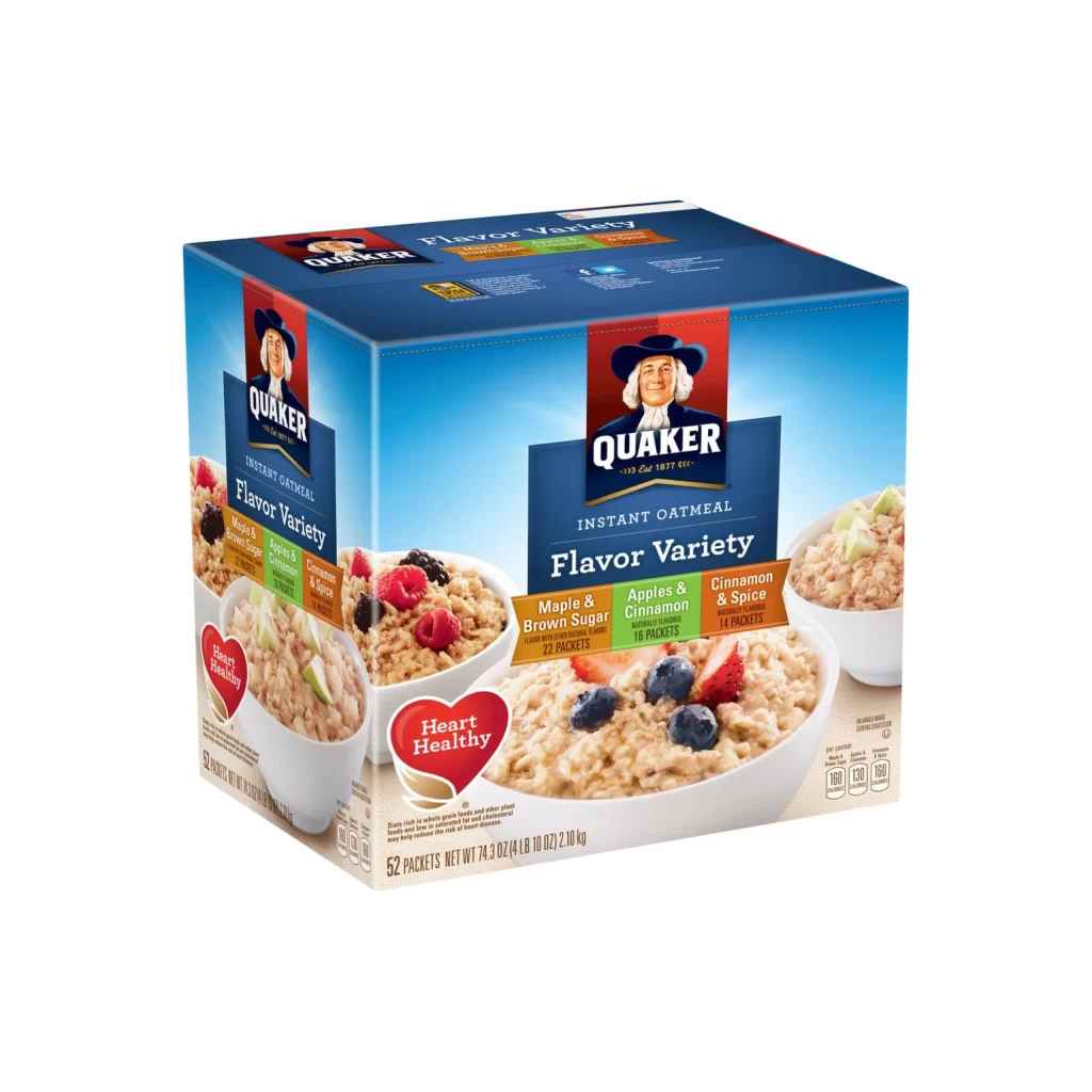
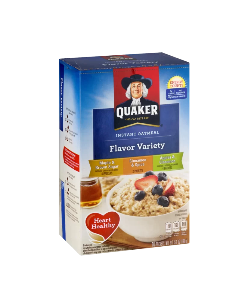
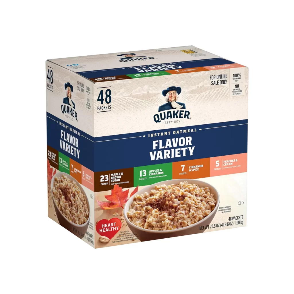
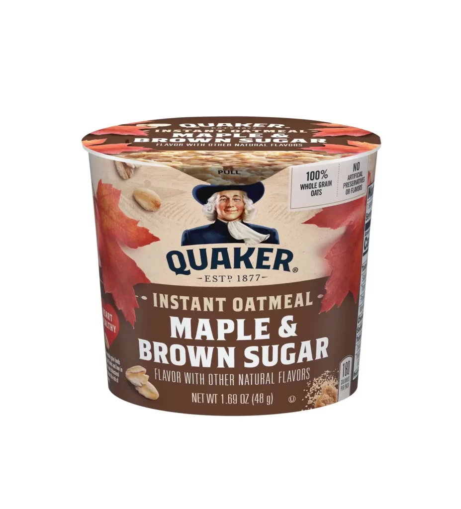
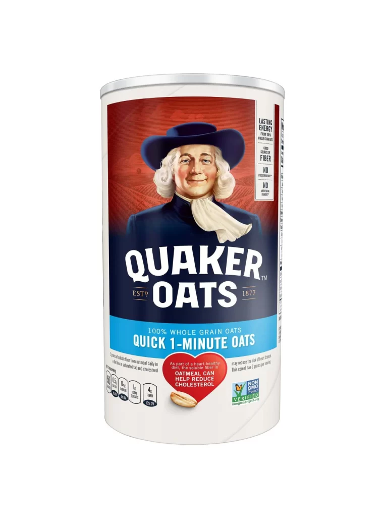
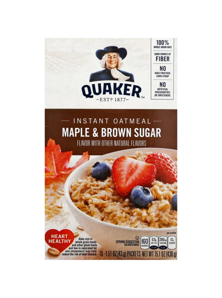
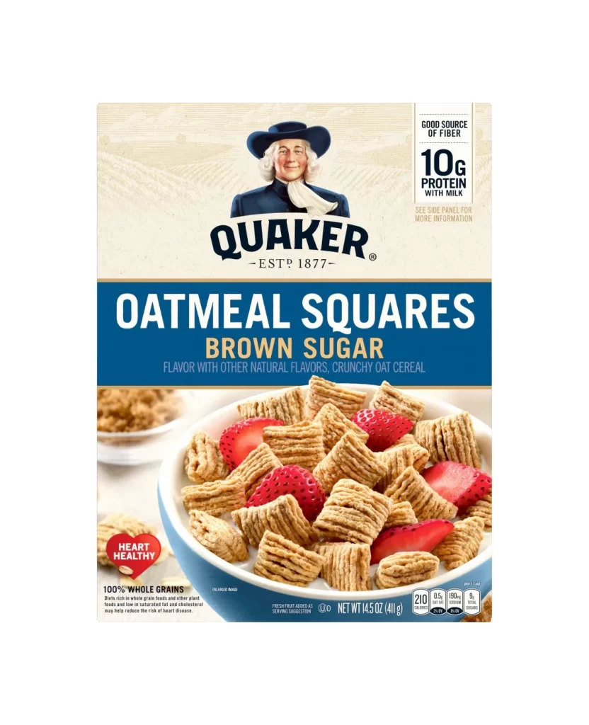
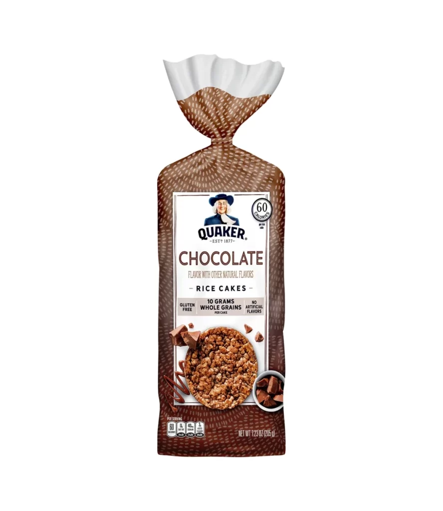
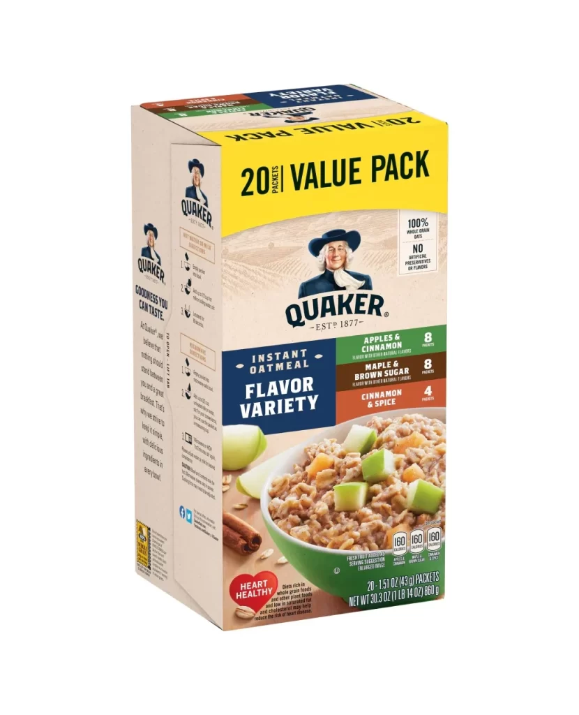
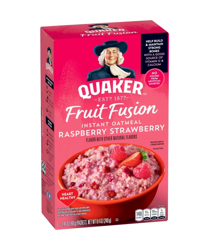
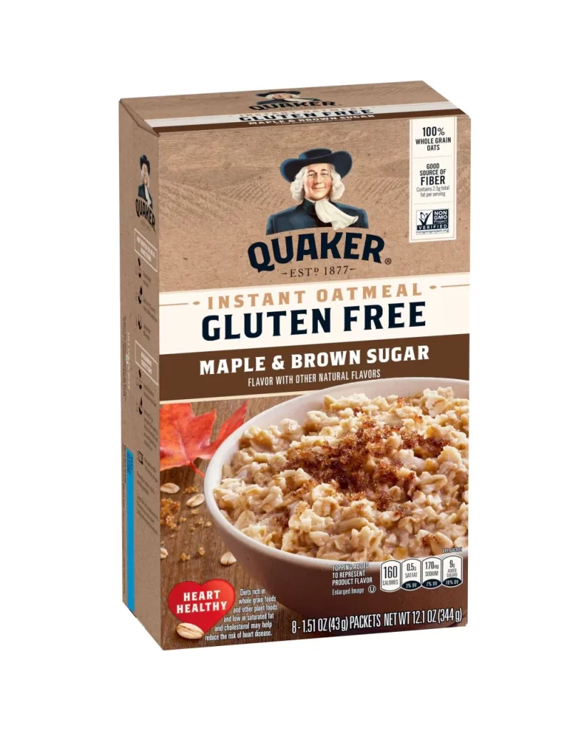
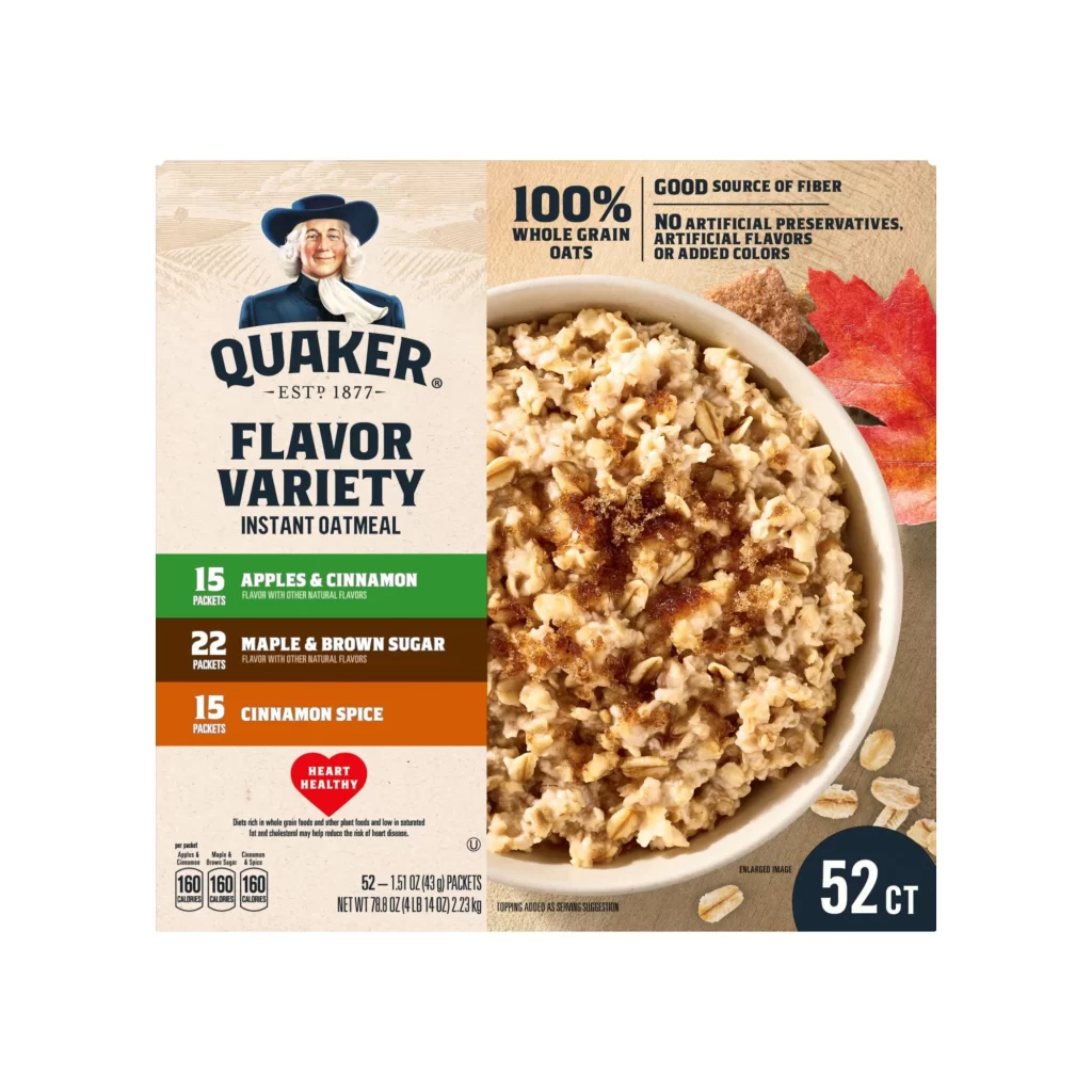
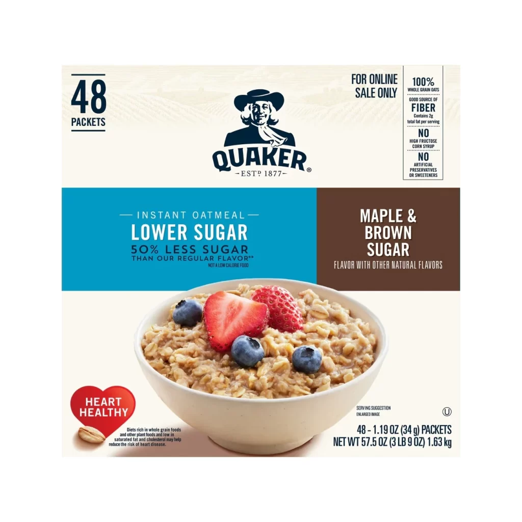
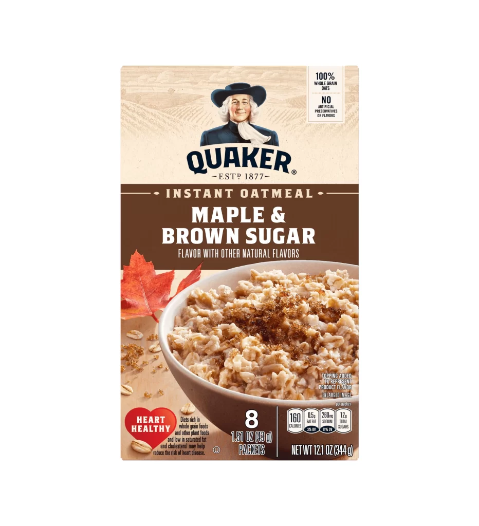
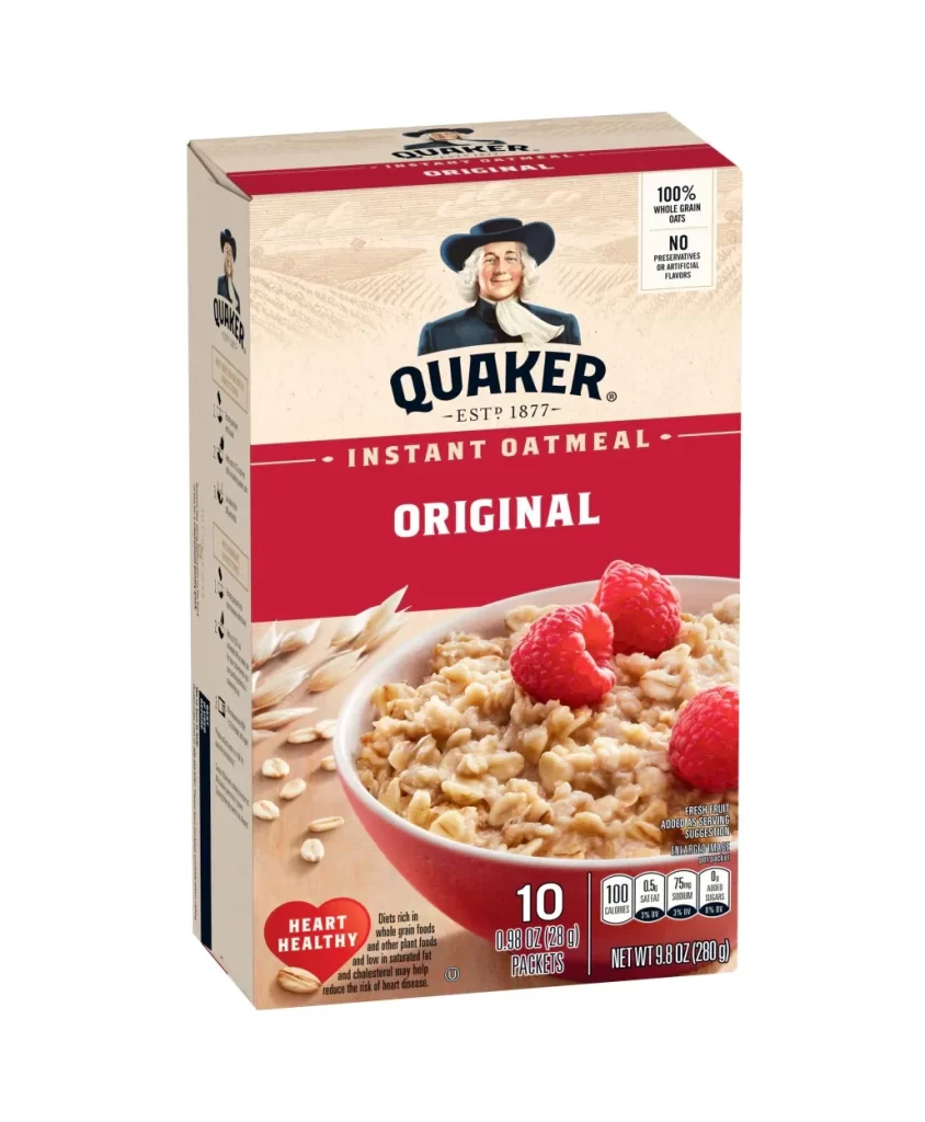
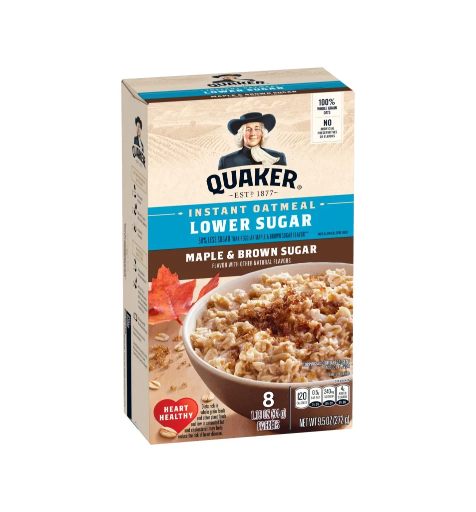
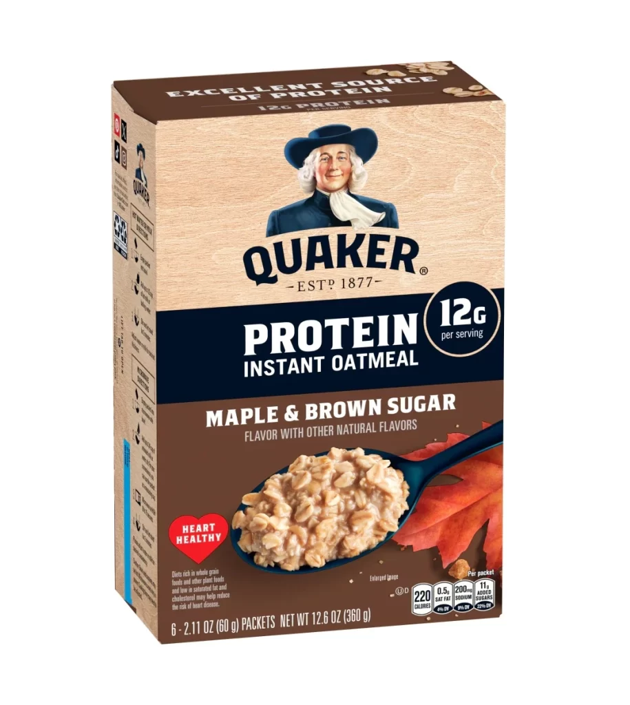
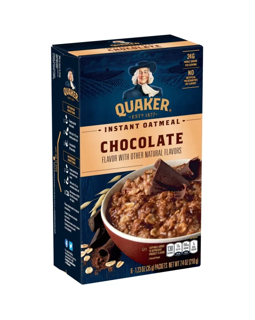
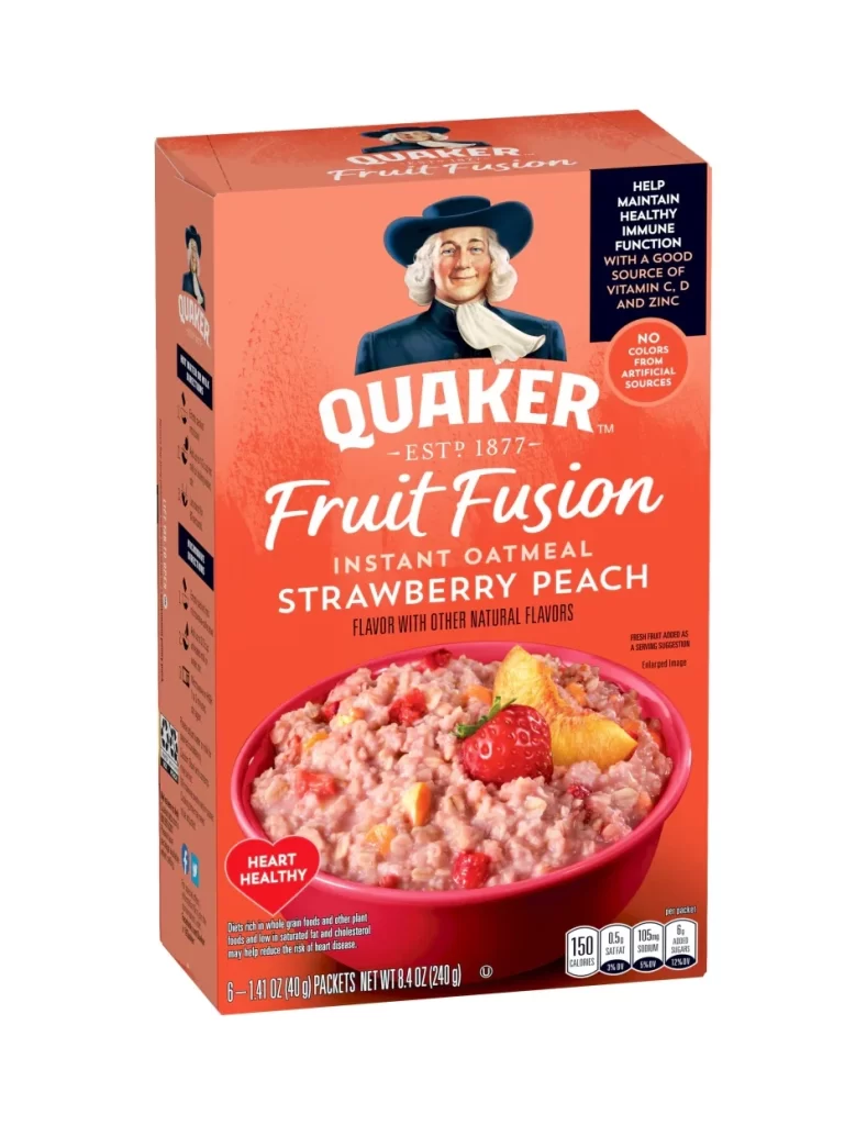
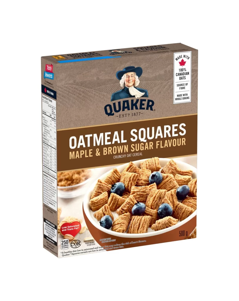
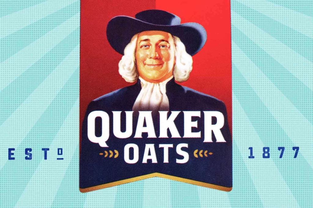
The Quaker Oats logo features the iconic Quaker Man, affectionately known as Larry, dressed in traditional attire. Established in 1877, the design utilizes a striking red and navy blue color block that ensures instant brand recognition. This styled representation of the mascot remains a classic piece of American visual identity, capturing the heritage and trust associated with the historic cereal brand.
From a design perspective, the logo masterfully balances historical authenticity with commercial appeal. The bold red and navy blue color palette creates a strong, trustworthy contrast, while the detailed illustration of Larry adds a human touch. The typography, prominently displaying EST 1877, reinforces longevity. This combination of traditional imagery and structured color blocking makes it a quintessential study in effective, enduring brand mascot design.
This logo reference is an essential resource for graphic designers, branding students, and packaging illustrators. Professionals tasked with creating heritage brands or revamping vintage mascots will find immense value in analyzing its color theory and composition. Additionally, marketing historians and educators can use this classic example to teach the enduring power of consistent visual identity in the food industry.