Rockster Logo
Topics
Details
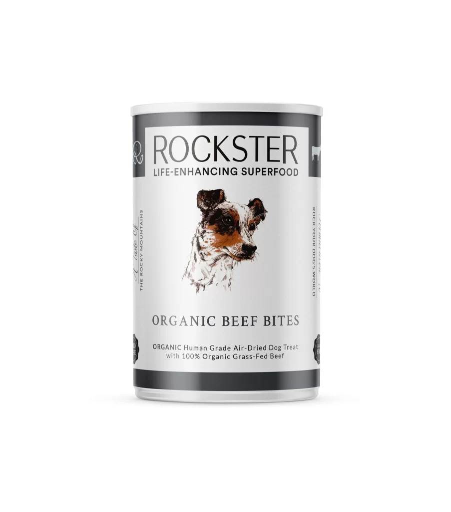
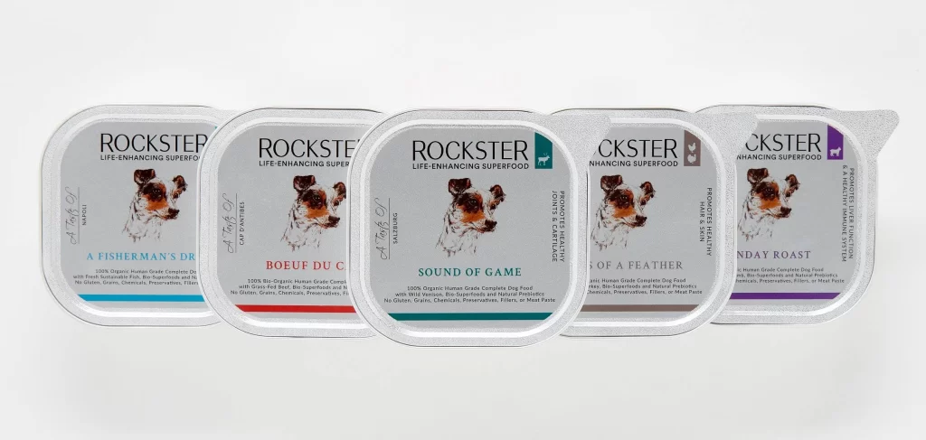
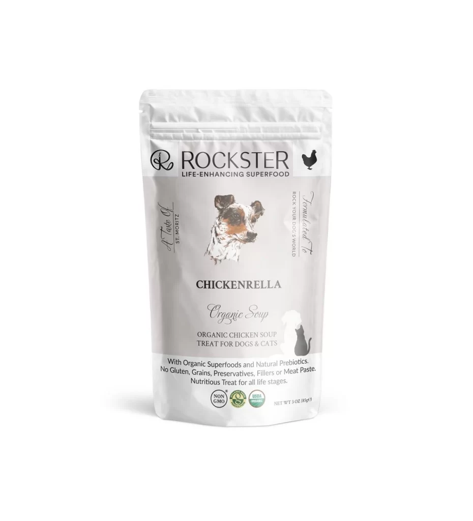
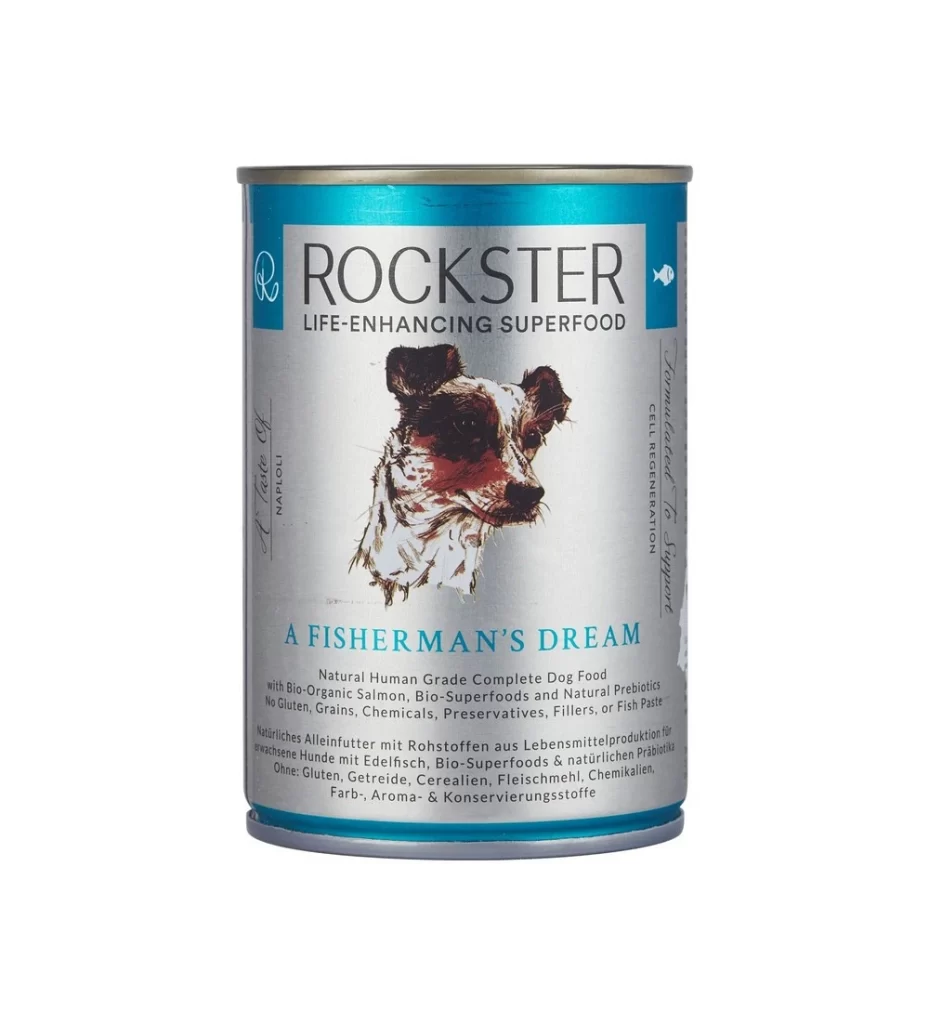
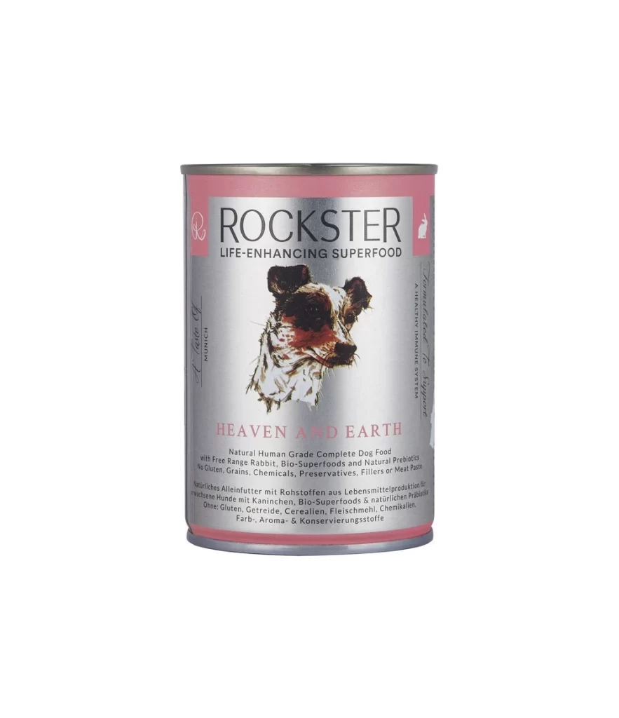
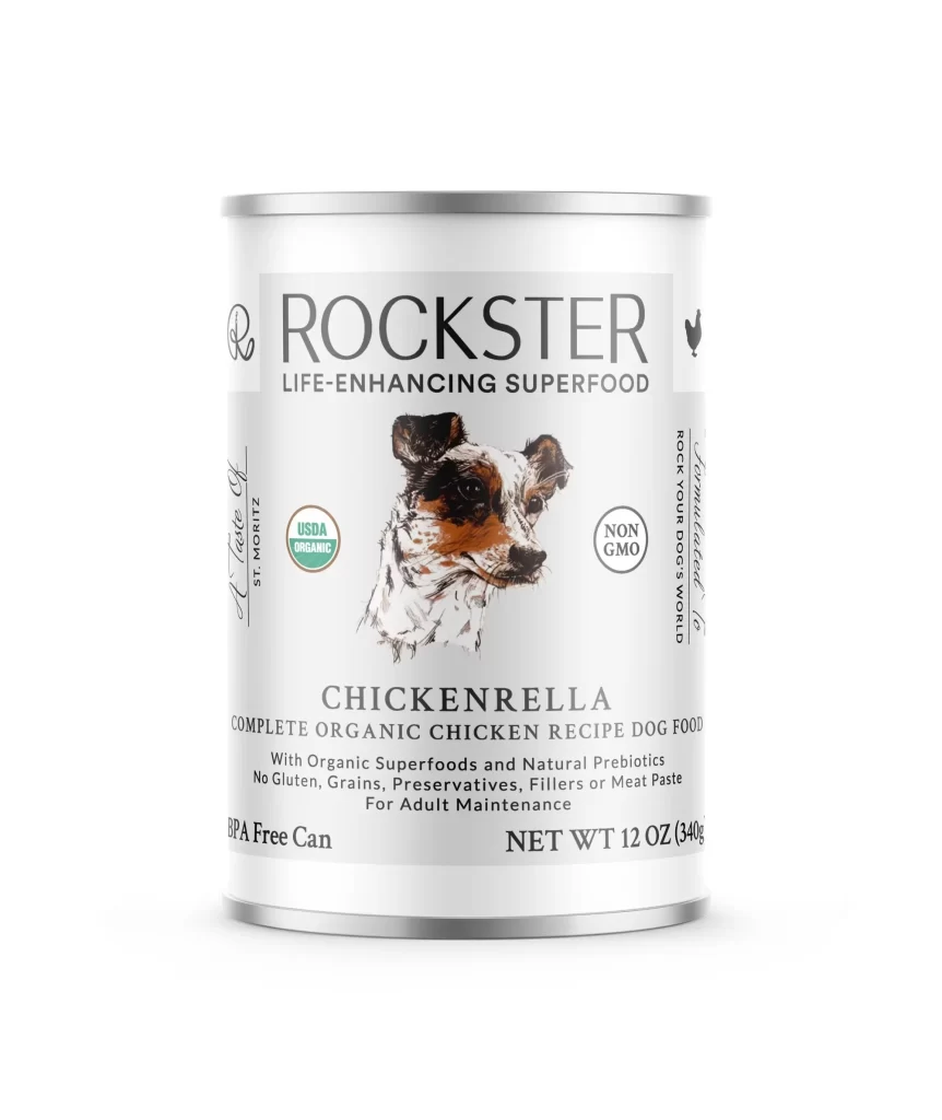
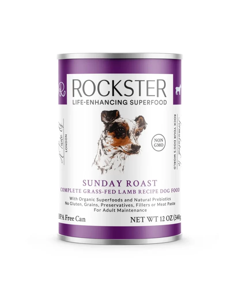
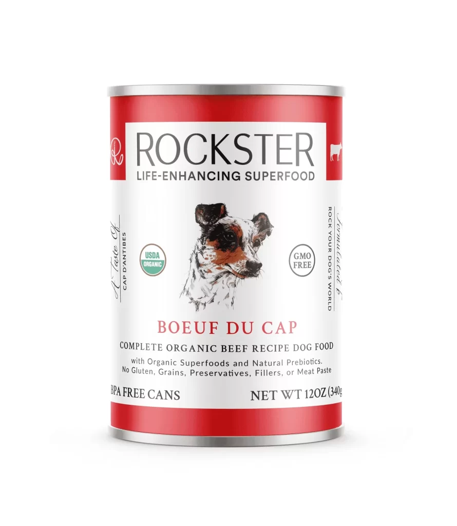
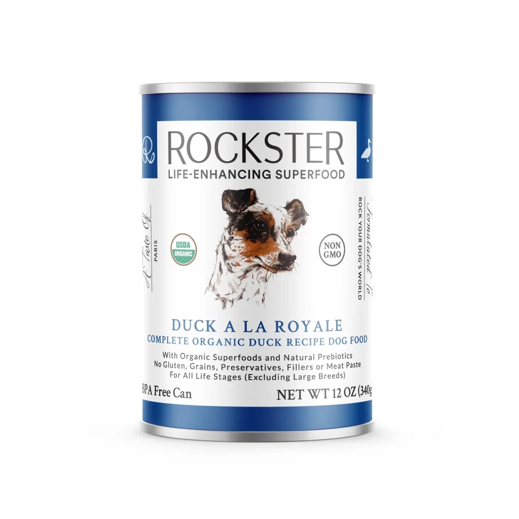
The ROCKSTER logo presents a clean packshot display for the LIFE-ENHANCING SUPERFOOD line. Its visual identity centers on a stylized cursive R monogram. This distinct letterform cleverly integrates an anchor or carabiner clip motif. Paired with a minimalist sans-serif wordmark, the overall composition appears crisp and modern against a simple background.
Typographically, the design balances fluid cursive dynamics with grounded sans-serif stability. The integrated clip motif within the letter R adds a rugged, functional aesthetic. The layout remains uncluttered, allowing the brand name to breathe. A restrained color palette enhances the premium feel, ensuring the product packaging communicates both vitality and trust effortlessly.
This reference is essential for brand designers crafting active lifestyle or outdoor wellness identities. Packaging specialists seeking clever ways to merge monograms with functional hardware motifs will find great inspiration here. Additionally, graphic design students studying minimalist logo integration and clean packshot composition can learn valuable techniques from this superfood branding execution.