Rockster Dog Food Can Design
Topics
Details
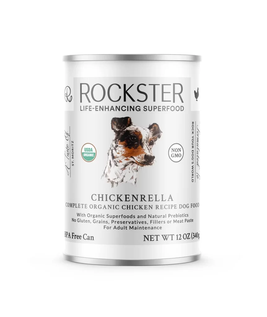
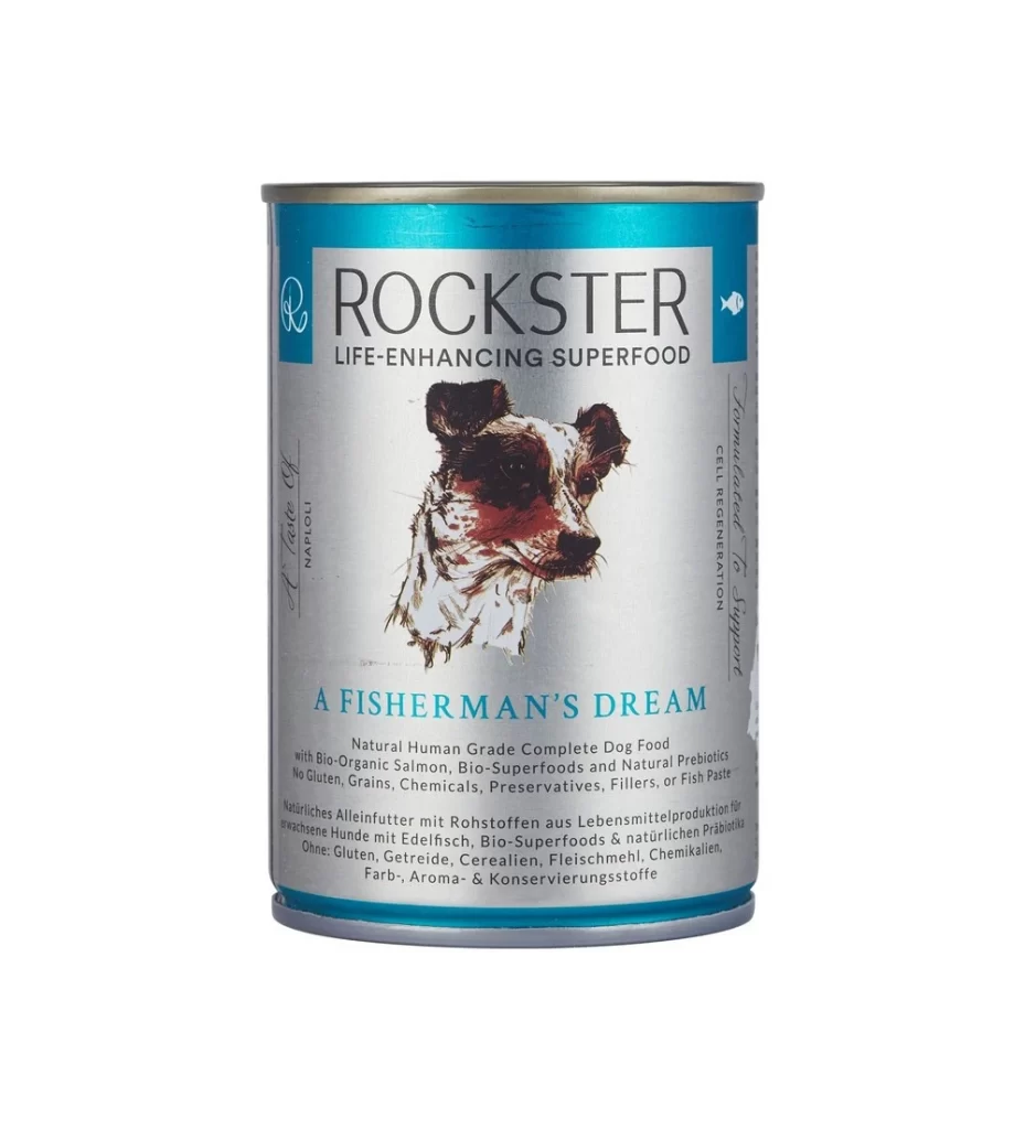
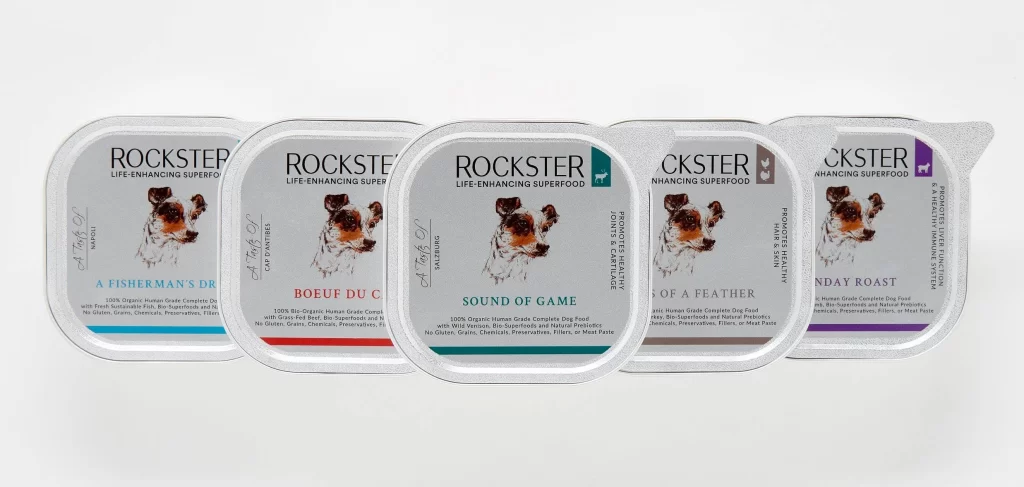
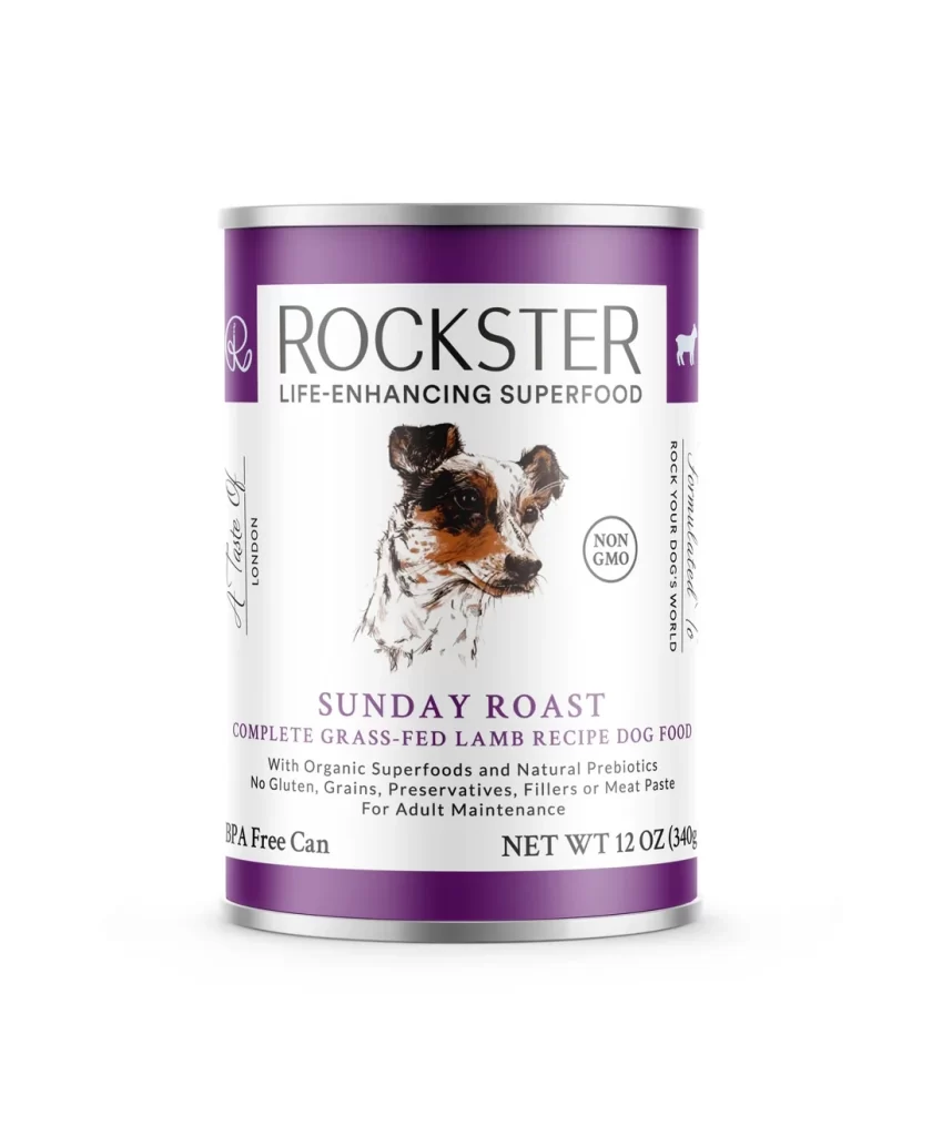
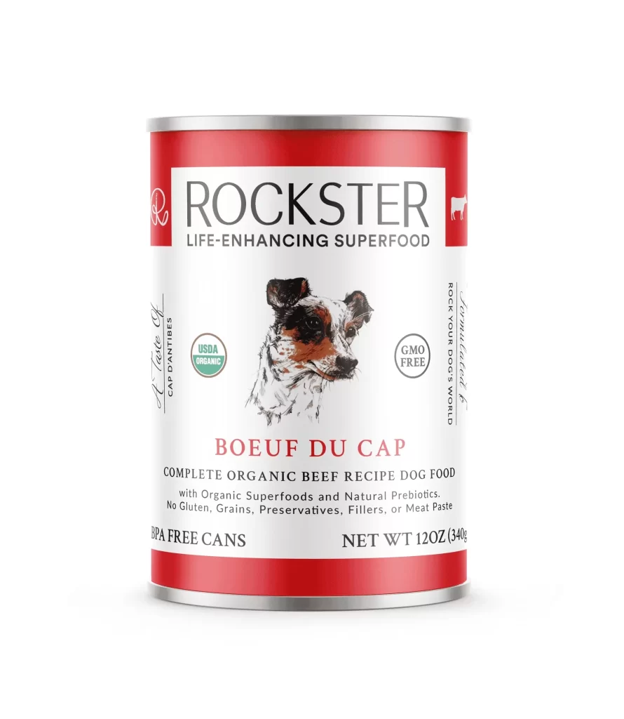
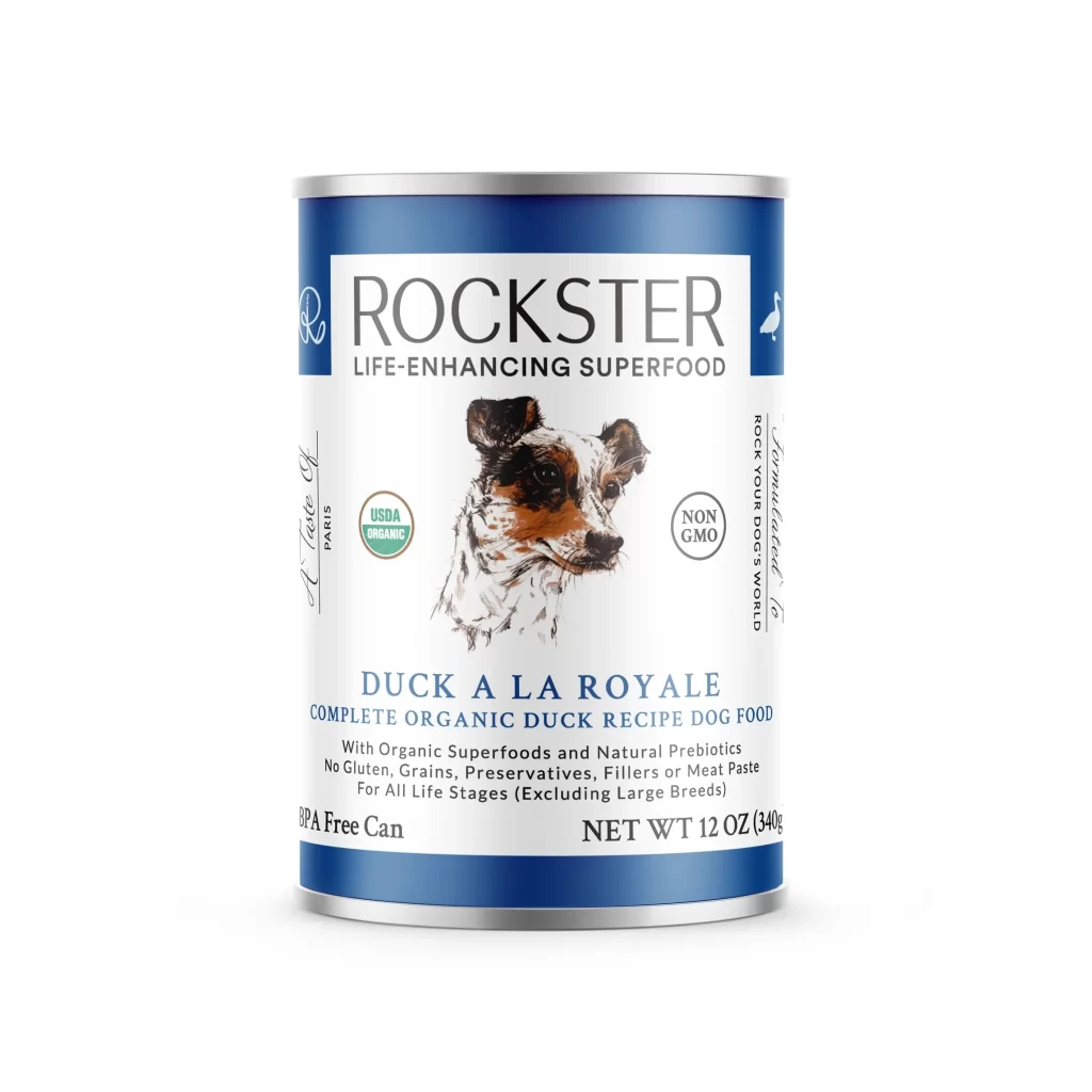
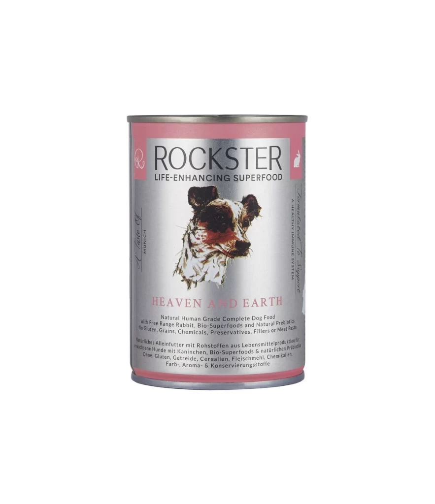
Rockster displays a cylindrical metal can with a silver body and pink top and bottom bands, featuring the brand name in bold black letters above 'LIFE-ENHANCING SUPERFOOD' and an illustration of a dog's head centered on the front, with 'HEAVEN AND EARTH' printed below in pink text alongside product details, all set against a plain white background with even studio lighting.
Visual distinction emerges from the juxtaposition of industrial metal textures against delicate pastel accents and organic illustrative elements. The hand-drawn quality of the canine portrait introduces an artisanal sensibility that contrasts sharply with the clean typographic hierarchy and structured layout. Bilingual text placement—English paired with German product specifications—creates layered informational density while maintaining visual balance through careful alignment and spacing.
Packaging designers studying premium pet food branding might examine this composition to understand how illustration styles convey ingredient quality and ethical positioning. Art directors developing luxury consumer goods could reference the color palette integration when balancing metallic substrates with soft graphic treatments. Students of commercial typography would find value in analyzing how multiple languages coexist within a constrained cylindrical format without compromising legibility or aesthetic cohesion.