Rockster Dog Food Can
Topics
Details
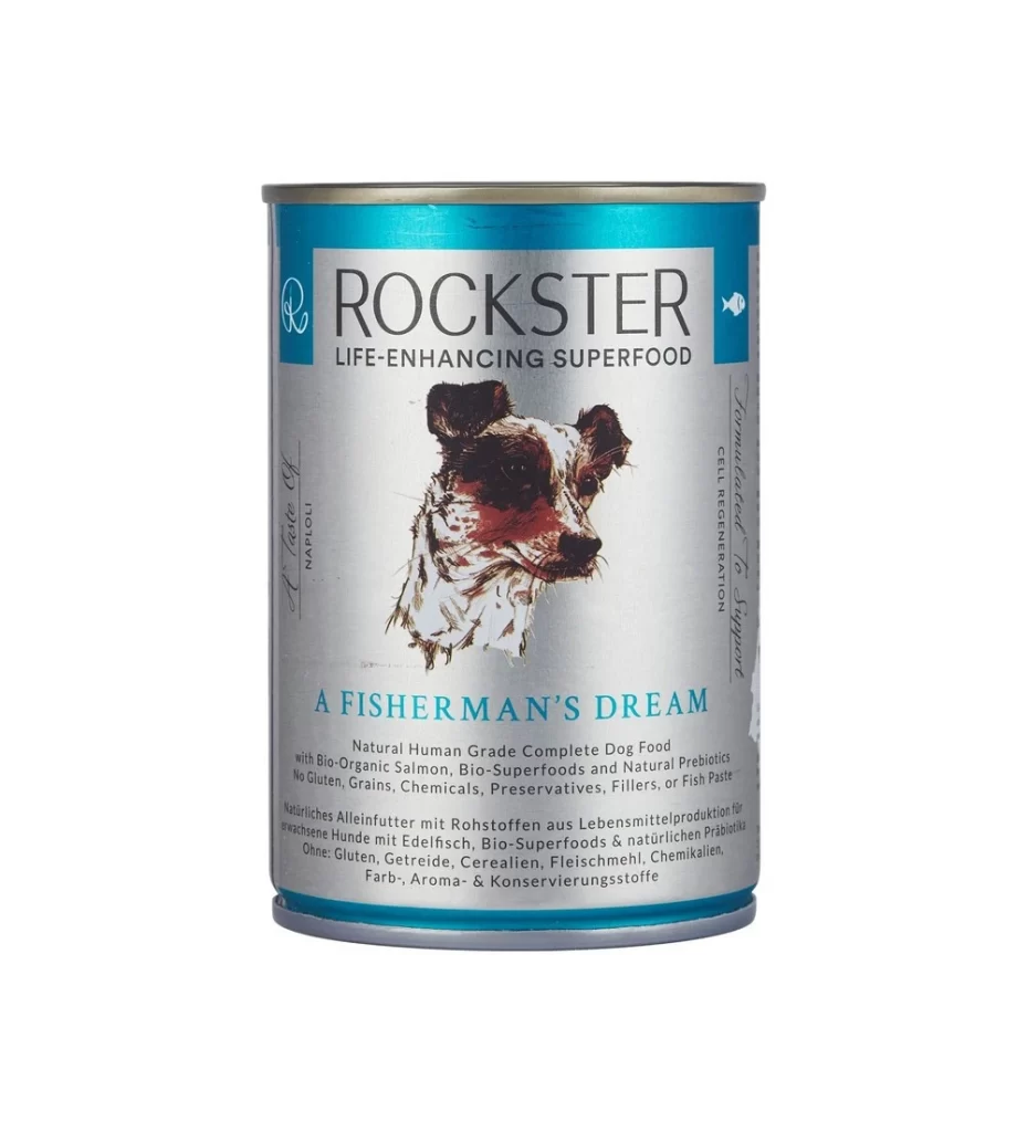
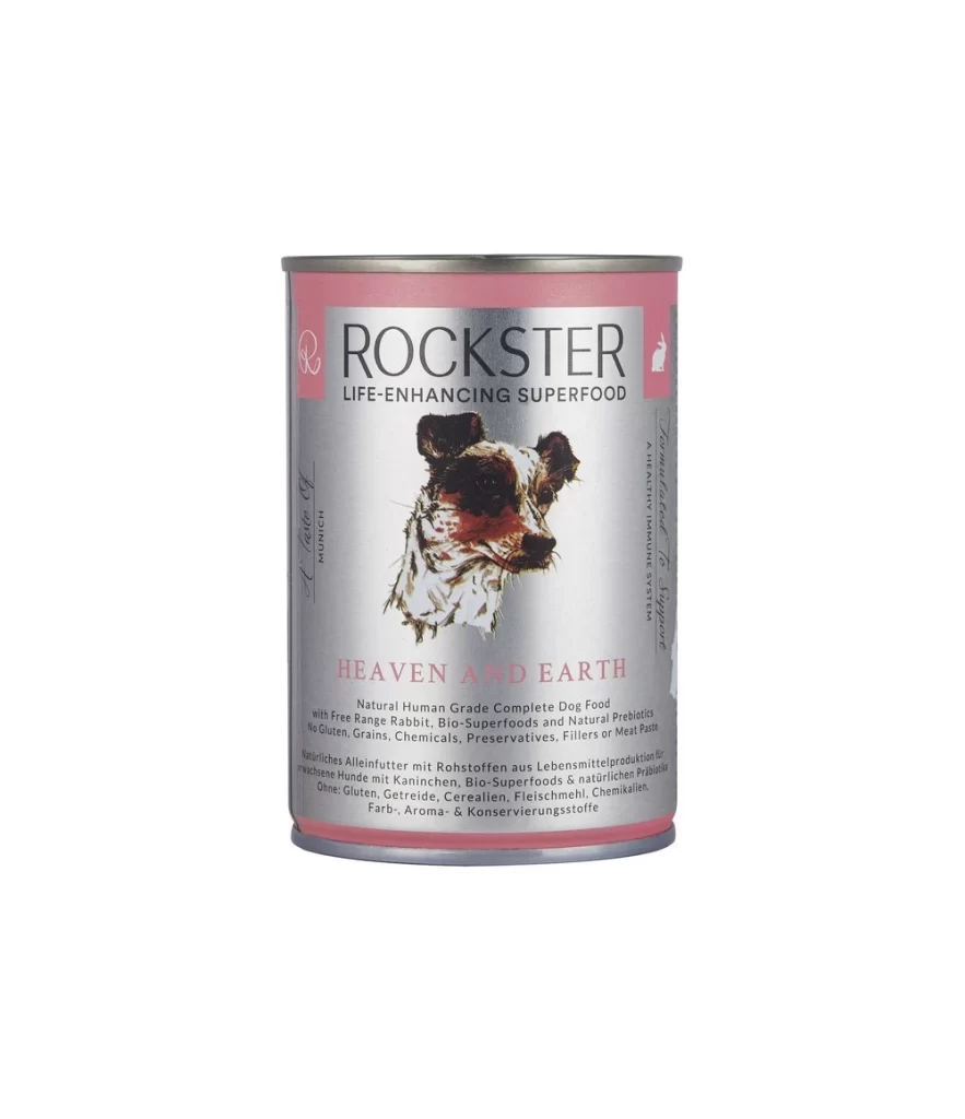
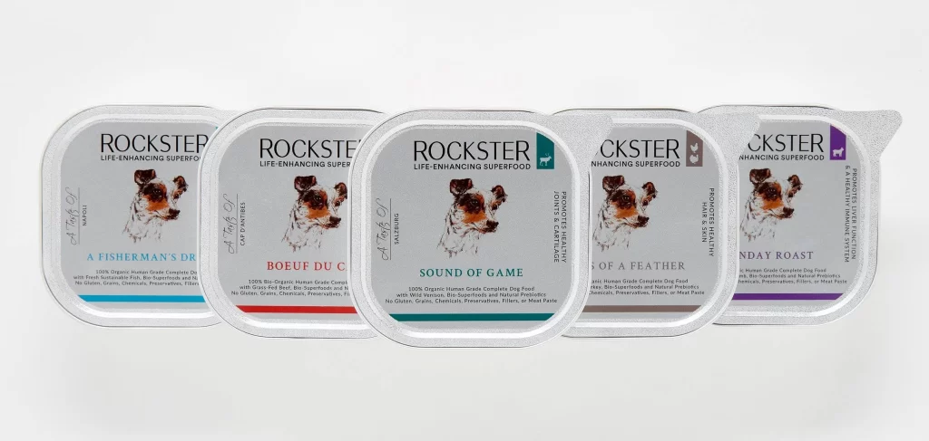
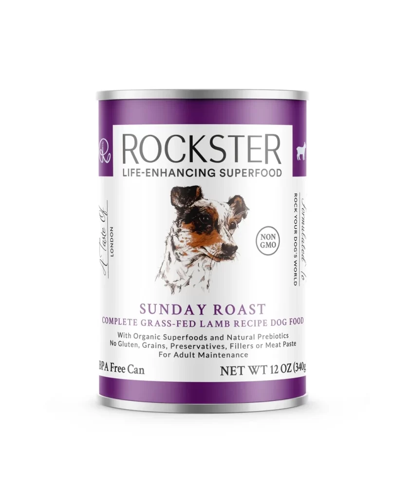
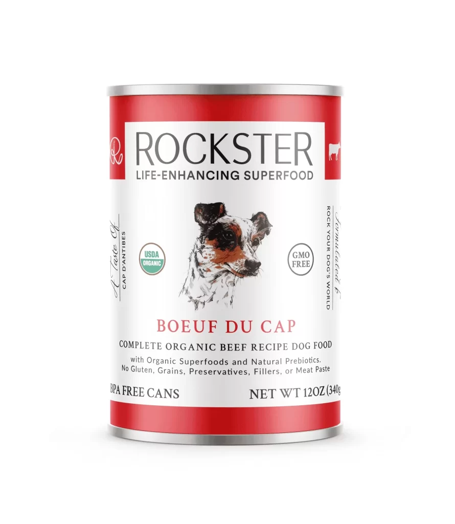
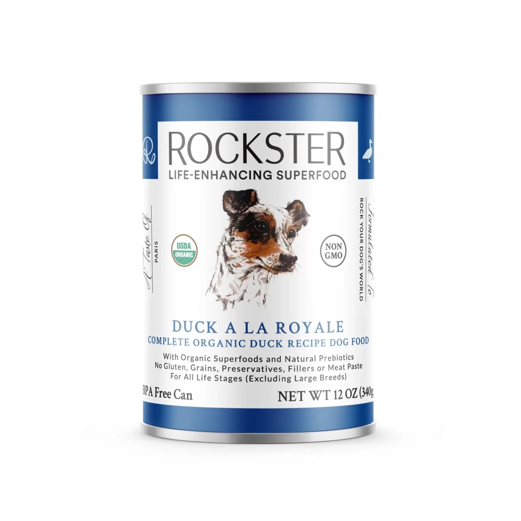
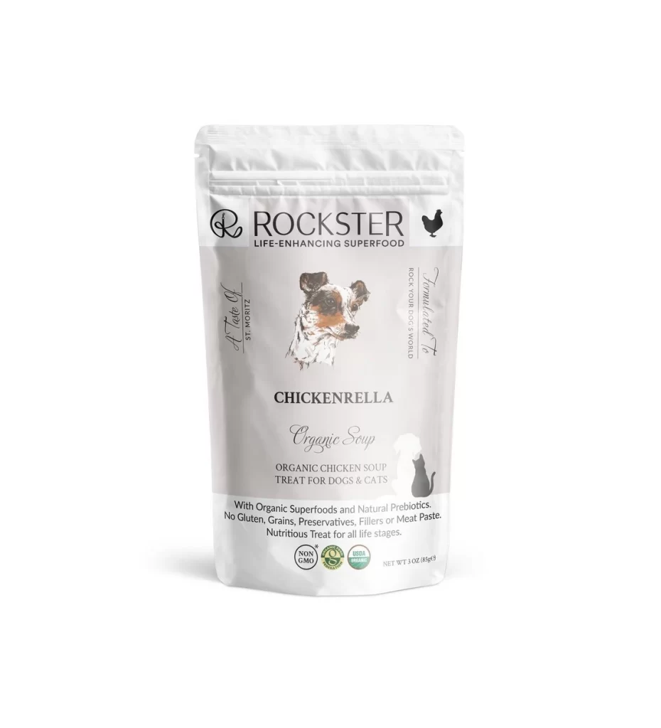
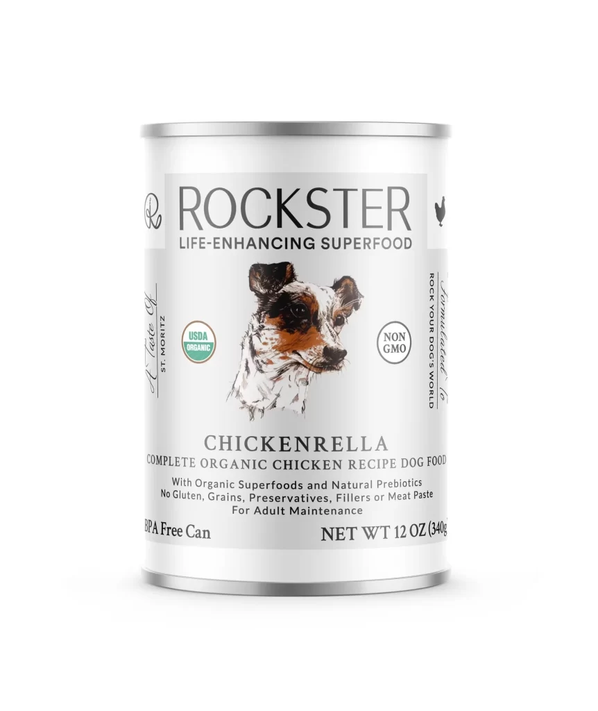
A cylindrical aluminum can with a crisp white label dominates the frame, displaying the brand name ROCKSTER in bold black serif lettering above the tagline LIFE-ENHANCING SUPERFOOD. The central illustration features a detailed watercolor-style dog portrait with black, white, and tan markings, flanked by circular USDA Organic and Non-GMO certification badges. Even studio lighting illuminates the metallic silver rim and printed product details, including CHICKENRELLA, the 12 oz net weight, and BPA Free Can designation, all arranged in a clean vertical hierarchy.
Visual distinction emerges from the sophisticated interplay between minimalist layout and detailed organic branding cues, where the hand-drawn quality of the canine artwork contrasts sharply with the geometric precision of the certification badges. The typographic hierarchy guides the eye from the prominent brand name down through the product identifier ‘CHICKENRELLA’ to the smaller claims about superfoods and prebiotics, creating a clear information architecture. Notably, the absence of clutter allows each element—from the tiny chicken silhouette icon to the net weight specification—to maintain legibility while contributing to an overall aesthetic of premium pet nutrition.
Packaging designers studying premium pet food trends would find this composition valuable for analyzing how whitespace and strategic icon placement communicate quality without overwhelming the consumer. Marketing teams developing organic product lines could reference the specific color palette of forest green, charcoal, and warm browns when establishing their own brand identity systems. Additionally, illustrators working on animal portraiture for commercial packaging might examine how the sketch-style rendering balances personality with professional polish, offering a template for similar lifestyle brand applications.