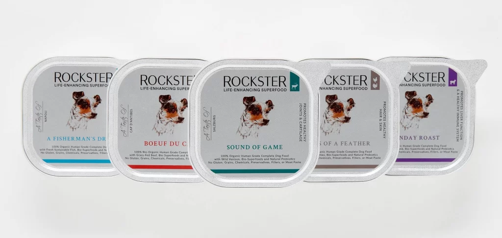
Rockster Dog Food Can Detail
Topics
Details
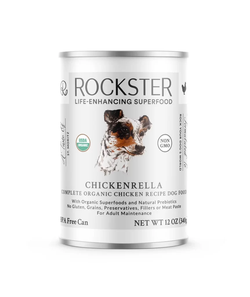
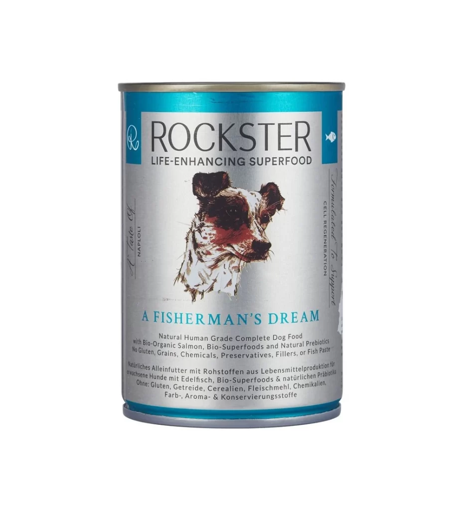
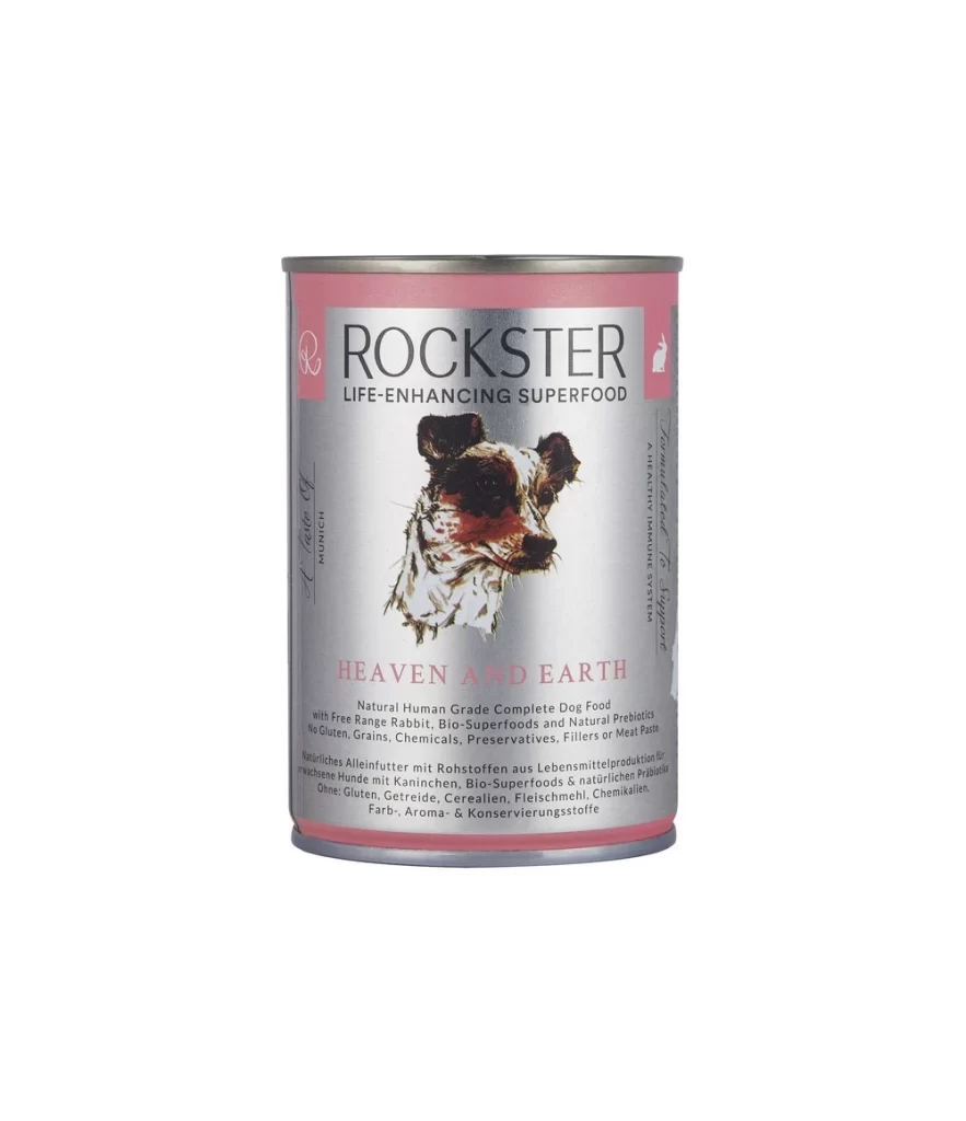
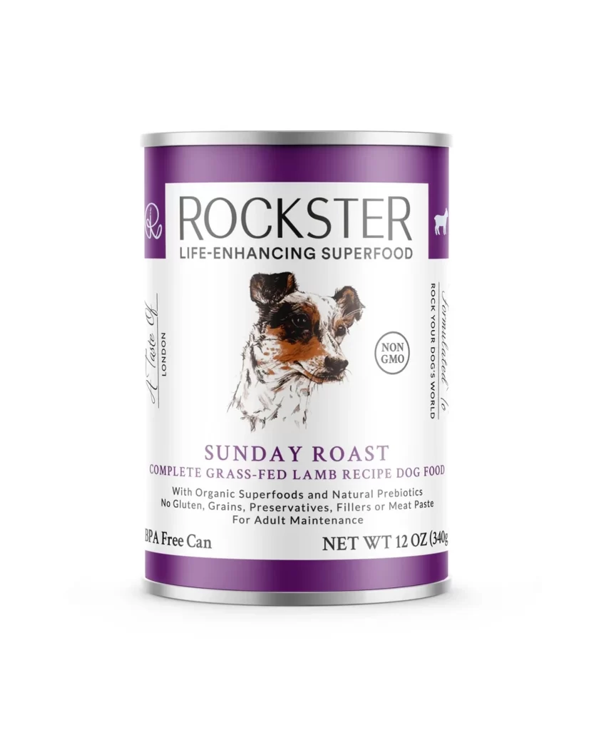
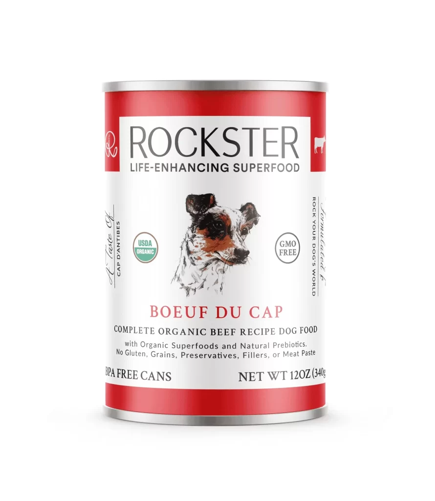
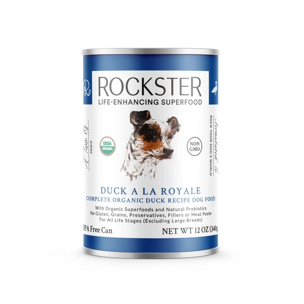
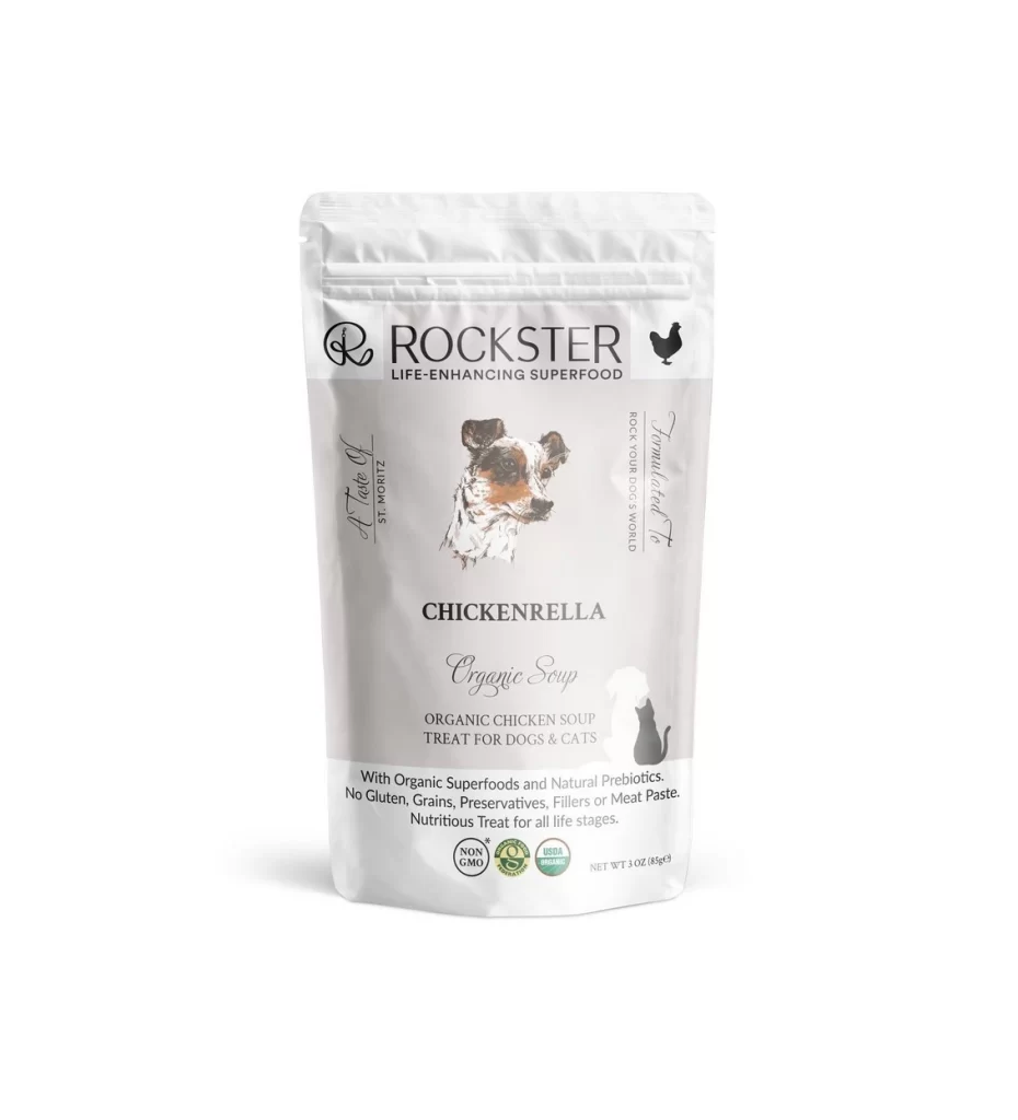
Five circular aluminum containers sit in a neat horizontal row against a seamless white backdrop, each displaying the 'ROCKSTER' brand name in bold black serif lettering above the tagline 'LIFE-ENHANCING SUPERFOOD'. The packaging features a consistent layout with a realistic illustration of a Jack Russell Terrier's head centered on every lid, while distinct color-coded bands—cyan, red, teal, grey, and purple—differentiate the flavors beneath product titles like 'A FISHERMAN'S DREAM', 'BOEUF DU C...', and 'SUNDAY ROAST'. Soft, even studio lighting eliminates harsh shadows, presenting the metallic surfaces with a subtle sheen from a straight-on camera perspective that emphasizes the uniform curvature of each tub.
Visual hierarchy plays a crucial role here, as the restrained palette of silver, white, and black allows the accent colors to function as immediate flavor identifiers without cluttering the premium aesthetic. The typographic contrast between the sturdy uppercase brand name and the elegant script of 'A Taste Of...' creates a sophisticated balance that suggests both reliability and artisanal care. Furthermore, the repetition of the dog portrait across all variants builds strong brand recognition while the varying color bars provide necessary differentiation for consumers scanning retail shelves.
Packaging designers studying pet food branding would find this arrangement particularly useful for analyzing how minimal color shifts can organize product lines while maintaining visual cohesion. Marketing teams could also reference this composition when planning e-commerce photography that requires showcasing multiple SKUs in a single frame without visual confusion. Additionally, illustrators looking to understand how to integrate animal portraetry into commercial layouts might examine the precise placement and scaling of the terrier image relative to the textual elements.