Rise Shine Typography
Topics
Details
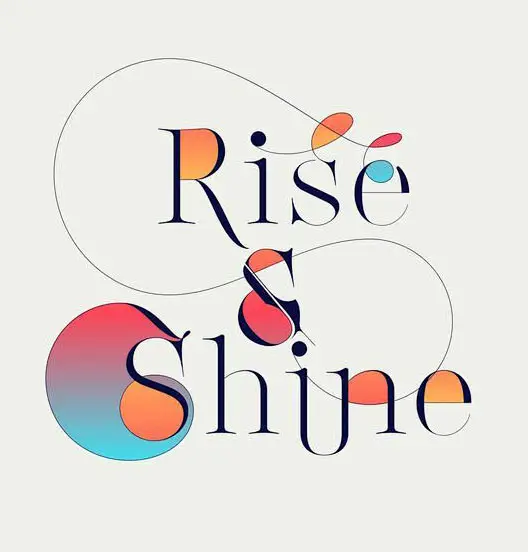
Refined serif letterforms spelling 'Rise' and 'Shine' anchor the composition, joined by a stylized ampersand. Vibrant geometric overlays in coral, tangerine, and cyan punctuate the text, including a large gradient circle behind the capital 'S', while thin black lines arc gracefully across the pale cream background.
Visual interest stems from the interplay between rigid typographic structure and organic, floating color elements. The gradient transitions within the circular shapes suggest a sunrise palette, while the sweeping lines add a dynamic, hand-drawn quality that contrasts with the digital precision of the font. This balance between classical elegance and modern abstraction creates a sophisticated yet approachable aesthetic.
Branding specialists might reference this for morning lifestyle products or wellness applications requiring optimistic visual language. Editorial designers could adapt similar techniques for magazine headlines seeking warmth without sacrificing readability. The layered approach also serves as a model for integrating illustrative elements into typographic systems.