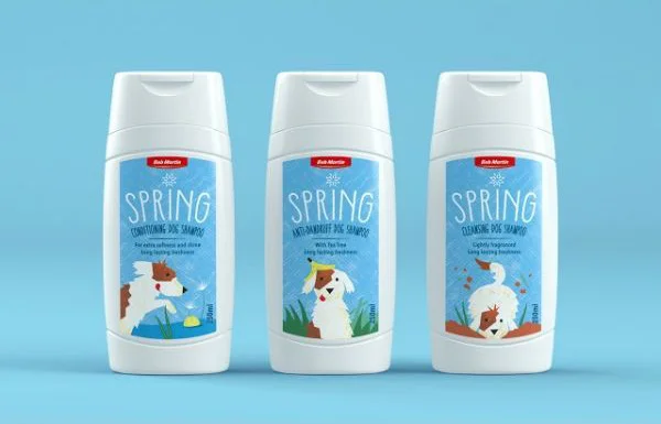
Spring Dog Shampoo White Blue Red Illustration
Topics
Details
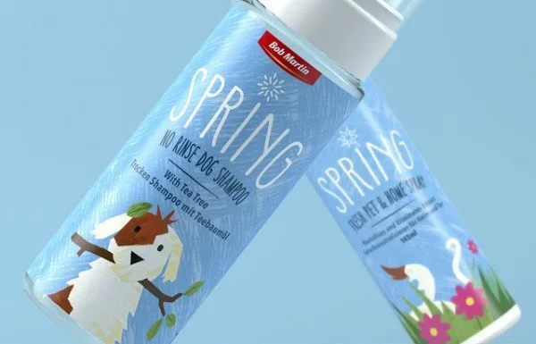
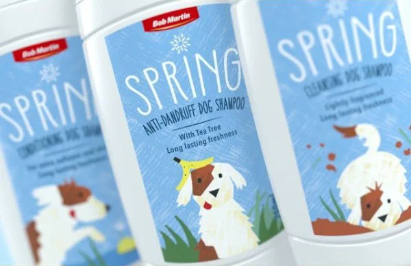
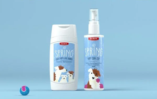
Three white plastic bottles with flip-top caps stand in a row, each featuring a light blue label dominated by the word 'SPRING' in white hand-drawn lettering. A small red rectangular badge sits at the top of each label containing the brand name 'Bob Martin', while the lower half displays unique illustrations of different dog breeds engaged in seasonal activities like running through grass or splashing in water. The entire arrangement is photographed straight-on against a solid pale blue backdrop that complements the label color, with soft even lighting creating minimal shadows beneath the containers.
Visual distinction comes from the cohesive color palette combining clinical white packaging with cheerful sky-blue graphics and strategic red accents that draw the eye to branding elements. The whimsical, sketch-style illustrations of dogs vary across the three variants while maintaining consistent artistic treatment, creating product differentiation without breaking visual unity. Typography choices mix bold display fonts for the seasonal theme with smaller functional text describing specific shampoo types, establishing a clear hierarchy between marketing appeal and practical information.
Packaging designers studying pet care branding could analyze how color psychology and illustration style communicate freshness and gentleness for animal grooming products. Marketing teams developing seasonal product lines might reference this layout to understand how to maintain brand consistency while introducing variant-specific imagery. Art directors creating e-commerce photography for personal care items could examine the lighting setup and composition techniques that emphasize product details without distracting reflections or harsh shadows.