Starbucks Colombia Huila Coffee Bag Advertisement
Topics
Details
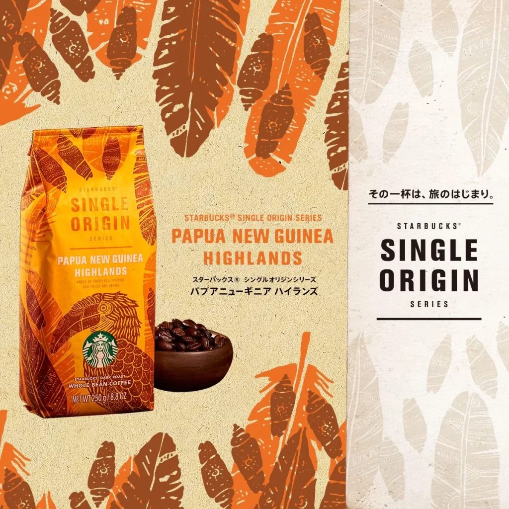
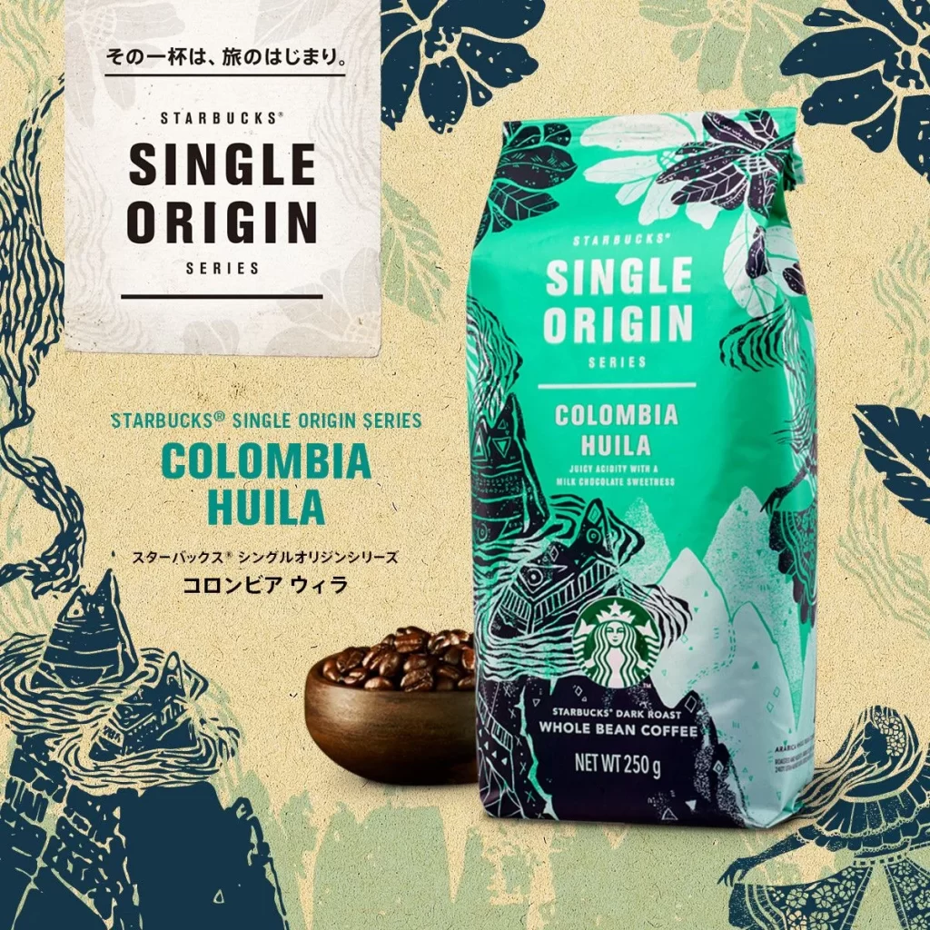
A 250g bag of Starbucks Single Origin Colombia Huila dark roast whole bean coffee stands as the central focal point, its packaging dominated by a vibrant teal-green upper section that transitions into a deep navy base. Bold white sans-serif typography spells out 'SINGLE ORIGIN' and 'COLOMBIA HUILA' above the iconic siren logo, while intricate black linework illustrations of mountain peaks, tropical leaves, and stylized human figures wrap around the bag's surface. To the left, a small wooden bowl filled with dark roasted beans sits on a textured cream-colored backdrop decorated with large-scale botanical patterns in navy and sage green, and a white card displaying Japanese text and series branding leans in the upper left quadrant.
The visual distinction lies in the fusion of corporate identity with regional folk-art aesthetics, where the geometric mountain motifs and organic leaf patterns create a sense of terroir-specific storytelling that transcends typical commodity coffee branding. The color palette—specifically the striking contrast between the electric turquoise and midnight blue—evokes both the lushness of Colombian landscapes and the depth of a dark roast profile, while the hand-drawn illustration style adds an artisanal authenticity that mass-produced packaging often lacks. This particular iteration balances the global recognition of the Starbucks siren with localized visual narratives, making the origin story immediately legible through graphic elements rather than text alone.
Brand strategists developing premium agricultural product lines could study this example to understand how illustration styles can communicate geographic specificity without relying solely on photography. Packaging designers tasked with creating limited-edition retail SKUs might analyze the typographic hierarchy and color blocking to see how maximum information density coexists with decorative artwork. Marketing teams launching single-origin or craft-sourced products could reference this approach when needing to convey authenticity and provenance through visual systems that feel both globally consistent and locally resonant.