Starbucks Cherry Blossom Frappuccino
Topics
Details
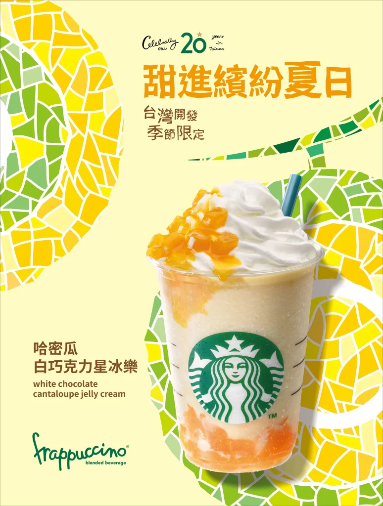
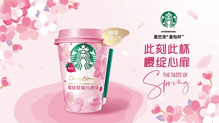
High-contrast silhouettes are not present in this image; instead, the frame is centered on a Starbucks ‘Star-Enjoy’ cup featuring the Cherry Blossom Strawberry Macchiato flavor, set against a soft pink background. The composition includes scattered cherry blossom illustrations, the green Starbucks siren logo, and prominent Chinese text reading ‘此刻此杯 樱绽心扉’ alongside the English translation ‘THE TASTE OF Spring’, while a gold badge in the upper left corner announces the spring season launch.
The visual identity relies on a pastel palette of blush pinks, whites, and soft greens to evoke a gentle seasonal atmosphere. Typography mixes bold red Chinese characters with elegant, flowing English script to create a contrast between modern impact and organic grace. Illustrative elements are rendered in a soft, watercolor style that blends seamlessly with the product photography to create a cohesive romantic aesthetic.
Graphic designers often analyze this layout to understand how to balance central product focus with decorative background elements without cluttering the message. Marketing professionals utilize this case study to observe how localized text integrates with global brand standards for specific regional campaigns. Packaging specialists reference the cup design to see how limited-edition artwork can transform standard containers into collectible seasonal items.