Titanic Movie Poster Collide With Destiny Red View
Topics
Details
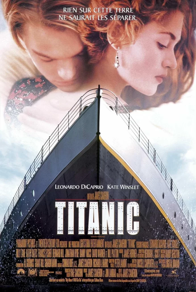
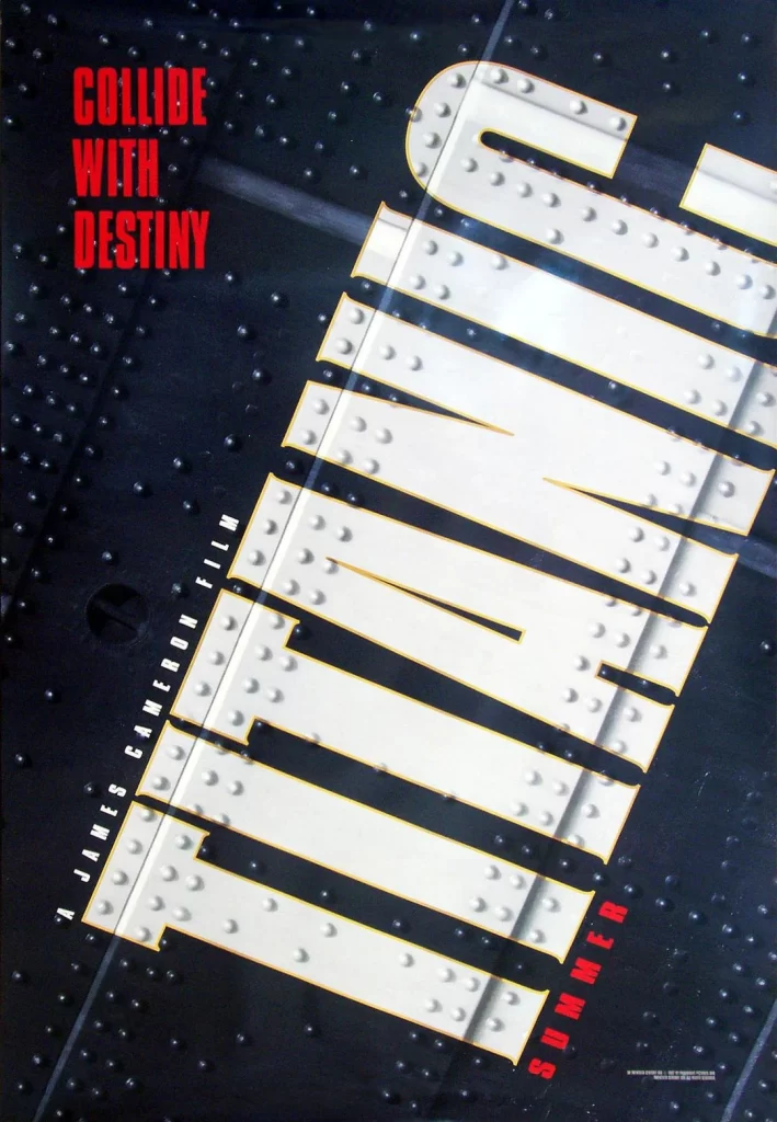
Against a dark, riveted steel background, the word 'TITANIC' dominates the frame in massive, diagonal white letters outlined in yellow. Each letter features realistic metallic rivets along its edges, mimicking the industrial construction of a ship's hull. Bold red text reading 'COLLIDE WITH DESTINY' sits vertically on the left, while 'A JAMES CAMERON FILM' runs parallel to the title's left edge and 'SUMMER' anchors the bottom right corner.
The visual power of this composition lies in its clever integration of typography with texture, where the letterforms themselves appear to be constructed from heavy metal plating. By tilting the entire layout at a dynamic angle, the design creates an immediate sense of instability and impending motion that perfectly complements the film's narrative about a doomed vessel. The stark contrast between the cold industrial grays, the warning-red tagline, and the pristine white title ensures maximum legibility despite the complex textural details.
Film historians and graphic design students might analyze this piece to understand how 1990s blockbuster marketing utilized industrial aesthetics to convey scale and danger. Prop makers constructing replica movie memorabilia could reference the specific rivet patterns and font weights to achieve period-accurate results. Marketing teams developing campaigns for historical dramas or disaster films could study the color psychology and spatial arrangement to evoke similar emotional responses in their own audiences.