Titanic Ship Poster Blue Line View
Topics
Details
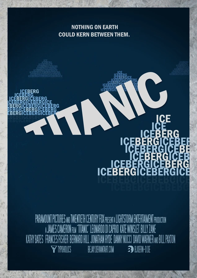
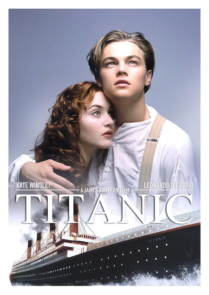
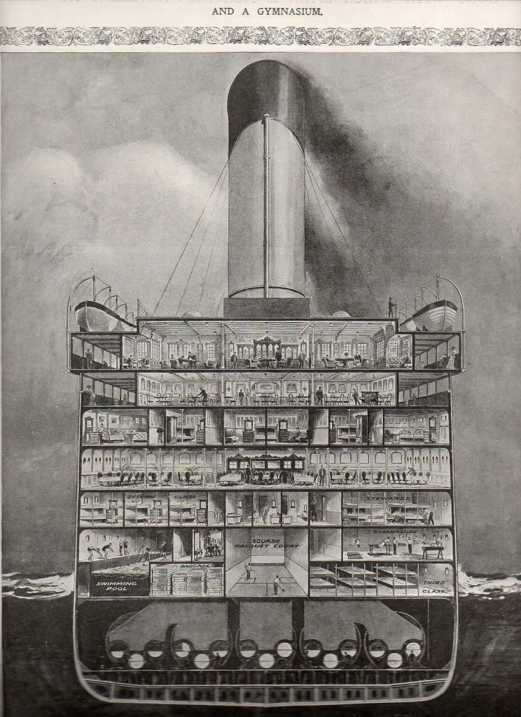
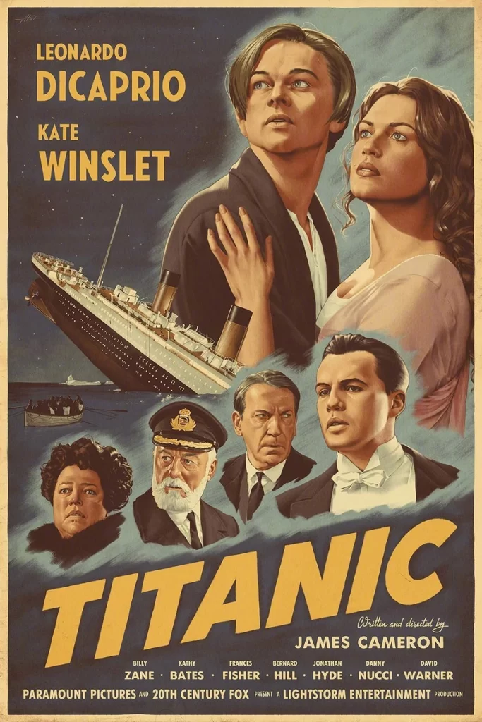
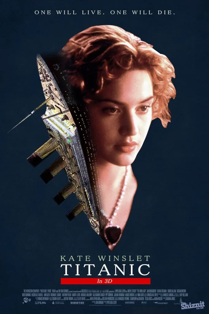
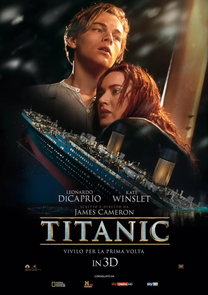
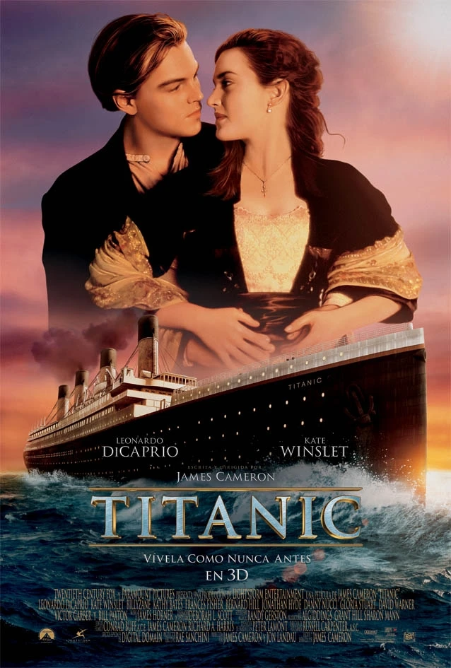
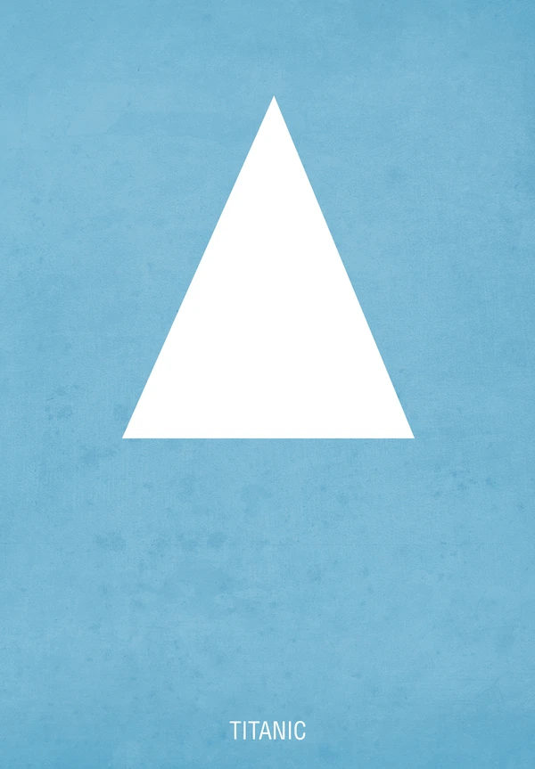
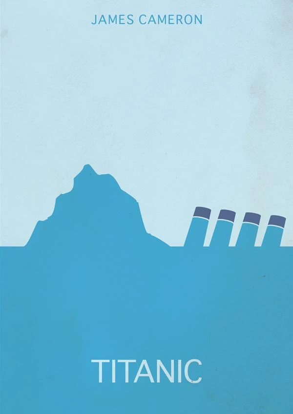
Against a pale, textured sky-blue background, the composition divides horizontally into two distinct zones of color. The upper register features the name "JAMES CAMERON" in a clean, sans-serif typeface, while the lower half is dominated by a deeper cyan field containing the word "TITANIC" in bold white capitals. Between these text elements, a jagged iceberg silhouette rises from the left, its peak irregular and sharp, while to the right, four dark smokestacks with lighter caps emerge at an angle, suggesting a vessel tilting into the depths.
Minimalist geometry drives the visual impact here, reducing a catastrophic maritime event to essential symbolic forms. The limited palette—ranging from powder blue through medium turquoise to near-navy accents—creates atmospheric depth without realistic detail. By cropping the ship to merely its funnels and implying the hull's submersion through the color block division, the design achieves narrative efficiency that literal representation cannot match.
Film studies instructors might employ this graphic when lecturing on iconic cinema branding or minimalist poster movements. Interior decorators seeking nautical-themed wall art for modern spaces could reference this aesthetic for commissioned prints. Additionally, typography analysts examining how director attribution balances against title hierarchy in promotional materials would find the spatial relationships instructive.