Torras O1S Stand Case Advertisement
Topics
Details
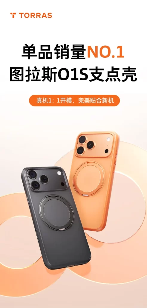
Whimsical illustration styling defines the promotional poster, which features the Torras brand logo in orange at the top left followed by bold Chinese text declaring the product as the number one best-selling item. Two smartphone cases, one black and one peach-colored, are displayed at an angle to showcase their circular magnetic stand modules and camera cutouts. A smaller orange pill-shaped badge contains text claiming a perfect fit for new phone models, all set against a soft gradient background with abstract circular shapes.
Visual hierarchy is established through large, heavy sans-serif typography for the main headline, with the ‘NO.1’ segment highlighted in orange to draw immediate attention. The color palette relies on warm peach and cream tones contrasted against the dark product, creating a premium yet approachable aesthetic. Product photography utilizes soft lighting and subtle shadows to emphasize the texture of the cases and the metallic finish of the magnetic rings.
Marketing professionals and graphic designers utilize this composition as a benchmark for effective e-commerce product visualization and headline placement. Students of advertising often reference the balance between textual information and visual product demonstration found in this layout. Mobile accessory enthusiasts and case collectors also examine such imagery to evaluate build quality details and color accuracy before making purchasing decisions.