Urban Decay Makeup Setting Spray Bottle
Topics
Details
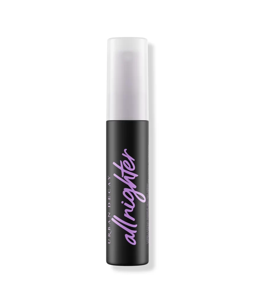
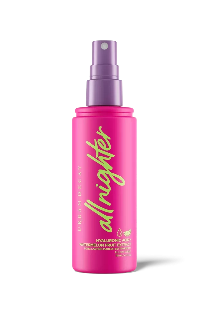
Centered within a void of pure white, a cylindrical bottle of Urban Decay All Nighter setting spray stands in sharp relief. The vessel features a saturated magenta body capped by a matte lavender spray mechanism, with the product name rendered in an oversized, pale chartreuse cursive script that cascades vertically down the front. Smaller gold typography identifies the brand and key ingredients like hyaluronic acid and watermelon fruit extract, while soft studio lighting casts a subtle shadow to the right, emphasizing the bottle's smooth, opaque plastic texture.
Visual hierarchy is established through the dramatic contrast between the hot pink substrate and the cool-toned purple cap, creating immediate chromatic tension. The oversized, fluid lettering of 'allnighter' dominates the composition, transforming functional labeling into a bold graphic element that draws the eye downward. This specific iteration introduces fruit-based skincare claims through minimalist iconography, distinguishing it from earlier versions through its playful yet clinical color palette.
Product photographers might study this composition to understand how neutral backgrounds amplify saturated packaging colors without distraction. Packaging designers could analyze the typographic scale and weight distribution to inform their own cosmetic branding projects. Marketing teams reviewing this reference would note how ingredient benefits are integrated subtly beneath the primary brand identity, maintaining visual clarity while conveying technical information.