Urban Decay Eyeshadow Palette Box View
Topics
Details
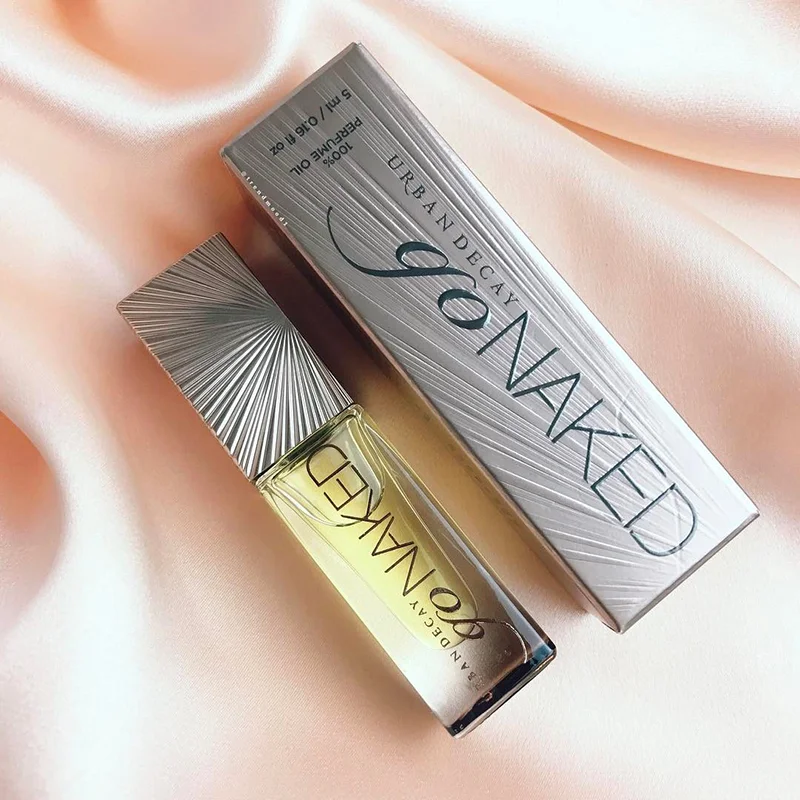
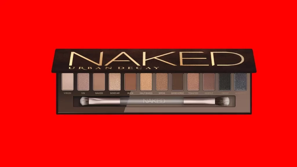
Against a saturated crimson backdrop, the Urban Decay Naked palette sits in a direct frontal view, its lid propped open to reveal twelve rectangular eyeshadow pans arranged in a precise horizontal row. The packaging features a matte black finish with the word 'NAKED' rendered in large, metallic gold serif lettering above the smaller 'URBAN DECAY' brand name. Below the shadows—ranging from pale ivory and shimmering champagne to deep charcoal and midnight blue—a dual-ended applicator with silver ferrules rests in a dedicated slot, each pan labeled with distinct names like Virgin, Sin, Buck, and Darkhorse.
Visual hierarchy dominates this composition through the stark contrast between the warm red negative space and the cool, neutral tones of the cosmetic product itself. The typography choices create immediate brand recognition, while the gradient of earthy neutrals punctuated by darker, sparkling finishes demonstrates sophisticated color theory in commercial packaging. Such deliberate arrangement of textures—from buttery mattes to glitter-infused shades—offers a masterclass in how luxury beauty brands communicate quality through tactile visual cues.
Product photographers might study this framing to understand how flat-lay aesthetics emphasize inventory details without distraction. Packaging designers could analyze the balance between bold logo placement and functional element organization, noting how the brush integration maintains a clean silhouette. Marketing teams developing e-commerce visuals would benefit from examining how even lighting eliminates harsh reflections on the glossy black surfaces while preserving the metallic sheen of the gold text.