Urban Decay Mascara Tube
Topics
Details
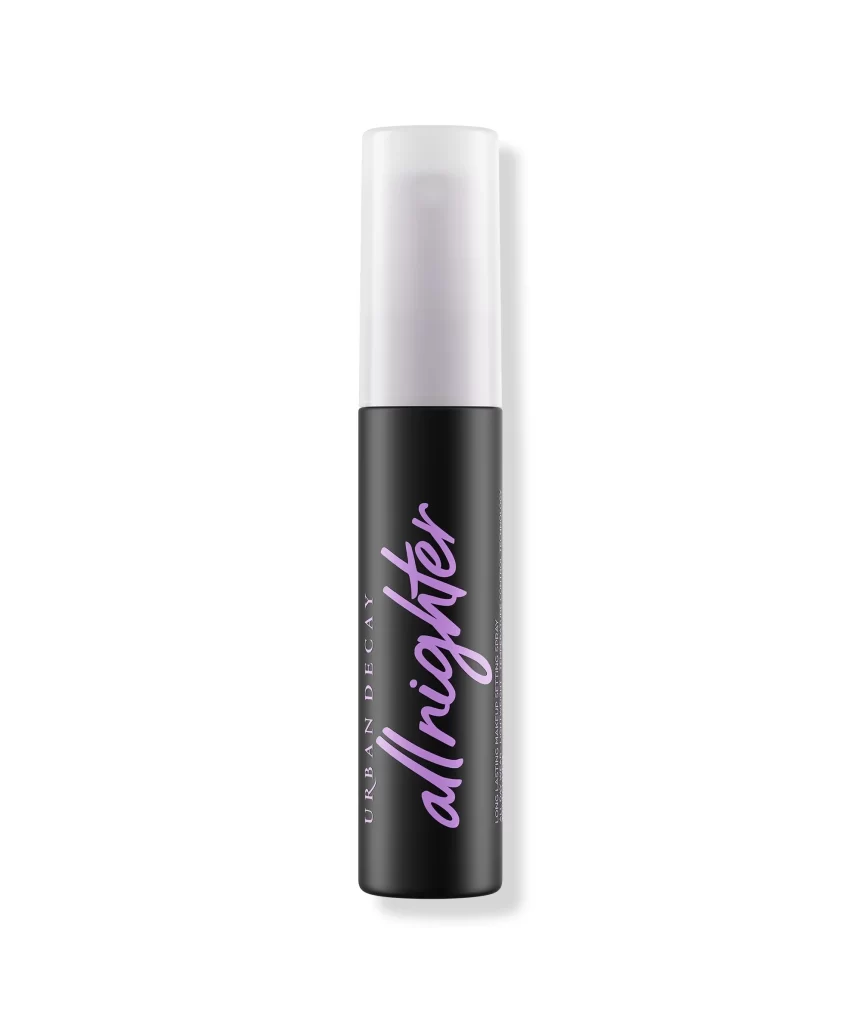
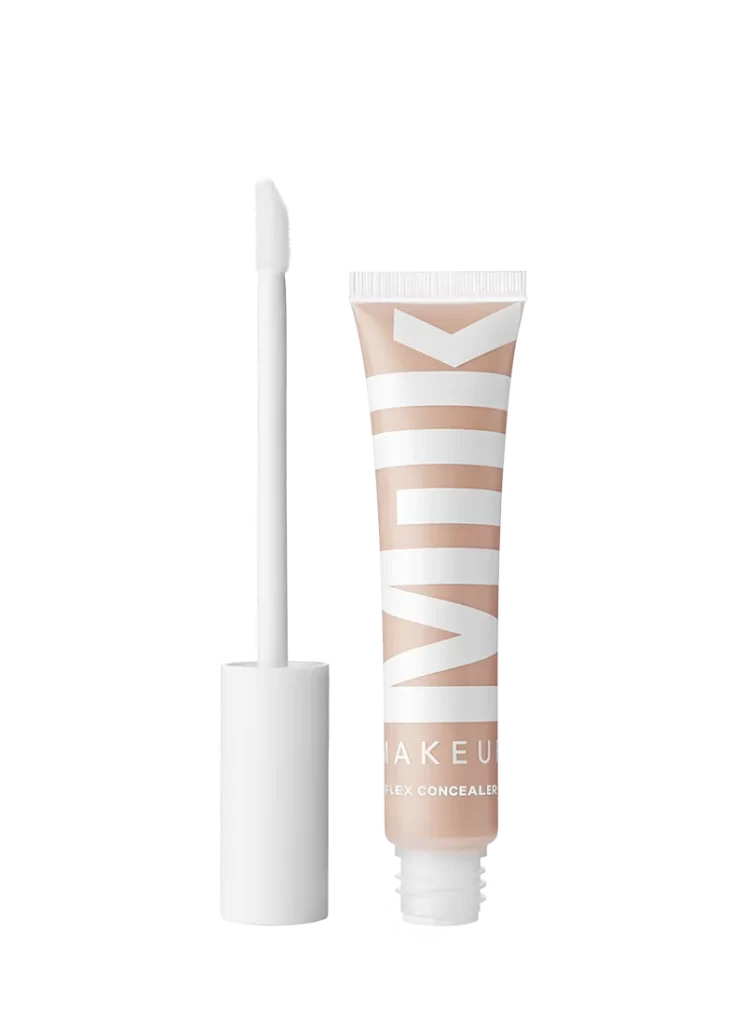
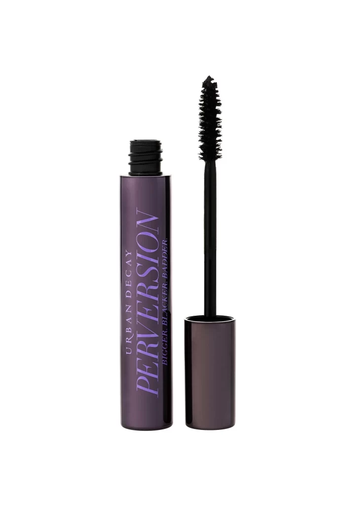
Centered within a clean white void, the Urban Decay Perversion mascara tube stands vertically with its cap removed and placed beside it. The cylindrical container features a deep purple-to-black gradient finish, displaying 'URBAN DECAY' in small white capitals above a large, stylized 'PERVERSION' in lavender, with 'BIGGER BLACKER BADDER' running vertically in smaller text. A dense, spiral-bristle wand extends upward from the open neck, while soft even lighting eliminates harsh shadows across the glossy surfaces.
Visual distinction emerges from the dramatic typographic hierarchy where the product name dominates through scale and contrasting color against the dark metallic substrate. The wand's bristle architecture shows precise spacing and curl patterns that indicate specific application mechanics, while the cap's interior reveals threading details often overlooked in standard beauty photography. This particular shade variation creates an almost iridescent quality that shifts between violet and charcoal depending on light angle.
Packaging designers studying premium cosmetic branding will find value in analyzing how the gradient metallic finish interacts with foil-stamped lettering for luxury positioning. 3D artists requiring accurate brush topology for beauty product renders can reference the exact bristle density and handle proportions shown here. Marketing teams evaluating competitive packaging might use this to benchmark how vertical text orientation affects shelf presence and brand recognition in crowded retail environments.