
Packaging Picks — Gillette: One Brand, Two Design Languages
Walk down the shaving aisle and you will find one of the most interesting design case studies in retail — hiding in plain sight. Gillette and Venus are the same brand family, made by the same company, selling the same core product: razors. Yet on the shelf they speak two completely different visual languages. The men’s line is built on saturated color blocks, tech typography, and performance claims. The Venus line answers with pastels, botanical illustration, and words like comfort and gentle.
At Gropicture, we have Gillette packaging images available as design reference — covering Fusion5, MACH3, GilletteLabs, Guard, Foamy, deodorants, and the full Venus range. Together they show how one company deliberately designs two opposite packaging systems for the same category.
The Men’s System: Color as Technology Coding
The first thing to understand about Gillette’s men’s packaging: color is not decoration, it is navigation. Each sub-line owns one signature color, and the color tells you which technology platform is inside the box before you read a single word.
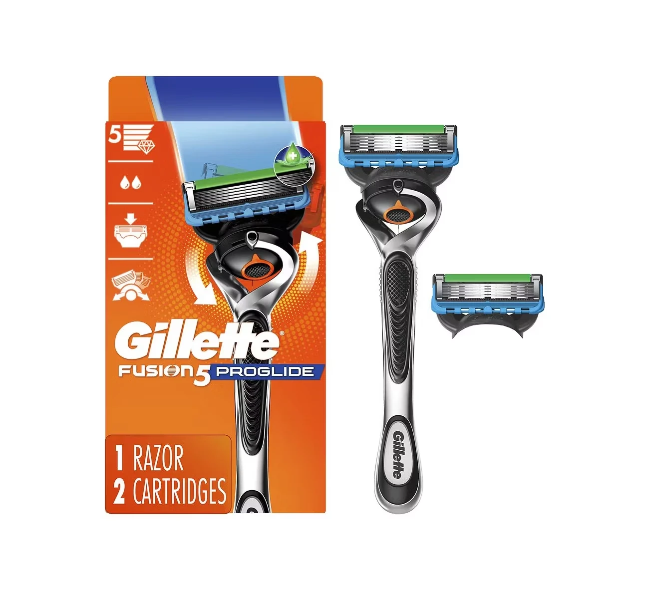
Fusion5 ProGlide: The Orange Flagship
The Fusion5 ProGlide box leads with a bold orange band — the louder, faster color in the range, matched to the brand’s most aggressive glide technology. The razor handle is displayed like a trophy against the color field, and every claim (blade count, precision trimmer, lubrication strips) sits in its own labeled zone. This is packaging as spec sheet.
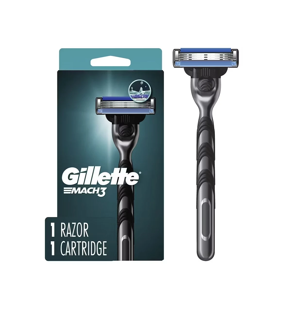
MACH3: The Green Classic
MACH3 — the three-blade platform that has been the entry hero for decades — carries its signature green on the blister card. Note the format switch: the everyday razor hangs on a transparent blister so the handle itself does the selling, while the premium lines get closed boxes. The hierarchy of packaging formats mirrors the hierarchy of the range.
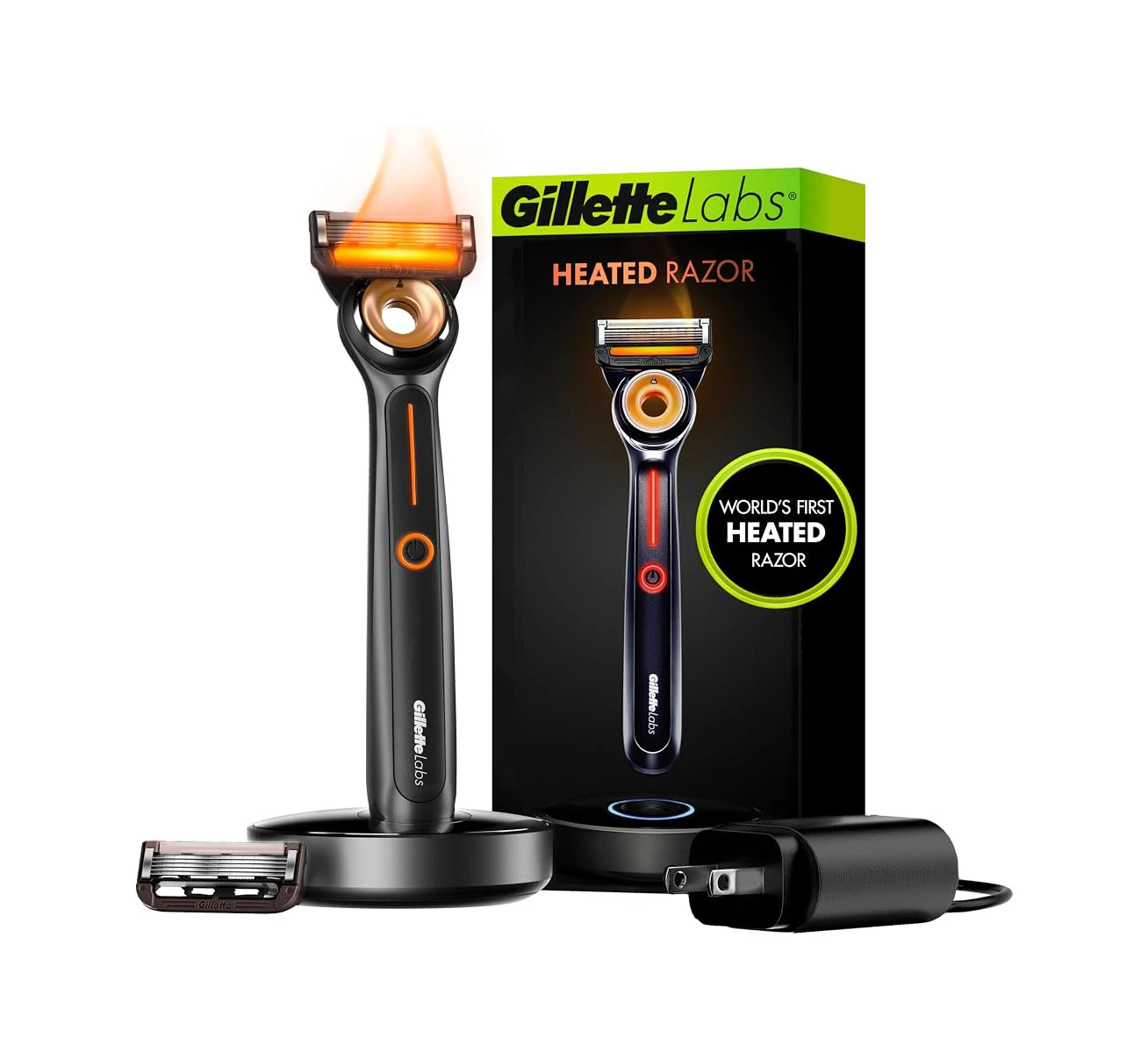
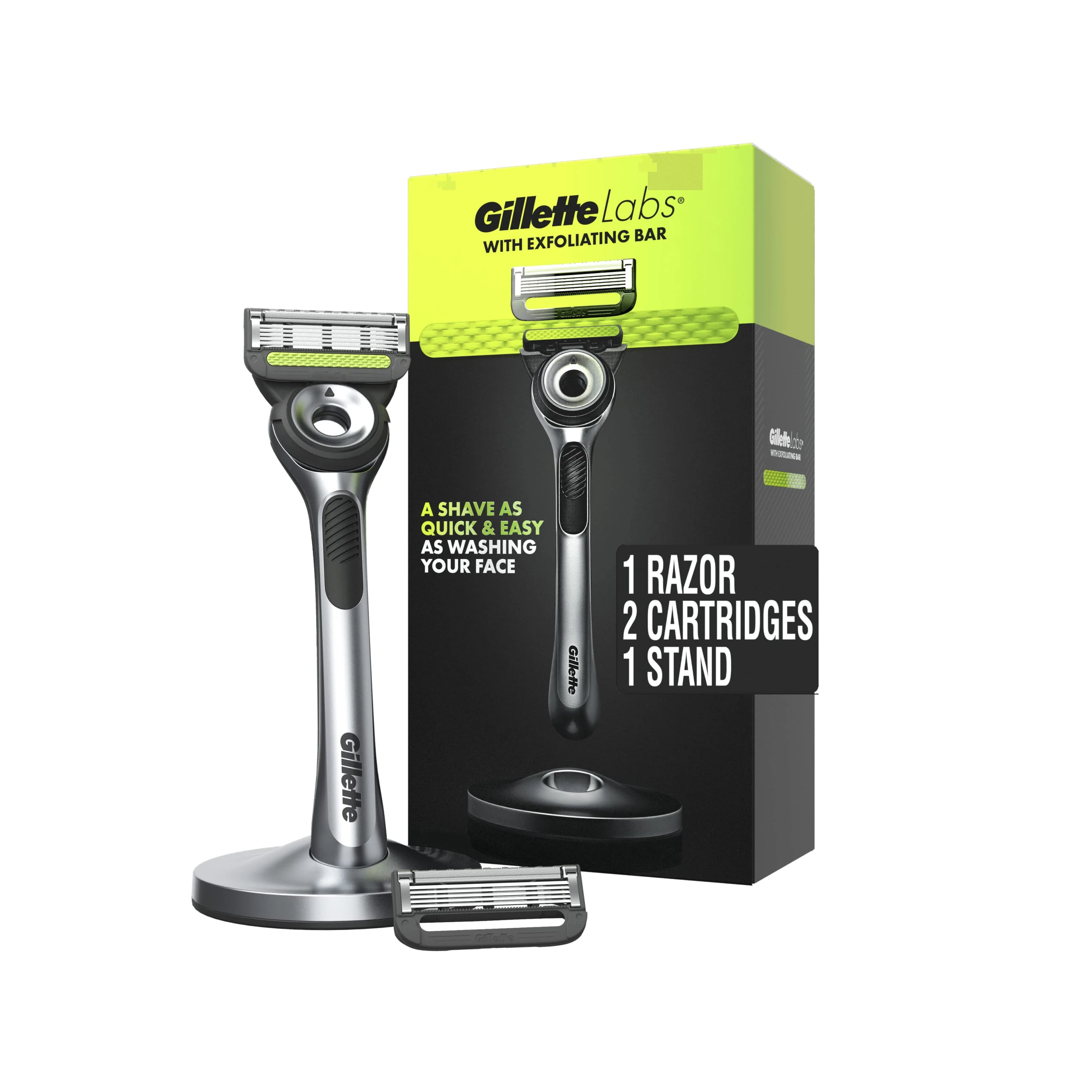
GilletteLabs: Black Means Future
The GilletteLabs line strips the color almost entirely. The Heated Razor arrives in a black-and-silver box with temperature graphics — the palette of consumer electronics, not shaving. The Exfoliating Bar edition adds a single green accent to explain its built-in skin-care bar. The message: this is not a razor, it is a device.
Guard and Foamy: The Value Anchors
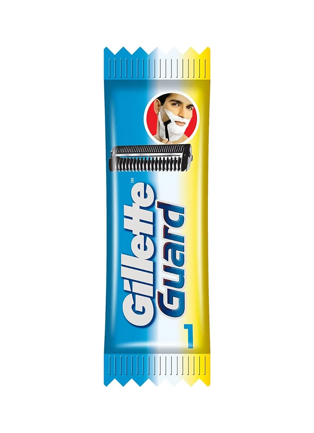
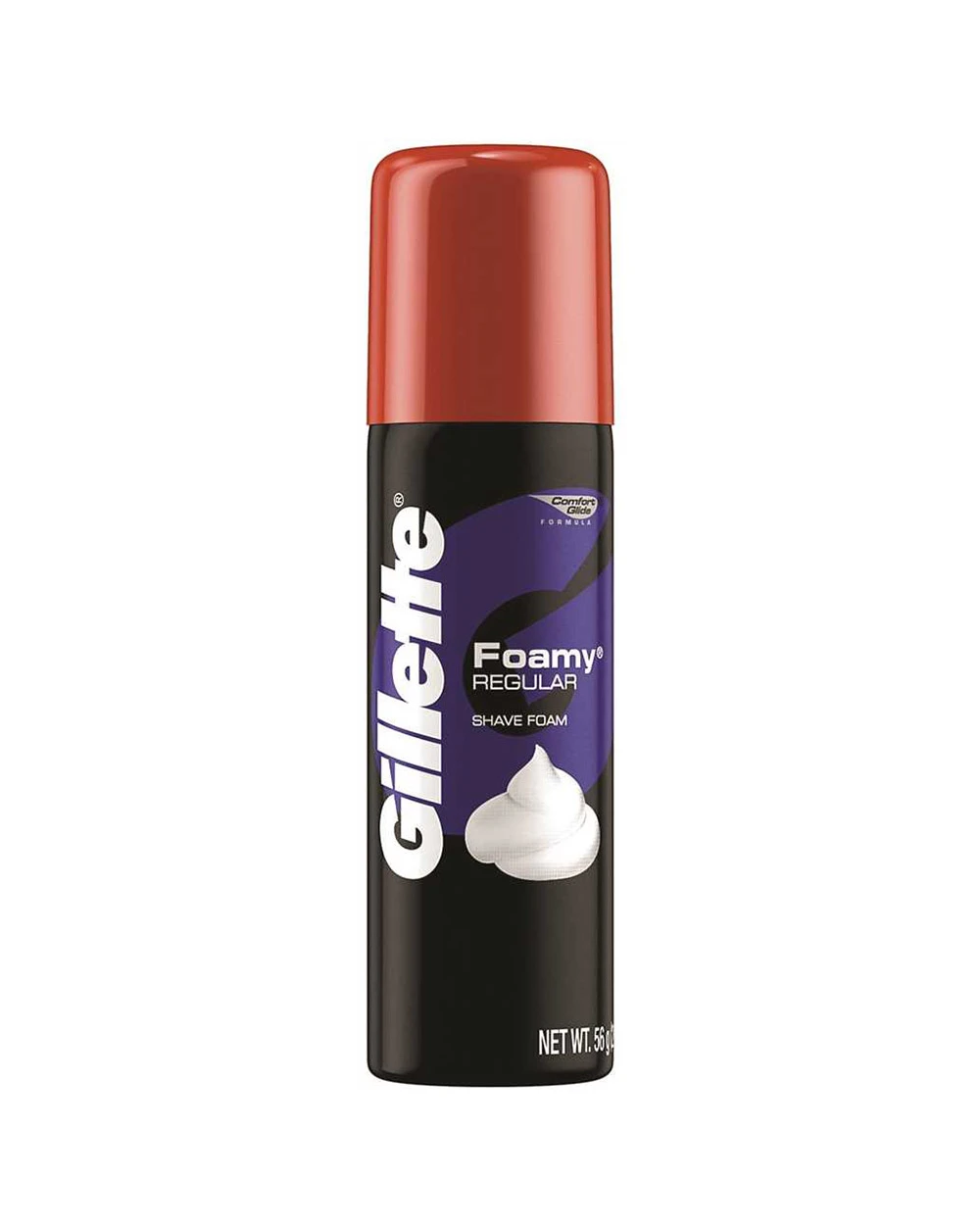
Guard, the value-engineered line, wears a bright blue and yellow card that reads honest and hard-working. And the Foamy aerosol can keeps its black livery basically unchanged for generations — proof that in men’s grooming, an old design that still sells is a design you do not touch.
The Refill Economy: Cartridges as Currency
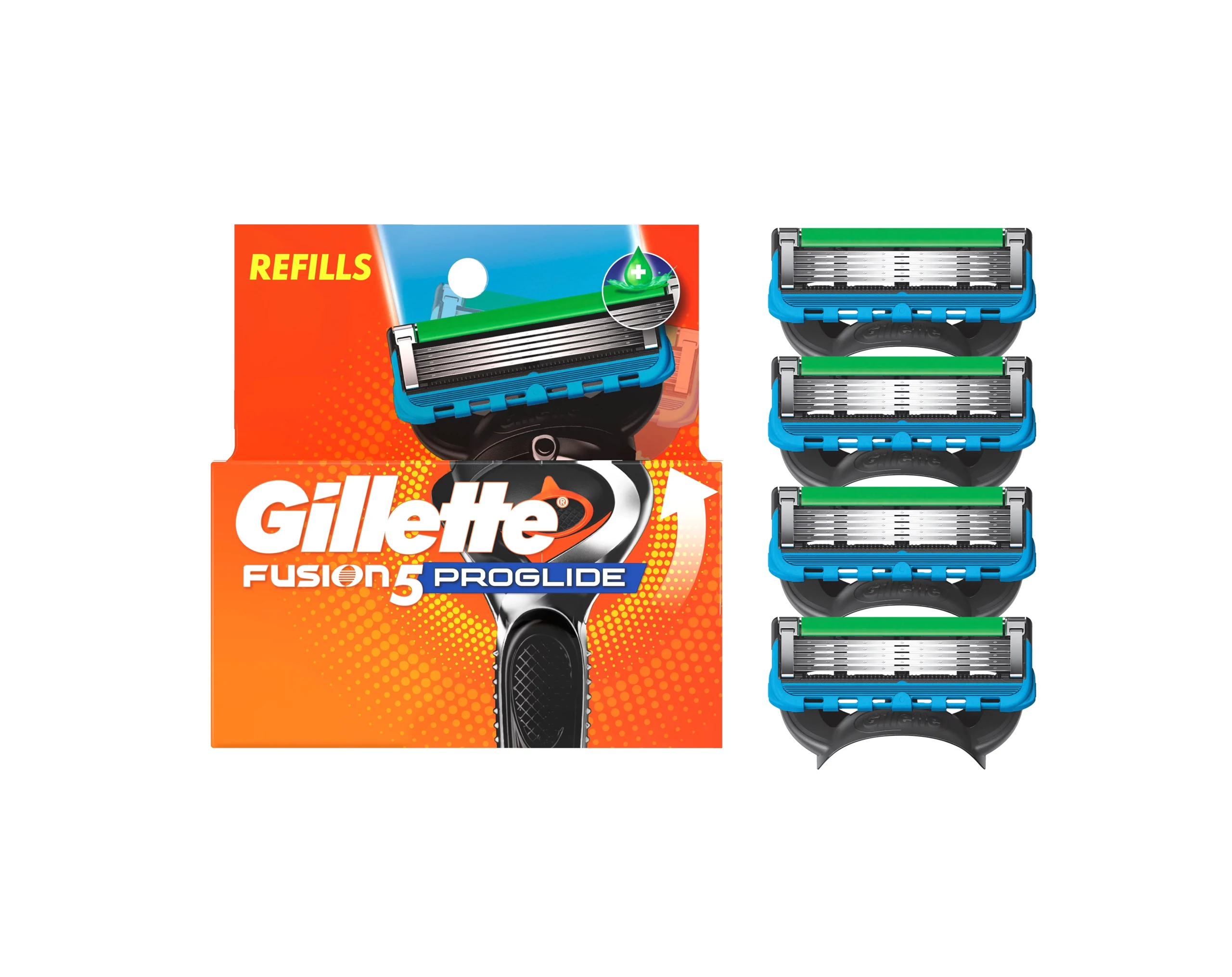
Razor packaging has a second life after the first purchase: refills. The Fusion5 ProGlide 4-cartridge refill card keeps the orange platform color and stacks the cartridges vertically in the blister — the product itself becomes the graphic, and the “REFILLS” badge does the rest. Designing a refill pack that reads instantly from the handle-box design is what keeps customers inside the system for years.
Beyond the Razor: Deodorant Multipacks
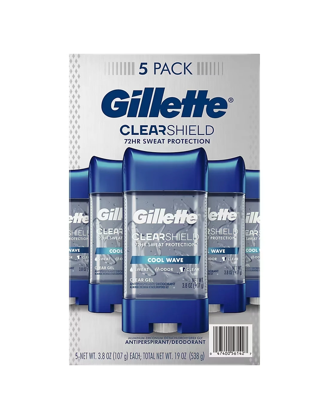
The men’s system also extends beyond shaving. The ClearShield Cool Wave deodorant 5-pack sleeve keeps the same clean blue-and-white freshness coding, with the “5 PACK” badge leading the layout — quantity as the value message. The Gillette italic signature travels intact from razor to deodorant, exactly the way Venus carries its logo into shave gel and trimmers.
The Venus System: Color as Mood and Care
Cross to the Venus side of the shelf and every rule flips. Here color does not encode technology — it encodes feeling. Each variant owns a soft shade that names the experience before the product: spa freshness, sensitive comfort, premium smoothness.
ComfortGlide Spa Breeze: Pink as Promise
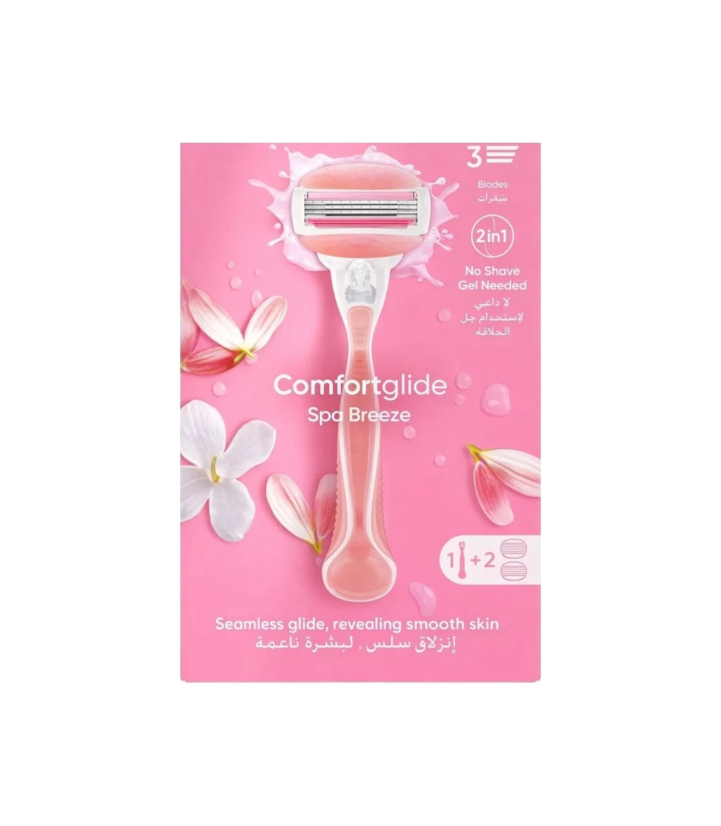
The ComfortGlide Spa Breeze blister card wraps the razor in pink and white florals — the language of bath and body care, not hardware. The razor sits inside the illustration like jewelry. Where the Fusion5 box shouts performance, this design whispers ritual.
Sensitive and Gold: Calm Blue, Premium Metal
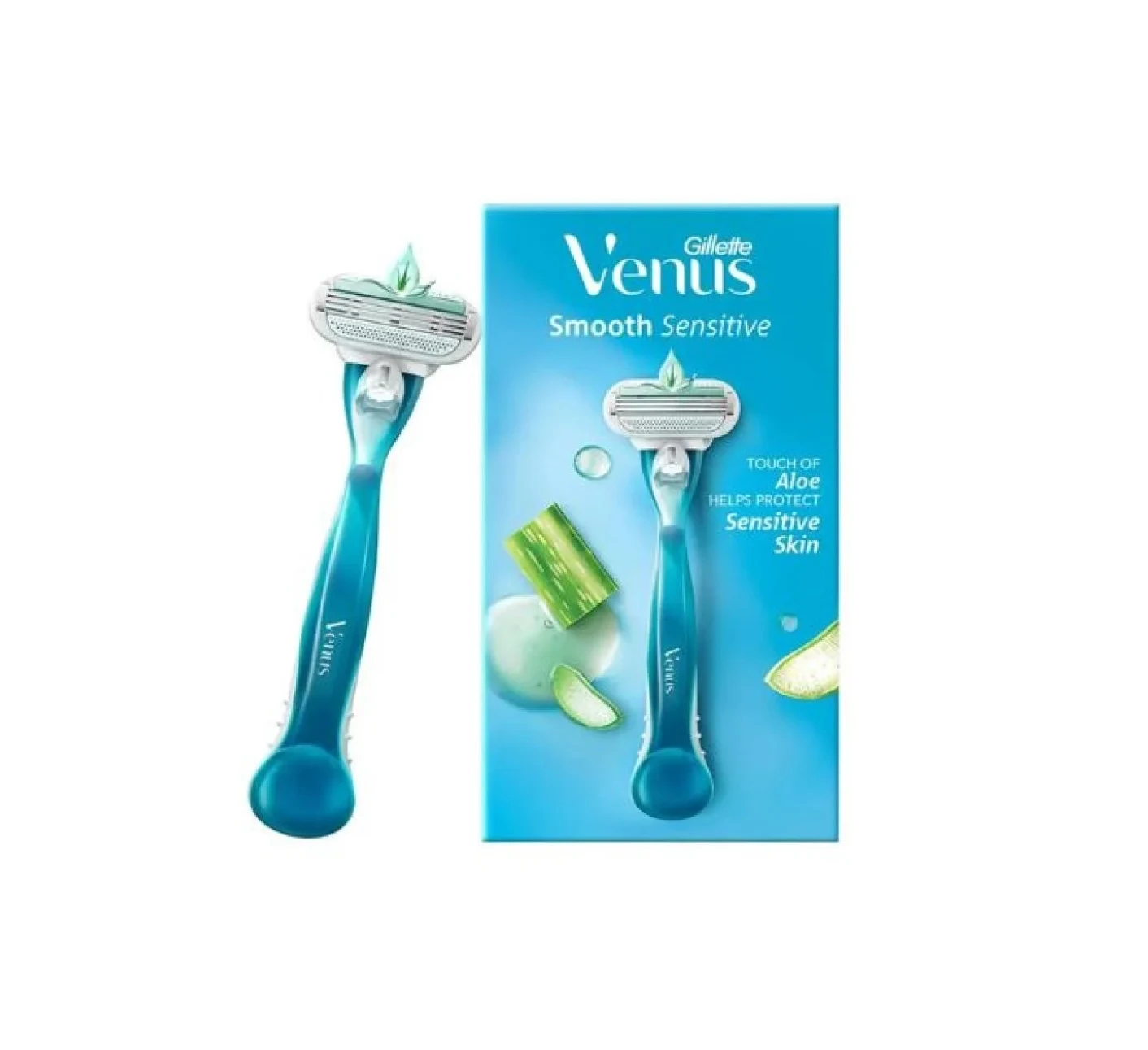
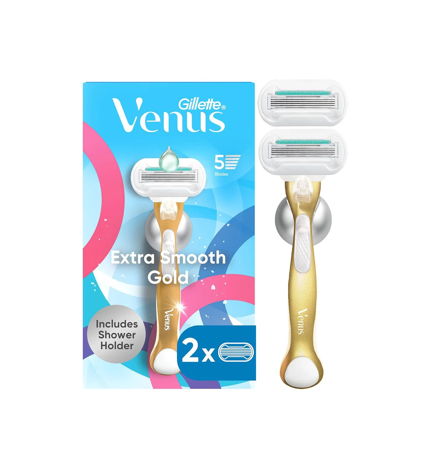
The Smooth Sensitive edition moves to a pale, calm blue — the international shorthand for gentle. The Extra Smooth Gold edition keeps the same layout but crowns it with gold accents, Venus’s version of a luxury tier. Same architecture, two emotional registers: soothing, then aspirational.
Two Collabs, Two Dialects
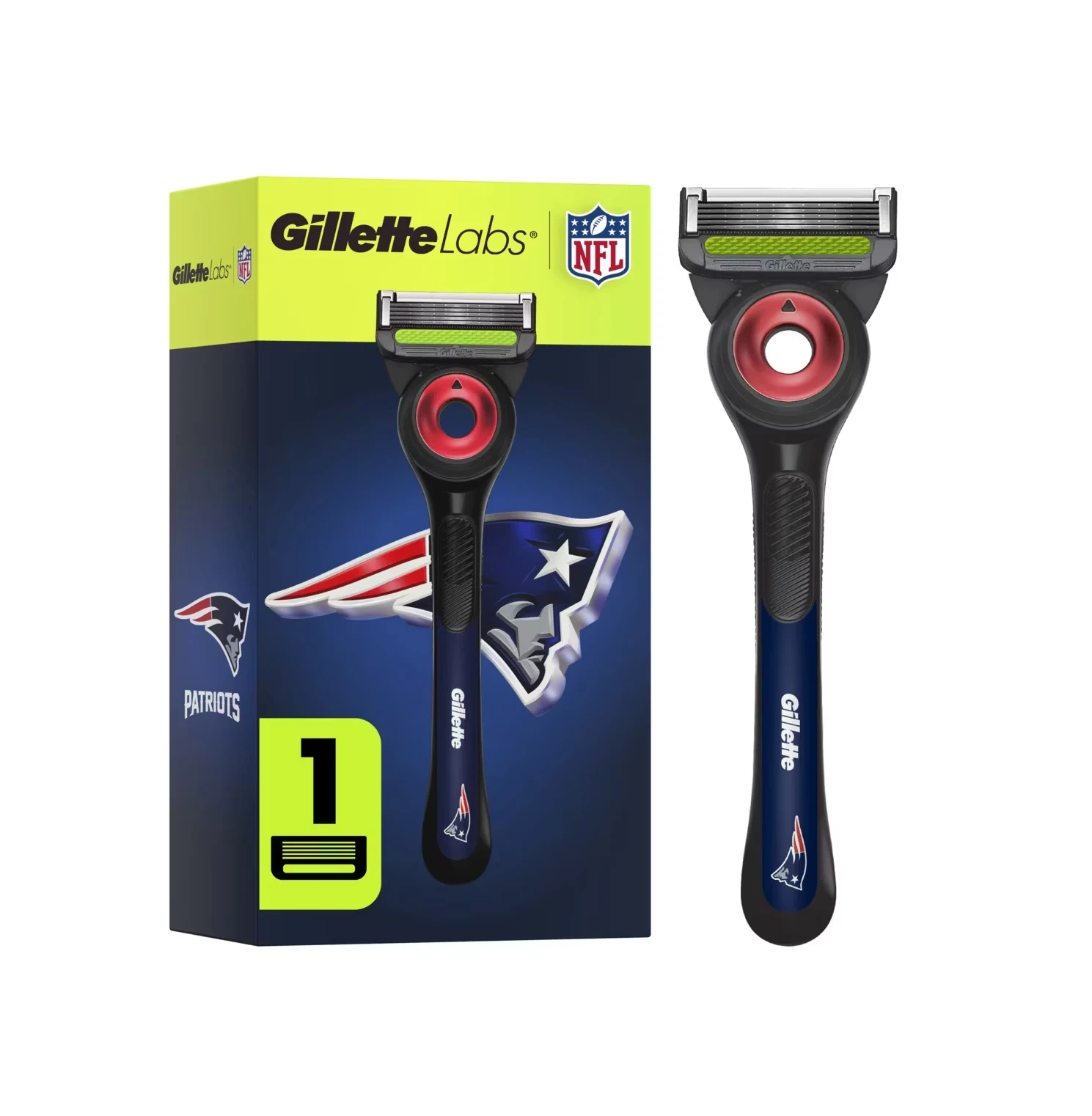
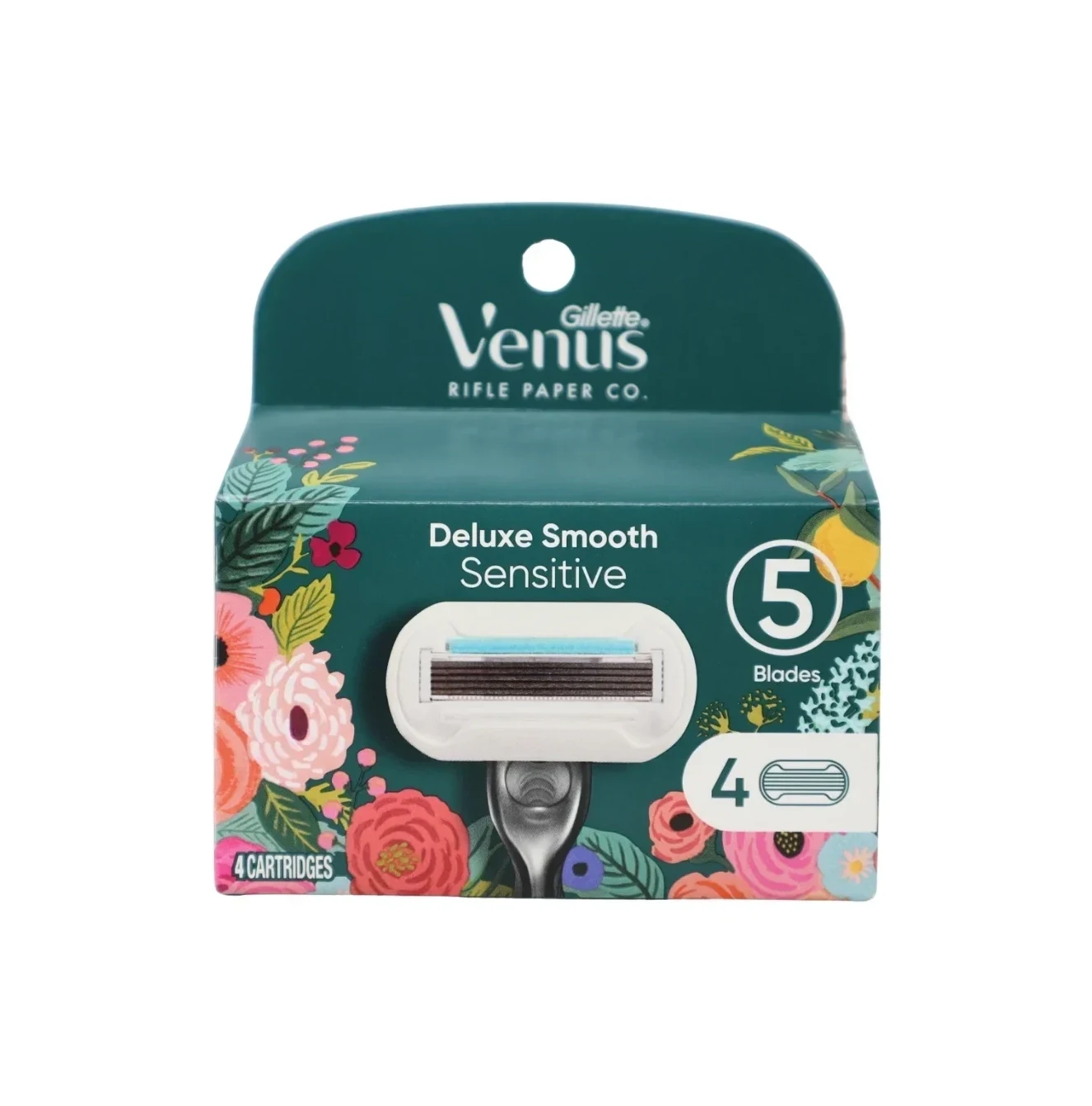
Nothing exposes the two design languages more honestly than collaborations. For men, Gillette partnered with the NFL — the Patriots edition carries team navy and silver, and the energy is borrowed straight from stadium graphics. For women, Venus partnered with Rifle Paper Co, the illustration studio — the result is a botanical, hand-painted blister card that would not look out of place in a paper goods shop. Same company, same shelf, two completely different ideas of what a partnership should look like.
Extending the Territory
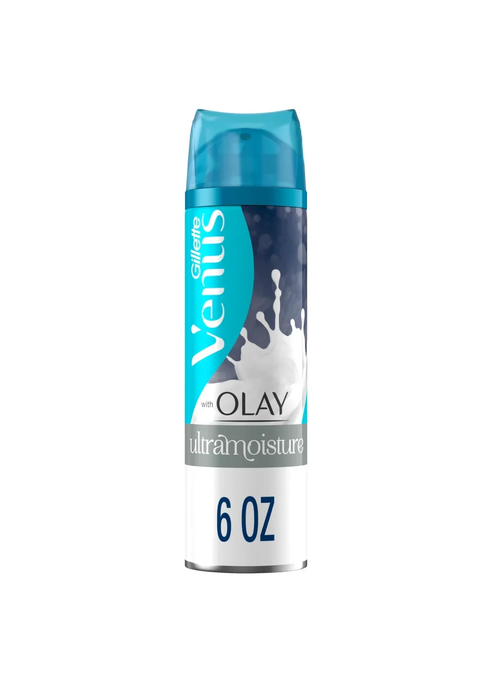
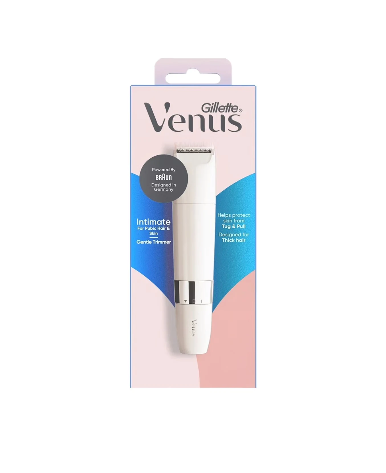
Venus also stretches the brand into adjacent categories with the same soft voice: the Olay UltraMoisture shave gel borrows credibility from a skincare sister brand, and the Intimate Gentle Trimmer extends into the most delicate category of all — still in whisper-pink, still botanical, still unmistakably Venus.
The Shared DNA
Strip away the color psychology and both lines rest on the same three bones: the slanted italic Gillette logotype as the single brand signature, the product itself shown large — handles and cartridges always visible through blisters or windows — and a disciplined white-space grid that keeps every claim legible at one meter and one second. Two languages, one grammar.
5 Lessons for Packaging Designers
1. Let Color Mean Something Structural
Gillette’s men’s colors map to technology platforms; Venus’s colors map to moods and scents. In both systems the color is a lookup key, never random decoration. Decide what your palette encodes before choosing it.
2. One Brand Can Speak Two Dialects
Audiences are not identical, and pretending they are flattens the design. Gillette proves a single masterbrand can run opposite visual systems as long as the underlying DNA — logo, product visibility, layout discipline — stays constant.
3. Match the Collab to the Audience’s World
NFL energy for men’s sport credibility; Rifle Paper Co illustration for women’s lifestyle credibility. A collaboration works when it imports a dialect the audience already loves, not when it slaps a logo on the usual pack.
4. The Product Is the Hero
Everywhere in this collection, the handle is the visual star — through transparent blisters, in die-cut windows, photographed like jewelry. In design-driven categories, showing the object beats describing it.
5. Premium Means Subtract, Then Gild
When Gillette wants to signal premium, it removes color (Labs black) or adds a single precious accent (Venus gold). The lesson generalizes: premium is an edit, not an addition.
Explore the Full Gillette Collection
Browse all Gillette and Venus packaging images for design reference:
- Gillette Packaging Collection — men’s and Venus lines together
- Razor Packaging — razor and refill formats across brands
- Packaging Design — broader packaging collection
- Skincare Packaging — adjacent beauty packaging references