AGF Tea Box Orange Tea
Topics
Details
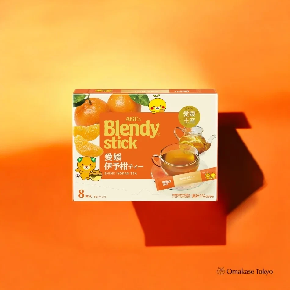
Against a vibrant gradient background that shifts from pale yellow to deep orange, a rectangular tea box floats in the center of the frame, casting a sharp, geometric shadow to the right. The packaging features a clean white base dominated by a bold burnt-orange panel displaying the 'Blendy stick' brand name in large yellow serif typography. Visual elements include realistic illustrations of whole and segmented oranges in the upper left corner, alongside two cheerful cartoon mascots—one bear-like figure with green leaves on its head and a smaller round character—while the lower right quadrant showcases a glass teapot and cup filled with amber liquid.
What distinguishes this particular packaging is its clever fusion of photographic realism with playful illustration, creating an approachable yet premium aesthetic that feels distinctly Japanese. The color palette leverages warm citrus tones to immediately communicate flavor, while the strategic placement of the product name within the orange block ensures high readability without overwhelming the whimsical mascot characters. Subtle details like the circular green badge indicating local origin and the small text specifying eight sticks per box add layers of information that reward closer inspection.
Brand strategists analyzing Japanese consumer goods packaging would find this example particularly useful for studying how regional specialties are visually communicated through coordinated color systems and character branding. Food photographers might reference the lighting setup and shadow play to understand how to make flat-lay product shots appear three-dimensional and dynamic. Additionally, illustrators working on beverage packaging could examine the balance between realistic fruit rendering and simplified mascot design to achieve similar visual hierarchy in their own commercial work.