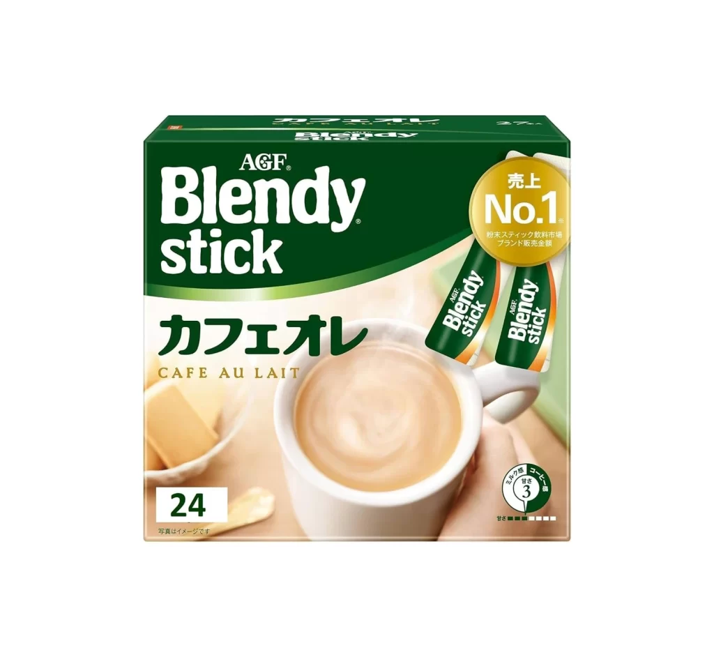
AGF Coffee Stick Box Detail
Topics
Details
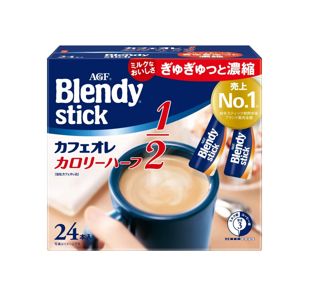
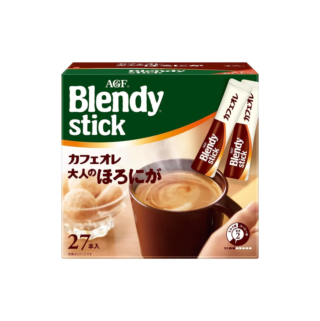
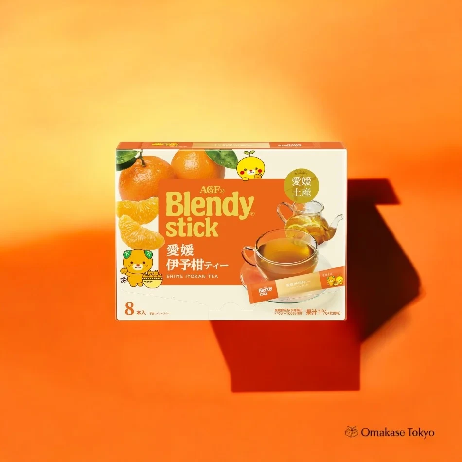
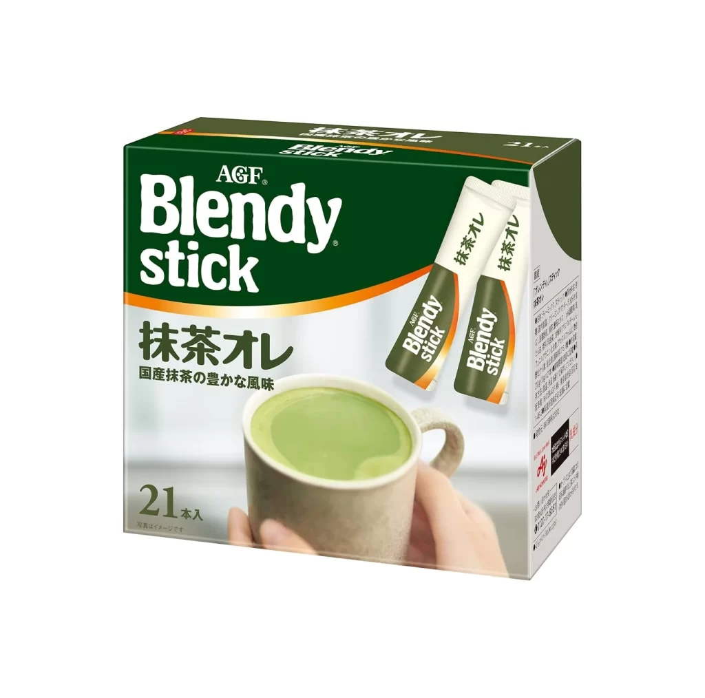
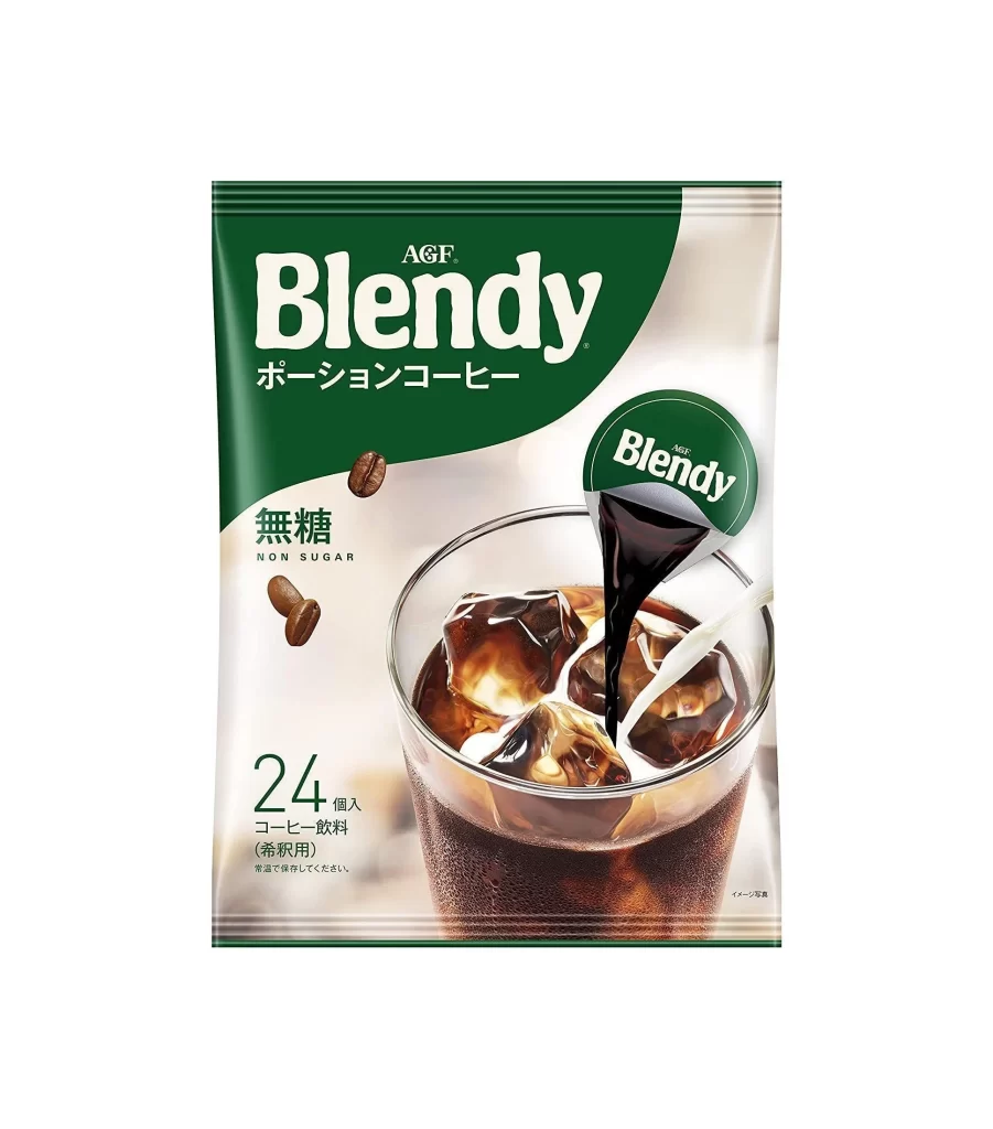
Deep forest green dominates the upper half of this rectangular cardboard package, transitioning into a warm cream tone near the bottom where a steaming white mug sits. The brand name 'AGF Blendy stick' appears in bold, oversized white sans-serif lettering against the dark background, while the product type 'Café au Lait' is rendered in elegant gold Japanese characters just above the coffee imagery. Two individual green sachets peek out from the right side of the box, and a prominent golden circular badge announces 'No.1' sales status in the upper right corner.
Visual hierarchy plays a crucial role here, with the massive typography drawing immediate attention before the eye settles on the appetizing beverage photograph. The contrast between the serious, corporate green header and the soft, inviting coffee scene creates an interesting tension that suggests both reliability and comfort. Subtle details like the small nutritional rating circle in the lower right and the clean '24' count indicator show how secondary information is integrated without cluttering the main message.
Packaging designers studying Japanese consumer goods would find this layout particularly useful for understanding how to balance multiple text languages within a confined space. Illustrators working on food-related projects could reference the way steam and liquid texture are rendered to evoke warmth without overwhelming the composition. Anyone building a mood board for beverage branding might analyze the color psychology behind combining deep greens with creamy neutrals to signal both freshness and richness.