AGF Coffee Stick Box Design
Topics
Details
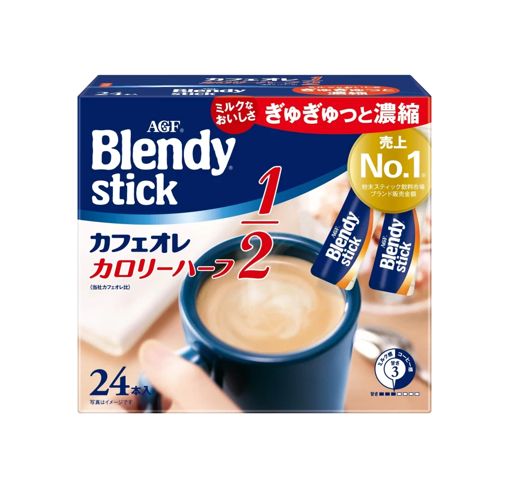
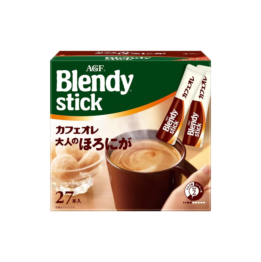
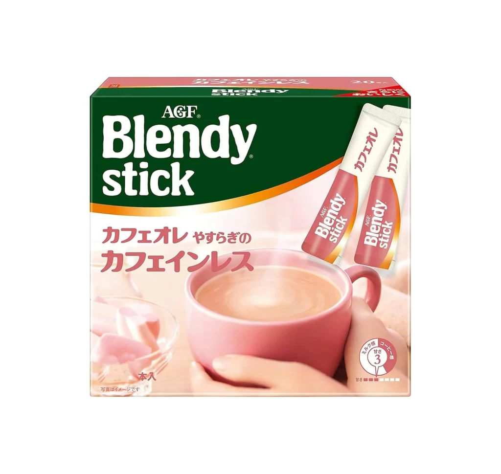
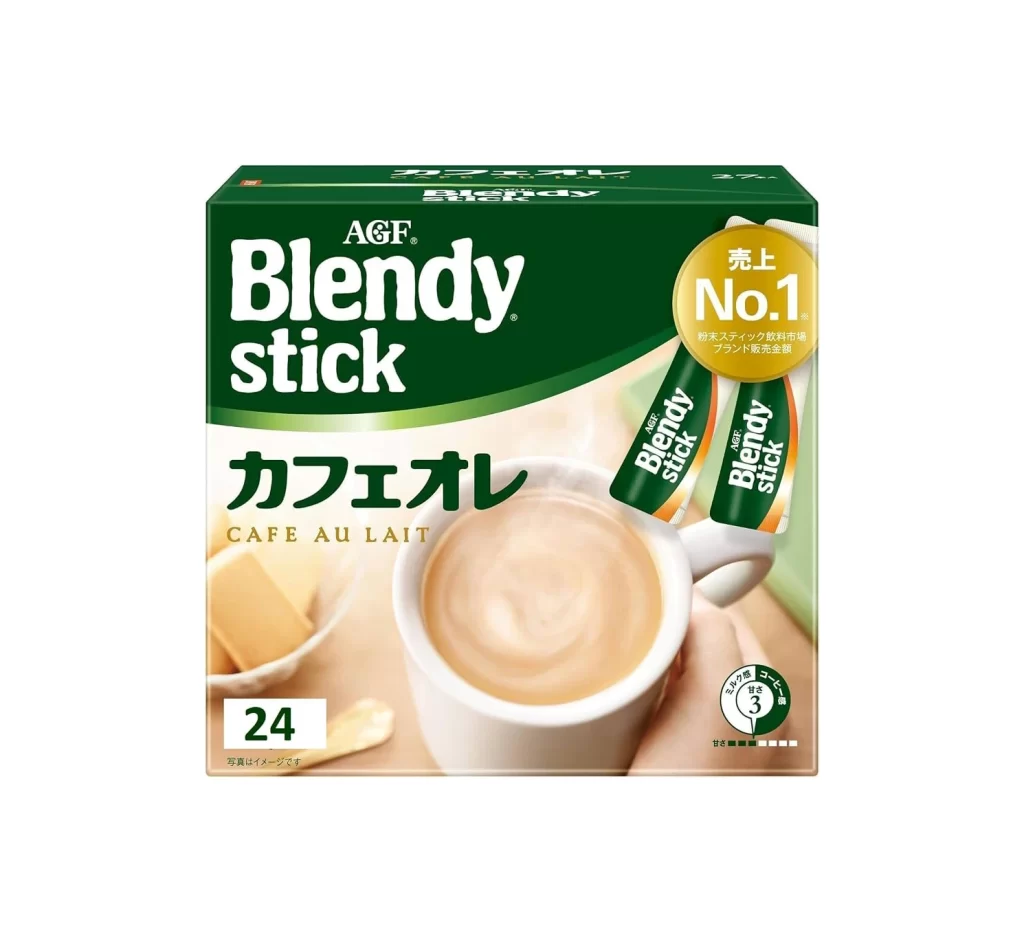
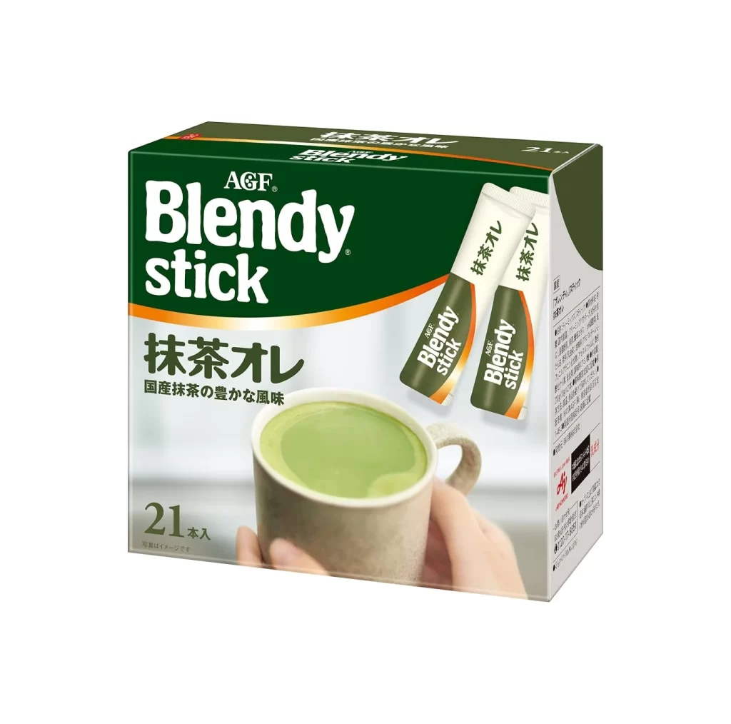
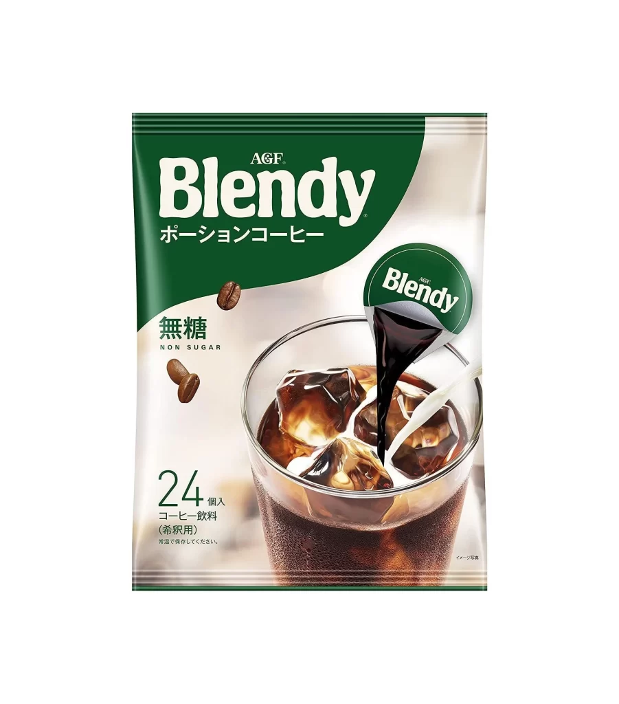
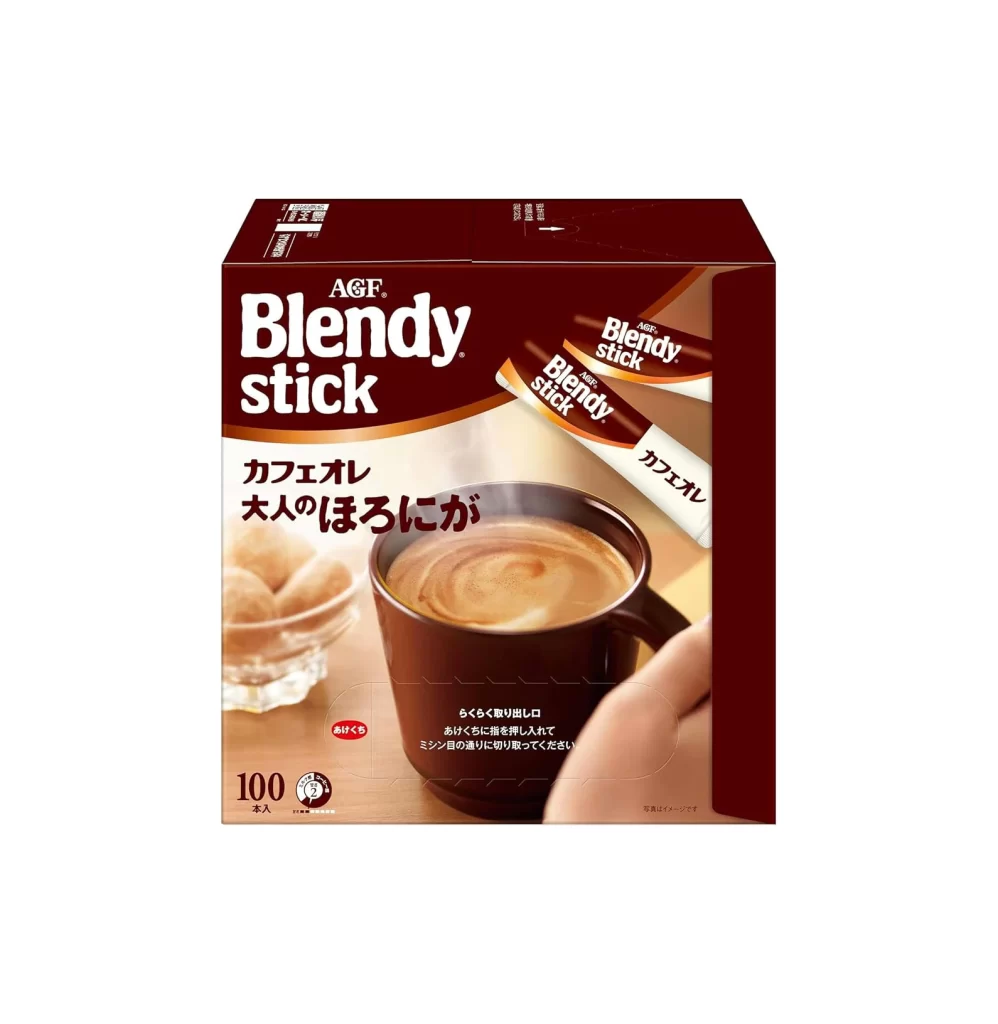
Deep maroon dominates the packaging of this AGF Blendy stick box, creating a rich, warm backdrop for the crisp white typography. The front panel features a large, inviting photograph of a dark ceramic mug filled with a frothy coffee beverage, complete with realistic steam rising from the surface. To the left of the mug sits a small glass dish containing sugar cubes, while two individual stick packets are angled dynamically across the upper right corner, clearly displaying the product name and Japanese text indicating the cafe au lait flavor.
What makes this packaging particularly effective is its masterful use of contrast between the dark background and the luminous product photography. The curved white swoosh separating the brand header from the main image adds a sense of fluid motion that complements the steam and the creamy swirl in the cup. Additionally, the strategic placement of the '100 count' badge in the lower left corner immediately communicates value without cluttering the primary visual hierarchy.
Product photographers studying food and beverage packaging will find this composition useful for understanding how to balance multiple elements within a confined rectangular space. Illustrators working on commercial mockups can analyze the interplay between photographic realism and graphic overlays to achieve similar depth. Even 3D artists creating virtual store environments might reference this layout to ensure their digital products convey the same sense of warmth and accessibility as this physical example.